
Avalanche making changes for 20th anniversary season
/
When it comes to new uniforms and logos, Colorado Avalanche fans have a lot to look forward to during the team's upcoming 20th anniversary season in 2015-16.
The team is making alterations to their home and road jerseys, debuting a redesigned third, and unveiling something entirely new for their Stadium Series game all while celebrating two decades in the Mile High City.
20th Anniversary
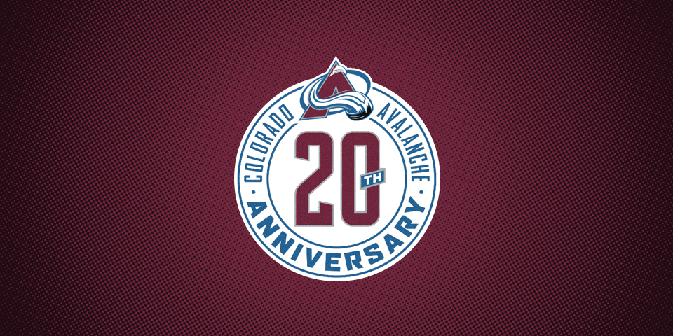
There's a lot to address, so let's start with the 20th anniversary logo. It was unveiled on Thursday and will likely to be used on the club's jerseys throughout the season as well as in merchandise and marketing efforts. In fact, it's already all over the team's website.
To be honest, it's a bit disappointing. While I'm a fan of simple design, this may be too simple. Take away the roundel text and the tacked-on Avs logo and this could be the 20th anniversary logo for anything.
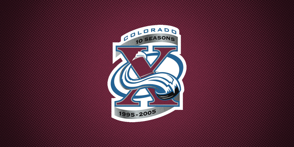
At least the 10th anniversary logo was unique to Avalanche branding. (See the slideshow above.)
However, the biggest problem with this logo, in my view, is the typeface used. (Yeah, this is about to get nerdy.)
It's called Font Bureau Agency and the Vancouver Canucks — the Avs' current conference and former division rival — have been using it on their actual uniforms since 2007.
Don't get me wrong, it's a solid font, but the Canucks have really made it their own within the NHL.
Bank Gothic, on the other hand, has been part of the existing Avalanche branding since the beginning — specifically in the wordmark. And it has plenty of weights and options to choose from, just like Agency.
I'm probably overthinking this, but I figured I should explain my disapproval. Prepare to see lots of that logo throughout the season if you live in Denver.

New secondary logo?
The other big news concerns Colorado's primary home and road uniforms. In the last edition of NHL JerseyWatch, we got the first inkling of changes coming to those sweaters by way of Denver Post writer Mike Chambers.
Now Icethetics can share exclusive details regarding those "minor alterations" by way of a source who wishes to remain anonymous.
I'm told that the team is looking to scrap the Yeti foot logo currently in use as a shoulder patch on its jerseys. It would be replaced by an all new design. (Perhaps something modeled after the state flag?)
This would be a big shift in Avalanche branding as the logo has been around for 20 years now. But there's a sense that it no longer represents the brand accurately.
As indicated by Chambers' tweet, we should get our first look at the new logo and how it works on the sweater this Friday when the 2015 NHL Draft begins.
To my knowledge, apart from the new shoulder and anniversary patches, no other changes are planned for Colorado's home and road uniforms for 2015.
New Third & Stadium Series Jerseys
While the home and road sweaters see minor tweaks (though it should see more), the third jersey is expected to undergo sweeping changes. No word yet on the design or colors, but if the Avs introduce a new secondary logo, it would make sense to see it as the crest of a new alternate uniform.
Let me play a little armchair GM here. If I'm the Avs right now, I know my Stadium Series jersey will be more than likely dictated by the NHL who wants to put a futuristic design on the national stage. So I take the opportunity to create a new third jersey with the retro elements fans want to see. Maybe even a little inspired by the old Rockies franchise.
Is this realistic? Maybe. I hope so anyway. What do you think the Avs should do?