
Everything that happened on draft day in the NHL
/
Connor McDavid went first overall. Jack Eichel went second. And NBCSN cut away before it was all over. The 2015 NHL Draft was anything but unpredictable on Friday night.
That is except for jersey geeks. For them, there were surprises around almost every corner!
Coyotes unveil new uniforms!
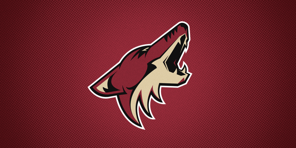


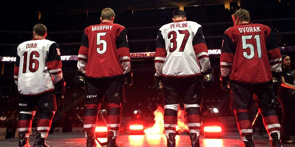
All right, the first one wasn't a surprise. We knew that new jersey were coming to the Arizona Coyotes. We just didn't know what they would look like.
So the afternoon brought our first look at the Coyotes' new home and road uniforms as they were unveiled at Gila River Arena during the team's draft party.
As promised, the primary logo did not change, but everything else did. Some bullet points:
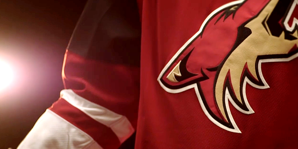
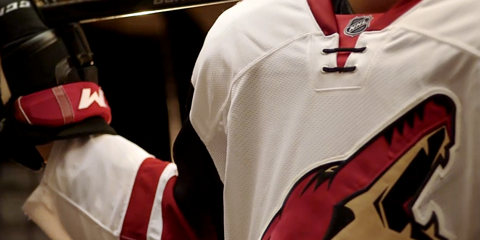
- Black is now a prominent color in the sweaters.
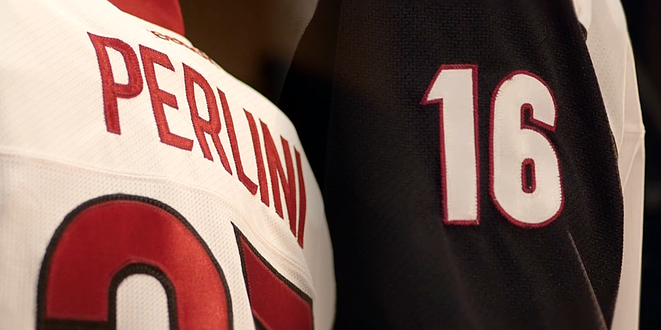
- The shoulder patches are different between the two uniforms — a new "A" paw print logo on the home jersey and a revised "AZ" logo on the road.
- Both jerseys feature the modernized lace-up collar popularized in the first NHL Stadium Series.
- New name and number fonts have been implemented.
- Horizontal
Now here's what the press release says:
The body of the Coyotes home and away jerseys remains unchanged but the new jerseys feature an original sleeve stripe designed to connect with Arizona’s distinctive striated landscape. These bold sleeves, along with a striking black pant, will be worn both at home in Glendale and on the road.
The new red jersey shoulder patch features a coyote’s paw “A” mark, an icon built for Arizona’s hockey fans; while the white jersey shoulder will carry an updated “AZ” mark, connecting back to the new word mark.
Finally, a uniquely Southwestern pattern in the jersey’s neckline connects the Coyotes to the legacy of Arizona.
I haven't yet seen the last two items mentioned — the new wordmark or the "southwestern pattern" in the neckline. Hopefully we'll see more of those details in the days to come.
Last October, I included the Coyotes in my list of teams in desperate need of new uniforms, so I was excited to learn they were doing this redesign.
Now that I've seen it, there are things to like and dislike. I'm a glass half-full kind of guy, so I prefer to focus on what works more than what doesn't.
The black is a great addition. It adds dimension to what might be considered a plain uniform. Black was one of the Coyotes' original colors and it never made sense for them to remove it from the jerseys.
The name and number fonts are classy and subdued. But my favorite element is the new shoulder patches. The "A" in the new paw print could've been a bit more subtle, but I love the idea of have different shoulder patches for each jersey.
Some might consider this new design to be a bit of a snore, but let's not forget the idea is for these uniforms to live on for years to come — setting aside the issues between the team and city of Glendale. If they went too wild with the styling, it would be dated very quickly, not unlike those '90s uniforms.
Avalanche revise primary uniforms

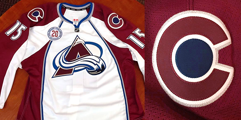
Also prior to the start of the draft, the Colorado Avalanche took to Snapchat for the reveal of their updated jersey. Photos were shared on Twitter as well.
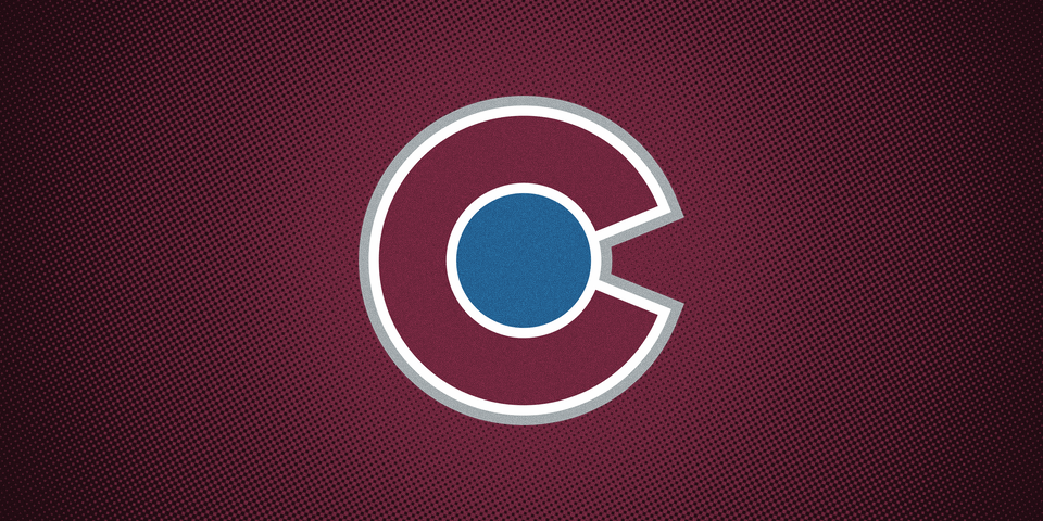
As expected, the Yeti foot patch is gone from the shoulders, replaced by a new "C" logo inspired by the state flag of Colorado. It's also the same symbol used by the NHL club that previously occupied the state — the Colorado Rockies of the 1970s.
I'm not sure how this decision advances the brand, to be honest. While the Yeti foot may no longer be relevant to the identity, this new logo just seems out of place — a completely different design style, not to mention unoriginal.
Then again, if it's meant to evoke Colorado's hockey history, I can get on board with that. And the great thing about simple designs like this is that they never go out of style.
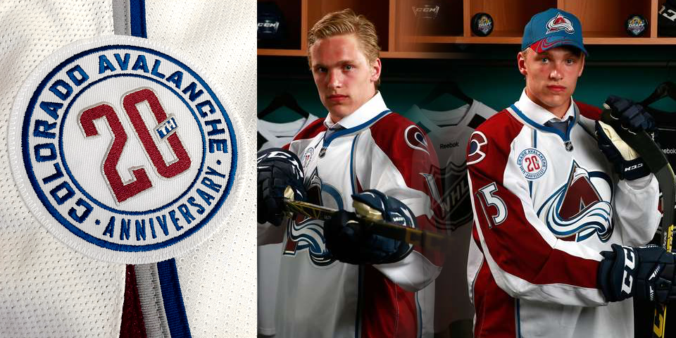
The photos also showed a variation of the 20th anniversary logo the Avs unveiled last week. The patch, worn on the chest, is without the Avalanche logo at the top. (They've also inverted the fonts for those of us that pay attention to that.)
By the way, the Avs aren't done yet. We're still anticipating a new third jersey as well as the unveiling of their Stadium Series sweater in the coming months.
Oilers surprise with orange retro jersey
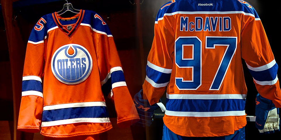


Ever since the draft lottery in April, there's been no mystery as to how the opening moments of the draft would play out. So how did the Edmonton Oilers still manage to surprise us? By unveiling a new orange throwback jersey at the podium!
It's a remake of the sweater worn by the Oilers during their first two seasons as a member of the WHA back in the early 1970s and Connor McDavid became the first player to wear it in the NHL.
Word of an orange Oilers jersey had been reported two days earlier, but did you really expect to see it so soon? Talk about a pleasant surprise!
What's funny is just over a week ago, I posted this on the Concepts page asking, "How long will it be before the Oilers finally introduce an orange third jersey?" Didn't think we'd get an answer so quickly.
However, this isn't a true "third jersey" — which is why it wasn't included in the Reebok catalog referenced in our NHL JerseyWatch series. Think of it more like the throwbacks worn on special occasions by the Devils, Kings and even Coyotes last season.
From the Oilers' press release:
The design of the new jersey was inspired by one worn by the Oilers early in the franchise’s life as a member of the World Hockey Association.
The orange jersey will be worn for seven select home games during the Farewell Season at Rexall Place, including Opening Night on Thursday, October 15 against the St. Louis Blues.
Note the fact that the jersey is only being worn seven times next season. Third jerseys are generally worn 12 to 15 times a year.
Speaking of Rexall Place, you can see the Farewell Season logo above. I'm assuming we'll see it on the blue home jersey this season, though it was not present on McDavid's orange one.
By the way, this will be the only jersey in the NHL to feature TV numbers on the shoulders instead of lower down the sleeves.
It's a great look and one I hope gets promoted to full-time alternate jersey in 2016.
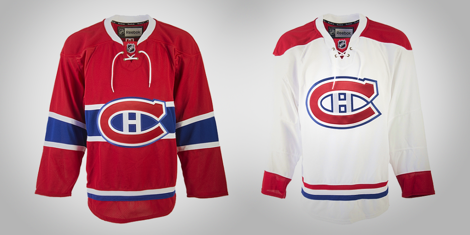
Canadiens retrofy jerseys with collar laces
Yeah, I just made up a word. What about it?
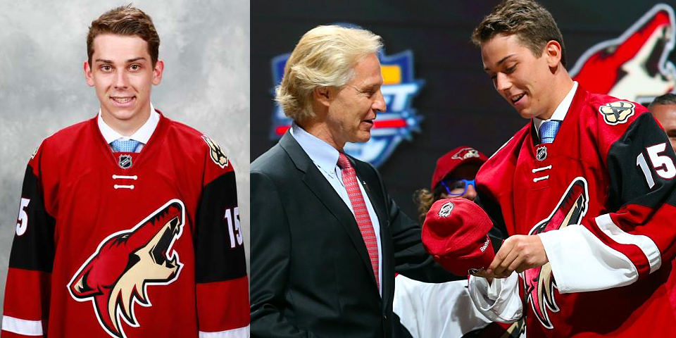
After teasing us with enigmatic photos all day on Twitter, the Montreal Canadiens finally revealed their updated home and road uniforms upon drafting Noah Juulsen 26th overall.
The Habs were part of NHL JerseyWatch 2013 so this change has been in the pipeline for at least a couple of years. Even then, we were expecting little more than a collar revision.
The change in collar design evokes the sweaters worn by Montreal from the 1940s to the 1970s.
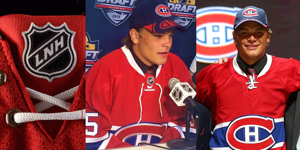
But it wasn't just the ties. There was actually another subtle change made to the collar area. From the Canadiens' press release:
On the team’s red home jersey, the French “LNH” logo will be stitched at the nape of the neck, an homage to the roots of the franchise and the lone exception to the “NHL” visible on all other jerseys across the League.
This comes after the Canadiens finally began using French accent marks on letters in players' names where appropriate — like Brière, for example.
Overall, this is a classy update to two otherwise untouchable and historic NHL uniforms.
Blue Jackets expand cannon with new shoulder patch

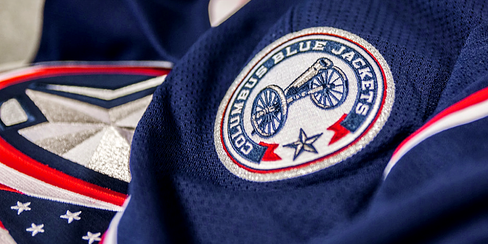
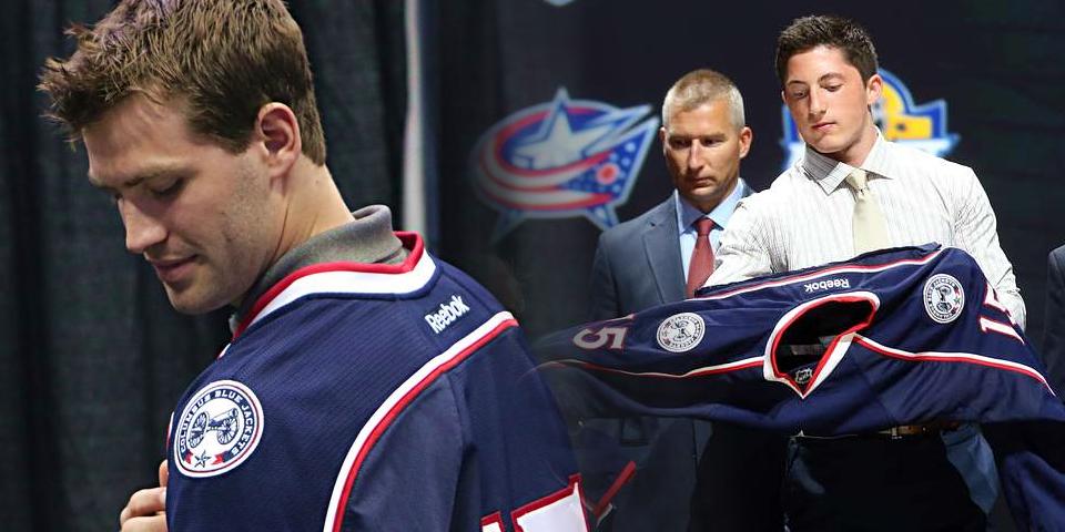
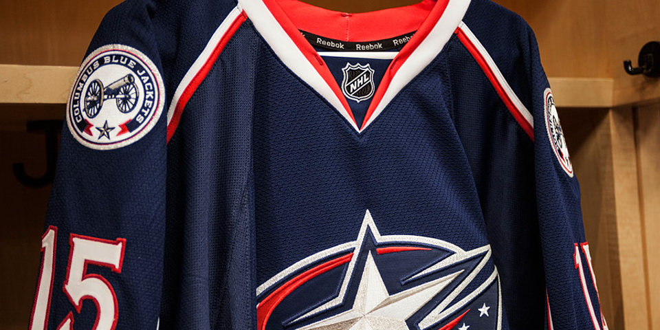
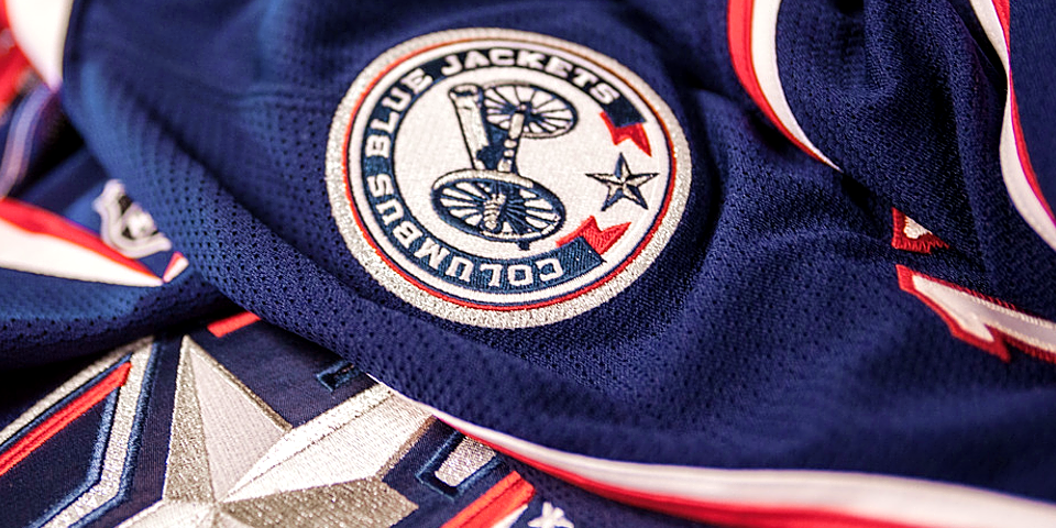
The Columbus Blue Jackets added to the bevy of new shoulder patches unveiled on Friday night with one of their own featuring their beloved cannon.
The cannon-based logo that sits on the crest of the team's third jersey has been recolored and shrunk down to fit nicely on the shoulders of the home and road sweaters beginning next season.
From the Blue Jackets' press release:
The 1857 Napoleon cannon that has become an iconic part of the Columbus Blue Jackets experience since its introduction in 2010 will be part of the club’s primary home and road jerseys in the form of a shoulder patch beginning with the upcoming 2015-16 National Hockey League season.The shoulder patch logo is similar to the club’s current third jersey logo as the team name encircles the cannon in a ribbon inspired by Civil War medals while a single star centered at the bottom of the crest signifies Columbus as Ohio’s capital. The difference is the logo is comprised of the club’s primary colors — Union Blue, Goal Red, Capital Silver and White.
“When the cannon logo was introduced on our third jerseys five years ago, it was extremely well-received and has become very popular with our fans,” said Blue Jackets Vice President of Marketing J.D. Kershaw.
The Jackets also confirmed this is the end for the Union Army cap logo that has been used as the shoulder patch since 2007.
This is a brilliant decision by Columbus. The Army cap never meant as much to the brand as the cannon does. I've never been to a game at Nationwide Arena, but I hear nothing can prepare you for the boom of that cannon when the Blue Jackets score a goal.
For more photos of the new patch, head on over to the team's website.
Sharks add 25th anniversary logo patch

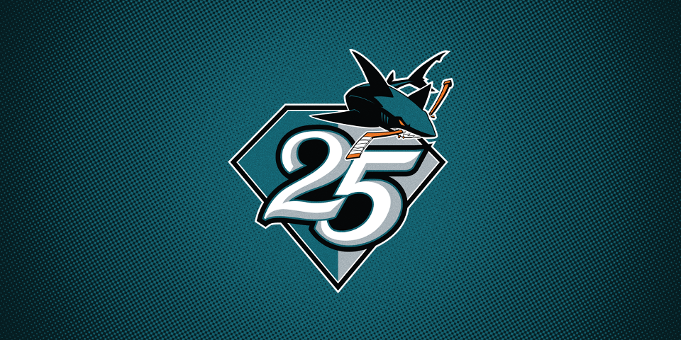
The San Jose Sharks showcased their 25th anniversary logo on jerseys given to draft picks this weekend.
The placement of the patch on the chest leads me to think this is the end of San Jose using players' jersey numbers on the chest. Of course it could just be temporary while the patch is in use.
Personally, I'd like to see this change become permanent. Those numbers along with patches on both shoulders have always created awkwardness when it comes to commemorative patches.
Anyway, I just hope it doesn't weigh down the jersey too much, right?
Ducks' draftees get alternate collar lace color

The Anaheim Ducks introduced new home and road jerseys last season, but they may already be getting a small tweak. We noticed the collar laces, normally black, were white on the jerseys given to Ducks draft picks this weekend.
The black ties on the black jerseys were almost impossible to see last season, so this change would certainly help with visibility. The ties on are black on the white sweater so I don't envision any changes there.
Capitals picks sport new throwback third jersey
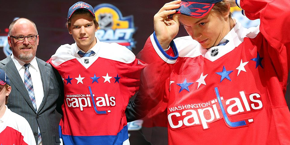
And I think I can safely bring this blog post to an end by pointing out that the Washington Capitals wasted no time getting their new third jersey out into the wild. They handed out the new red throwbacks to their draft picks this weekend in south Florida.
They look fantastic. That is all.
I'll leave you now with a look at all the jerseys handed out at the draft this weekend.
