
World Cup of Hockey logos, uniforms unveiled!
/Wednesday was all about the World Cup of Hockey 2016 as the rosters, logos and uniforms for all eight teams were officially revealed.
The fun began on Tuesday, in fact, with the unveiling of the World Cup logo, seen above. The abstract mark is based on an abstract physical object — that being the World Cup trophy itself, which was designed by Frank Gehry for the tournament in 2004.
The design is distinctive, to be sure, garnering any number of colorful descriptions. But here's how it was described in the official press release back on May 12, 2004.
The trophy is comprised of four components: a base, pedestal, cup and shell. It's made from a composite alloy of copper and nickel as well as solid cast urethane. The pedestal and base provide support or a "stage" for the shell and cup. The cup sits inside the trophy and is removable from the top of the shell for engraving and display purposes.
The shell is made of an array of twisted rectangular shapes sitting on end that are reminiscent of skate marks in the ice. Water-clear urethane was used to give the trophy an 'ice-like' appearance.
As for the new World Cup logo, branding duties went to M Style Marketing in New York. For more on how the design came about, the full story is on their website. Here are some highlights.
The interpretation captures the speed and fluidity of the sport, illustrating the trophy in a free flowing manner. The trophy sits on an abstract background of iconic hockey elements, including the Maple Leaf, which pays homage to the host city.
The unique shape of the brand mark is reflective of the trophy view from the top with the angular lines evoking hockey sticks. The color palette is representative of the eight teams competing in the tournament, emphasizing the international statement.
M Style Marketing previously worked with the NHL on the logo for the 2013 Winter Classic, which was postponed a year due to the 2012-13 lockout.
All that and we haven't even gotten to the jerseys yet. Let's do that.
The World Cup of Hockey 2016 will take place from Sept. 17 to Oct. 1 and feature eight teams split into two groups. Group A includes Team USA, Team Canada, Team Czech Republic, and Team Europe — a club made up of European players not of Czech, Swedish or Finnish birth. Group B has Team Russia, Team Sweden, Team Finland, and Team North America — another mixed team comprising Canadian and American players under the age of 24 (as of Oct. 1).
Today, each team named the first 16 members of its 23-man roster but I'll leave other media outlets to fill you in on those details. The important thing is that all 16 Adidas-designed team jerseys were also revealed to the world!
Group A
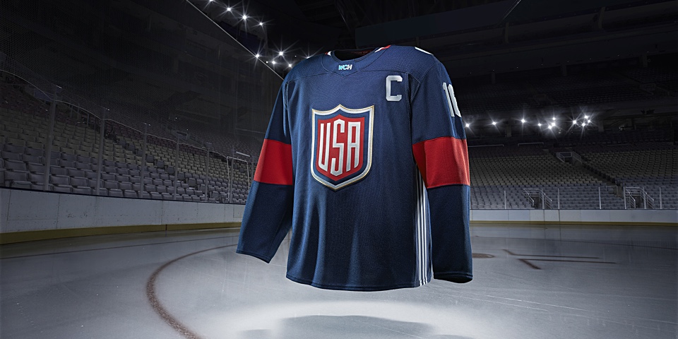
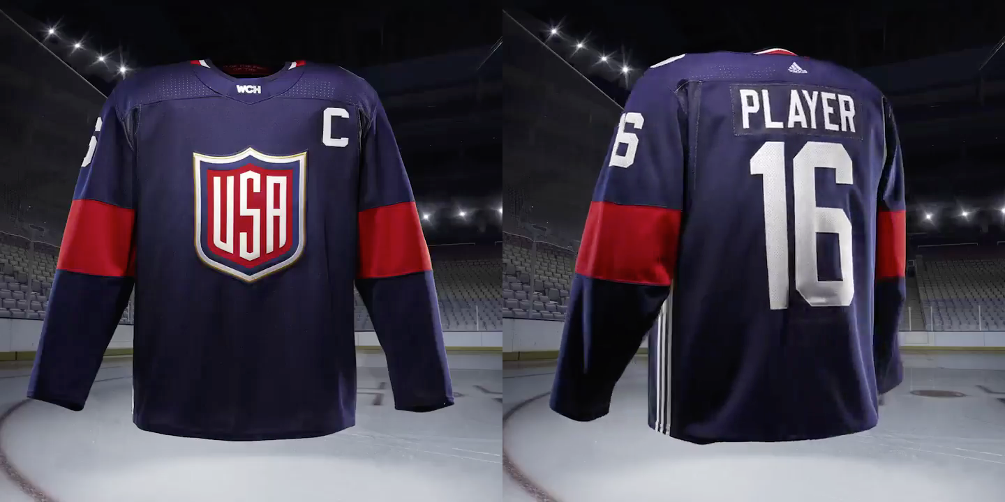
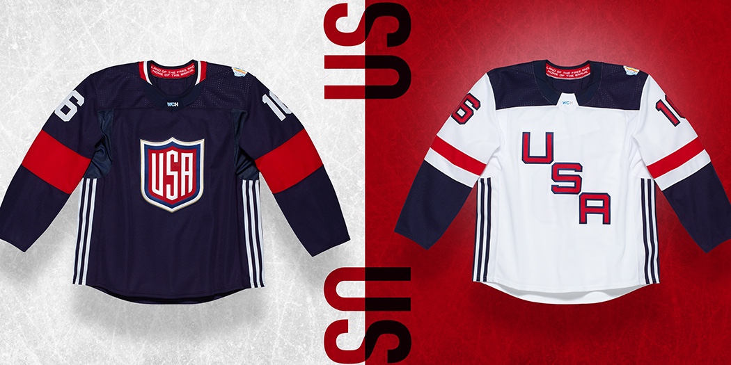
Team USA
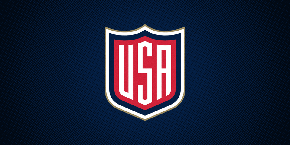
Classic and simple. Not a bad start. Adidas describes the sweater as "building upon a tradition befitting the land of the free and home of the brave" — the latter of which is in text visible inside the collar — as "national emblems and banners inspire an unapologetic shield and word mark." I'd love it a little more if there was a white stripe or two to add definition to the blue sweater but the white one is practically perfect. Grade: A–
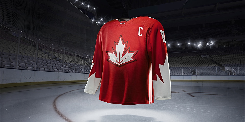
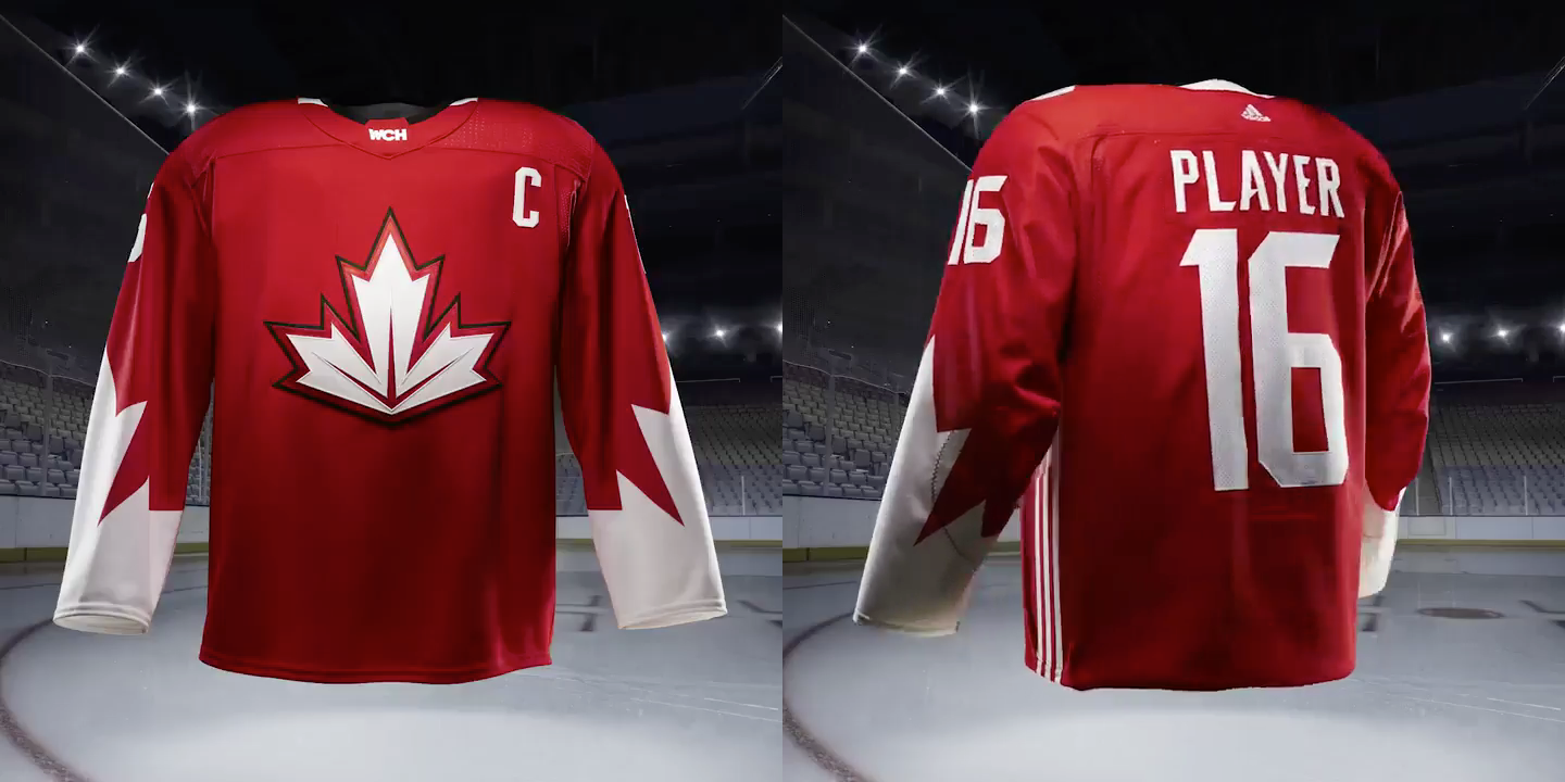
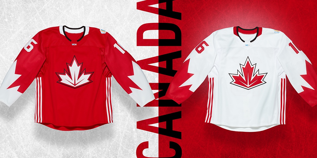
Team Canada
Initial feedback to what Adidas calls "a modern interpretation of the national icon—the maple leaf" was expectedly mixed. It was both necessary to refresh the design and impossible to create one that could please every fan. But given the mountain they had to climb, I have to commend the design team on coming up with something we're likely to look back on as a classic.
"The three veins contained in the Dominion Leaf crest," according to Adidas, "represent Canada's three coasts and make this a mark to represent all of the Great North." Grade: A
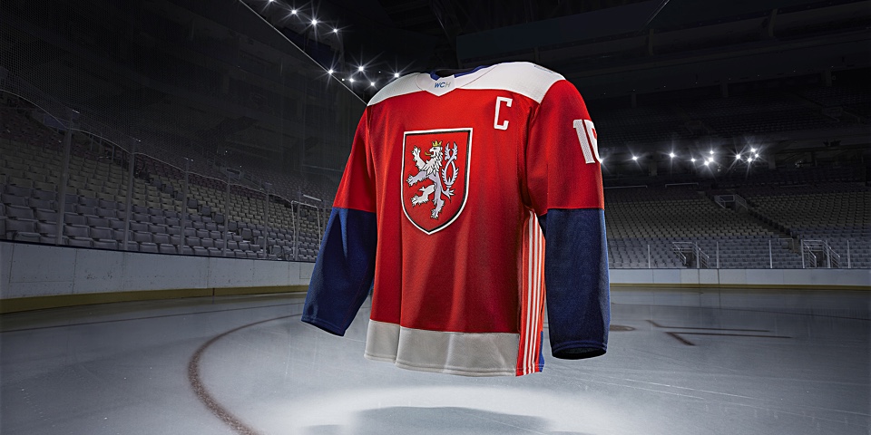
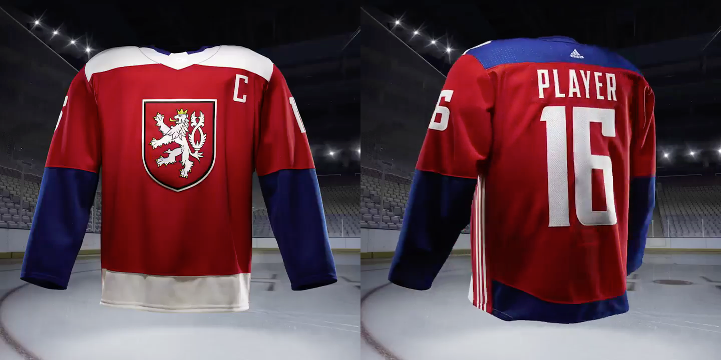
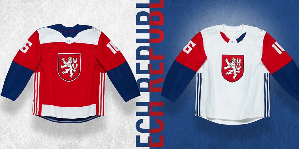
Team Czech Republic
Perhaps it was the memorable national flag-inspired design introduced by Nike at the 2014 Olympics in Sochi, but the new Czech look left me wanting more. Adidas tells us "the statement color blocking highlights the coat of arms, a silver double-tailed Lion crest."
The color blocking has served Adidas subsidiary Reebok rather well when it comes to NHL Stadium Series jerseys in recent years, but this is just plain. I can forgive the plainness of the blue American sweater because of the bold crest but I don't get the same thing when I see this one. I do, however, like the creativity of the shoulder yoke which is white on the front and blue on the back. Grade: C+
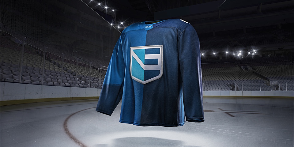
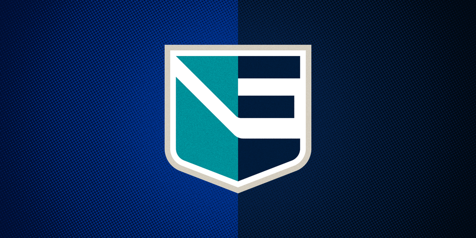
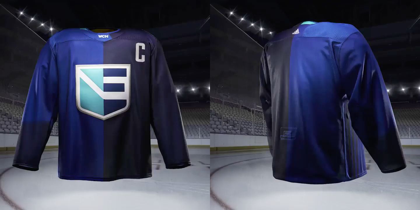
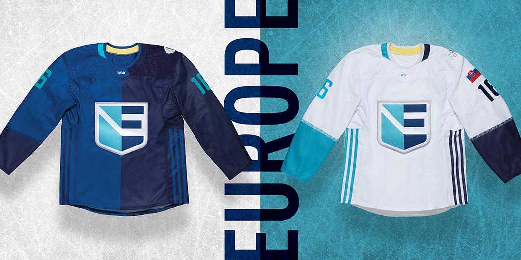
Team Europe
By far the most difficult challenge had to be designing a sweater for a unified European team that would make its players feel like they're playing for national pride. Adidas characterizes the jersey crest as "a modern E shield, featuring a single crest that connects all of their home nations." But I don't see the connections.
The 16 players named to the team today represent seven nations — Austria, Denmark, Germany, Norway, Slovakia, Slovenia and Switzerland. Fewer than half of those nations have blue in their flags. All have red but there's not a single thread of red to be found on these uniforms.
Then again, red already features prominently in the sweaters of five of the six national teams in the tournament. So maybe introducing teal here was a good call for the sake of contrast. Plus, this way the unified sweater doesn't appear to be favoring any particular country over another. And each player will wear his country's flag on his shoulder, so the red is sure to stand out.
Honestly, there's a lot more to like than dislike about this jersey. Not only are the colors appealing on their own, but the patchwork nature of the design brilliantly symbolizes the patchwork nature of the team. Even better, the "E shield" design calls back to an era of classic letterform hockey logos from the 1960s and '70s.
And if you look closely at the sleeves, the apparent disturbance at the edge of the color blocks is actually a listing of all the European countries covered by Team Europe in what Adidas calls a "unity stripe." In other words, even if there are no Croatian players on the team, Croatian hockey fans will have a clear team to root for. It says so right there on the sleeve. Grade: B+
Group B
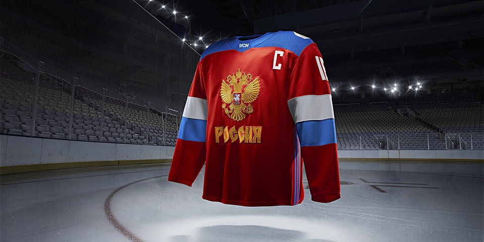
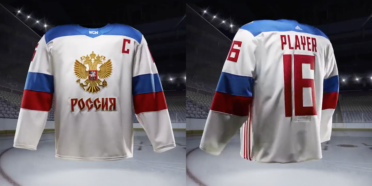
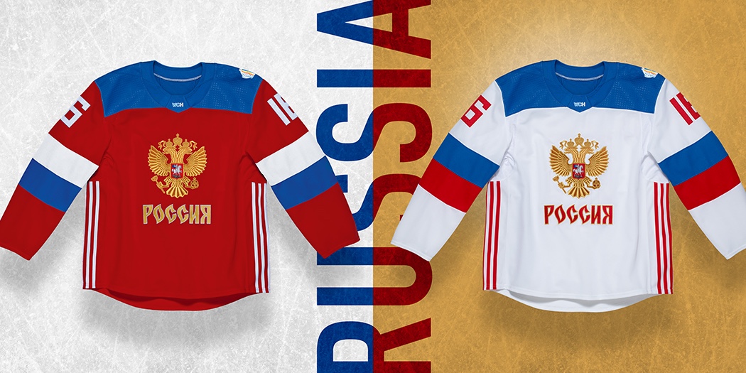
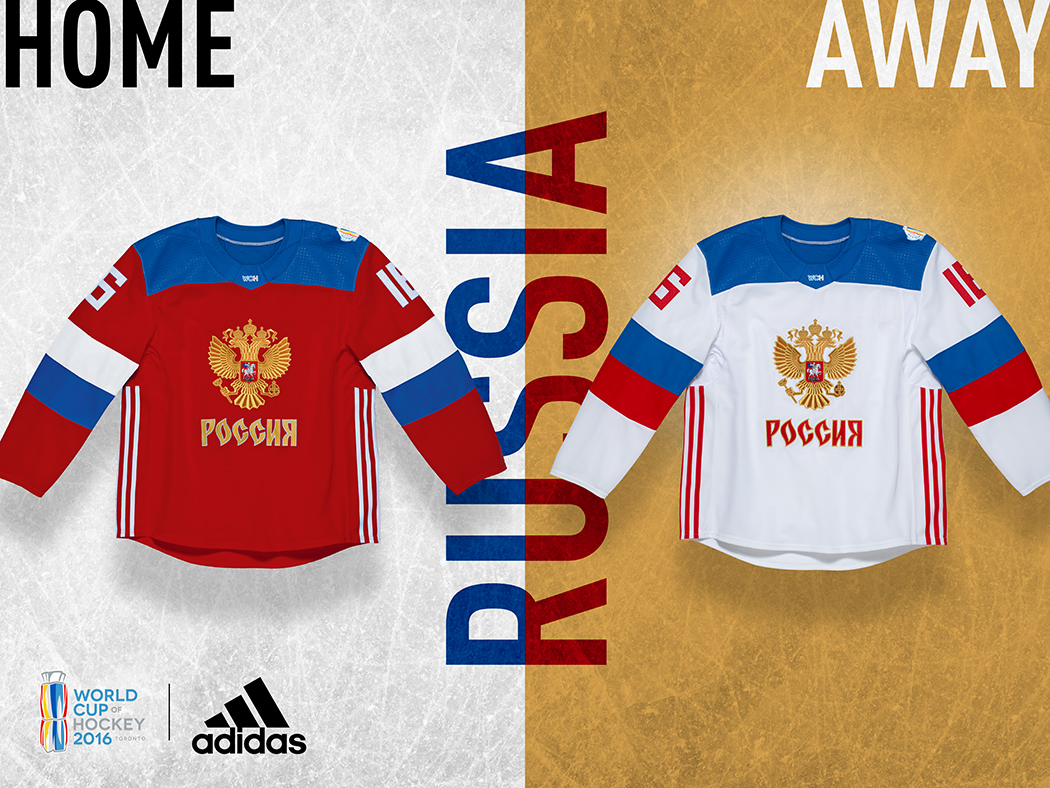
Team Russia
There's no doubt the double-headed gold eagle grabs your attention. As does the Cyrillic text beneath it. Still, I can't help but feel like Adidas was handily beaten by Nike when you compare these uniforms to what Russia wore when they hosted the Winter Olympics in 2014. Those were absolutely epic.
"The uniform reflects a modern interpretation of the steadfast Russian identity," according to the Adidas press release. And I'll buy that to an extent, but I think it's a bit of a cop out — just as it would be for me to say something like "they could've done so much more." Don't get me wrong, these are gorgeous, but given the creativity evident with some of the other World Cup jerseys, you know something was left on the table. Grade: C
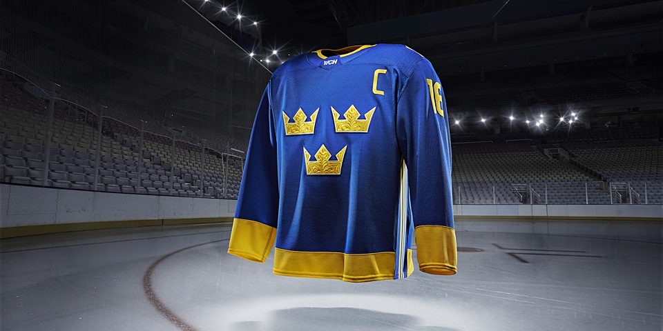
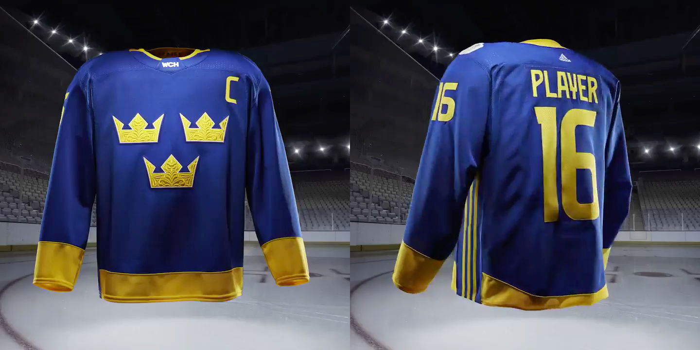
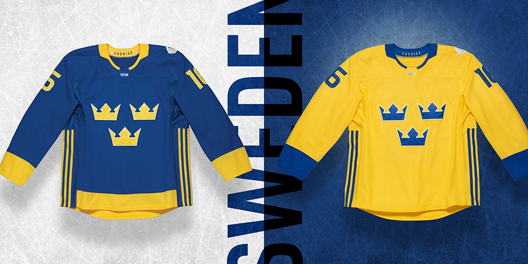
Team Sweden
They're the Detroit Red Wings of the international hockey scene. By that I mean there are only two colors and the sweaters are absolutely untouchable. For years, the blue and gold and the three crowns have remained unchanged. Just as they should.
Yet Adidas found a way to make familiar jerseys feel fresh. Credit some of that to "the emblematic tre kronor crest appointed with kurbits detailing, an honored Swedish traditional motif" — adding a regal texture to an otherwise minimal design. Grade: A+
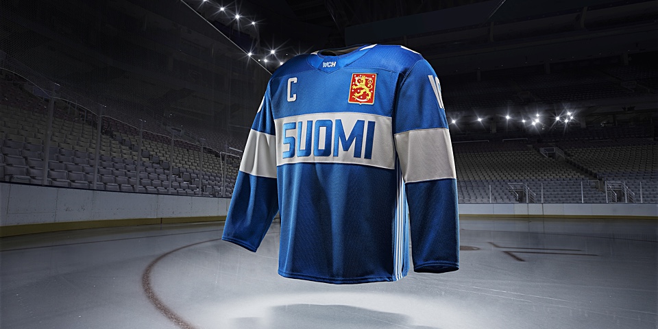
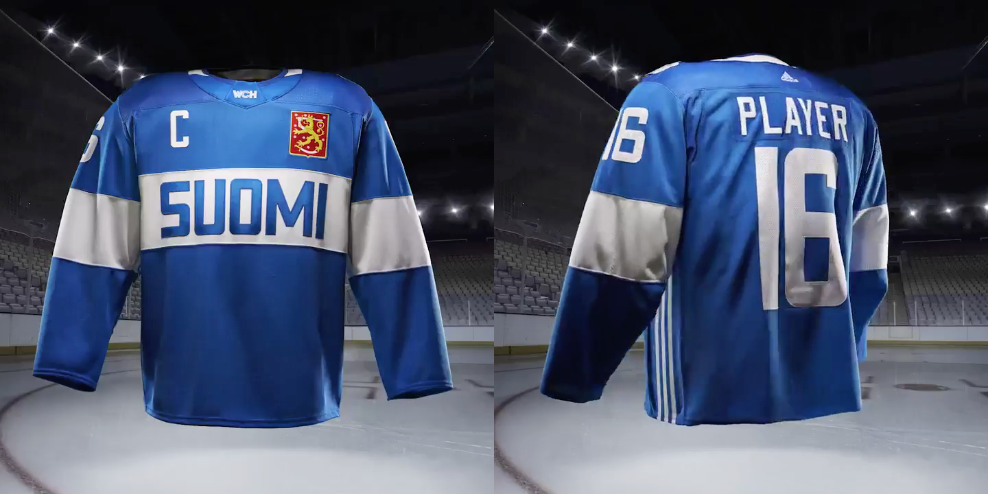
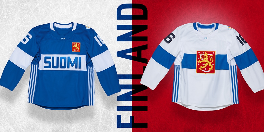
Team Finland
Finland's colors and bold "SUOMI" across the chest are instantly recognizable and completely unmistakable. It's hard to ruin a Finnish sweater, after all. What I like about this set is that while the jerseys each feature different crests, they pair perfectly. Normally, I'm not a fan of text-heavy sweaters, but when it comes to national pride, exceptions can be made. Grade: A–
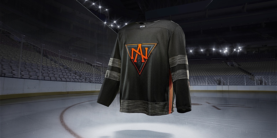
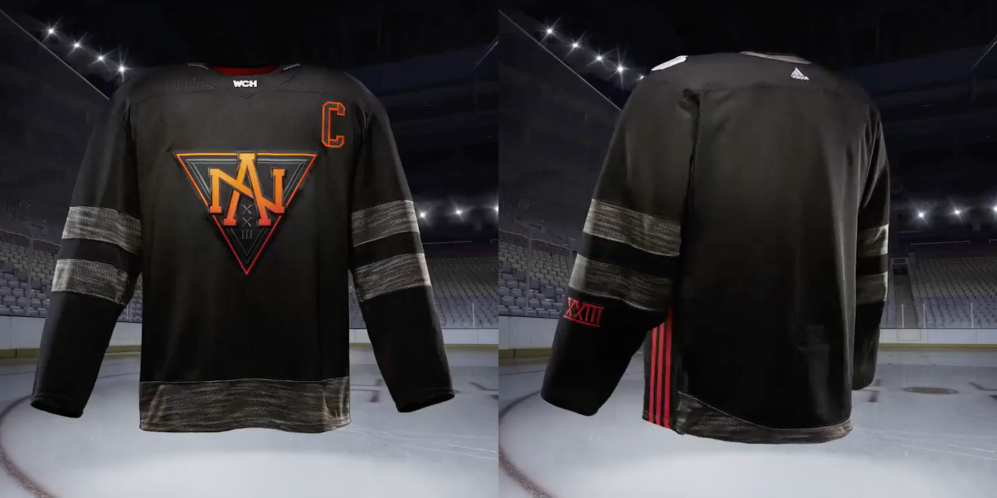
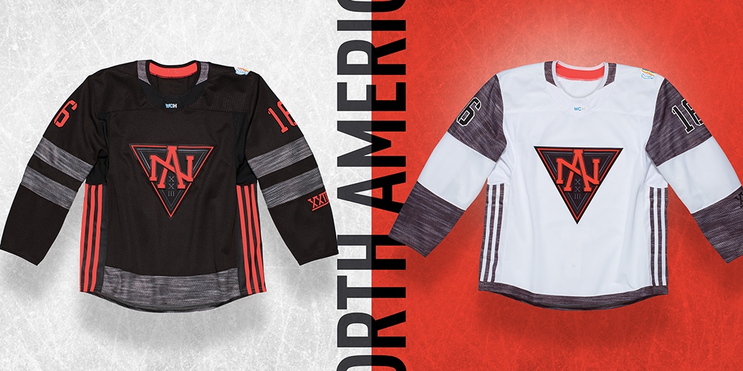
Team North America
This is a head scratcher. I've been staring at it all day and I'm honestly not sure what to make of it. Team North America definitely looks nothing like I had imagined prior to last week's sneak peek at the black and orange crest. On the other hand, I imagine they've hit their target market (i.e.: kids) squarely on the nose. It's dark and edgy almost trying too hard to be cool (i.e.: kids).
All that said, I'm somewhat taken with it, to be honest. It's like a guilty pleasure. I know I shouldn't like it. Years of being engrained with "traditional"-this and "classic"-that resulted in a knee-jerk scowl at first glimpse. But I can't look away. Not in the car wreck sense but in the sense it's so completely unlike any hockey sweater I've ever seen on a stage this big.
I saw one tweet tonight that sort of nailed my feelings.
Superhero symbolism. That's exactly what it looks like. Adidas describes the downward pointed triangle as an "inclusive badge of brotherhood" but it's also rather reminiscent of the Iron Man Mark VI armor from Iron Man 2. The kids that get selected for this team are unlikely to be a serious challenge for their more experienced opponents — but as everyone's been saying all day, they will definitely be fun to watch. (Much like a Marvel film.)
These jerseys are perfect for what they are. They will remind us that this team simply exists to make the NHL's most exciting young talent part of this global tournament. They're designed for kids because the players wearing them are still "growing up" in the sport.
In a fitting final quote, the Adidas release tells us "this uniform admits the wearer to the exclusive club of the next generation." What the release doesn't mention is the use of the Roman numeral XXIII in the crest and on the left sleeve to signify the maximum age (23) of the members of this exclusive club. Grade: B
Based on my grades, it appears the ranking goes like this: Sweden, Canada, USA, Finland, Europe, North America, Czech Republic, and Russia.
The one thing I left out of my review is the one thing that pervades all 16 sweaters. You knew Adidas would find a way to incorporate it's three-stripe branding and they did, down the sides of each jersey. Some will immediately find fault with it and fret over the future of NHL uniforms.
However, it's been handled here in a way that's tasteful and works without drawing a lot of attention to itself. Not to mention, this is the first outing of the NHL-Adidas partnership so they're going to want to make sure they get a good name check.
As for the future, Adidas takes over production of NHL jerseys in 2017-18, during the league's centennial. There are likely to be changes but the NHL has already stated it's not interested in another complete redesign like what we got with Reebok in 2007.
Keep in mind that prior to 2007, NHL teams made their own deals for jersey design and manufacturing. When the league brought in Reebok, they did it in part to bring everyone together under one roof. Going into 2017, things are different. Everyone's already under the same roof and Adidas owns Reebok which means they already own the existing jerseys.
That said, as much as I like what Adidas has done with the upcoming World Cup, I wouldn't like it as much if they were doing it to the NHL. But stylistically, we're talking about two different beasts. In other words, I don't think it's time to worry yet.


And if you're curious about uniform pieces beyond the sweaters, I did come across this.
Now that you've read my take on the World Cup sweaters, tell me about yours. What do you like about them? What would you do to improve them?