
Idaho Steelheads unveil refreshed logo
/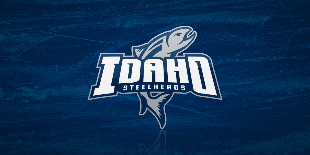


The ECHL's Idaho Steelheads unveiled a new logo today — well, not new so much as refreshed. The design features a refined color palette and new fonts. But even though there's no more black in the logo, it will still be present in the uniforms, which will be revealed at a later date.
From the team's press release:
“We felt the logo needed a refreshing. The balance of it certainly is better now,” said Eric Trapp, President of the Steelheads. “We think the design and the lettering are sharper, but we’re also preserving the mark our fans love and identify.”
The team will incorporate shades of black, silver, and navy blue in their uniforms.
The new alternate logo and third jerseys added this season will be more unique, worn at select home games during the season. Again it serves as an effort to modernize a variety of looks that Steelheads fans know well.
Founded in the West Coast Hockey League in 1997, the franchise not only survived the demise of the WCHL in 2003, but actually thrived after joining the ECHL — winning its first Kelly Cup championship that season. A second came in 2006-07.
There's also a new secondary logo that was inspired by a mark from the club's WCHL days.

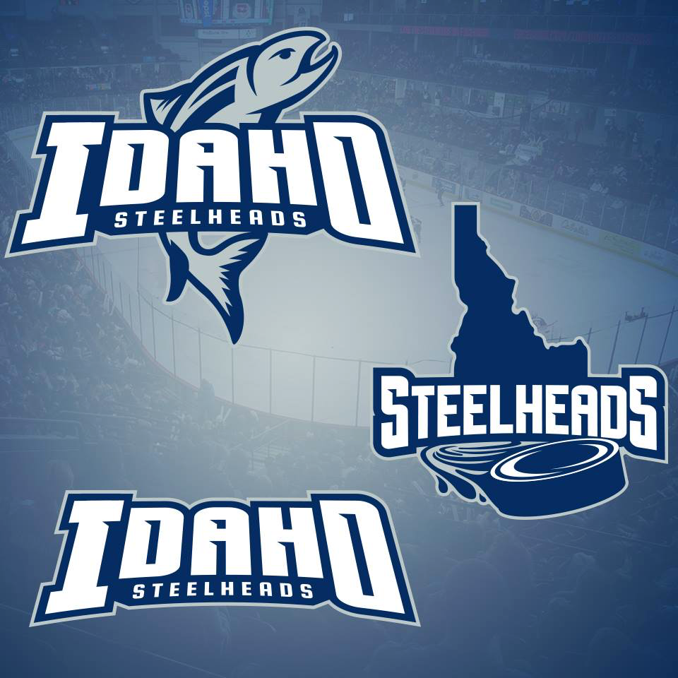
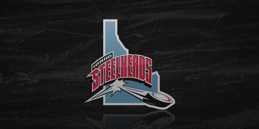
It's a nice update to a solid identity. I'm looking forward to seeing how they handle the jerseys. The old ones left a little something to be desired.
Speaking of new ECHL jerseys, the Colorado Eagles revealed new threads yesterday but I'll tackle that in another blog post.
Meantime, what do you think of the new Steelheads look?