
The many logos of the 2018 Stanley Cup Playoffs
/
Sometimes it's good to get back to basics and just write up a post full of logos. Like, just loads of them. I've prepared just such a post today — all about the 2018 Stanley Cup Playoffs. Of course I'd intended to do this before teams started getting eliminated but who knew there would be two sweeps within the first week's worth of games?
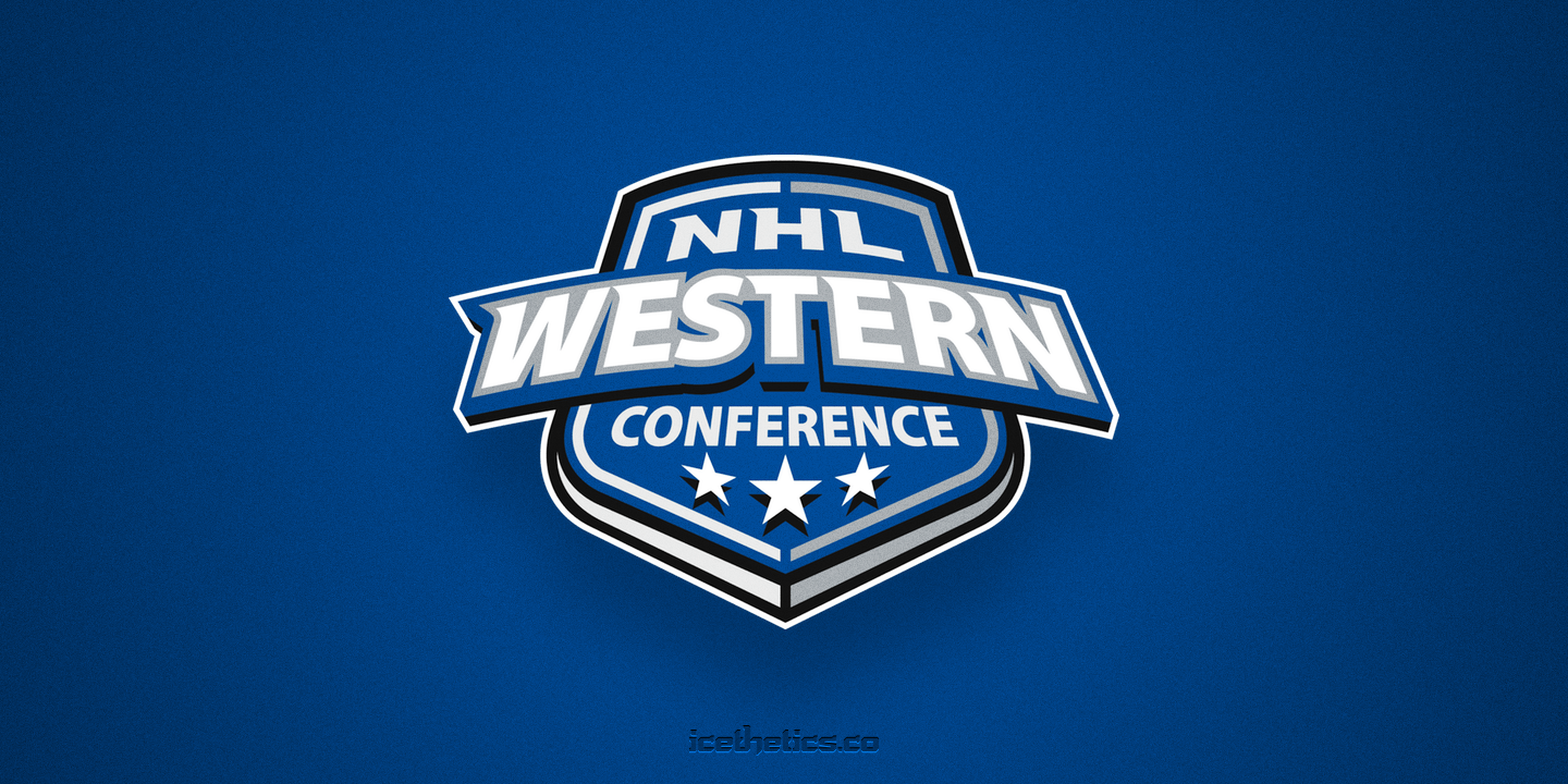
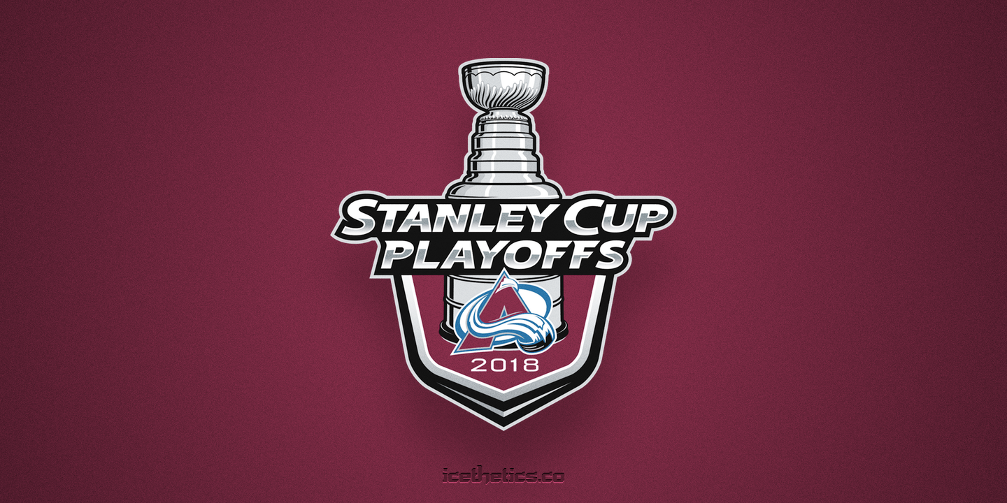
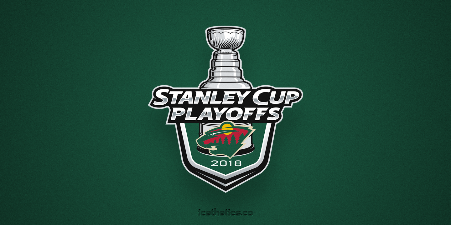
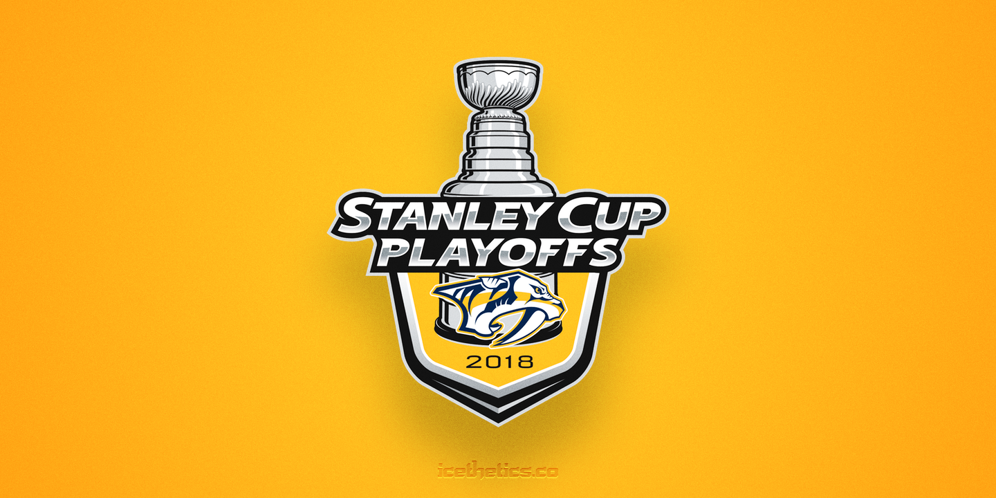
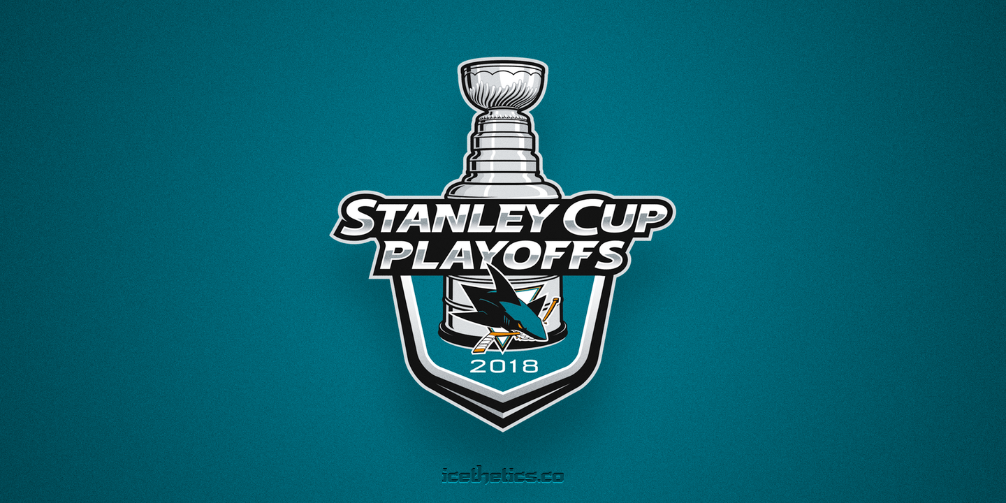
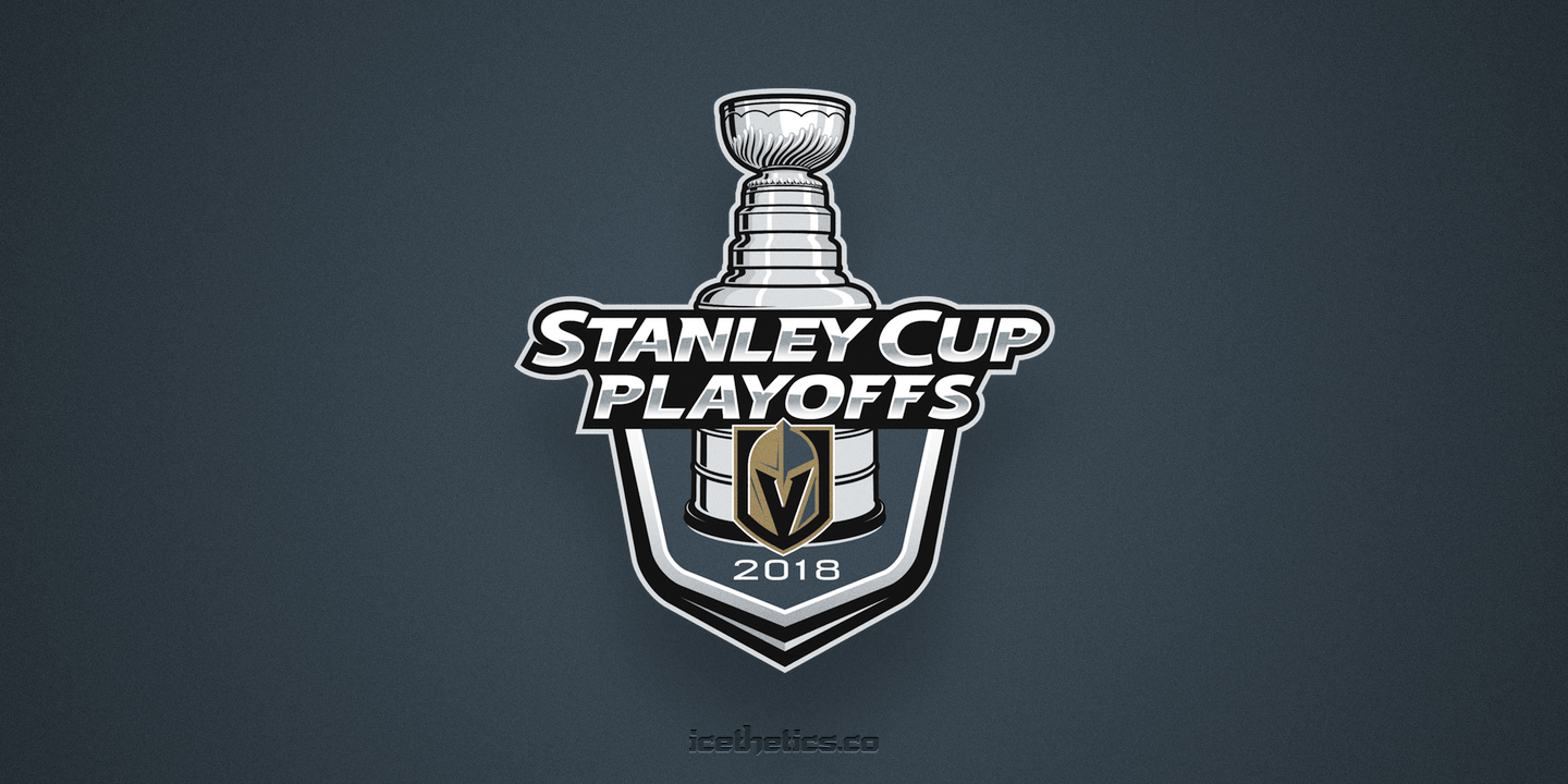
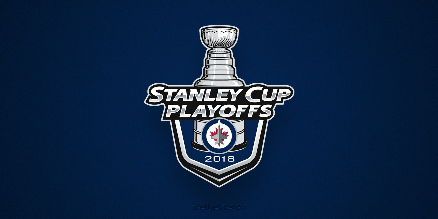
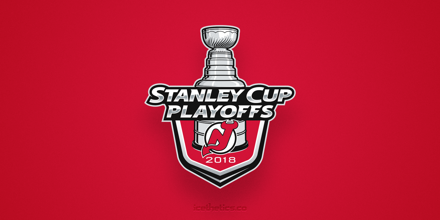
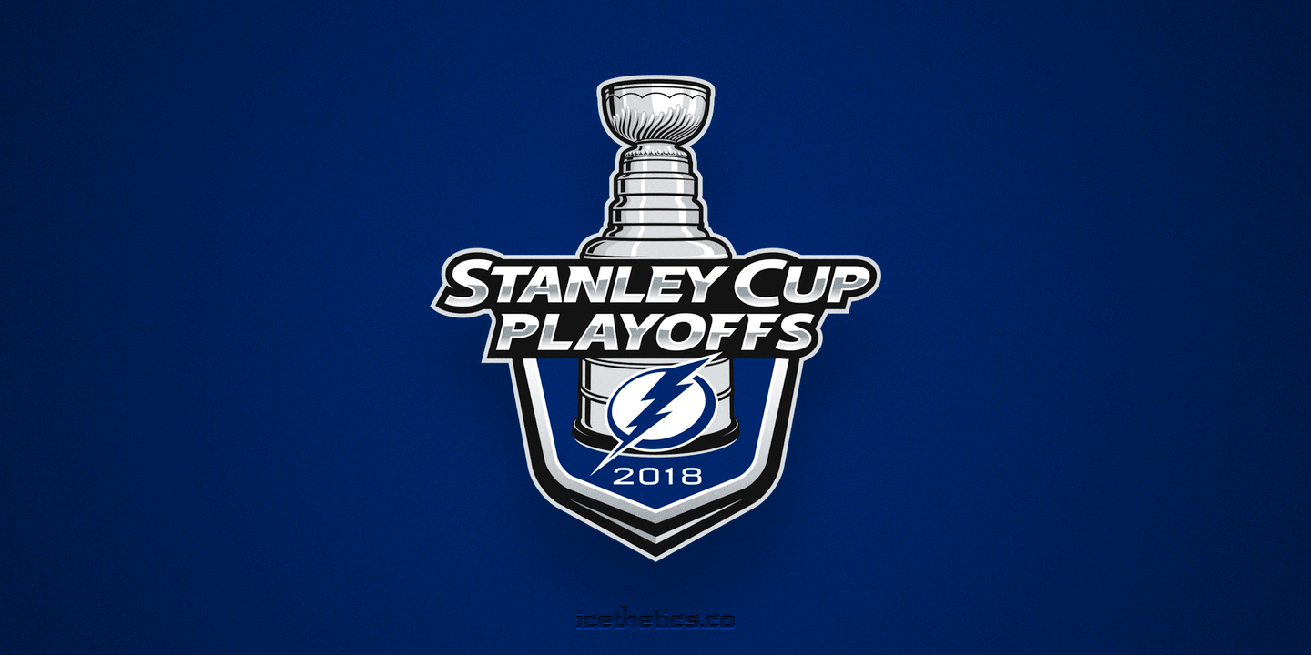
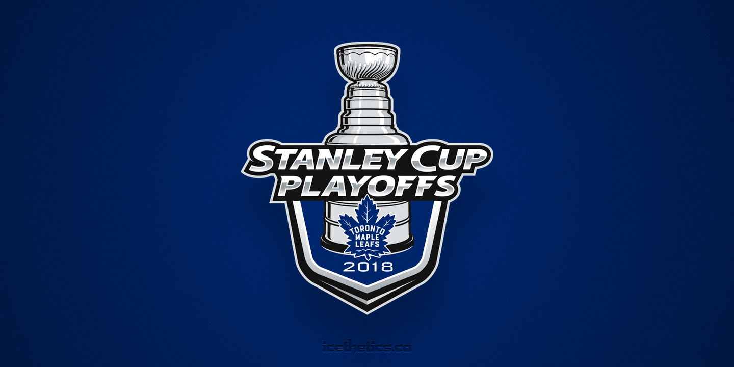
The primary logo of the playoffs is the one you see above. It's everywhere. And every team has their own custom version with their own logo and colors. I've collected them here, separated by conference. West first.
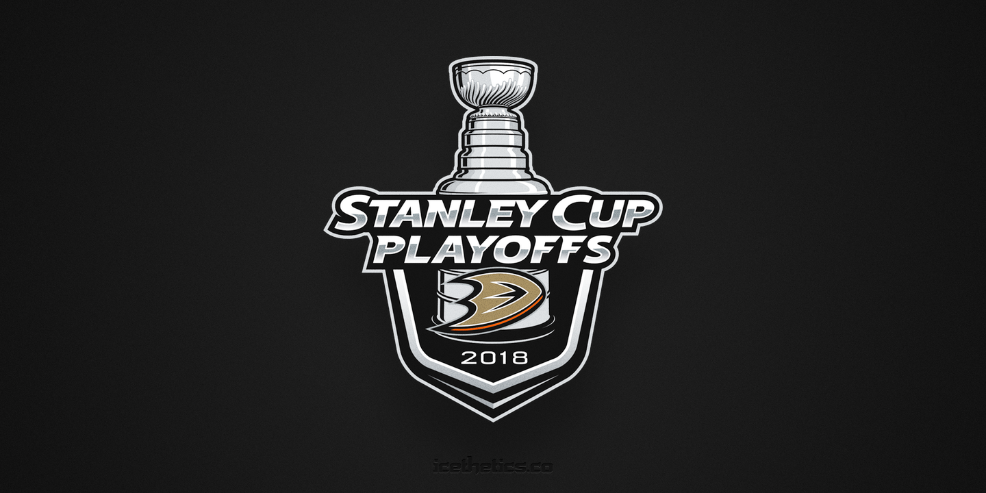
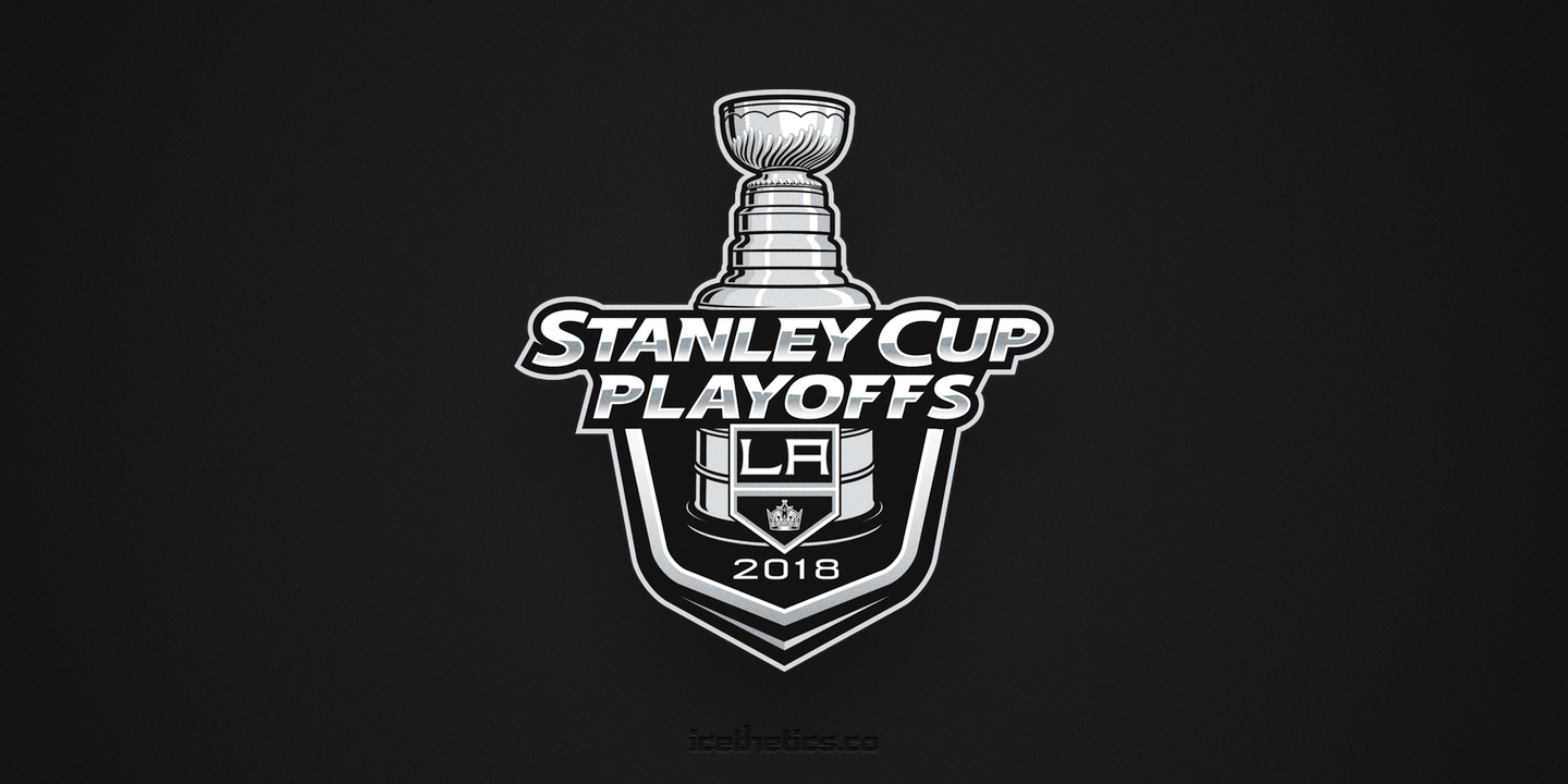
The Anaheim and Los Angeles ones are already irrelevant as of last night. Still can't believe an expansion team swept it's first playoffs series in its first season. But I guess a lot of people have been singing that song lately.
Interestingly — depending upon how you define that word — the original logo released by the league for Vegas had a gold background, but I've mostly seen it in grey since the start of the playoffs.
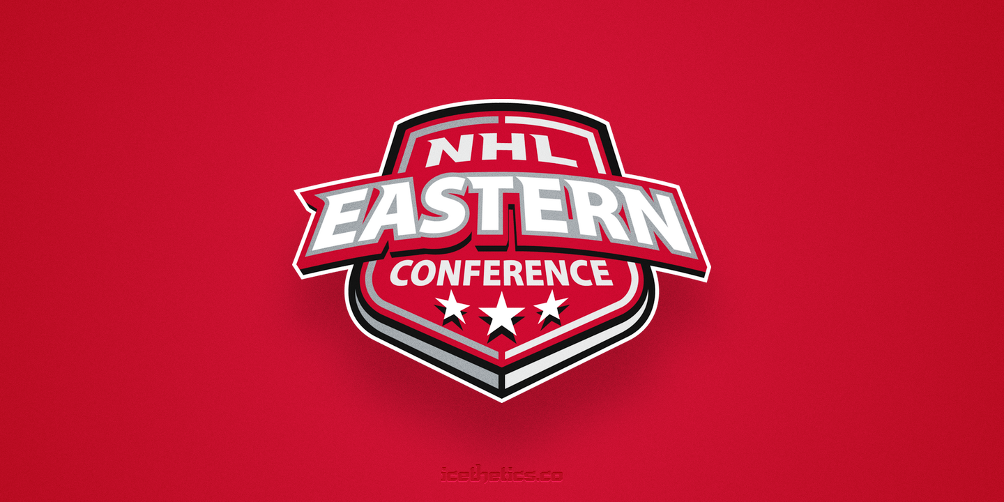
Now here's a look at all the East logos.
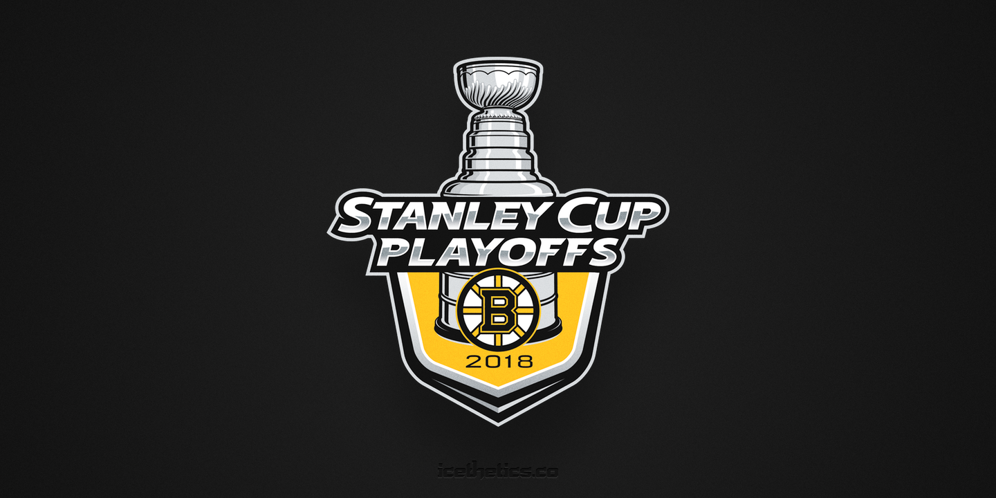
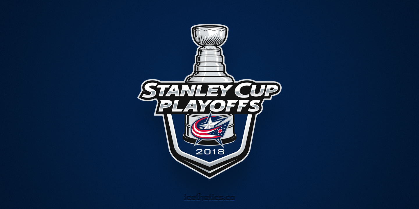
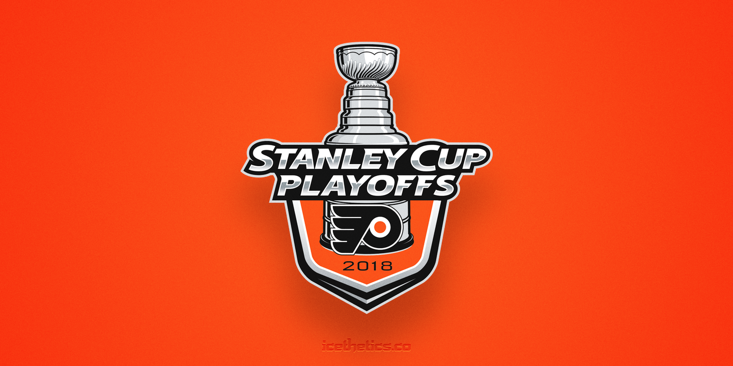
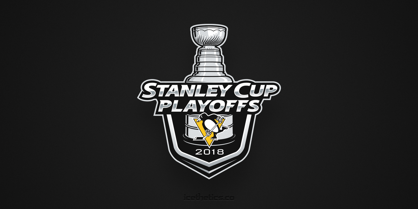
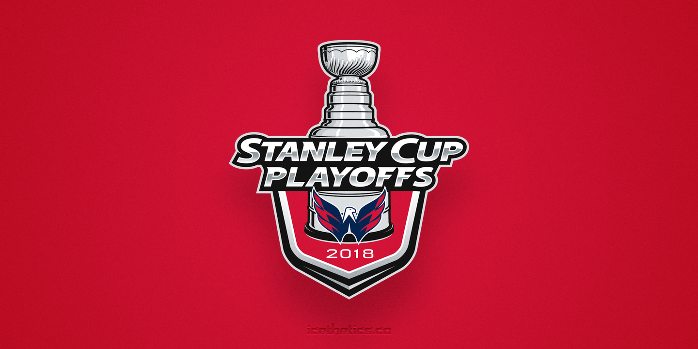
Which one of those will be the first to be obsolete? No one in the East will be eliminated tonight. But on Friday, the Penguins could wipe out the Flyers. Anyone else think its weird that every game in the Caps/Jackets series has gone to OT while every game in the Pens/Flyers series has ended with at least a 4-goal difference? Round 2 will be interesting in that corner of the bracket.
But then so will the corner with San Jose and Vegas — the two teams that will have had the most rest going into the second round. Kind of a strange playoff year so far.
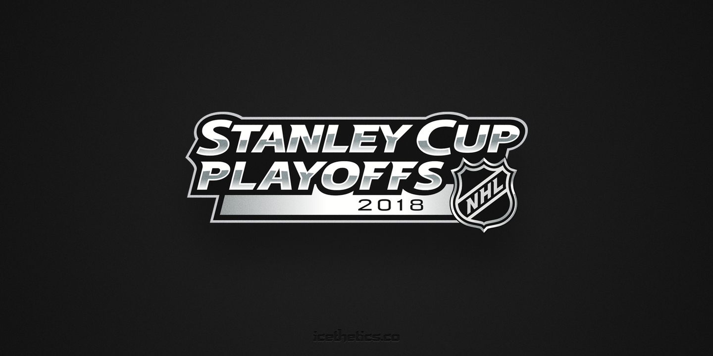
Moving on. Just wanted to include the horizontal wordmark version of the primary playoff logo.
But I didn't think I could stop there. We haven't looked at enough logos yet. You know me, I usually like to go digging into the archive at this point. The NHL has used the current Stanley Cup Playoffs logo since 2013. But what about the ones that came before that?
I've got you covered. Below you'll find the last 15 years worth of NHL playoff logos.


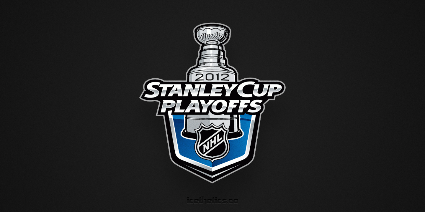


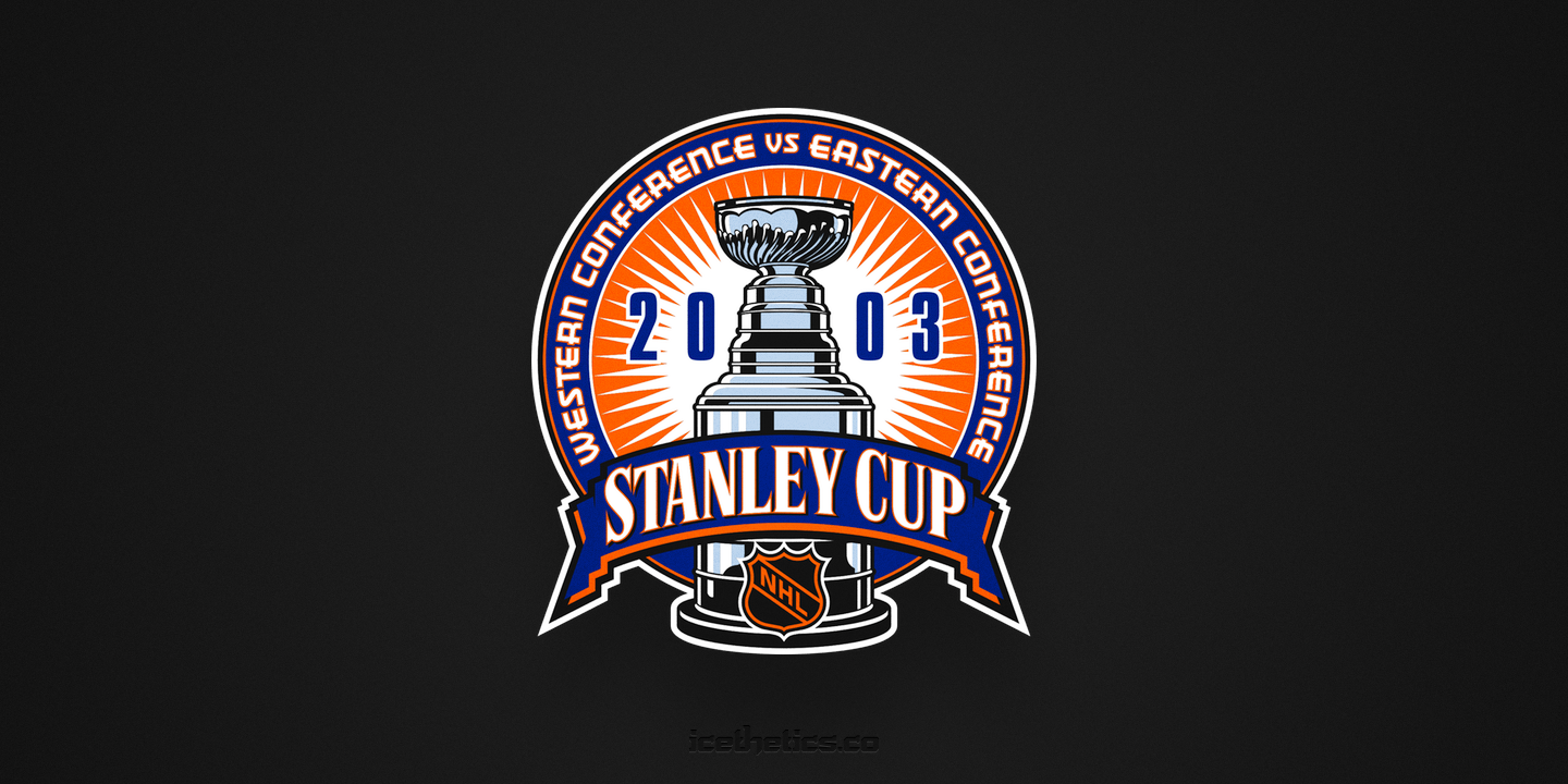
The lockout that canceled the 2004-05 season meant there were no playoffs that year — and no Stanley Cup. In an effort to win back fans in 2005, the NHL went through a bit of a rebrand. The shield was redesigned in silver with the letters shifting to an upward slope. And the playoff logo saw its first major redesign in decades, taking the Stanley Cup outside of the circle.
The league kept refining the idea from 2005-06 until settling on something in 2009. That lasted until the next lockout in 2012-13 — though that one didn't cost us an entire season. But at that point the NHL landed on the colorless version we know today. I assume they started removing colors so they wouldn't clash with any particular team's palette. It's neutral and, more the point, as silver as the Stanley Cup itself. (At least I assume that's what all those gradients are about.)
I'm curious when we'll see the next evolution of the playoff logo. The next time there's a lockout, probably. But there's no need to rush that day along. I honestly have no complaints about the current Stanley Cup Playoffs logo system. What about you?