
Three AHL teams celebrating anniversaries in 2018-19
/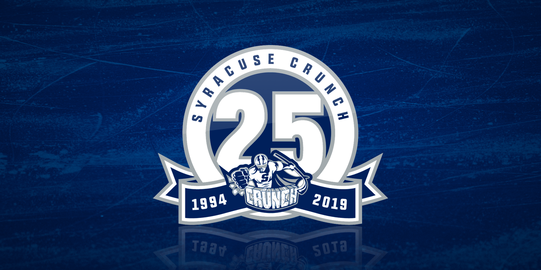
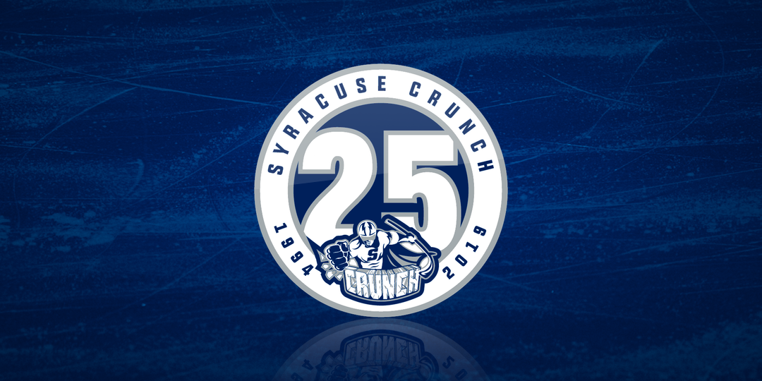

We start with the eldest of the group. The Syracuse Crunch will commemorate a quarter-century in the American Hockey League next season. They unveiled two logos on Tuesday. The secondary is merely the primary without the banner. For that one, the years 1994 and 2019 are placed within the circle that surrounds the "25" in the center.
The banner may actually have been inspired by their NHL parent club, the Tampa Bay Lightning who used a similar look during the 2017-18 season. Speaking of which, the Crunch seem to suffer from the same problem as the Bolts. Both teams' 20th anniversary logos are much better than their 25th anniversary logos. Here's what they used in 2013-14.
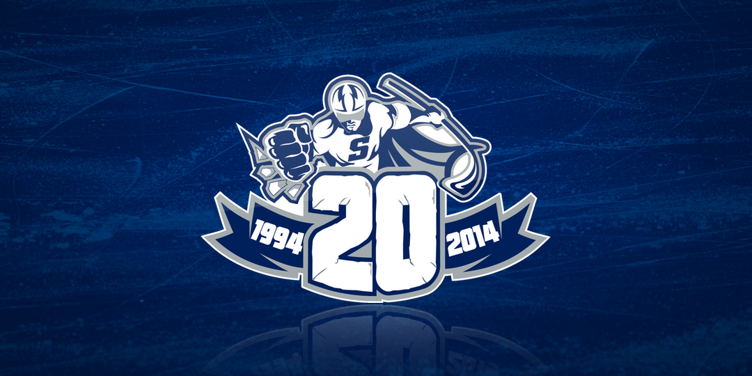
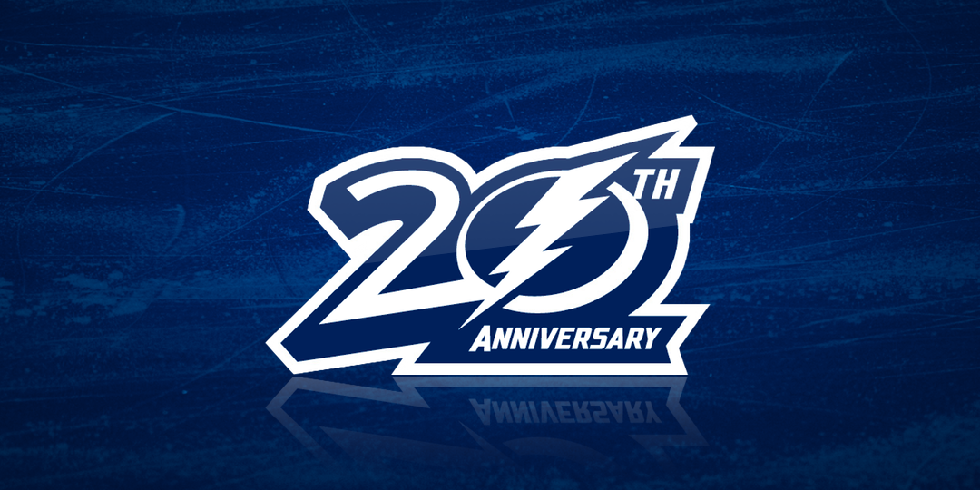
In both cases, the "20" is well branded. It's a design no other team could get away with using. You can't say the same for the 25th anniversary logos. They're just bland.
The Crunch arrived in Syracuse in 1994 after the franchise was originally founded in 1992 in Hamilton, Ont. as a the top farm team for the Vancouver Canucks.
Up next, we find the Wilkes-Barre/Scranton Penguins turning 20.

For two decades, the "Baby Pens" — as I'm sure these professional hockey players hate to be called — have been owned by the Pittsburgh Penguins and used as their primary minor league affiliate. The Pens bought the Cornwall Aces franchise in 1996 but sat it out a few seasons while an arena was built in Wilkes-Barre Township.
I'm not exactly sure when this logo was officially released, but I have seen it in tweets as far back as June 20. The logo has a lot of elements we've seen before. However, the execution gets top marks from me. I'll admit it's a little busy, but it doesn't bother me. Not bad at all.
Lastly, the Texas Stars will mark their 10th anniversary next season.
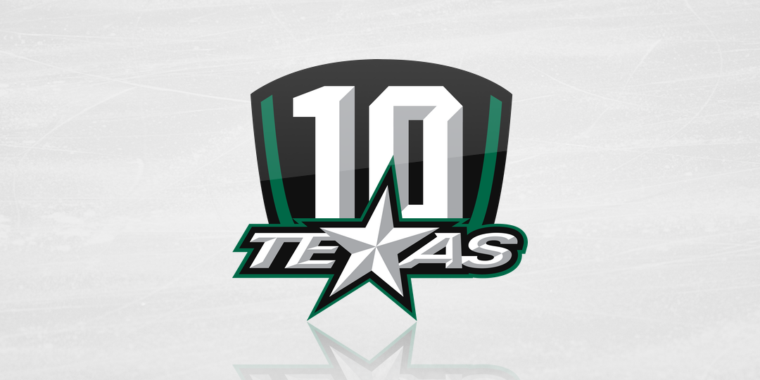
It's double digits for the Dallas Stars' top affiliate, who unveiled this logo way back in February. The Texas Stars arrived in Cedar Park in 2009 after four seasons in Des Moines, Iowa — the last of which they were hilariously named the Iowa Chops. I'm not joking about that.
In any event, this logo is the inverse of the Penguins in that it's simple — but not terribly well executed. What's that weird shape behind the "10" supposed to be anyway?
In February, the Stars tweeted a graphic that shows the logo on a black jersey, which will be given to season ticket holders. But whether it will be worn by the team at all is unclear.