
Winnipeg Jets officially reveal Aviator third jersey!
/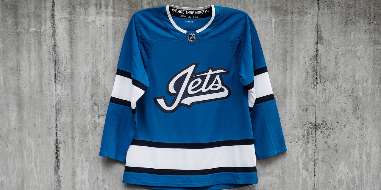

A day after it leaked, the Winnipeg Jets third jersey became official tonight. It’s been dubbed the Aviator jersey by the team because of its use of Aviator blue — an accent color from the club’s palette since its 2011 inception.
The Jets and Adidas aimed for minimalism on this one and they certainly hit the mark. Whether people like it or not seems to be up in the air. There’s no question the response on Twitter has been negative. But when has that sentence ever not been true on any subject?
In fairness, overwhelming positive feedback was immediate for the retro thirds brought out by the Coyotes and Blues among others. But note that “retro” qualifier. For some reason, mass appeal only seems to apply to well-tread territory. If it’s not old and tired, it’s trash.
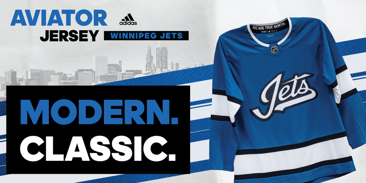
What’s happening to hockey fans? I know we’ve always been big on tradition, but that’s sort of why I thought this new Jets jersey would be an instant classic — or a “modern classic” as the Adidas marketing materials seem to suggest.
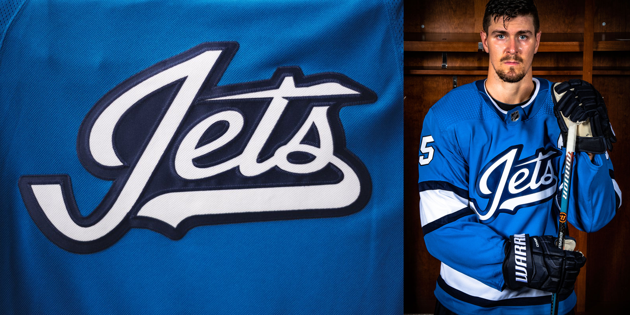
It’s clean and simple. It uses a great color, the unsung hero of the identity. It uses a scripted crest — which I’m not normally a fan of — but this one is so full of historical Jets symbolism, it’s hard not to like it. Plus, the striping is a clear call back to the old Jets jersey of the early 1990s. Isn’t that what you people wanted?!
But if it’s not a direct throwback — an exact copy of something that’s already been done — then it’s not worth doing. How can that possibly be right? Why is nostalgia the only solution? The Jets had the Heritage Classic jersey — a straight throwback. They did that. They wore it a few more times and put it back in the closet where old clothes belong. And then they moved forward.
Why is there such hostility toward moving forward? As I ask that it occurs to me I might’ve just stumbled upon a societal issue that’s much bigger than hockey sweaters. So I should move forward.
Except for one more thing.
I’m willing to make a bet right now. In six to eight years, when this jersey is retired or replaced, make no mistake, fans will be shouting once again — but this time in favor of the jersey rather than against it. It will be a classic, and one day many years from now, they’ll bring it back for an anniversary or a special event game and fans will go nuts, having completely forgotten all the mean tweets they wrote this week.
It happened with one of the jerseys I just referenced. When the Coyotes arrived in Phoenix — from Winnipeg of all places — their jerseys were condemned as an affront to the tradition of the hockey sweater. It was ugly. It was awful. It was “designed by a five-year-old” or “on a lunch break.” “It made me vomit.” Heard those before? Now suddenly it’s everything you’ve ever wanted.
People are weird. And I know you can’t make everyone happy, but surely people can find it within themselves to be a little more positive about things, right? Though if you’ve read this far, you probably already agree with what I’m saying. Everyone else will have clicked away by now in this age of digital echo chambers.
Anyway, the funny part is Heritage Classic jersey will apparently be worn this season and in the future. This was tweeted from the Fan Forum event that took place tonight where the new third jersey was unveiled.
Which is probably how teams should do throwbacks. Out of the closet once in a while. Then right back in. At least then it’s special. So look, all that whining for nothing. We get the best of both worlds. A true throwback alongside something new with genuine local hockey symbolism.
With that, let’s talk more about the new sweater. And I highly recommend watching this video with Adidas designer Matty Merrill who worked on the design.
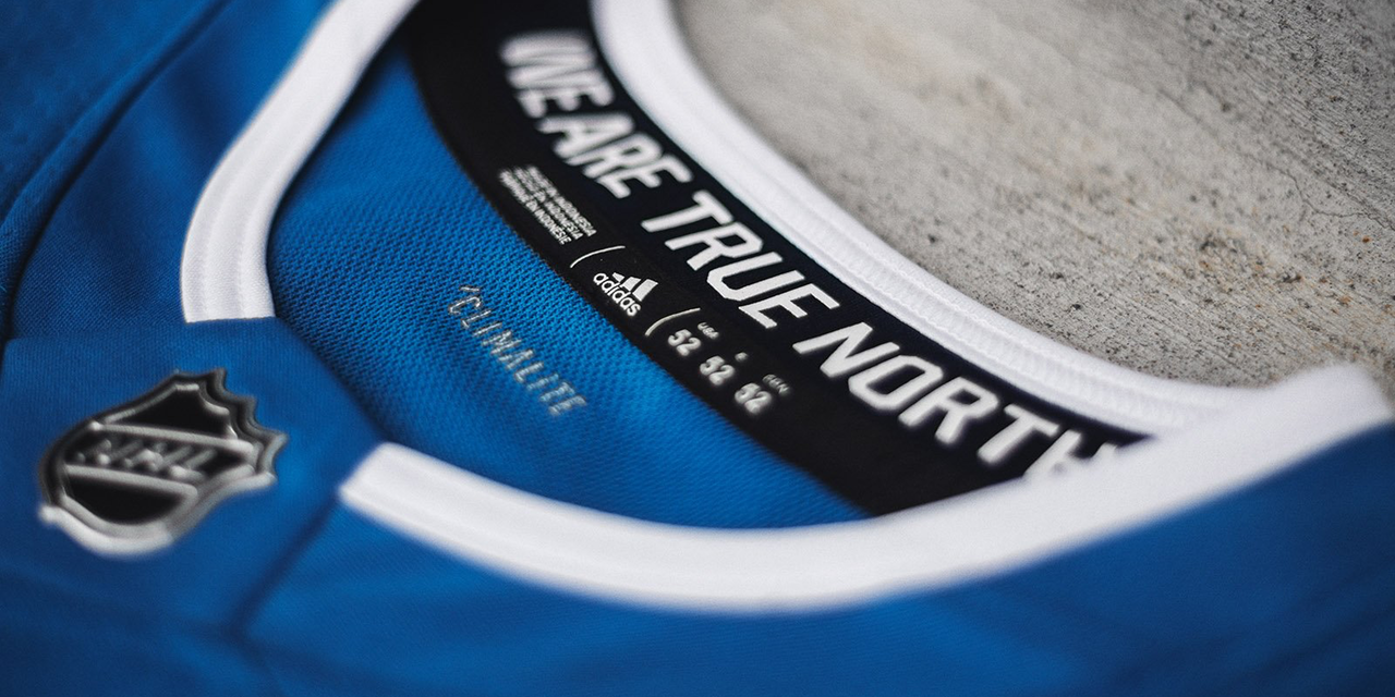
The hanger effect is a nice touch. “We are True North” is claimed as call back to fans so I guess it’s just convenient its also the name of the club’s ownership group. Regardless, it works and it’s a nice thing for players to see every time they pull the jersey on.
But what struck me more than anything is how the Jets’ wordmarks of the past all came together to inspire this new design. A lot of unique history here.
The big “J” designs across the board. The subtle plane from the 1990 design. The swoop in the “s” from the original 1972 WHA logo. It’s all present in the new mark in its own way.
Another element I liked is the name and number font. They’re carrying it over from the Heritage Classic jersey. That was one thing yesterday’s leak didn’t tell us.
The new third jersey makes its on-ice debut Oct. 14 when the Jets host the Hurricanes.
All in all, there’s a lot to like about this sweater — a lone opinion that I realize isn’t shared by many. But I do think that in time, many of the current detractors will find something to like about it. Hell, the team very nearly went to the Stanley Cup Final last season and I’m sure they’re in for another strong season. Winning in this jersey might just turn some opinions around.
I’ll stop there. Since you’ve made it to the bottom, I’m curious what you think of the Jets’ new alternate uniform knowing what you know now. Has your initial opinion changed in any way?