ECHL expands, adds CHL's seven franchises for 2014-15 season

Remember that major minor league shake-up we speculated on last month? It happened. And a lot faster than expected.

The ECHL announced today that it has accepted seven new members into the league effective immediately. They are the Allen Americans, Brampton Beast, Missouri Mavericks, Quad City Mallards, Rapid City Rush, Tulsa Oilers and Wichita Thunder.

If those names sound familiar, it's because all seven were members of the Central Hockey League until yesterday. The teams will begin play in the ECHL, which now has 28 teams, in the 2014-15 season.

I don't envy the people who will need to work out the logistics in the next 10 days. It's going to mean divisional realignments, changes to the Kelly Cup Playoffs format and a completely new game schedule.

The new schedule also means a lot of the specialty jersey dates currently in the Icethetics Calendar may need to be thrown out and replaced in the next couple weeks.

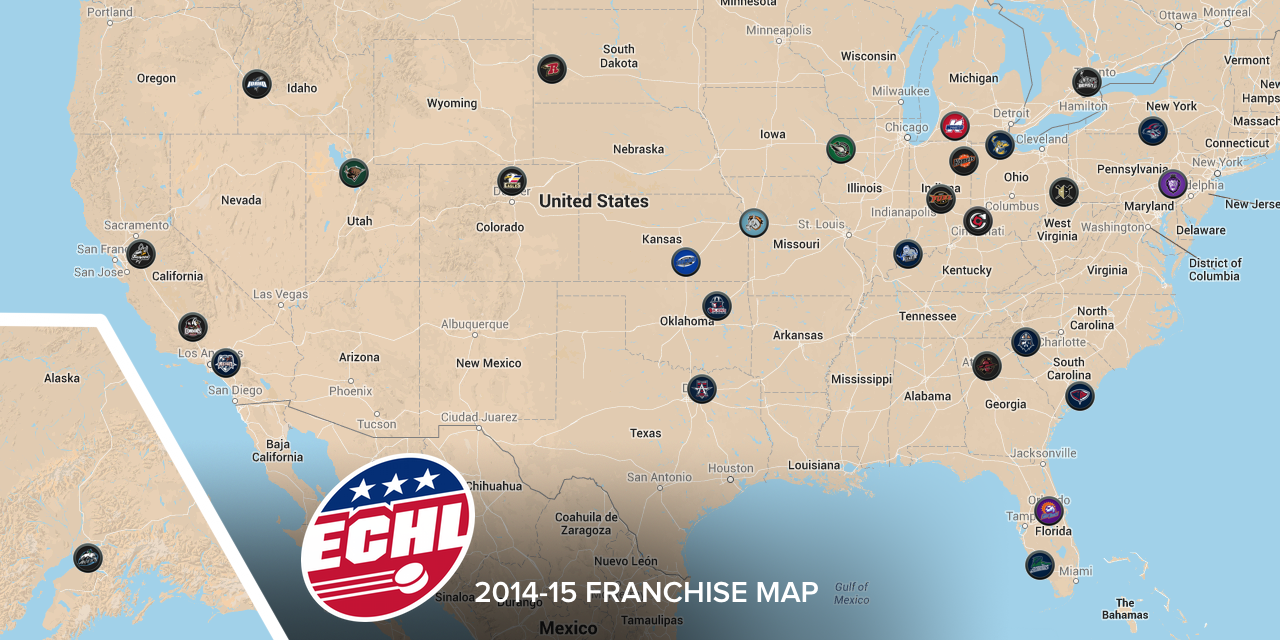
This news also requires the fifth — and hopefully final — revision of my NHL affiliation infographic (right).

Speaking of that, you might be wondering if any NHL teams now have affiliates who will be competing against each other in the upcoming season.

As it happens, the Tampa Bay Lightning have agreements with both the Florida Everblades and Brampton Beast. The deal with the Beast was a one-year term signed last August and I haven't seen a press release about a renewal. However, the Beast still use the Lightning logo in their website banner. Confused? Me too.

The Dallas Stars were previously affiliated with the Allen Americans, but a recent change in ownership put an end to that. The Stars are still tied to the Idaho Steelheads.

So what do you think of this major upheaval of minor league hockey in North America?


Image from Utica Comets via Facebook

By the way, since we're talking minor league hockey, I'd be remiss not to mention the unveiling of the 2015 AHL All-Star Classic logo today. The Utica Comets will be hosting on January 25, 2015.

Are you ready for Brett Hull Night? It's a real thing

0228-stc-hull.jpg

Down there in the Central Hockey League is a first-year team named the St. Charles Chill. You may remember them from their logo contest in 2012.

Tonight, this St. Louis Blues affiliate will take the ice looking like their NHL parent club for what they're calling Brett Hull Night.

Apart from the NHL team, what's the connection between the Chill and Brett Hull? Brett's younger brother Bart is the VP of business operations for the team. So we can probably guess where the idea originated.

Their dad Bobby will also be honored at the Heroes Night game next weekend. But it seems there aren't any special jerseys for that one.

I'm looking forward to seeing how this turns out. It's a great looking jersey. And lest we forget the Blues are rumored to be launching new uniforms next season. Just something to think about.

Blaze Become Bloomington Thunder

Central Hockey League forced name change

Back in May we learned the Bloomington Blaze were leaving the Central Hockey League for the Southern Professional Hockey League beginning next season. Seems that may have ruffled some feathers because the CHL's lawyers said the club would have to give up the Blaze name.

For that reason, according to the Pantagraph in Bloomington, Ill., the franchise renamed itself the Bloomington Thunder in late July. The move also helped the team align with the local youth hockey organization, also called the Thunder.

These teams are not to be confused with the Bloomington PrairieThunder which formed in the International Hockey League in 2006 and joined the CHL with the league merger in 2010. A year later, the PrairieThunder dissolved and a new group brough the Blaze to town in 2011.

I'm not sure why the CHL is so tied to the Blaze moniker considering the team only existed for two years. Unless they're just being petty because the team decided to switch leagues. This low-level minor leagues can be interesting. But nonetheless there's another new logo in the hockey world so it gets a place here on the blog.

For now, I'll leave you with a last look at the old Blaze logo.

Denver Cutthroats Unveil Uniforms

Photo from Mile High Hockey

On Monday, the CHL's Denver Cutthroats officially unveiled their jerseys. The expansion team gave us our first look at its logo back in May. To say I disliked it is putting it mildly. But I was very much a fan of the color scheme. Both opinions hold five months on.

With the jerseys, I'm torn. How can I hate a green hockey sweater? I love green hockey sweaters! But this an abomination. It's basically the generic Reebok Edge template employed by the Penguins, Senators and even Lightning for a few years. Worse than that, the jersey isn't even made by Reebok. It's made by SP Apparel but has the look of a cheap knockoff.

All right, you know I'm not a fan of the Cutthroats look, but they're actually putting NHL players on the ice this season — unlike, you know, the NHL itself. That's right, the team also used this jersey-unveiling press conference to introduce their newest member, ex-Av Kyle Quincey.

Photo from Denver Cutthroats (Facebook)

What does it say that the Central Hockey League is the best Quincey can do right now? That's him, second from the left. This lockout needs to end now! Anyway, the unveiling of these jerseys was also the first time we really got to see the Cutthroats' secondary logo.

It's not bad if you can look past the crossed hockey sticks cliché. It incorporates elements of the city of Denver's official flag, which is actually a pretty nice flag (as city flags go, anyway).

To sum up, I love the colors, dislike the crest and hate the jerseys. The shoulder patch gets a pass. What do you guys think? Are we on the same page or am I being too harsh?

Denver Cutthroats Unveil Logo

After losing the Colorado Eagles to the ECHL last season, the Central Hockey League is expanding back into the Centennial State in 2012 with the addition of the Denver Cutthroats.

The CHL made the announcement about an expansion team in Denver last month, but the team officially unveiled its name, colors and logo today. Interestingly, the new look was created by Denver-based Adrenalin, the same agency also responsible for the Colorado Avalanche and Phoenix Coyotes logos in the NHL.

So it's troubling to see them really miss the mark on this logo. But let's face it, this is a CHL team so I'm assuming they didn't exactly put their "best people" on it. They probably have bigger fish.

So it's a trout in a D with mountains and river rapids. Not a bad idea, but for some reason it ended up looking like it was drawn by an amateur for a logo contest you might find here on Icethetics.

That critique may have been a little harsh, so I'll balance it out. I love the color scheme. Nobody in hockey really uses that shade of green and I don't understand why not. I like that the blue is muted but not necessarily navy. And together with those two colors, the red accent really pops off the screen.

Here's some extra stuff from the team's press release:

“We wanted to be sure the logo included elements and colors that depict the state of Colorado and the city of Denver,” said Adrenalin President Dan Price. “The trout maintains a position between white mountain peaks and river rapids, and breaks through a forward moving ‘D’ — representative of Denver's progressive population.”

The Cutthroat Trout was named Colorado's state fish in 1994.

Jersey designs will probably be unveiled later this summer, but no specific mention was made in the press release.

For more about the team, check out their Facebook page, Twitter feed and official website.

Meantime, what do you think of the logo? Am I being too critical or does it deserve to be fileted? (Sorry, that was the last pun.)