 All images from Nike
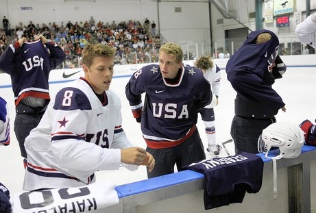
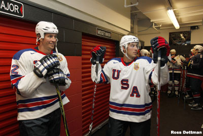
United States gets classy new look for 2014
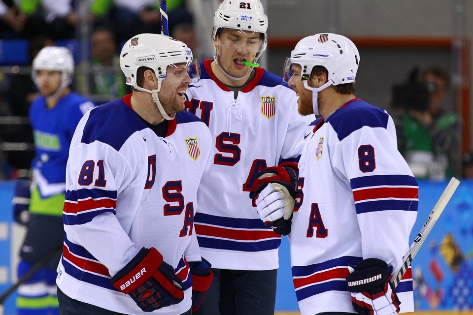
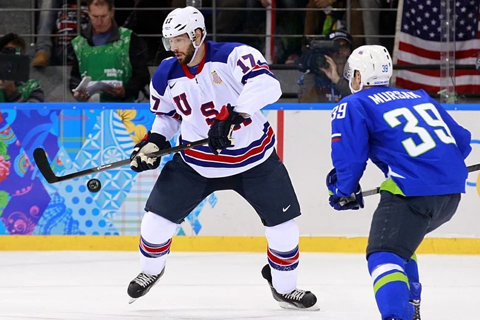
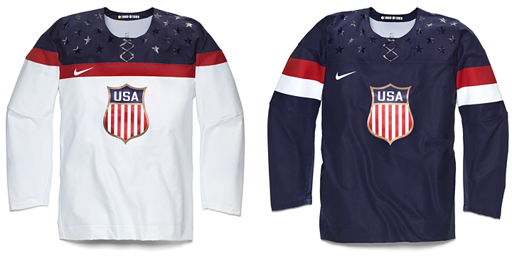
Nike has been using this week to unveil the hockey jerseys slated for use during the 2014 Winter Olympics. Today, they revealed the new look of the United States. Team USA will be sporting these classy numbers. They're minimalist in their overall aesthetic and very tasteful.
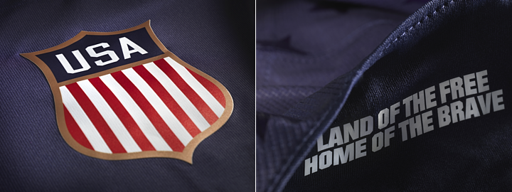
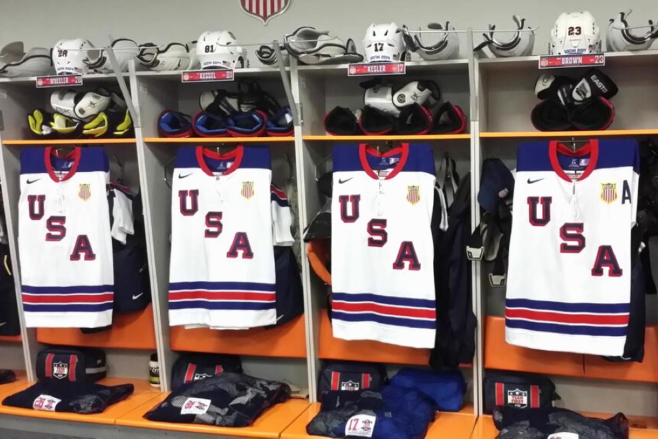
I particularly like how they swapped out the tired collegiate text for a beautiful new crest. Another feature of the jersey is the slogan "land of the free, home of the brave" printed inside the collar. I suppose that's just a feature for the players to see as they pull their jerseys over their head before they hit the ice. There's no other way to see it, really.
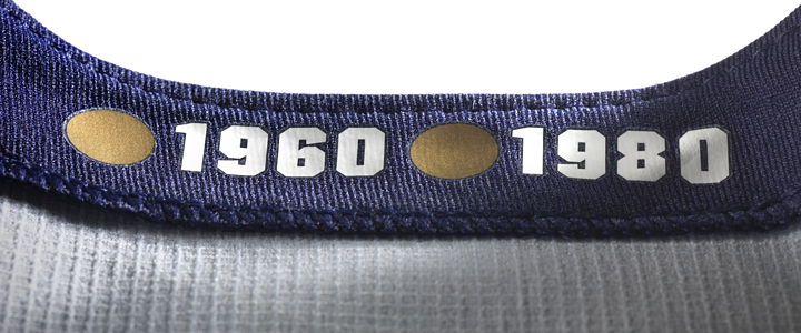
It turns out even Nike isn't immune from Reebok's "hanger effect" trend. The inside of the collar pays tribute to the years the U.S. brought home gold medals. It's a nice touch, even if it's only visible when it's hanging on a rack in a store. Still, it's probably a good reminder for the players when they walk into the locker room.
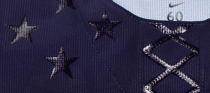
We'll wrap up with the feature that was exploding Twitter at last check. The same effect used to create the twinkling stars on on the shoulders has been fashioned into a fake lace-up collar. I guess the point is that the lace-up collars on hockey sweaters are strictly for appearances. So Nike figures, why not make them even more pointless.
But if that's the worst thing these jerseys have to offer, I think we're in pretty good shape. Some might question the lack of sleeve and waist striping — a problem I noted for the San Jose Sharks not long ago — but there's a different aesthetic to national team jerseys. They don't need bells and whistles. They need to be classy. I think Nike hit the mark for Team USA.
But wait, there's more...
 All images from Nike
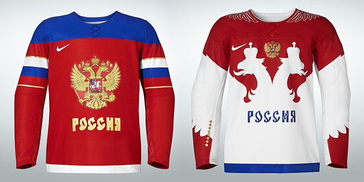
Russia revises uniforms for Sochi
As the host country of the 2014 Winter Olympics, Russia was first to show off its new uniforms. The designs were revealed by Nike on Monday, and once again, we get a solid pair of jerseys.
The red one features the Russian flag wrapped around the sleeves while the white one has an entirely different feel — both with lots of Russian iconography. In fact, that's addressed in Nike's media release:
Taking inspiration from Russia’s national emblem of the two-headed eagle, the jersey has been redesigned with streamlined design lines, lighter graphics and a modern neckline reinforced with Nike Flywire. The result is a lightweight, breathable jersey that moves naturally with the body, and is steeped in hundreds of years of history and heritage.
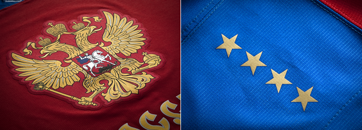
Featured on the shoulders of the red jersey are eight stars — four on each side — commemorating what Nike refers to as "past successes." A similar feature is on the white jersey but in the form of eight gold crowns on the right sleeve. But by my count, Russia/Soviet Union has only won seven gold medals in Olympic hockey. What am I missing? Anyone know what the eighth star references?
UPDATE: I was forgetting about 1992 Olympics and the Unified Team, for which Russian players suited up. That accounts for the eighth gold star/crown. Thanks to Corbin LeGrand for pointing that out.
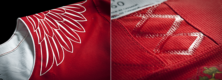
Speaking of the white uniform, here's a look at some of the detail. That faux lace-up collar shows up again — on both jerseys, in fact. Too bad, and Nike had such a good thing going otherwise. The other thing that got some negative feedback, at least through Twitter, was the eagle wing graphics on the shoulders.
I may be in that group. It doesn't really feel like it belongs with the rest of the jersey. Especially when you see it on Alex Ovechkin. Check out these shots.
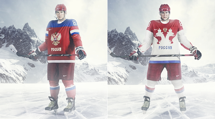
The red one looks incredibly cool. The white one... well, let's just say I hope they get to play more games while wearing red. Both designs are very Russian, but I'm partial to the red, obviously.
How about you? How do you feel about what Nike's done for the U.S. and Russia?