
Is this an old NHL All-Star prototype jersey?
/
It was never used in a game but it was definitely made by Reebok. Take a look for yourself.
Read MoreIt was never used in a game but it was definitely made by Reebok. Take a look for yourself.
Read MoreTake a peek down the road not taken with a pair of unused Reebok-designed sweaters.
Read MoreThere's a second version of the 2006 prototype Lightning jersey out there!
Read MoreTonight, we're taking a look at a couple of purported Reebok Edge prototype jerseys thanks to one ebay seller with a rare stockpile. And they are fascinating!
Photos by manonthemoon12345 via ebay
A current auction listing from manonthemoon12345 features what's described as a "rare authentic" Washington Capitals prototype jersey. The date on the tag appears to read Nov. 16, 2005 and notes it is a second version.
Most intriguing about this jersey is the crest which bears more than a passing resemblance to the Caps' Weagle logo — which currently graces the shoulders of their primary uniforms. In this version, the U.S. Capitol dome silhouette in the negative space is much more pronounced.
The design of the jersey itself, on the other hand, is much closer to the final product that was finally implemented during the 2007-08 season.
Photos by manonthemoon12345 via ebay
Back in July, another listing from the same seller offered an alleged "rare authentic" Vancouver Canucks sweater. The tag was dated September 2006, a full year before the blue and green jerseys were introduced.
This one is just painful. So many bullets dodged. First, remember that Reebok template I railed against earlier this week? The one Pittsburgh, Ottawa and Tampa Bay all used in 2007. Looks like Reebok was trying to push it on Vancouver as well.
Second, it looks like the Canucks considered sticking with the 1997 color scheme. I call it a dodged bullet, but in truth it was a unique look. No other team before or since has used it. But green and blue are definitely more fitting.
The best thing this prototype had going for it was the lack of the word "VANCOUVER" arched across the upper chest. Everything else about it... yikes.
What do you think of these jerseys? Have you seen any other interesting NHL prototypes?
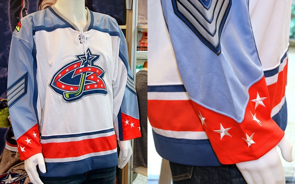
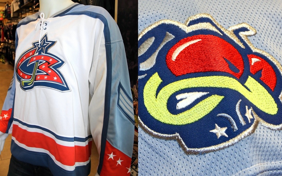
Photos from Blue Jackets Pucks and Stuff
Photos from Blue Jackets Pucks and Stuff
It's rare that fans get a look inside an NHL team's jersey design process. It's especially exciting to see prototype jerseys and imagine what might have been.
Today, John from the memorabilia-centric blog Blue Jackets Pucks and Stuff provided the world with a look at a concept from the earliest days of the Columbus Blue Jackets. It's the kind of thing Icethetics readers live for.
Reader Nathan submits our latest feature, and it's a doozy! It's a Pro Player jersey concept for the Columbus Blue Jackets from around 1998 or 1999. The final jersey design was announced on October 15, 1999 so I would say this predates that announcement by at least several months. Prototype jerseys are exceedingly rare, and eagle eyed collectors are happy to obtain them when the opportunity arises.
John doesn't say where Nathan took these photos, but the jersey appears to be on display somewhere with other Blue Jackets gear around.
As far as the design, the Blue Jackets probably made the right call steering clear of the powder blue. However, they would've stood out in 2000.
Another way they would've stood out is the lace-up collar. At the time, only the Rangers and Maple Leafs had that feature. Today, of course, they're all over the place and less functional than ever.
But it was inevitable. The lace-up collar was eventually used on the team's first third jersey in 2003. It came back with the new third in 2010.
This is a nice bit of Columbus Blue Jackets history to be sure. I hope that someday fans and collectors can get a glimpse into other proposed designs from this era.
Seconded.
If you want to see more high-resolution photos I strongly encourage a trip to Blue Jackets Pucks and Stuff right now!
For more stories on unused NHL prototypes, check out these past blog posts:
These are the jerseys the Blue Jackets chose for their inaugural season in 2000-01. // Photos from Blue Jackets Pucks and Stuff

