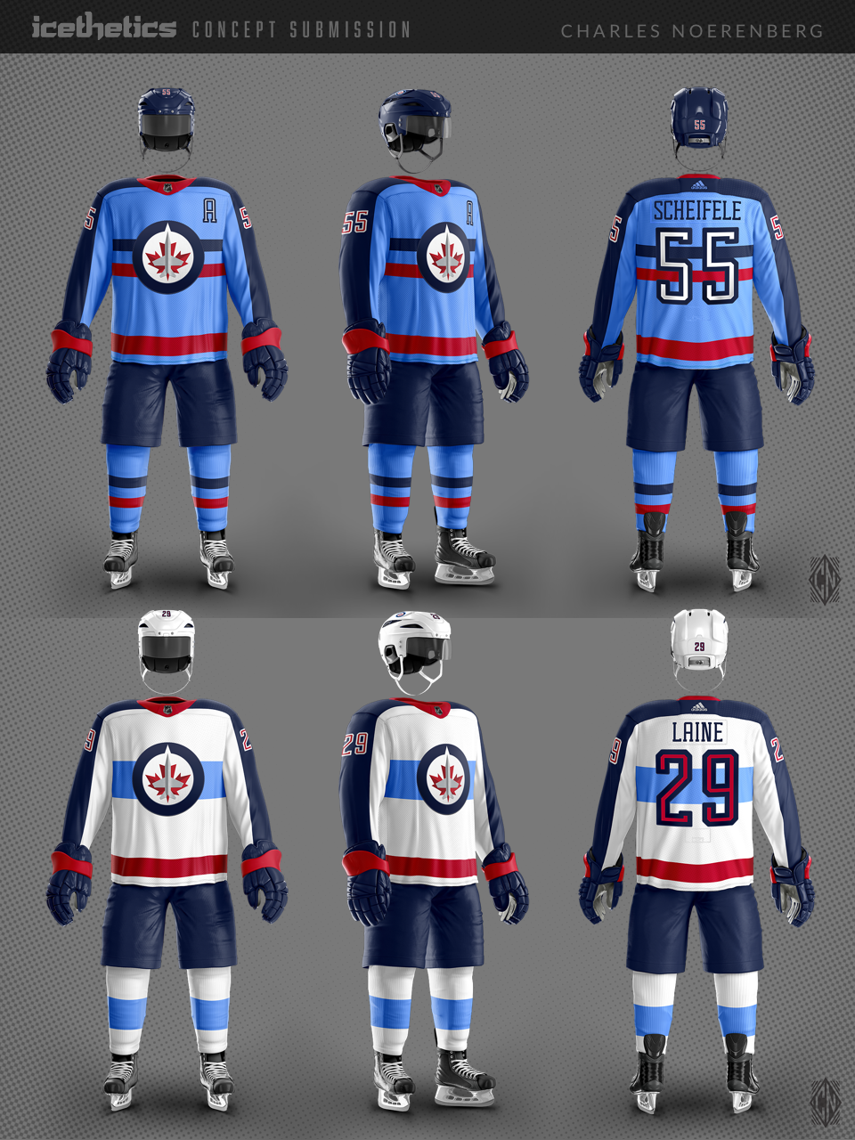
Jets Blue
/Charles Noerenberg returns with a new look for the Winnipeg Jets. He writes:
I was going for a clean, modern update to the beloved RCAF Flyers look, utilizing the light blue more. I created a new name and number typeface as well.
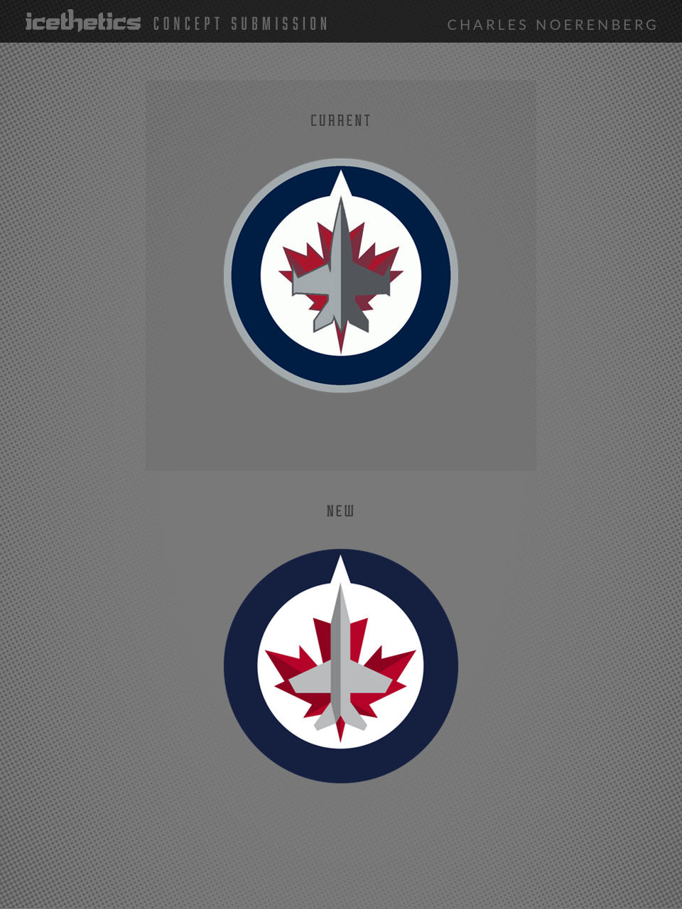
I made the revisions to the Jets' primary logo to make the plane more visible, to give the maple leaf a better form, and to give the logo better balance overall, so there isn't as much negative space on the left and right sides of the circle. I also removed the bombs from the plane's wings, to play down the militarism of the logo, and flipped the shadow to the left side of the plane, indicating a "bright future."