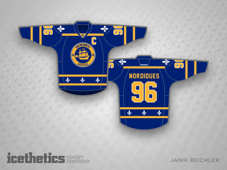
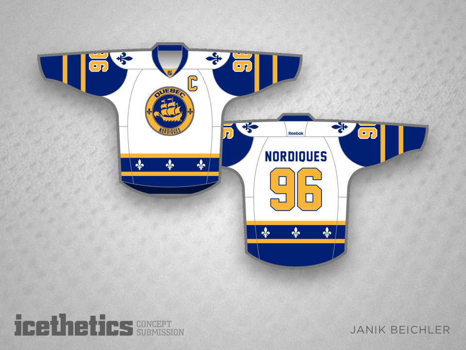
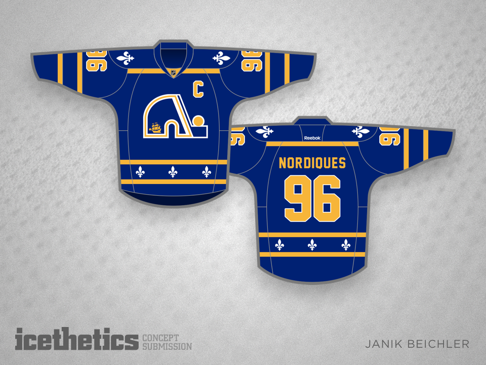
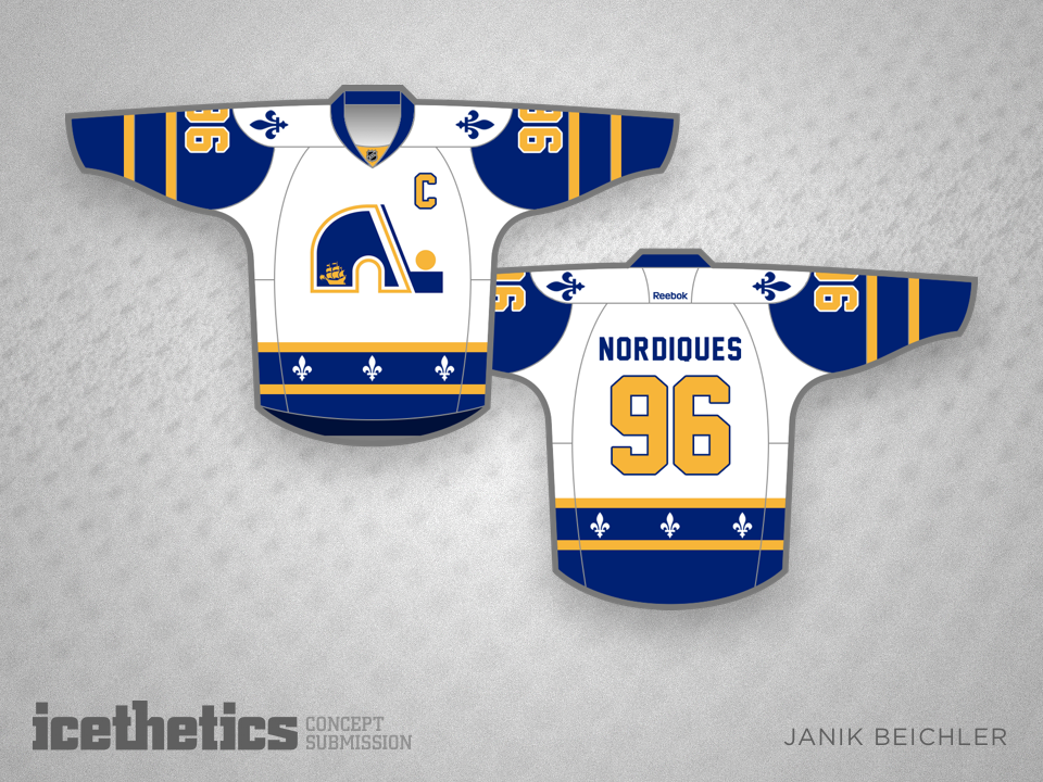
Skyline Freak Out

You know what the Maple Leafs need? A third jersey with the skyline on it. Janik Beichler submitted this freaky yet well-crafted concept. But for those of you who think it's a bit too much, he also created a toned-down skyline design.

Which do you prefer?

Unique Nordiques

Janik Beichler makes his debut on the Concepts page today with a Nordiques set. He writes:

Since the Nordiques would not be the only team from Quebec, the new color scheme is that of Quebec City, instead of the light blue of the province Quebec.
The ship in the logo is also that from the Quebec City flag. However, the fleur de lis is still included, which creates a combination between the historical team and the expansion franchise — similar to the Winnipeg Jets, who went with a new style and color scheme, while maintaining the name.

Janik also submitted this set which relies more heavily on the previous Nordiques logo. Do you have a preference?