Vegas Trio

UPDATE · Mar 9 · It was pointed out that a very similar version of this concept was first posted back in December. So to ensure we have original concepts here everyday, I'm adding an extra "trio" of Vegas jersey sets to this post.

First up, Chris Fortier tries out an unconventional design.

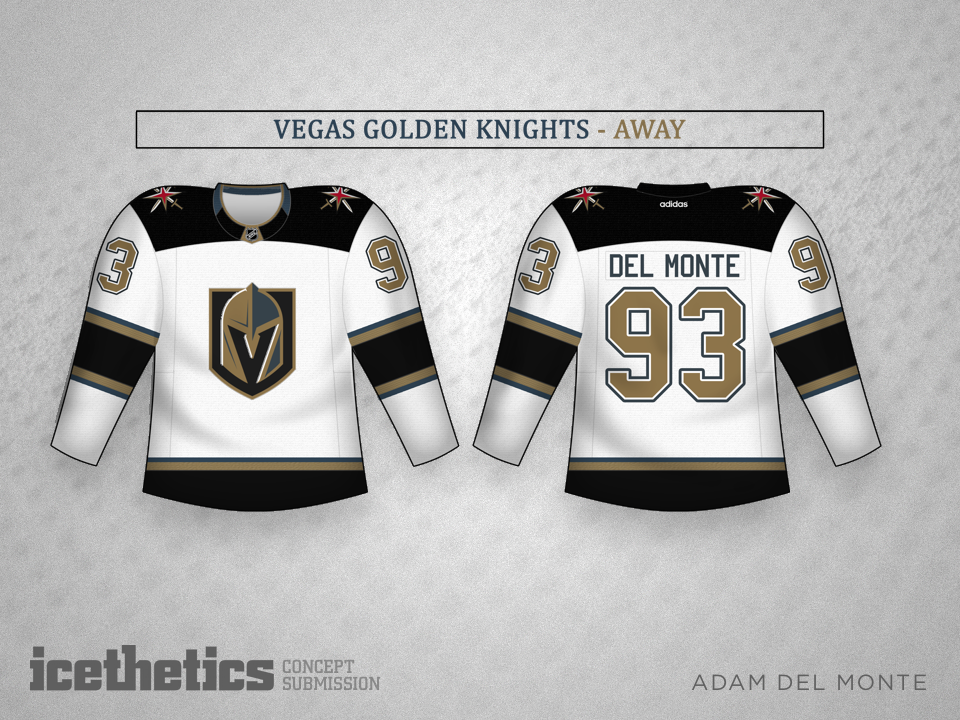
Adam Del Monte goes a little more traditional.

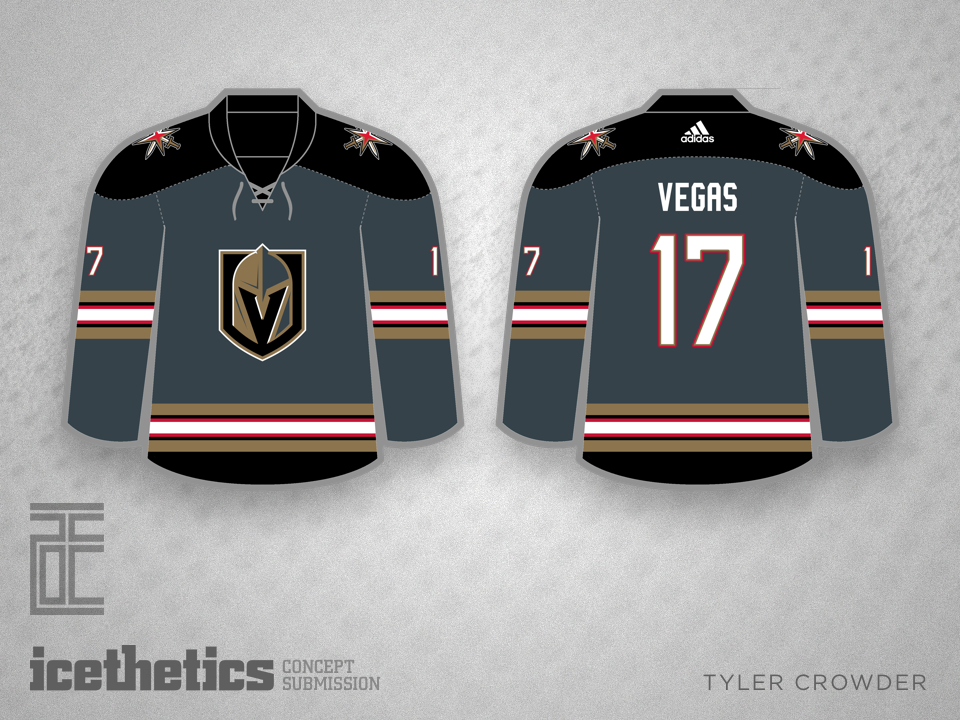
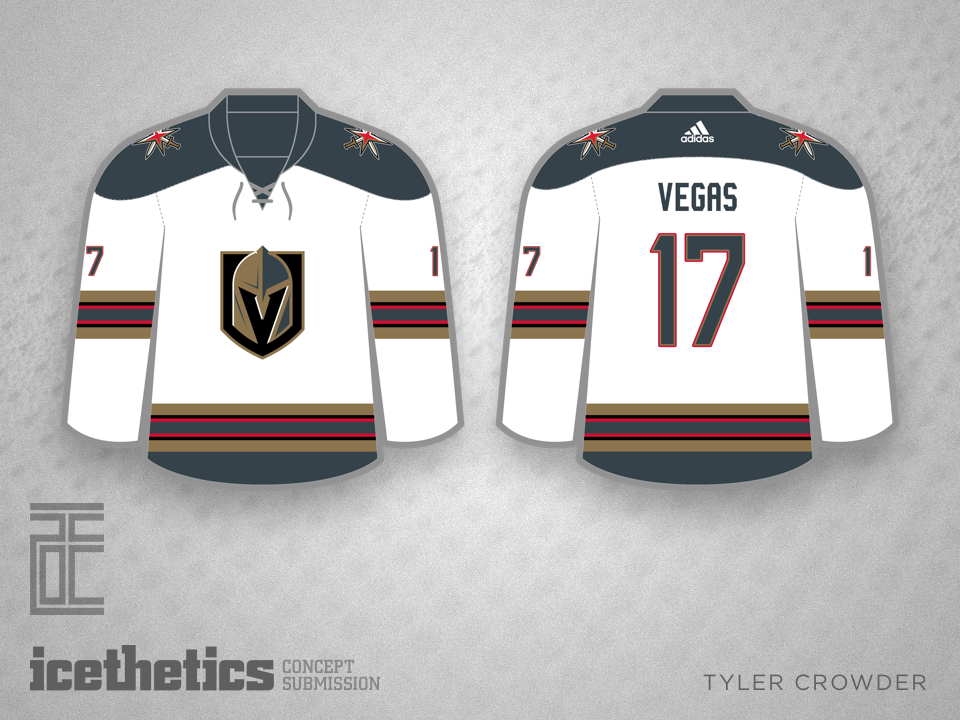
And newcomer Tyler Crowder finds a way to make the red trim really pop.

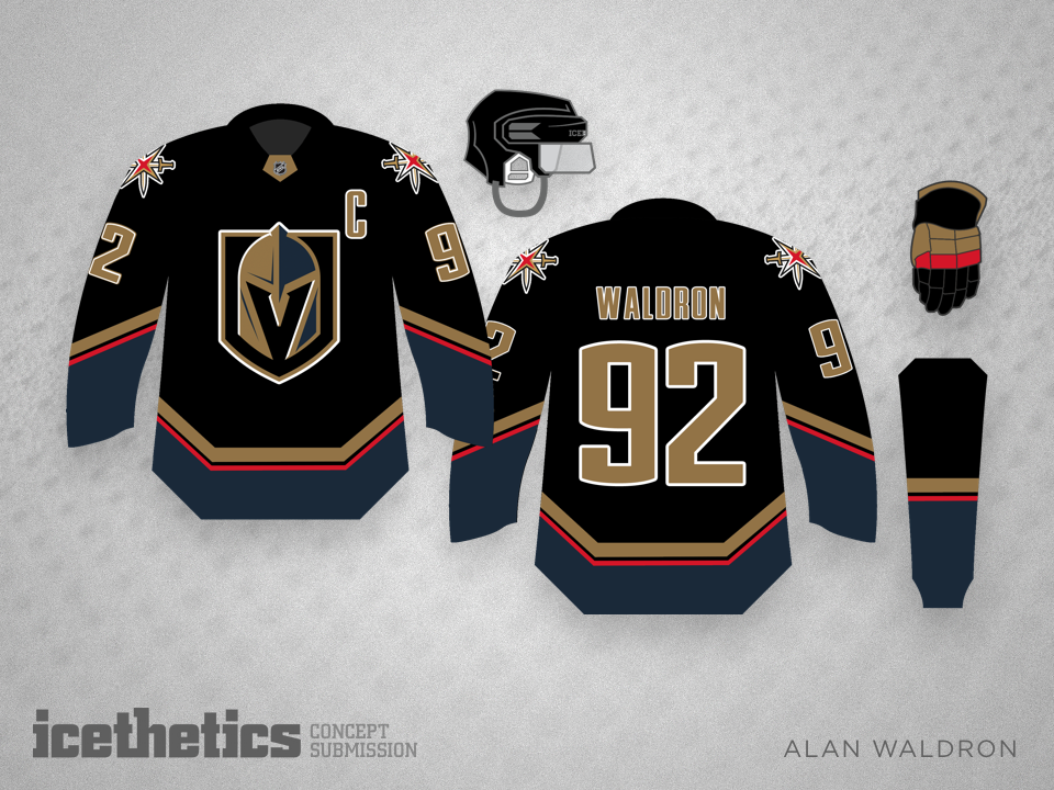
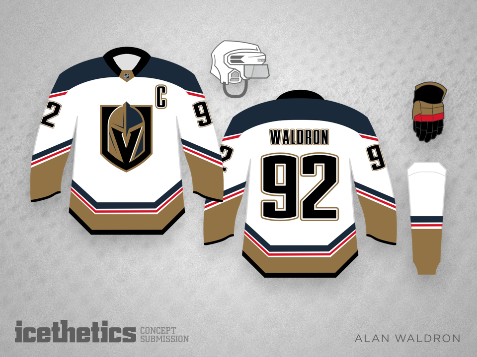
Below is the original concept that appeared in this post.


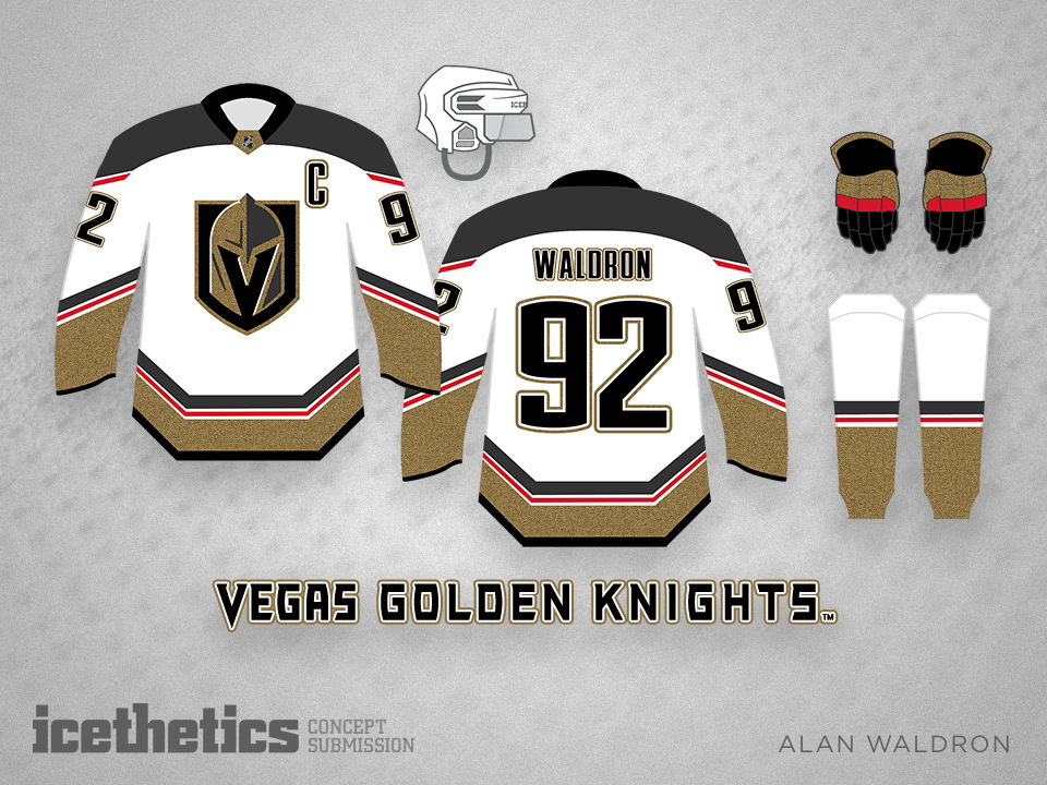
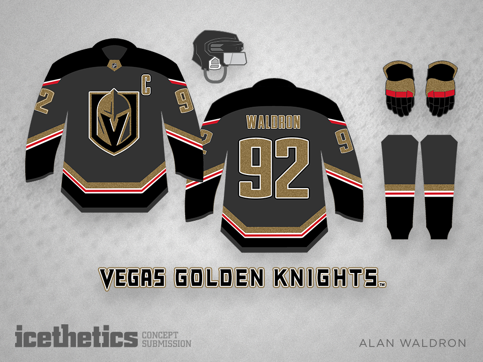
This week the Vegas Golden Knights picked up their first ever player, Reid Duke. But the jerseys will remain a mystery, likely until the expansion draft in June. Until then, Alan Waldron offers up his prediction.

Vegas By Alan

Alan Waldron shares with us not one or two but three jerseys for the new Vegas Golden Knights. What do you think of his set?

0037: A Possible Fix for Pittsburgh?

Last week I lent voice to the opinion that the Pittsburgh Penguins are overdue for a uniform overhaul. They wear a generic template with washed out colors and a weak design. I'm not saying Alan Waldron has the perfect solution, but this is certainly a step in the right direction. It minds the club's near half-century of history with bold lines and a design that stands out. If it were me, the one thing I'd change: forget Vegas gold and go with full on Penguins yellow from back in the day. Where do Pittsburgh fans stand on the matter?

Having said mine, it's only fair now that I let Alan say his peace on the design:

I kept the Pens 5-stripe pattern because I like the fact that it's a design element unique to the Penguins and featured on our inaugural uniforms. I know there aren't many people in the 'Burgh that like the diagonal Pittsburgh on the front, so I've included a second option with the circle logo which I think is equally as attractive.