Blues Unveil New Uniforms!
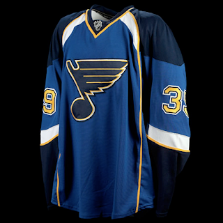
/The St. Louis Blues officially unveiled their new Rbk EDGE uniforms at FANfest this morning. Check out photos.
As I said yesterday when we first saw photos, I love the shoulder design on these sweaters. Unlike some people, also, I don't mind that there are no horizontal stripes at the bottom of most of these uniforms. I think they look great — especially on the ice.
 Even the road jerseys look pretty sharp, and I haven't really loved most of the white jerseys that have been unveiled to this point.
It'd be nice to see how they look on the players in full padding because it can only improve an already excellent design. If you ask me — and I know no one is — the Blues definitely got it right.
Wish I could say the same about the Islanders.
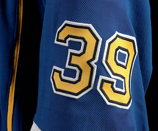
The Blues' online photo gallery of the new sweaters didn't include a lot of close-ups, but here's one I like.
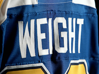
The numbering and lettering text on the jerseys remain the same. Check out Doug Weight modeling the new duds.
Some people have expressed concern over how longer names will look on the back of the sweater. The issue is the yellow piping extending down the back which we really haven't seen on many other new jerseys.
Anyway, I know most of you have already commented on these jerseys in previous posts, but for everyone else, here's your shot. We'd love to hear what you think.
UPDATE (8:26 PM): I was emailed an action shot from a Blues fan who was at FANfest today. I guess some of the players took part in a scrimmage. This photo gives us an idea of how the jerseys will look over the gear. The answer is spectacular.
I'm a Lightning fan and I'm jealous.

