Updating The Wings
/Yesterday I posted a great Florida Panthers rebranding concept and lots of you responded. I know one comment in particular asked about a Detroit Red Wings concept of similar quality. Well that reminded me of this logo I came across a while back. And I would contest that it's even of a higher quality than that Panthers' concept.
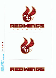
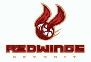
Before I talk about it any more, take a look at it.
It took me a second to even realize what I was looking at. It's just so different. One thing I've always thought about with regard to updating the Wings' logo was maybe using a more contemporary-looking wheel.
 The current wheel is classic but dated — and as long as we keep making new cars, that will always be the case. But this thing just floors me.
First of all, the design itself is top-notch. I mean, don't get me wrong, I know nothing like this will ever don a Wings' sweater — not even a third jersey — but it's way cool to look at. Second, it definitely has a "now" sort of feel as opposed to something stuck in the 1950s.
My favorite thing about this logo is in the wings. At first glace, you may not have noticed, but hidden within them are an "R" and a "W" — standing for Red Wings, naturally.
Like I said, nothing like this would ever come to be accepted by hockey fans in Detroit, but it's fun to wonder.
If somebody wanted to create a concept uniform around this logo, I'd be open to posting it. In the meantime, what do you guys think of this? Worthy of a Detroit jersey? Or too crazy to ever make the cut?

