
New Sweaters Abound!
/Big night for classic hockey jersey enthusiasts! The Nashville Predators unveiled their new third jersey as the Boston Bruins gave fans a first look at what they'll wear on New Year's for the Winter Classic — both with tradition in mind.
 Let's start with my favorite of the two — the Bs' 60-year-old throwback.
A photo leaked last week but didn't really do this jersey justice. For one thing, I don't think it was clear enough that it's brown and gold. That's awesome! Nobody else wears brown. And it's used rather nicely here.
Check out David Krejci sporting the new threads.
 David Krejci models the Bruins' 2010 Winter Classic sweater
I don't know. It may well be the best of the six Winter Classic jerseys — and that's some stiff competition. It barely beats out that Blackhawks jersey if you ask me. Just barely.
What we really need is a side-by-side comparison of the sweater it was based on, which was worn for a single season (1948-49) — to celebrate a quarter century of existence.
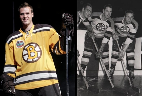
The Bruins are now just 15 years shy of their 100th anniversary. That's quite a bit of history. And there's no doubt in my mind they picked the best looking uniform for this event. By the way, I haven't seen any head-to-toe pictures yet. Anyone know if they're going with those classic socks too?
 Leaked pictures take the wind out of jersey unveilings a little bit. I disappoint myself being part of that machine. Still, the Nashville Predators officially debuted their new alternate sweater for 2009-10 before their preseason tilt against Atlanta.
David Legwand, Martin Erat and Joel Ward gave fans their second look at the sweater — Taylor Swift having given the first one at a recent concert.
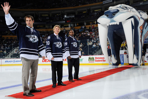 Legwand, Erat and Ward model their new threads (John Russell/Getty Images)
The big question you're surely asking: What of these wretched checkerboard patterns we heard about? Were they mere rumors? Sadly, I'm afraid not. Check out the close-up.
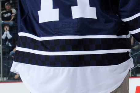 The checkerboard stripes
I mean it may not ruin the jersey, but it sure doesn't help things. Why are they there? They don't seem to serve any visual purpose as they're only visible up close when well-lit. But I've learned not to question what goes on in the Age of Reebok.
The jersey sticks with a classic numbering and lettering style in plain white and the primary logo on the front has undergone a bit of desaturation — now featuring only shades of blue. The shoulder patch features the now standard skull logo on top of its very own checkerboard pattern.
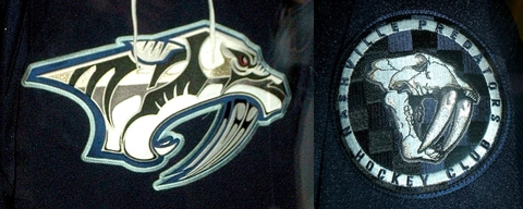
Icethetics reader Matt has provided these close-ups for us.
I think that covers it. The Icethetics Season Preview kicks off in just three days!
Almost forgot about these. Both teams have short videos worth taking a look at.
Cam Neely talks about the elements that went into the design of the Bruins' Winter Classic sweater...
...and the Predators unveil their alternate with a unique video.
Best part of that was Diller trying to defend the mustard.
...and this is how the Bruins Winter Classic sweater was leaked.
Thanks Colin!