
Ducks Finally Fixing the Logo?
/ Are the Anaheim Ducks finally fixing their logo? Several clues are leading me to think the "ucks" is out and the webbed "D" will finally stand alone!
I wrote a post like this a few weeks ago when I examined the possibility that the Florida Panthers are changing their logo. Unfortunately, the Panthers were the one team that didn't need it. The Ducks, however, are a different story.
 From the day they introduced that wordmark trying to pass itself off as a logo three years ago, many of us have been annoyed. Looking back, I do understand the purpose. They were changing the name and marketing had a big role to play. They needed to let everyone know that the team was "Mighty" no more.
Still, from the beginning I said they should just go with the big webbed "D" on its own — especially on the jerseys. So it's encouraging to see the "ucks" starting to disappear. For instance, the Ducks recently launched their redesigned web site and the webbed "D" is by itself in the banner.

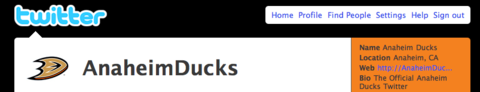
Even their Twitter page features the standalone "D."
If the web change alone isn't enough to bring you some relief, Ducks PR guy Adam Brady wrote a new blog post yesterday with some pictures of the freshly painted ice at the Honda Center.
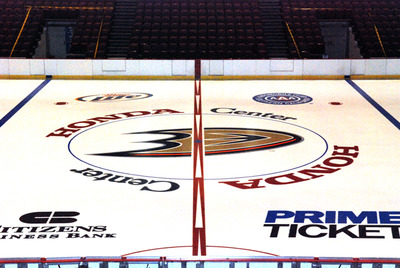 Anaheim Ducks' newly painted center ice
It still bugs me that the team's own public relations guy has a redundant logo at the top of his blog. But hopefully that will be fixed in time as well. These things don't happen overnight.
It's the Anaheim Ducks Ducks Blog. But I digress. Here's what he wrote about the newly painted center ice logo.
As a follow-up to yesterday's photos of the Honda Center ice being painted, here's a look at the completed project. Notice the new Ducks "D" at center ice, in addition to a slick new look for the red line.
The "D" isn't new, the center ice design is. But we know what he meant. Still, as I said, it's encouraging to see these small but significant changes coming about. The next big change, which needs to happen sooner rather than later, is to have the webbed "D" get the star treatment on the front of those jerseys.
Only then can we truly be optimistic about the look of the Ducks.