
NHL JerseyWatch 2011
/ March Edition Reebok released its planning catalog to retailers for the new season in January. That's when we got our first look at NHL JerseyWatch 2011 here at Icethetics. In the two months since then, we've learned a lot more.
As always, with rumored information, nothing is official until the specified team or league says so. For example, last year's early catalog for retailers suggested the Predators would have new home and road uniforms this season. That never happened. All we know are the plans — which are subject to change.
For each team, I've listed what's changing along with speculation on how said changes might manifest. The keyword being "speculation" in most cases. New or updated information is noted in red. For religious reader of the blog, there's probably not a lot of new information here for you, as this is meant to be a compilation post for the non-regulars.
Now join me in celebrating Pi Day with another look at the uniform changes ahead for the NHL!
Atlanta Thrashers

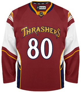 Thrashers current third jersey / from NHL.comNew alternate jersey Atlanta has what many consider to be the ugliest third jersey of the Reebok era. Despite a look that merges elements from football and basketball uniforms, it gets points for standing out in a market where hockey is often overlooked. But they still play hockey, right?
It was a surprise to hear the Thrashers are already looking to replace the alternate sweater as it was only introduced in the 2008-09 season. Makes me think sales are in the tank. So how might they make changes?
I don't want to be the one to say it, but dark blue is probably a good bet. It's the new black in terms of being a popular color for alternate uniforms. And it's certainly not maroon.
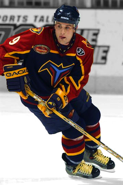 Thrashers 1999-2006 / from Getty ImagesWhat's more is the Thrashers don't have a lot of history to draw from, having been founded in 1999. But if they were to take inspiration from the past, let's not forget their original dark jersey (left) was navy.
By the way, anyone recognize the 26-year-old kid in that photo? If you guessed Marc Savard, well done. I'd forgotten he spent a few years in Atlanta before becoming a star in Boston.
Anyway, if the Thrashers' goal is to sell more jerseys, I'd sooner buy this than the weird hybrid they're currently offering. But then truthfully, I'm a Lightning fan so I'd never buy a Thrashers jersey anyway.
Who can say if they're interested in digging up the past? They completely surprised us in 2008 with the jersey they came up with so we may be shocked again in 2011. If it is an original design, I'd count on a major element that highlights the city of Atlanta, be it a new logo or straight-up text.
Regardless, I don't see how they can do worse than their current alternate uniform. And it will be a relief to finally see this one disappear from the NHL.
Buffalo Sabres

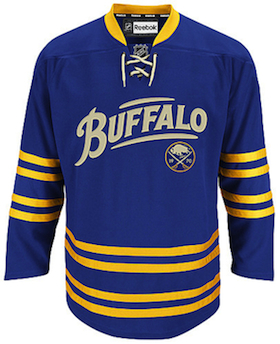 Sabres third jersey / from NHL.comSame alternate jersey The Sabres will hang onto the alternate sweater they introduced this season as part of their 40th anniversary celebration.
Though nothing is changing, I thought it worth mentioning here as some thought perhaps the jersey would be worn only this season and then retired. In fact, it seems the royal blue will hang around at least one more year. Possibly longer.
Also, the jersey does feature the throwback Sabres logo with their founding year, 1970, set inside. This was used as the team's 40th anniversary mark but it's not specific to this year, which means it's likely to stay on the sweater.
It goes without saying, but Buffalo's home and road uniforms will also stay the same for 2011-12. Overall, this might be the best set of sweaters in the NHL. And it's all because they're paying attention to their past and their fans.
Dallas Stars

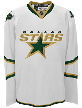 Stars current third jersey / from NHL.comNew alternate jersey Reebok says the Stars are looking to launch a brand new third sweater. And most of us are hoping they run far away from their current look.
Dallas may have been the hardest hit by the transition to Reebok Edge in 2007. They went from having a beautiful and unique set of sweaters to some of the blandest in the league. And green almost disappeared entirely.
Currently, the Stars wear a black jersey and a white jersey, each of which simply has the word "DALLAS" arched above the sweater number — not too unlike the Thrashers' current third. They're trimmed in gold and only the white uniform has any hint of green. Their third jersey (right) is the only one with any kind of a logo on the front.
 Stars 2003-2006 / from Getty ImagesNow it seems they're finally ready to advance the brand and add something new. (Let's just hope it's not a black version of the present third.) I think we're all anticipating something in green, a color that's slowly but surely returning to the NHL after an absence that went on too long.
Maybe even a new logo to go with the green? So long as they learned their lesson from the "Mooterus" (left). That lesson being, don't get too cute with your logo or it will come back to bite you.
Let's be honest, anyone who's ever opened up a sixth grade health class textbook would recognize that shape without a second look. We can all pretend it's the constellation Taurus, but no one is being fooled here. Not even Trevor Daley.
Not only that, but what's with the red? That's never been in their color scheme. And they don't need it. They already have two great colors in green and gold.
The point is, the Stars don't have a good track record with third jerseys. Keep in mind that the current road jersey was their most recent try at an alternate design. And it was terribly lacking in creativity, obviously. Maybe the next try will put an end to that streak.
Edmonton Oilers

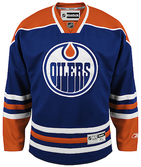 Oilers home jersey / from NHL.comNew road jersey At last, Oilers fans can rejoice! A new white sweater is coming to Edmonton this fall.
If the Stars fared the worst in the switch to Reebok Edge jerseys in 2007, the Oilers weren't far behind. Fans had been without their true blue and orange, instead dealing with navy and copper with red trim since 1996.
In 2007, the colors stayed the same, but the jerseys were a disappointment. As with many new Reebok sweaters, there were no waist stripes. And the sleeve stripes inexplicably stopped on top of the elbow instead of wrapping completely around the arm.
Only a season later, the complaints were quelled with the introduction of a retro third jersey (right) that brought back the brightly-colored blue and orange from the '80s that most hockey fans associate with Gretzky's Cup-winning dynasty.
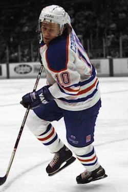 Oilers 1981-1996 / from Getty ImagesJust one year after that, the fan-favorite uniform got top-billing as the new home sweater. Things have been quiet on the jersey front this season. But now with a new white sweater in the works for 2011, fans should be excited.
Most likely, the new road sweater will be a white version of the current home jersey — a look we haven't seen on a regular basis since it was retired back in '96.
To remind you of what that looked like, I tracked down this shot of Mariusz Czerkawski specifically because you can see that the sleeve stripes wrap completely around the elbow. We have indeed missed that feature.
Many fans were expecting/hoping the white jersey would make its return this season, but after three consecutive seasons of uniform changes in Edmonton, the NHL probably frowned upon the notion of a fourth — even though the Islanders got away with it. And as disappointing as that may be, let's take solace in the fact that it's being rectified next season and not five years from now.
Unfortunately, however, the third jersey will not be changing. So those wanna-be stripes aren't disappearing entirely quite yet.
Now for this final paragraph, I could go off on a tangent about how we don't know anything for sure and they could come out with an entirely new design for the white jersey... but I think we all know the Oil would not dare be that reckless. Or would they?
Florida Panthers
updated

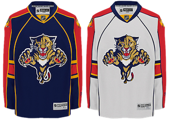 Panthers current home & road jerseys / from NHL.comNew home & road jerseys Reebok says that Florida's piping-happy home and away sweaters are going away at the end of this season. And even a Lightning fan will admit that's a good thing. Because these are terrible and I have to see them six times a year.
Over the last season or two, there's been a noticeable shift away from the leaping panther logo to something more simplified — similar to what we're seeing in Nashville. The Cats' new third jersey is a great example of this.
More and more, Panthers marketing materials have featured either the third jersey logo or a paws up version of the leaping cat. It's hard to say for certain what changes are in store for the new sweaters, but there are no plans to change the third jersey at this point.
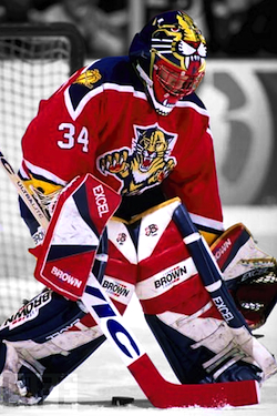 Panthers 1993-2007 / from Getty ImagesIf the Cats really want to do it right, just look back. Under the heading of you don't know what you have until it's gone, the funny thing is they're one of those teams that got it right the first time.
And even though the red jersey (left) that we'll always associate with John Vanbiesbrouck was relegated to alternate status in 2003, it's too good to disappear forever. Bring it back.
Following the January JerseyWatch post, Miami Herald writer George Richards revealed that he's heard from players and team officials that the red is, in fact, coming back. He believes the third jerseys will remain intact as well. And that's a good thing.
Since the Panthers have a navy blue jersey that actually looks good, they should hang onto it (as a third) and bring the red back. To the Panthers I say, let the Lightning be blue and reclaim your original colors.
Of course the odd thing is that the Panthers' new marketing campaign — The Blueprint — which is their way of trying to make fans feel better about their last few lousy seasons (aka, "we're rebuilding").
And because of that, their whole website is currently bathed in blue. Mixed messages.
Hopefully the hot Florida summer — which I no longer have to contend with (yay!) — will yield some answers. Until then, like Richards, all we have is speculation. And hope.
Los Angeles Kings

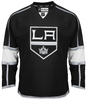 Kings current third jersey / from NHL.comNew home, road & alternate jerseys Apparently the Kings intend to toss out everything and go back to the drawing board in 2011. (Maybe.)
Actually, if I'm being honest this complete reboot wasn't entirely unforeseen. The team has been dropping hints over the past year. For example, the players opted to wear the black third jerseys throughout their 2010 playoff run. And the throwback launched this season is very popular among fans.
Not only that, but Icethetics reported in October on photos of possible jersey prototypes seen in Luc Robitaille's office at the Kings' practice facility. They are essentially white versions of the current third jersey (right).
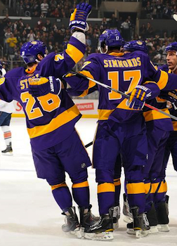 Kings throwback jersey / from Getty ImagesSo if I had to guess, the crown logo along with the black and purple sweaters will disappear. Replacing them will be the LA shield logo along with black and white jerseys. And as for the third, obviously the purple and gold throwback is the front-runner.
And that suspicion just got a little more meat on it in January when the Kings added nameplates to those jerseys. Surnames are a league requirement on uniforms, but they got away without them for opening night against the Canucks as they were celebrating the 40th anniversary of their first meeting — which was at a time when jerseys didn't have nameplates.
So now this is a complete uniform and it looks phenomenal. Fans like it and there's no reason not to keep it around. I wouldn't be at all surprised if that's how things shake out for the Kings next season. Black and white regular unis and very colorful thirds.
Of course I could be totally wrong and they could be in the process of launching an brand new identity altogether. As I've been saying, we'll really just have to wait and see.
Nashville Predators
Updated

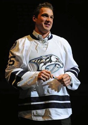 The "limited edition" jersey / Nashville PredatorsNew home & road jerseys In the 2010 catalog, Reebok reported new home and road uniforms were in the Predators' pipeline. It appears to still be in the cards — just delayed.
Last year's report indicated the third jersey would be going away. That led us to believe the current third would be the new home sweater and a white version would be added for the road.
In February, we finally got a real look at what such a jersey would look like (right). But the Preds were just teasing us. The players, including Shane O'Brien, wore them to a casino night event where they were auctioned off as "limited edition" jerseys.
The team immediately denied this would be Nashville's new road jersey next season. But didn't deny there would be a new one. More on that in a sec.
 Predators 2001-2007 / Getty ImagesAbout a week later, a fan emailed me to say his ticket rep said a mustard-colored jersey was being tested. The Predators wore a love-it-or-hate-it third jersey of the mustard variety (left) from 2001 until the Age of Reebok. Marek Zidlicky knows all about it. And many Predators fans will tell you they loved it.
In late February, the team started sending out renewal notices to season ticket holders, which offered a free "new look Predators home jersey" to those with full season tickets. This officially confirmed new uniforms are on the way, but gave no details about the design.
This is where the speculation begins. Because Reebok says the third jersey isn't changing, we're likely to see brand new designs for the forthcoming home and road sweaters in Nashville.
Then there's the unconfirmed report from commenter Kiltimar on January's JerseyWatch update. He claims to have been part of a focus group which got a look at new jersey concepts — which looked like nothing we've seen before.
It's also now looking more like the colors and logo will remain unchanged despite earlier reports. The Predators may simply be aiming to freshen up their look rather than go for an all-out redesign. I'm actually looking forward to seeing what they come up with.
New York Islanders
Updated

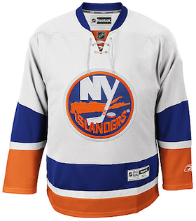 Isles current road jersey / from NHL.comNew alternate jersey Reebok is indicating a brand new third jersey for the Islanders — which will probably ruin everything now that they've finally gotten it right.
This season, the Isles debuted their new white sweater (right) to match the blue throwback that's been in use since 2008. We were all relieved and overjoyed to see it.
And that's because the folks on Long Island historically make bad decisions when it comes to redesigning Isles uniforms. For this team, retro works and it always has.
Remember the "fishsticks" debacle of the mid-90s? If not, you're lucky. Fans revolted at the sight of the new sweaters and logo. So much so that the team was forced to bring back the old look not three seasons later.
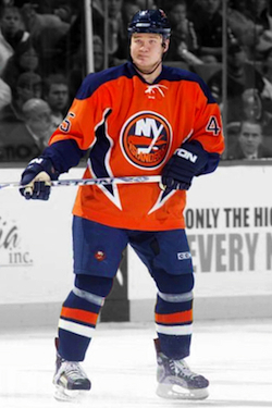 Islanders 2002-2007 / from Getty ImagesThe only time the Islanders have attempted a non-retro third jersey, it was orange and featured some very bizarre design choices.
The Isles weren't part of the wacky third jersey era of the mid-90s because they were busy making wacky home and road jerseys at the time. This orange sweater (left) was launched in 2002 and if Aaron Asham looks puzzled, imagine the rest of us.
I'm all for trying new things. The orange jersey is cool. I like the blue shoulder yoke and laced collar. But what is with the odd pointy blue and white stripes in the middle? What are they meant to be pointing at exactly?
Honestly, I don't want to know.
Also worth noting, ex-Isles employee and exiled blogger Chris Botta said in a video blog that the team is indeed adding an alternate sweater next season. When asked why by a fan, his simple answer: money.
I'm not sure what the Islanders have in store for a third jersey in 2011. I'm just worried it's not going to be good what with their terrible track record.
New York Rangers

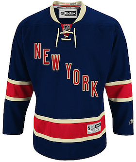 Rangers current third jersey / from NHL.comSame alternate jersey Like the Sabres, the New York Rangers will hang onto their anniversary sweater for at least another season.
None of the Rangers' three jerseys are changing in any way. But again, like Buffalo, I thought it worth a mention since there was the possibility the sweater would only survive for the 85th anniversary season.
The only difference between what the Rangers are wearing in 2010-11 and what they'll have in 2011-12 is the 85th anniversary shoulder patch. Obviously that will disappear following the end of this season.
Personally, I'm a bit disappointed. I, along with many of you, was hoping the Rangers would one day bring back the Lady Liberty logo and uniform. It lasted 11 years and it's arguably the best alternate jersey in the history of the NHL.
For now, though, it looks like we'll have to continue waiting for that day to come.
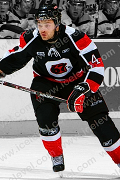
Ottawa Senators
Updated

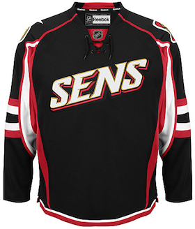 Senators current third jersey / from NHL.comNew alternate jersey Earlier I said the Thrashers may have the ugliest third jersey in the NHL. Forgot about the Senators.
Luckily, the Sens confirmed this news to fans in early March. They're calling it a "heritage" jersey. Team president Cyril Leeder later went on the radio and divulged a key detail — that being a barber-pole look as "part of the design." He even confirmed already having a prototype in the office.
Thing is, it can only be an improvement on what they've been wearing since 2008 (right) — which is all over the map. Who mixes super-retro elements with super-modern elements? These guys.
Some things to keep in mind: A retro-styled concept designed by a fan has appeared in official team materials and in January, Ottawa's farm team in Binghamton wore the barber-pole throwbacks that the original Senators sported in 1930s.
 Ottawa 67's dark uniform / Robert LefebvreWe've also speculated on the possibility of the Sens borrowing inspiration from the junior club in town, the OHL's Ottawa 67's. They've been sporting a rather sharp black jersey with barber-pole striping down the sleeves. Personally, that one's my pick.
And just this past week the 67's re-introduced the full barber-pole uniforms they're known for. Also huge fan favorites.
The question is whether the Sens will copy any of the aforementioned designs or create something entirely new that still feels retro. Because the term "heritage jersey" absolutely screams faux retro and there's nothing we can do about that.
Just have to hope they opt against the "vintage white" that seems to be taking over throwback jerseys in the NHL these days. That's a color that's been worn out in just the span of a couple seasons.
The Blackhawks started the trend with their 2009 Winter Classic uniform, which was striking, and since then it's a color that's been stolen by the likes of the Bruins, Sabres, Penguins, Rangers and even the 10-year-old Blue Jackets.
I guess the good news is that regardless of what they come up with, the SENS jersey will be going away and that has to be a good thing.
Pittsburgh Penguins

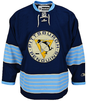 Pens' Winter Classic jersey / from NHL.comNew alternate jersey This should be the least surprising news in the entire post. The Pens will have a new third in 2011.
The Penguins first talked about replacing their powder blue third jersey last year. But upon the announcement they'd be participating in another Winter Classic, those plans were shelved.
The last time the Pens added a third jersey, it was borrowed directly from the 2008 Winter Classic. Now three years later, it's all but a given that history will repeat itself.
I'd be very surprised if the new uniform isn't the 2011 Winter Classic sweater (right). Chances are it's the same design they were working on last year when the idea of changing the alternate jersey first came up.
The only difference would be the lack of a Winter Classic shoulder patch. I've altered the image to represent that. It's a nice looking jersey on its own. But I do think it would be better if they used real white instead of the trendy vintage white.
Tampa Bay Lightning
updated
 Yzerman, St. Louis, Lecavalier, Stamkos, Vinik and Leiweke unveil new Lightning uniforms / Lightning
 New home & road jerseys The Lightning unveiled a new logo along with new home and road uniforms to very mixed reviews on January 31.
The new management team in owner Jeff Vinik, president Tod Leiweke and GM Steve Yzerman wanted to put a fresh new stamp on the team by changing the entire look.
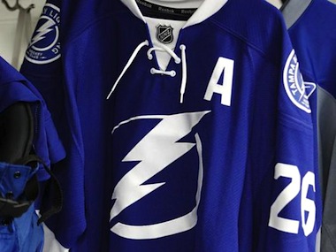 New home sweater / LightningThere are simplified logos and fewer colors than before, ultimately leading to a more traditional look worthy of an elite franchise. But for as clean as the new look was, many fans were not happy.
The new uniforms lost some of the personality and history that founder Phil Esposito built in back in 1992 — that being the underarm "victory stripes" and the lightning bolts on the sides of the pants.
After doing what they claim to do best — listening to the fans — Bolts brass made some tweaks which included adding black trim to the sweater numbers as well as white lightning bolts on the pants.
Leiweke also confirmed the "victory stripes" will be part of the uniform design going forward, but that the deadline for changes in the 2011-12 season has already passed.
The Lightning have also said the BOLTS third jersey will remain for years to come. I imagine that even means keeping the black and gray elements as an alternate color scheme, though the shoulder logo will likely be changed to one of the new marks.
Toronto Maple Leafs

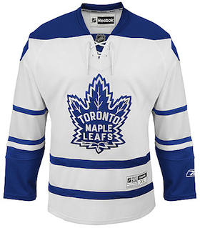 Leafs current third jersey / from NHL.comNew alternate jersey As rumored, the Maple Leafs will be debuting a new third jersey for the 2011-12 season.
The current third jersey in its Reebok incarnation launched in 2008. Prior to that, the same design was used from 2000 to 2007. It was based on a uniform and logo the Leafs used from 1958 to 1967.
When team management has recently discussed changing the uniform with the media, they've said the plan is to borrow from their own history once again.
 Leafs '70s throwbacks / from Getty ImagesA year ago, Toronto paid tribute to the 1970s as the players skated out in replica jerseys for warm-ups. They matched sweaters worn by the team from 1970 until 1992. Rumors suggest the team may look to that era for its next alternate uniform.
They look great and just different enough to distinguish themselves from the recently altered home and road jerseys. Fans always love the retro look so the Leafs would probably be wise to go this route.
Beyond that, there's not much else in the Maple Leafs' jersey history that isn't a little crazy. So unless they go with the '70s throwbacks, they'll have to come up with something completely new. And that doesn't usually work out well for them.
And I'll say it once again. We won't really know anything until next summer, fall at the latest. But the Leafs usually like to make a big deal about jersey unveilings so I'm sure we'll know when it's coming.
That wraps up the second edition of NHL JerseyWatch 2011. More updates will follow in the months to come — especially this summer once the playoffs have wrapped up.