
Columbus Cottonmouths bring fresh look to SPHL
/
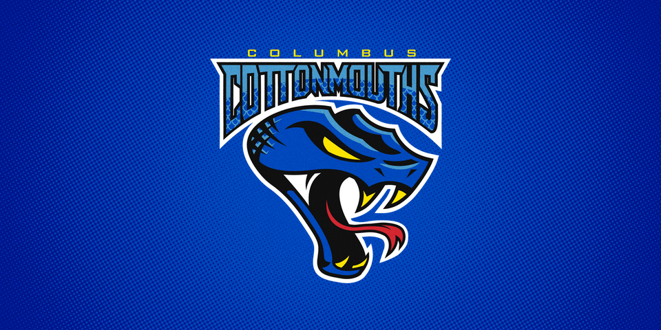
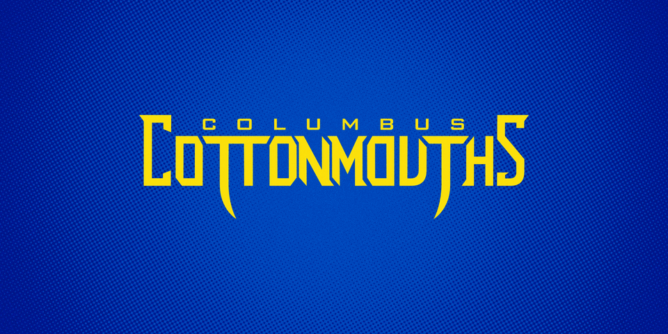
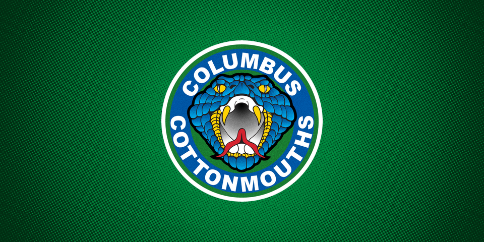
This morning the SPHL's Columbus Cottonmouths unveiled the first phase of a new identity being launched this summer. The redesign is the first significant change for the franchise, which has played in three different leagues over the past two decades.
Founded in 1996, the club was a member of the Central Hockey League and ECHL before joining the Southern Professional Hockey League in 2004 — where they won a championship in their debut season.
Redesigning the logo was long overdue. Personally, it was consistently one of my least favorite in minor pro hockey — which itself is often known for bad or silly logos. The original mark was covered with complex gradients that made it difficult to accurately reproduce. And frankly, it was ugly.
In fact, the team's own brand guidelines acknowledge the mistakes of their past. The document quotes a fan as saying, "You can look at 10 fans in the stands and see 10 different jerseys. What are the team colors?"
The immediate need for a new look could not have been more evident as the team turned 20 years old.

But it wasn't exactly an immediate or internal push that got the ball rolling on the new snake. It was someone you may know if you're a fan of Icethetics' own fantasy league, the IceHL. Are you familiar with the North Carolina Nighthawks?
The Nighthawks' logo was designed in 2008 by Nick Matarese — who is the founder of The Barn Creative, the design firm behind the Cottonmouths' redesign! Their clients include Disney, Adobe, Adidas, and the NBA D-League's Delaware 87ers.
As the creator of the IceHL, it's exciting for me to see one of our own designers now creating sports identities in the real world at a professional level. Better still, Nick was nice enough to discuss with me the process behind his latest work.
Two years ago, The Barn reached out to the Cottonmouths organization about rebranding. They were receptive but not quite ready to take action. The project was shelved until early March when the team finally decided it was time.
Things escalated quickly. Just three months passed from contract signing to final delivery of the artwork. In between, there were sketches. Lots of sketches.
Nick told me this the designs pictured here are only about half of what was shown to the club during the design process. (Personally, I like the seemingly Canucks-inspired snake-in-the-C.)
"I wouldn’t say we pitched Columbus traditionally," Nick said. "It was a collaborative effort as their owner definitely had a vision in mind."
That vision included a young target audience. Nick said he realizes NHL fans are less likely to understand the branding needs of a franchise in a small league and a non-traditional southern hockey market like Columbus, Georgia
"One comment from Twitter said something like, 'it looks a little too much like a Hot Wheels logo' — which I am okay with," he said. "The audience is still [new] to the sport. This is the SPHL. You need to be thinking a little more like a Carolina League baseball team."
His point was that a simplistic Canadiens- or Bruins-style logo — without the century of history behind it — will not be memorable within this market. So a different style is required.
This certainly won't be the last we see from The Barn. Nick told me his firm is currently in talks with two pro teams but isn't at liberty to say who they are right now.
Knowing what great work he's done and thrilled about what's to come, I had to ask him if his work on the IceHL has had any impact on his career. I was genuinely surprised by his response.
I think working with the IceHL did help my career, to be honest. I am sort of upset I found it so late in the game. I would have produced more/better work.
But working with teams now, a lot of the times the work done for the IceHL comes up. It comes up because, like many concept artists on Icethetics, they have day jobs as creatives/agency owners/freelancers and the client tends to make the final calls — which sometimes alters your vision.
That's the great thing about participating in IceHL design contests. Fans may like your work or they may not — but they cannot alter your vision. (Hey, speaking of which, we have a new design contest launching later this month!)
Now, since you've stayed until the end of the article, Nick has a special treat for you. The logos above are only the first to be revealed. There are more secondary marks and jerseys to come later this summer. But Icethetics readers are getting an exclusive sneak peek!

Stay tuned for details on the next phase of releases. For now, share your thoughts below on the new look of the Columbus Cottonmouths.