
Ducks unveil new throwback-inspired third jersey
/Anaheim Ducks third jersey, 2018—
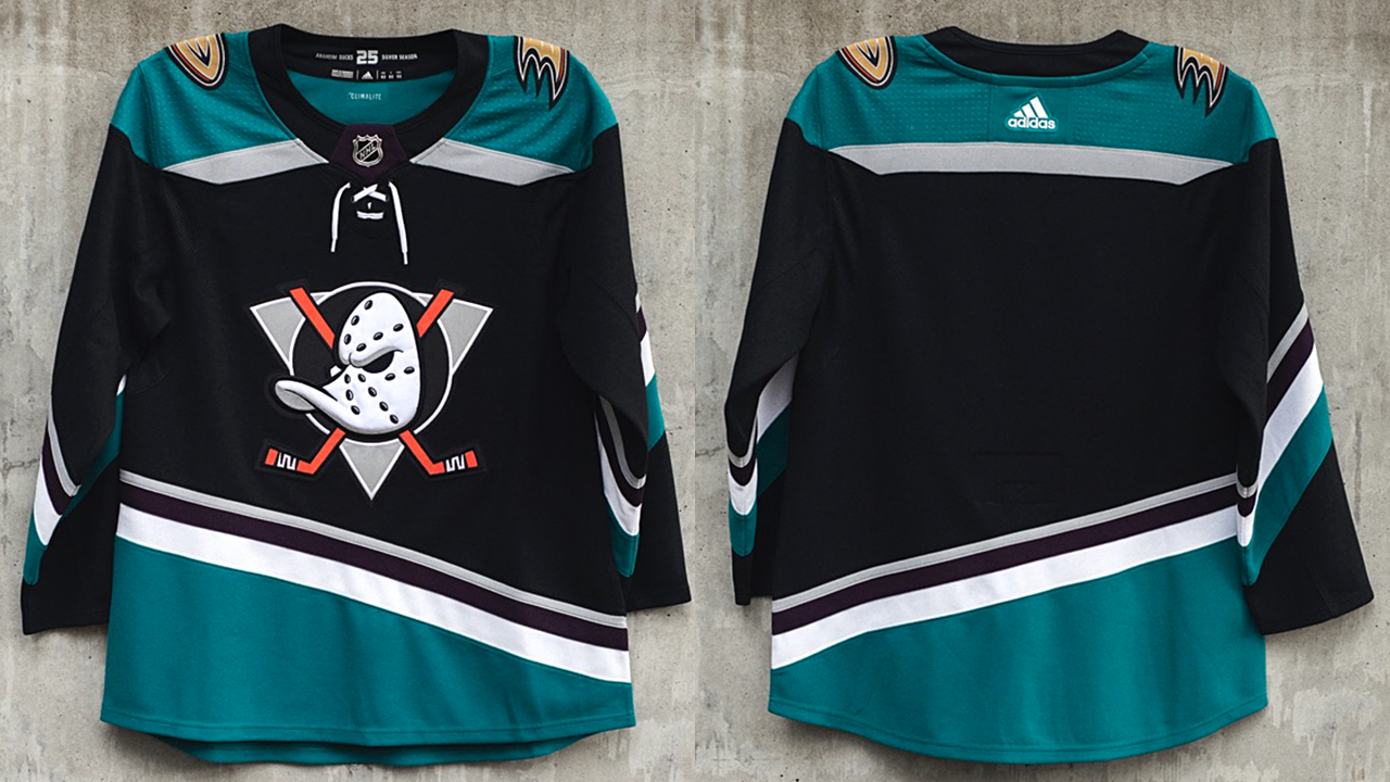
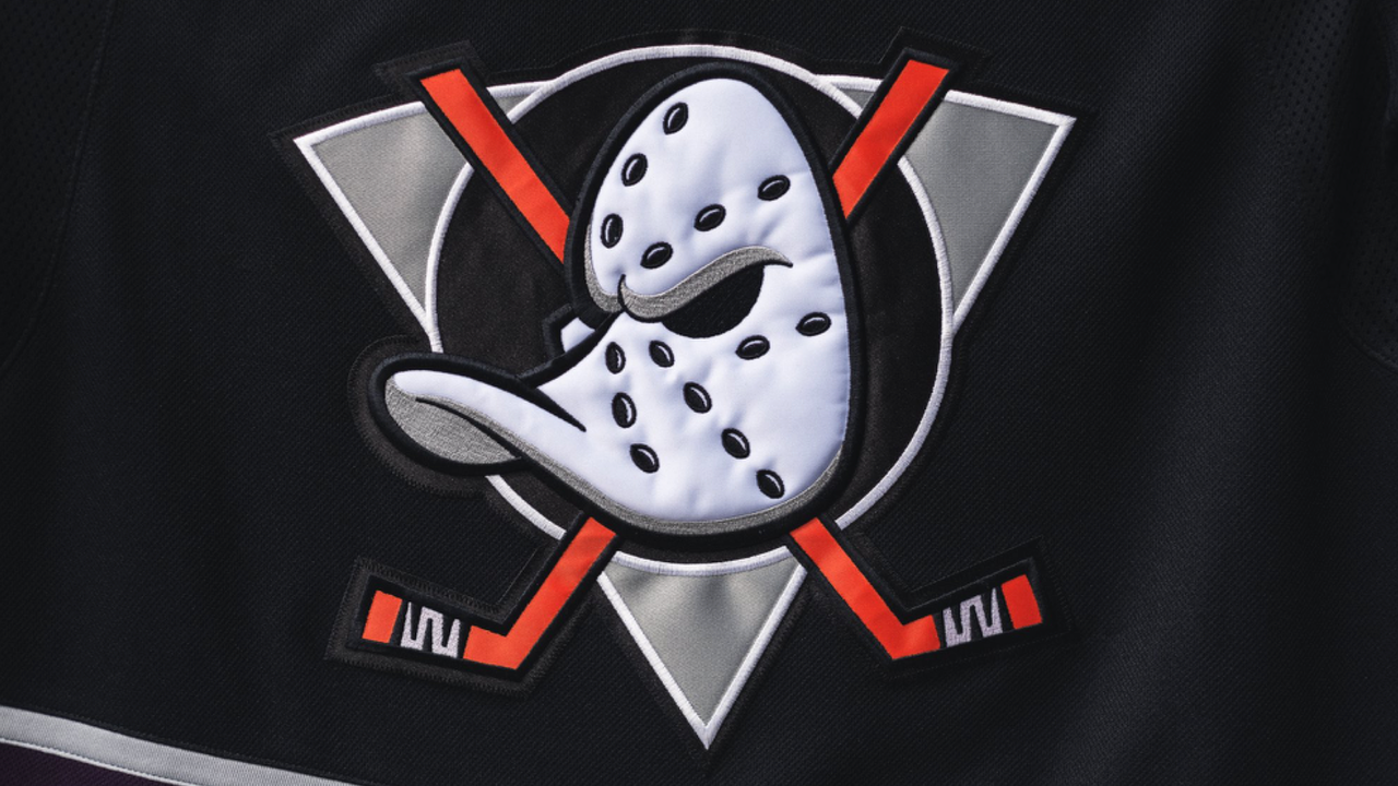
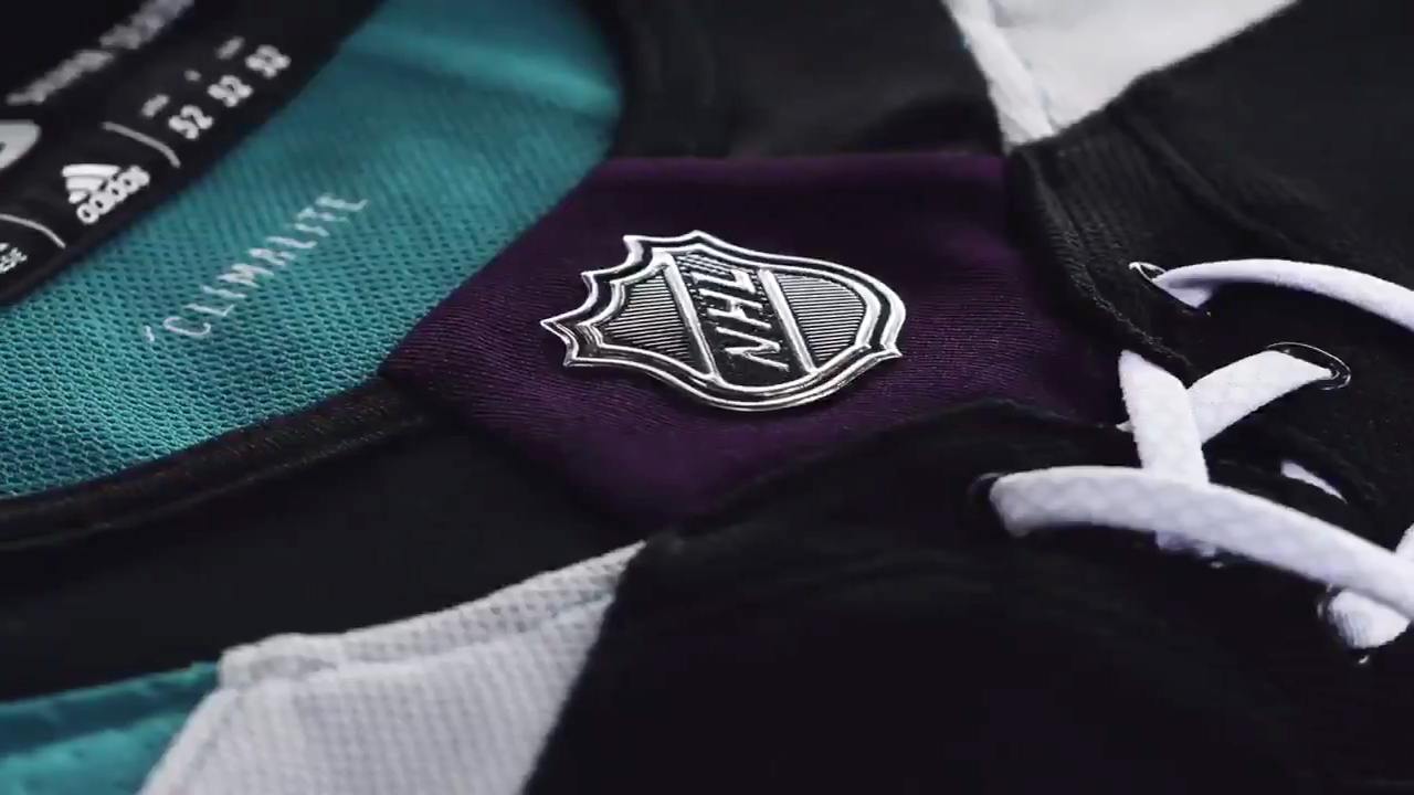
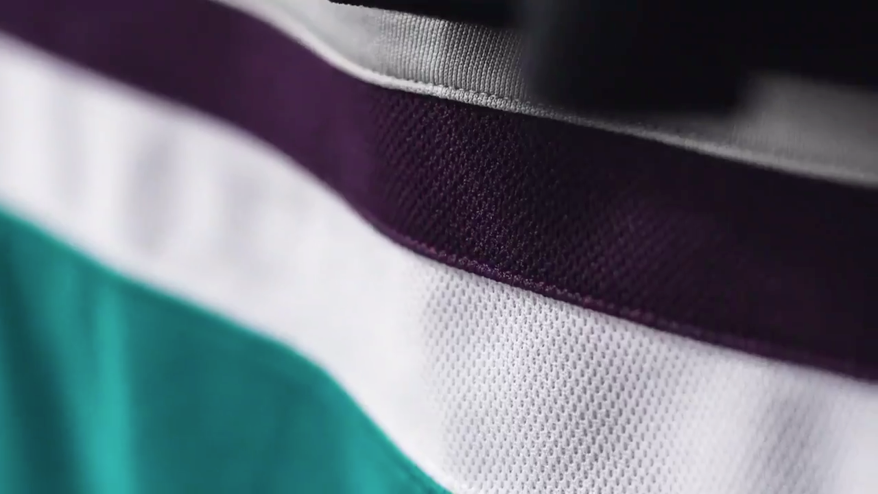
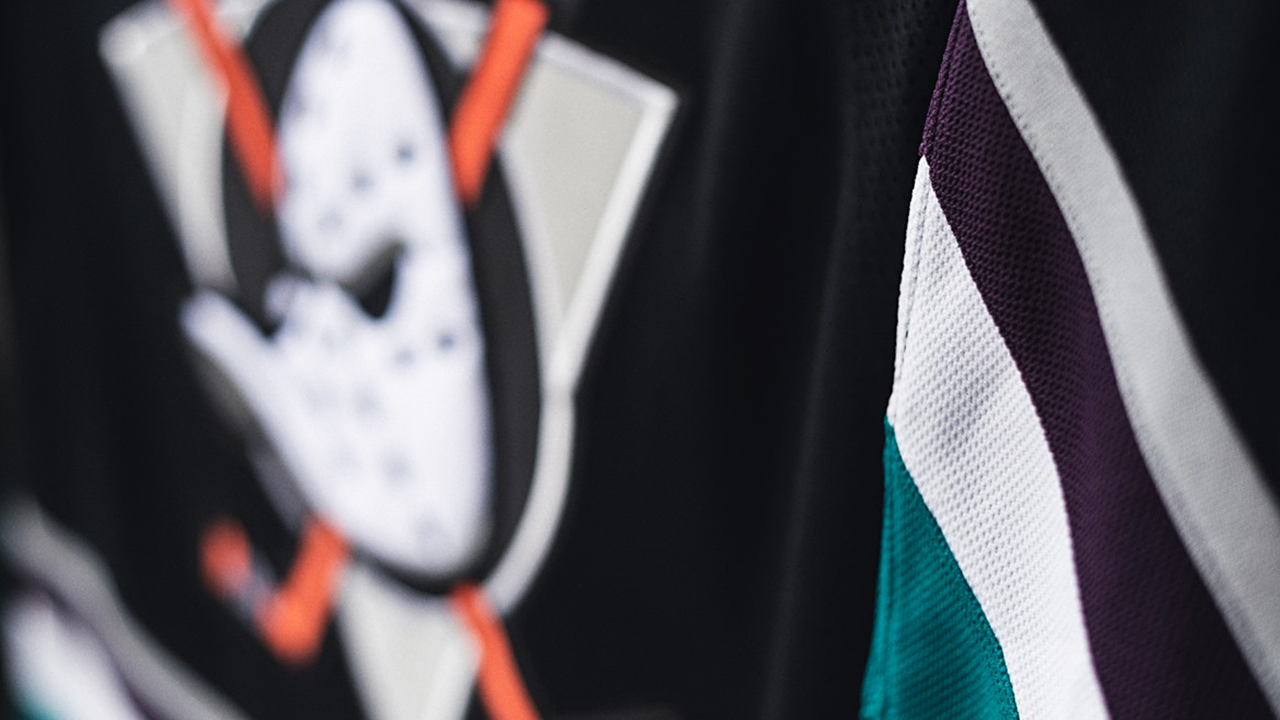
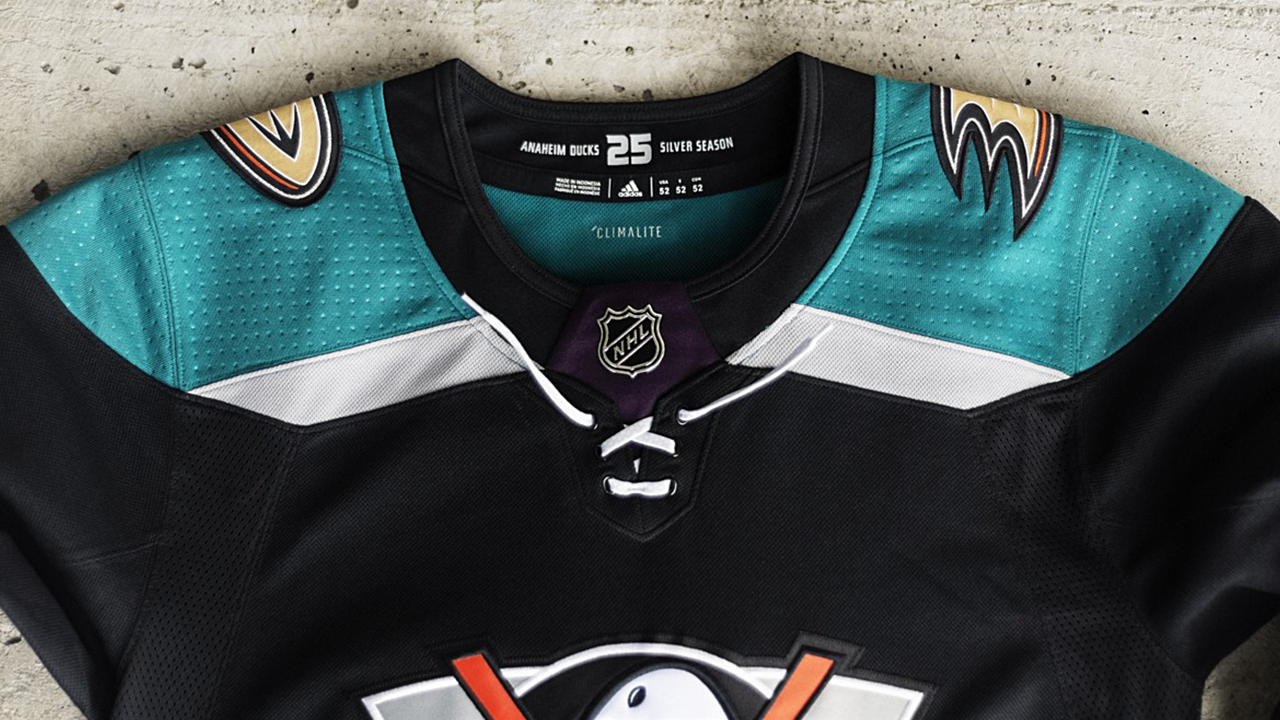
The Anaheim Ducks will bring back a touch of the past next season with their new third jersey, which was unveiled this afternoon at a fan event on Huntington Beach. It's a brand new design with plenty of nods to Mighty Ducks history, including the return of the jade and eggplant color scheme fondly remembered by many fans.
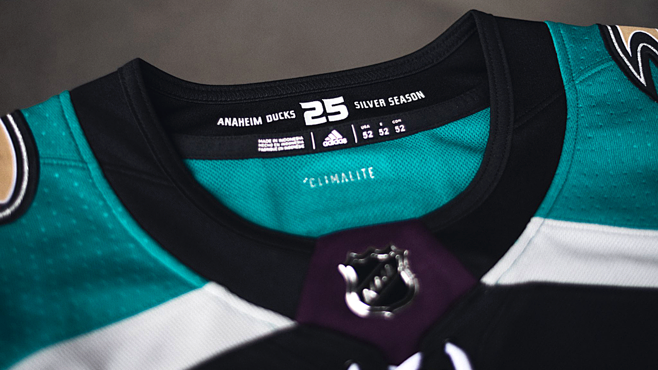
The last time these retro colors were seen on Anaheim ice was when the club marked its 20th anniversary in 2013-14. Now for the 25th — what the Ducks have dubbed their Silver Season — they're back, this time on a new black jersey.
From the Ducks' press release:
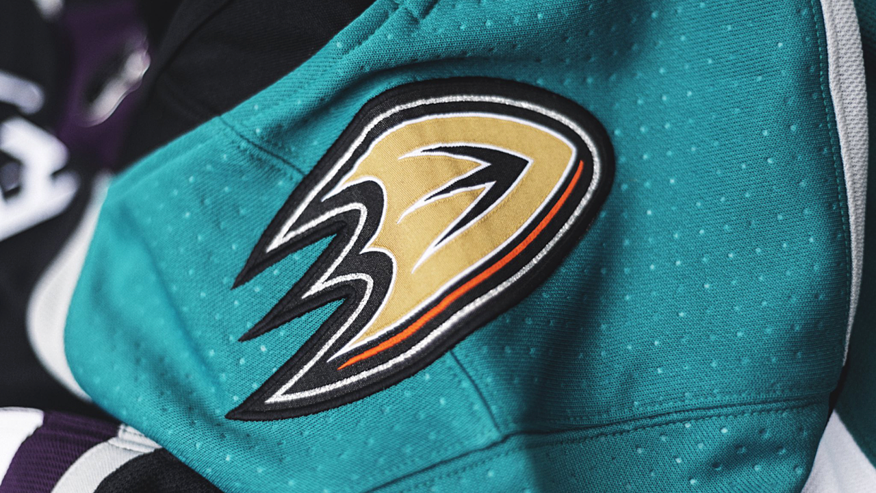
Linking the team's past and present, the jersey incorporates new into old with a touch of the Ducks current orange coloring represented in the crossed hockey sticks of the team's original mark. Anaheim's current jersey number and letter styling is used in the new third sweater, providing a cohesive look to the team's 2018-19 uniform kits.
Take a closer look at the details here.
So far, the instant feedback on Twitter has been a mix if extremes. Fans seem to either absolutely love it or hate it with a passion. Most of the haters seem to simply want an exact copy of the team's original look — like the new Coyotes third.
Personally, I like that the Ducks are showing progression with this design. It's a great look. It's modern yet it's retro without being stuck in the past. The throwback color scheme is great. I love to see it back in their repertoire.
There are a couple of elements I don't appreciate as much. The gold primary logo on the shoulders takes me out of it a bit. I'm sure the gold 25th anniversary patch will be present on the front. Couldn't that have been enough of a through line to the current branding?
And did it have to be black? Eggplant would've been nice.
I mean it. Four third jerseys have been announced in the NHL so far this summer. All of them are black. (And more of what's to come will be black as well. Bet on that.) That part of it feels a little regressive. The Ducks wear black every night. A third jersey should be an opportunity to step outside that box. In defense of the Coyotes, Hurricanes, and Flyers, at least none of them have black primary jerseys like Anaheim.
But that's really all I have to complain about. The return of the Mighty Ducks crest is wonderful. The fact that its colors have been updated for the current era of the franchise is even better.
The only lingering question I have is about this jersey's longevity. Note the hanger effect design in the collar. It specifically calls out the 25th anniversary. Will the Ducks wear this third jersey beyond the 2018-19 season? After all, it's not something you'll ever see on the ice anyway.
Speaking of which, the jersey will make its on-ice debut to open the season in the first of 15 times we'll get to see it in action. Catch it when the Ducks host the Red Wings on Oct. 8.
So what do you think of the new look?