Blaze Become Bloomington Thunder

Central Hockey League forced name change

Back in May we learned the Bloomington Blaze were leaving the Central Hockey League for the Southern Professional Hockey League beginning next season. Seems that may have ruffled some feathers because the CHL's lawyers said the club would have to give up the Blaze name.

For that reason, according to the Pantagraph in Bloomington, Ill., the franchise renamed itself the Bloomington Thunder in late July. The move also helped the team align with the local youth hockey organization, also called the Thunder.

These teams are not to be confused with the Bloomington PrairieThunder which formed in the International Hockey League in 2006 and joined the CHL with the league merger in 2010. A year later, the PrairieThunder dissolved and a new group brough the Blaze to town in 2011.

I'm not sure why the CHL is so tied to the Blaze moniker considering the team only existed for two years. Unless they're just being petty because the team decided to switch leagues. This low-level minor leagues can be interesting. But nonetheless there's another new logo in the hockey world so it gets a place here on the blog.

For now, I'll leave you with a last look at the old Blaze logo.

May Minor League Report

All this work on the IceHL's 13 Weeks of R&R project has kept from doing my real job on Icethetics — updating the blog with actual news. In other words, there's a lot to catch up on.

Hartford Wolf Pack officially return to AHL

Well that didn't take long. After playing parts of three seasons as the Connecticut Whale, the Hartford Wolf Pack identity has made a glorious comeback — thanks to their NHL parent club, the New York Rangers.

The Wolf Pack were established in 1997 when the Binghamton Rangers moved to Hartford. Then in 2010, Howard Baldwin happened. His effort to recapture Hartford Whalers failed miserably with the rebranding of the franchise as the Connecticut Whale.

Connecticut Whale, 2010—2013

We applauded the judicious use of green but not the name or the terrible logo. Within two years, Baldwin was gone — which probably says more about his management style than his taste in sports branding. But we're all grateful nonetheless that the Pack is back.

And not for nothing, but the New York Rangers' AHL affiliate is now operated by the parent company of the Philadelphia Flyers, is it not? Global Spectrum is running things these days and it would seem they have two masters. Interesting.

The Rivermen are dead, long live the Rivermen

Speaking of the AHL, some craziness took place on Monday. The Vancouver Canucks who recently acquired the Peoria Rivermen franchise from the St. Louis Blues, announced the team would not operate out of Illinois next season. They don't know where exactly yet. Just not Peoria.

So it seemed the end of a brand that has existed for nearly 30 years. But the Rivermen are plucky. They won't go quietly. After 12 years in the IHL between 1984 and 1996, the franchise transferred to the ECHL for about a decade. Then in 2005, they got the upgrade to the AHL. In 2013, they move down — way down — to the SPHL, that's the Southern Professional Hockey League. (It exists!)

The SPHL is home to teams like the equally plucky Columbus Cottonmouths and the Pensacola Ice Flyers. And now it's also home to...

Bloomington Blaze switch from CHL to SPHL

The Bloomington Blaze are jumping the sinking ship that is the Central Hockey League for the equally crummy SPHL. A lateral move at best. But one they apparently feel is necessary.

The Blaze were founded just two years ago after the folding of the IHL's Bloomington PrairieThunder. (All these minor leagues you've probably never heard of.) They begin play in their new league this fall.

Now that we're on the CHL, we might as well talk about their newest expansion team.

Brampton gets Beast to replace lost OHL team

Earlier this year when we learned the OHL's Brampton Battalion were moving to North Bay, Ontario, it seemed like the good people of Brampton would be without a team. But that's when the Central Hockey League jumped in, expanding into Canada for the first time.

On April 27, the Brampton Beast were revealed to the world. Along with a very vanilla CHL-like logo. I won't pass judgment too hard since somebody was obviously trying. (I just don't know what they were trying for.) In any case, the Beast begin play in the fall. Like Peoria, hockey fans of Brampton won't miss a beat.

For the record, the North Bay Battlion also begin play in the OHL this fall. They will keep the same logo they had in Brampton.

Attack, Blaze Unveil New Looks

A minor league and a junior league team have unveiled new identities for the 2011-12 season this week.

On Wednesday afternoon, the OHL's Owen Sound Attack held a press conference to show off their updated logo and new uniforms.

The revised primary mark consists of a new text element plus a simplified version of the ferocious bear featured in the logo the Attack had used since 2000. The broken stick and the rest of the creature's hulking body have been discarded leaving us with just the growling head.

They're following the trend we've been seeing throughout hockey branding lately... simplify. They haven't gone out and rebranded from the ground up. They've merely removed the extraneous elements of the existing brand.

Owen Sound Attack unveil new sweaters / AttackEven the jerseys are highly simplified — going for the Blackhawks-style stripes instead of the claw-shaped design that was previously featured.

The release on their website is poorly written, but includes this quote from forward Daniel Zweep:

“A bunch of us saw the new design halfway through last season and we loved it,” said Zweep. “It’s definitely a lot cleaner and more traditional. We can’t wait to throw them on and get back out on that ice.”

All right, something tells me that may not be a direct quote but I digress. For better or worse, traditional is indeed the trend of late.

Is the new logo an improvement? I'd call it more of a lateral move. The old one certainly had that late 90s look about it. This one just looks like any other simplified 90s logo. No better, no worse.

The only thing that bugs me about these jerseys is really a construct of the Reebok Edge template... that silly shoulder piping. If you're going to do the piping, it only makes sense for the shoulder yoke to be a different color. And even then, I'd do away with it.

You can read fan reaction to the new look on the Attack's Facebook page.


In the minors, the Central Hockey League's Bloomington Blaze unveiled their logo and uniforms on Tuesday, just a couple weeks after announcing their existence.

The CHL welcomed the team from Bloomington, Ill. in mid-July as a replacement for the Bloomington PrairieThunder. The Blaze will have the same general manager, coach, arena, and probably players as the PrairieThunder. However, since there's new ownership, I'm not sure the Blaze continues the PrairieThunder lineage. It's a little confusing.

The Pantagraph, a central Illinois newspaper, reported the logo was designed by "Skye Design Studios in New England." And while a Google search turns up a variety of companies (and individuals) under that name, none seem to be based in New England. I'd be curious to see what other work they've done.

The black burning "B" is not a bad logo. Bold and simple; and it manages to avoid looking like the Calgary Flames for the most part. I kind of like it. But here's where things get interesting. The jerseys...

CHL Bloomington Blaze jerseys / BlazeThis week we got our first look at the Ottawa Senators' new Heritage Jersey. We could finally put the crazy-striped third jersey out of our minds. And then the Blaze came along.

Indeed, that is the "SENS" jersey template you see there (right) with the new Blaze logo plastered on the front. That sweater will not die. I suppose the good news here is that we get to see what it would look like in white.

Guess it's time for a confession. I never really hated the Sens' third jersey. I just hated that it said "SENS" on the front instead of bearing, you know, an actual logo. It may be a little odd-looking, but you can't deny this is a killer jersey. And honestly, it seems to work with the Blaze logo.

So all in all, I don't truly have anything bad to say about the Blaze's identity. All I will say to their marketing people is this: Get your website up already! (Not that it matters anymore. The logo and jerseys have been documented now.)

If you're so inclined, you can find commentary on their logo and uniforms from fans on their Facebook page — their only online existence at the moment.

Between the Senators, Attack and Blaze, that's a lot of red and black this week. But there's going to be more. The Sens are holding a press conference to announce 20th anniversary details on Thursday afternoon. Maybe we'll get to see the new jersey in color? Or perhaps in a photograph? Stay tuned to Icethetics.

Loose Threads: Leafs, Jets and the CHL

It's been a busy week on the blog. We've seen a new logo, two jersey unveilings, and oodles of new sweater numbers for recently relocated NHLers! And there's still more to talk about. I've collected a few items for you in a new edition of Loose Threads.

Berger Talks New Leafs Third Jersey

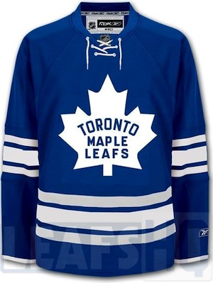
Maple Leafs concept by Jeff Veilette / LeafsHQThe Toronto Maple Leafs will get a new third jersey next season and that's become a hot topic again.

It's been reported in each edition of NHL JerseyWatch 2011 that the Leafs will replace their current white alternate sweater with a new one. But like the old one, it will borrow from the club's past.

Howard Berger, who covered the Leafs for FAN 590 in Toronto until last month, wrote about it Thursday on his new blog, Berger Bytes. (Hm, clever.) He said it "will look very much like the jersey the club wore at Maple Leaf Gardens on May 2, 1967 — the night it last hoisted the Stanley Cup."

In other words, like this concept (right) created by Jeff Veilette of LeafsHQ in April 2010. You'll notice the distinct watermark. However, despite this, I've been getting tweets and emails telling me Berger leaked the new Leafs sweater. He hasn't.

Don't get me wrong, I fully trust that this design or something similar will basically be what the new third jersey looks like, but don't be confused in thinking that this is an actual photograph of it. It isn't.

For a little background, Berger was a helpful in providing early details of the first Reebok Edge third jersey designs back in 2008. While some of his descriptions were slightly inaccurate — which can be attributed to the low quality images he was describing — he was mostly on the money.

Personally, I was hoping the Leafs would go with the 1970s/1980s look for the new third and, admittedly, my reporting was slanted because of that. But most of the trustworthy rumors I've read have said this 1967 design will be the one. Not that that's a bad thing. We get to bring an old logo back from the dead.

Jets Prepare to Unveil New Logo

It's a sentiment I share with many hockey bloggers, but it feels so strange talking about the Winnipeg Jets in the present tense again. Strange indeed, but also true.

On Thursday, Canada's National Post reported that the Jets were close to completing their new brand and nearing the point of releasing it to the eager public. You can read the article for yourself, but if you just want the bullet points, here you go:

  • Final tweaks are being made to the logo and jersey designs.
  • The new Jets logo will look "dramatically different" from the old one.
  • Anyone who prints anything NHL-related is breathing down True North's neck to finally release a logo. (This includes Upper Deck, who can't print trading cards yet.)
  • The new Jets jerseys will be ready by the time Canucks' rookie camp starts on Sept. 11. (Probably with an unveiling a week or so before that.)

So, here's my read of the situation. We'll be lucky to see the logo by the end of July. It's possible, but knowing the way the design process tends to go, it'll be a couple more weeks yet. They don't want to rush and make a mistake with so many eyes watching. I expect we'll see the new Jets logo in early August.

As far as the jerseys, I'm anticipating late August to early September for the unveiling. This is a little trickier than the logo. Most fans are impatient and don't understand what goes on behind the scenes in a situation like this. With so many fans desperate to get their hands on a jersey, a leak would be disastrous at this point. Why? It boils down to knockoffs.

They need jerseys to sell to fans the minute the design goes public. Otherwise, they risk counterfeiters being able to throw together their cheap crap faster than Reebok can manufacture the real thing. The bottom line is they don't want someone else stealing their money. Would you?

If you don't see this as a problem, you may lack critical thinking and reasoning abilities. (Sarcasm, folks.) Just accept it and try to have a little patience. The logos and jerseys will all be out soon enough. It's like Christmas Eve right now. Why not enjoy the anticipation of it all a little bit longer?

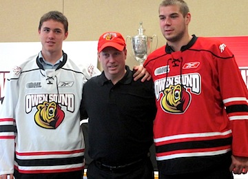
Blazing a path to the CHL

The Central Hockey League has welcomed the Bloomington Blaze as its newest franchise for the 2011-12 season. This team is not be confused with the now-defunct Bloomington PrairieThunder, who played in the CHL last season after the International Hockey League merged with it a year ago.

Basically, the PrairieThunder folded after last season and the Blaze are a new franchise with new ownership — though they just hired the same coach. The team has not yet unveiled a logo and doesn't even have a website I can direct you to. I'll try to keep an eye on it, but it is the CHL.

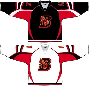
Speaking of the CHL, the Rio Grande Valley Killer Bees — the only hockey team I know with five words in its name — have unveiled a new logo. And by new, I really just mean simplified. I'll leave you with a before-and-after image as I wrap up today's post.

Rio Grande Valley Killer Bees unveil new logo