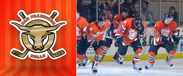
RIP: San Francisco Bulls (2012—2014)

Sophomore ECHL club shuts down midseason

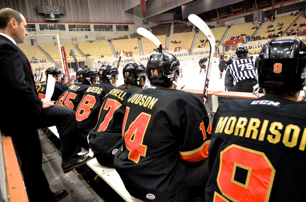
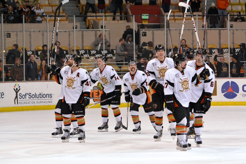
Maybe the Bay Area can only support one pro hockey team at a time. The San Francisco Bulls — ECHL affiliate of the San Jose Sharks — ceased operations on Monday after only a season and a half in action.

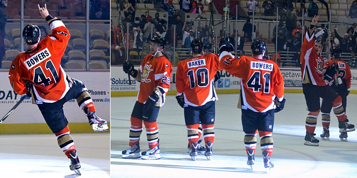
Flip through the photo slideshow above and it's not difficult to figure out why. All those empty seats aren't good for business. Unfortunately, the club was unable to secure new ownership and that necessitated the shutdown.

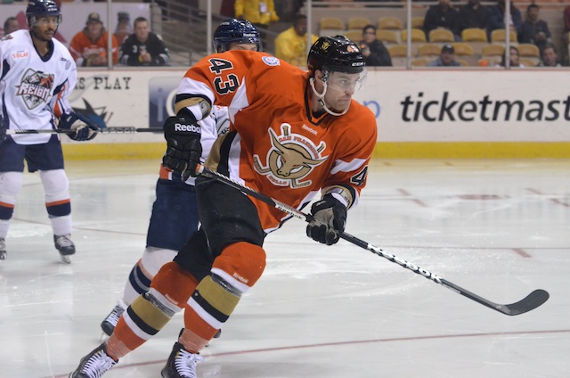
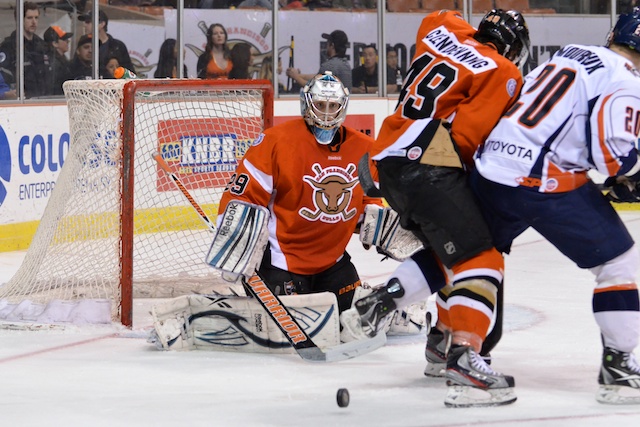
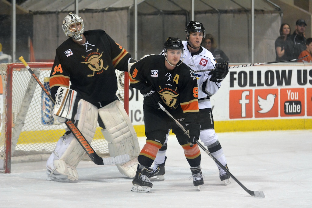
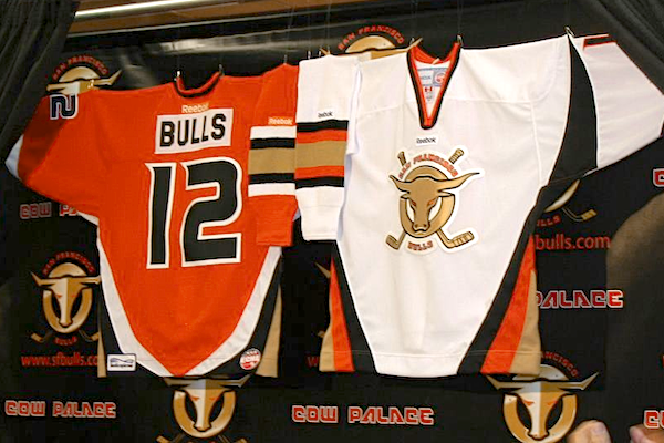
During their brief existence, the Bulls brought us one of the most wretched logos in minor league hockey. That abomination was filled with crazy gradients — except, of course, when it had to be embroidered on the front of a sweater. So I can't say I'll miss this team all that much.

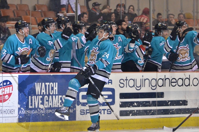
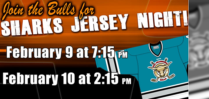
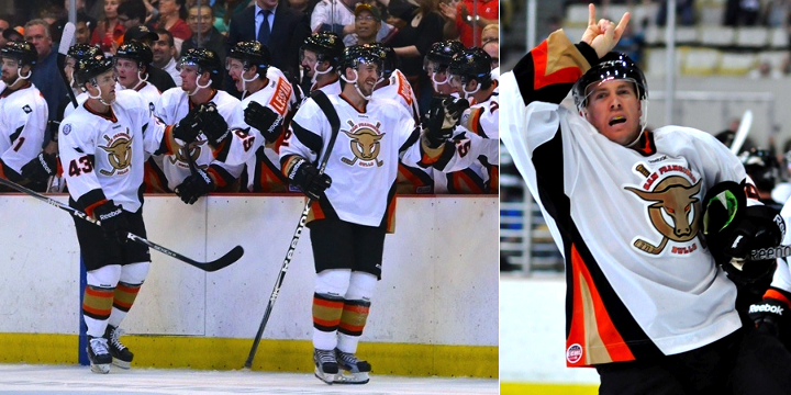
There is one thing they got right, though. Last season, the Bulls skated in San Jose Sharks throwback jerseys. A lot of us miss those so it was nice to see them in action one more time. Although they did their best to wreck it with those gradients in the crest.

S.F. Bulls Plan Sharks Homage

San Francisco Bulls to sport old San Jose sweaters

For all you lovers of the original Pacific Teal, the ECHL's San Francisco Bulls are about to make your weekend. The classic San Jose Sharks sweater returns to the Cow Palace ice after 20 years this Saturday night and Sunday afternoon. 

The Bulls, who are affiliated with the Sharks, will be wearing their parent club's very first teal jersey — only without the awesome shark on the front. In their press release, the Bulls point out that this will be their first time wearing something other than their orange and white jerseys.

If you can get over the ugly crest, the jerseys will be auctioned off during this weekend's games. The Bulls host the Bakersfield Condors for both games on Sat., Feb. 9 and Sun., Feb. 10. I'll be sure to keep an eye out for photos to share.

San Francisco Gets the Horns

Photo from San Francisco Bulls official website

The San Francisco Bulls made their ECHL debut over the weekend, giving us our first opportunity to see the team in action. And if you were paying attention when the club unveiled its uniforms last March, you'll notice a few differences.

Photos from San Francisco Bulls (Facebook)

Mainly, the name and numbers on the back of the jerseys have been changed. But apparently, that was the plan all along. When it was pointed out via Twitter (by @Puckguy14) that the numbers looked a lot like those of the MLB's San Francisco Giants, a response came from the guys who actually do the jersey customizations for the Bulls, Junkyard Athletic.

They also added that that was the team's plan from the beginning. (I think someone has an unhealthy attachment to the Giants. What happened to building your own identity?)

You may also note that conspicuously absent from these jerseys is any sign of a shoulder patch designed by one of our talented Icethetics artists. A week before the Bulls unveiled their jerseys, they said they'd be interested in looking at secondary logo proposals from our designers.

Well, they were interested in a couple but after a communication breakdown, the whole idea went nowhere. So instead, the jerseys feature the ECHL's 25th anniversary patch on the right shoulder and another smaller patch on the left that I haven't been able to make out. (Looks like it says BAT or something.) Can't tell if it's a sponsor or some kind of memorial patch.

Photos from San Francisco Bulls official website

I can't say I'm impressed with the uniforms and I still hate the logo, but I do like how Justin Bowers and his teemmates keep giving the horns to Bulls fans at the Cow Palace.

Does seeing the Bulls' uniforms in action change your view on them? Love 'em? Hate 'em? The comments await.

San Francisco Bulls Unveil Jerseys

ECHL expansion team San Francisco Bulls unveil uniforms

The ECHL's San Francisco Bulls won't hit the ice for the first time until later this year, but today they unveiled their new uniforms. And somewhat disappointingly, they're an odd amalgam of NHL sweaters.

The jersey itself is essentially the template based on what the Buffalo Sabres wore between 1996 and 2006 — otherwise known as The Goathead Years. I'm assuming they were chosen strictly for the bull horn style stripes on the sleeves. Not a bad call, but not all that original either. (Not that that's necessarily a bad thing.)

The colors being identical to those of the Anaheim Ducks, the Bulls have also borrowed the Ducks' number font. And the nameplate is straight off a Philadelphia Flyers jersey. And if I'm not mistaken, exact same font as well. The socks also look a lot like the Sabres' from the late '90s.

So it's not the most original uniform we've ever seen, but you'll notice the shoulders are bare. Last week, I mentioned that the Bulls agreed to look at some logo designs by Icethetics artists to use as a shoulder patch. Some awesome designs have been submitted and I can't wait to post some of them. And who knows, maybe one of them will be seen on this uniform by the time the team hits the ice.

You might also notice from the above photo that the logo on the jersey doesn't quite match what's on the backdrop. The Bulls went through some brand licensing issues this winter which pigeon-holed them into keeping the original logo that was being used for marketing purposes — or at least something very similar. The logo on the jersey is the newer one.

You can read more about the jerseys on the team's official website.  Feel free to sound off on the San Francisco Bulls uniforms in the comments.

Bay Area's ECHL Club Preps Unveiling

A big announcement is scheduled in San Francisco for Wed., March 7. No, I'm not talking about the iPad 3. It's the jersey unveiling for the ECHL's newest expansion franchice — the San Francisco Bulls.

The Bulls' new logo (left) was recently leaked on the team's Facebook page after a fan found it on the designer's online portfolio. Last September, we got our first glimpse at the original Bulls logo — which was downright awful.

The new logo is only a slight upgrade, but it's my understanding the team ran into some issues with the league over changing the design too drastically from that original mark. That's a shame, but it's not all bad news — especially if you're among the more creatively inclined.

For logo designers: I've been in contact with the San Francisco Bulls and I'm told they're willing to look at proposals from Icethetics artists for a secondary logo. Any artist whose work is used will, of course, be compensated. So here's what they're looking for:

  • The Bulls "want to do something featuring an intertwined 'SF' akin to the 49ers and Giants for [their] shoulder patch." It goes without saying, but they need something original so don't copy either of those teams' logos.
  • Also, the team owner is fond of the Golden Gate Bridge, particularly as viewed when one is driving across it. You can get an idea from this logo.

If you have a logo design, you'd like to submit, email it to me by clicking the red Gmail icon at the top of the page (beneath the Icethetics logo). I'll forward them on to the team and I'll post the good ones on the Concepts page. 

At this point, no deadline has been set. It's kind of open-ended, but you're probably wise to shoot for the end of the month at the latest. Good luck!