Flyers vs Senators


vs
FLYERS
SENATORS
4-4
3-2

The Aesthetics
It's funny. I never noticed the similarities between these two logos until just now. Both have wing-like elements on the left side and semi-circles on the right. Anyway, the Flyers logo has the same problem as the Sharks in the West. Too much black and not enough of the primary color. Find a way to make this logo more orange and then we'll talk. Until then, despite being a little heavy-handed with the detailing, the Senators logo is so much cooler looking.
Senators

The Nickname
Within the government, the Senator holds a lot of power over what laws should be passed to, say, protect endangered species, some of which may Fly. I know, a stretch, but you come up with something better. Seriously, comment away if you feel like it.
Senators

The Analysis
I'm not entirely sure what a Flyer is meant to be — perhaps a generic bird of some sort — but this competition is about logos, not team names. And when you say Philadelphia Flyers it's difficult for me to picture anything but the winged "P." So I'd say they got it right. I'm just not as happy with the Senators logo. I've heard rumblings that the Sens will go full-time with what is currently the third jersey logo. It's light years ahead of this one and I'd love to see them do it. Maybe then they can have this particular point.
Flyers


WINNER
2-1


New Lightning Logo Coming!

Well, we'll just have to see if it's new. According to St. Petersburg Times Lightning beat writer Damian Cristodero mentioned the other day in the paper that the Bolts will be unveiling a "modernization" of the logo "some time this summer." No word yet on when, but I'm pretty excited.
I understand there won't be sweeping changes. Minor upgrades is what "modernization" sounds like to me. And that's fine. Just make them count. I'll have the updates here.

Flyers Rbk EDGE Jerseys Up For Pre-Order


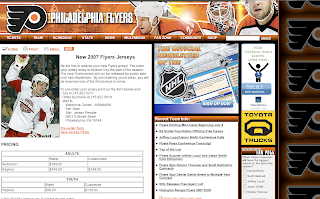
Grabbed this from the Philadelphia Flyers' official web site. They're taking orders for the team's new Rbk EDGE jerseys. The jerseys will be unveiled on September 16. So if you're a Philly fan, go ahead and get your $200 order in for a product you've never seen — and won't get to until the day it arrives at your door. I'm assuming there won't be any glaring changes to the uniforms since they're taking orders prior to the unveiling.

Either that or it's a really ugly design and they'll be taking in a lot of suckers.

Maple Leafs vs Rangers


vs
MAPLE LEAFS
RANGERS
0-6
2-6

The Aesthetics
Don't we just love those Original Six matches? We have a combined total of 31 letters embedded in these two logos. How much worse can it get? There's no reason to spell out your team name all over a logo that is supposed to serve as a symbolic replacement for said name. I like the use of multiple colors in the Rangers logo but it's the unique maple leaf silhouette that at least gives us some graphical representation of the team name. They'll take the point.
Maple Leafs

The Nickname
If we're sticking with the whole park ranger interpretation — which is lame, I know — then its the Ranger who is in charge of protecting the Maple trees and their Leafs.
Rangers

The Analysis
Neither logo makes a real effort at city recognition but each has been in those cities for nearly a century. It's not that I hate old logos or those which have been around for many years. That's a big part of what hockey is today. These two logos are some of the most recognizable in all of sports. But that doesn't mean that graphically we still have to live in the early 20th century. Make a few upgrades to show us that these teams exist in 2007. A good example is the Bruins. Ward off staleness, folks. Now when it comes down to it, the Leafs logo takes this point for unique lettering and a very cool maple leaf outline. (Shut up! Did the Maple Leafs really just get a win?)
Maple Leafs


WINNER
2-1


Ducks vs Stars


vs
DUCKS
STARS
0-4
1-2

The Aesthetics
Yikes! The similarities here are rather glaring and not at all good. Both logos spell out the entire team name and use a single letter to create what would otherwise be a decent logo. The "D" in Ducks creates a webbed foot. The "A" in Stars creates the top point in a star. It's actually almost impressive. And then there's the unique colors. But in this case, it's the horrible horizontal proportions of the Ducks logo that loses it this point.
Stars

The Nickname
Giant. Flaming. Ball of fire. Nothing stands a chance against a Star, especially not a little quacking Duck.
Stars

The Analysis
Because both logos are guilty of it, we're going to have to look past all the letters in these two logos. Now, despite being introduced in the last season of the Minnesota North Stars' tenure, the Stars logo has a rather Lonestar State feel to it — perfect for Dallas. The Ducks are in the process of rebranding the team, not too difficult a task now that the club has a Stanley Cup championship under its belt. Still, if it's going to succeed in this competition, a better logo will be required. The Ducks get swept once again.
Stars


WINNER
3-0