Coyotes vs Sharks


vs
COYOTES
SHARKS
3-3
5-6

The Aesthetics
I continue to be disappointed by the lack of color in the Sharks logo and eagerly await tomorrow's unveiling of a new logo. The Coyotes logo at times looks awkward to me, but I certainly feel the action while looking at it. You can almost hear it howling.
Coyotes

The Nickname
This is one of those situations where I don't know why a Coyote and a Shark would ever come face-to-face, but my money is on the Sharks for sheer power.
Sharks

The Analysis
My first question is always, does the logo match the team name? Here, we do in fact see a coyote and a shark. Next I look at home town representation. Here, there's nothing obvious but the team names are good indications. An Arizona team named for a desert animal. And a California coastal team named for an underwater predator. Now I'm looking at features like the broken hockey stick in the shark's mouth. It's unnecessary. We should already know the logo belongs to a hockey team. This point goes to the Coyotes.
Coyotes


WINNER
2-1


No Big Changes In Store For Avs

Any Avs fans looking for jersey info? A reader just pointed me the way of this post which seems to indicate we shouldn't expect any big changes for the Colorado Avalanche when they unveil their new Rbk EDGE uniforms. A retailer called Altitude Authentics put the following in an email.

The Avs jersey will not be drastically different, same logos and looks. The main difference will be the material of the jersey. We will have these in stock sometime in mid September.


As with anything, take it how you will. Of course we haven't gotten any word from the team yet, so all we know is what retailers say they've heard.

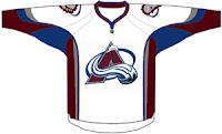
As it happens, I also recently came across a fan-made design to share with you. But don't expect to see anything in this vein if the quote there proves to be true. This looks nothing like what they currently wear and more like (as a few readers might point out) the 2007 all-star jersey with some colors swapped out. Take it for what it is.

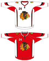
While we're on the topic, I also ran across this design for the Chicago Blackhawks. Once again its the all-star uniform template with some colors and logos changed. But if nothing else, it's something to stare at for a spell while we await official announcements league-wide.

Briefly I'd like to once again extend my thanks to the readers who have been sending in information. It's been extremely helpful and the more I know, the more I can post. So if you've seen any cool (or uncool as the case may be) designs, feel free to send them my way. I'd love to see them.

Canucks Fans, Prepare Yourselves

A link to this blog was recently posted on the Vancouver Canucks' message board. Most of you over there seem to like the site. A handful of you are skeptical as to where I procure my information, specifically the bit about the August 1 unveiling date for your team. I don't blame you.

First, I should tell you I was hesitant about putting that date in the countdown. It comes from a retailer who spoke in an article printed in the Vancouver Sun. Consult this post for further details on that. Second, all of the information I post here is secondhand. I don't intend to pass myself off as an authority on the subject, merely an information-gathering resource. I surf the web and find a lot of nonsense and I try to parse it for factuality. Obviously things will slip through the cracks but then take from this what you want.

In the meantime, everything I post I try to explain. Whether it's artwork designed by a fan or rumors or an official announcement from a team, you can trust me when I tell you I'm not going to make anything up out of thin air. What would be the point? Still, take everything I post here with a grain of salt. As I keep saying, until teams make official announcements, all we have is speculation.

Now then, as a thank-you to whoever noticed the site and decided it was worth mentioning, I have a treat for you. Well, actually that depends on how you respond to this little gem.
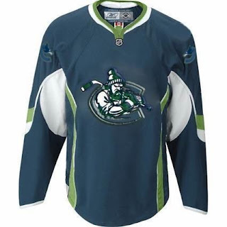
Now, don't be fooled, Canucks fans. What you're looking at will only make its way onto the ice they day you ride a unicorn to games. But I thought it was an interesting design, with colors we haven't seen before. I came across it on the Miami Herald's Florida Panthers blog while looking up information I posted earlier today.

It's like a tougher version of Johnny Canuck inside the orca "C." The designer also placed the current orca logo on the shoulders (backwards on one side for some reason).

Once again, don't freak out. It's not something that's been leaked by the team (or I'd hope not). It's obviously artwork designed by a fan and clearly not the work of a graphics professional (no offense to the person who came up with the idea). Having said that, what do you think of it? Would you like to see something similar on jerseys for the fall?

Bruins vs Islanders


vs
BRUINS
ISLANDERS
4-2
1-9

The Aesthetics
There certainly are a lot of circles before us today. And within said circles are letters. Were I to go about this arbitrarily, I'd say the logo with the fewest letters contained within the circle should get this point. But to be arbitrary is wrong. The Bruins logo gets it because the Islanders logo features more than a few of my aesthetic pet peeves, such as a hockey stick, puck and the team name written out.
Bruins

The Nickname
Islanders and Bruins are both known for doing in fish, but one-on-one, I think the larger bear has the upper hand.
Bruins

The Analysis
Often I've awarded this point to the Islanders for the outline of Long Island found in orange in the background of the logo. That'll continue today as what annoys me about the Bruins logo is its lack of an actual bruin. The scary bear on the new shoulder patches would work, but that's not in competition here.
Islanders


WINNER
2-1


Coyotes vs Red Wings


vs
COYOTES
RED WINGS
3-2
3-7

The Aesthetics
Visually, I'm more a fan of the Coyotes logo mainly because of its color usage. The red and white of the Red Wings logo often seems flat to me. Beyond that, it could use an upgrade.
Coyotes

The Nickname
A Red-Winged bird (or a bird of any sort) would be wise to keep itself airborne when in danger to avoid the clutches of a predator like the Coyote.
Red Wings

The Analysis
The wheel attached to the wing in the Red Wings logo has often won this point for that team. And it should be no different here as the Coyotes logo doesn't really make any reference to its home city. The desert colors and feel are nice, but what's to stop anyone from assuming New Mexico or even Las Vegas as the team's locale?
Red Wings


WINNER
2-1