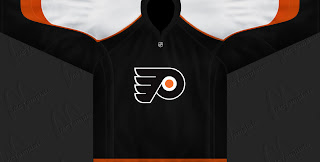
Possible Flyers Jersey Design?

Just yesterday I posted what appears to be the new Rbk EDGE home jersey of the Philadelphia Flyers. It was seen in the background of a video interview with Simon Gagne. Problem was, it was hard to see being in the shadows. So apparently a kind fan took the time to create a rendering of what they entire jersey might look like (from the front) to share with the world.

Nothing wrong with that design, though this image does have a couple of other issues I thought I should point out. For one thing, the cut is in the old style of NHL jerseys and not the Reebok style. Second, the crest is rather small. But again, take it for what its worth. It's one fan's rendering of the jersey we saw in the shadows yesterday. It's more than you or I have done.

Hurricanes vs Maple Leafs


vs
HURRICANES
MAPLE LEAFS
9-1
1-10

The Aesthetics
I know I continue to disappoint Maple Leafs fans for my lack of love for their logo, but I like pictures. The symbol on a jersey should be just that — a symbol. And while I think the leaf by itself is a little too boring to be its own logo, there's plenty that can be done to improve it. Or at least that's what I'm telling people. The Hurricanes logo is a cool one — a symbol for a jersey.
Hurricanes

The Nickname
This one pretty much writes itself. The winds of a Hurricane would blow all the Maple Leafs away.
Hurricanes

The Analysis
Now my distaste for the spelled out name on the maple leaf doesn't extend to this category. The reason I think it deserves this point over the Hurricanes is that the 'Canes logo lacks a good representation of the Carolinas, while the leaf is the very symbol of Canada itself and you can't really beat that.
Maple Leafs


WINNER
2-1


Stars vs Wild


vs
STARS
WILD
5-4
10-0

The Aesthetics
These two logos seem to share a few colors. It makes the red in the Wild logo really stand out. But as far as who takes the point in this category, I think you already know who I'm going to pick. I really do think there are was of improving the Stars logo if you remove all the lettering from it. I like the star itself, though I admit it would look a little bare on its own. I've heard tale of a new Stars logo to be unveiled this summer. So we'll wait and see what happens.
Wild

The Nickname
What seems to keep working for the Stars is the fact that one is a giant ball of fire that you couldn't possibly imagine up close. Even the Wild would be consumed by its ferocity.
Stars

The Analysis
Now this one is harder for me, because it could almost go either way. The big "lone star" has Texas written all over it (I say that despite Dallas actually being written right there). The Wild logo continues to amaze me with all of its ingeniously combined elements. I wanted to give the Stars logo this point, but I can't in good conscience take it away from a logo this good. It's even got the "north star" as a tribute to Minnesota's hockey history. It was a close one, though.
Wild


WINNER
2-1


Lightning vs Canadiens


vs
LIGHTNING
CANADIENS
5-5
7-3

The Aesthetics
Man, I'm starting to get too predictable. If it's got words, count it out. But wait! Do I have a surprise for you! You see, the Canadiens logo is all letters — a "C" and an "H" — while the Lightning logo may have the team name, it actually has a graphic symbol of a lightning bolt. Try to resist the temptation of calling me biased. My team's logo sucks and is performing as such in this tournament.
Lightning

The Nickname
Imagine being a Canadien walking down the street only to then be struck by Lightning. That would hurt.
Lightning

The Analysis
I've been getting conflicting reports from visitors to the blog over whether the "H" in the Canadiens logo stands for "hockey" or "Habs" — as in Les Habitants. Unfortunately for me, neither visitor has identified himself as a sports or hockey historian leaving me with no real answers. (One even asked to get my facts straight at Wikipedia of all places.) Regardless, I think the "H" is cool. I think it's cool that it could stand for either one of those things — or both. There's nothing that cool about the Lightning logo. No sweep.
Canadiens


WINNER
2-1


Ducks vs Flames


vs
DUCKS
FLAMES
1-10
8-1

The Aesthetics
Is it wrong of me to keep hating on the Ducks logo? I like the colors but the wordmark just rubs me the wrong way as far as crests go. Meanwhile, the flaming "C" continues to impress... me. Let's clean things up on the Ducks side and make the duck foot the primary and lose the rest of the letters. Then maybe they'll have a real shot in this competition.
Flames

The Nickname
What do you get when you cross a Duck and a Flame? Dinner. (You knew I was going there.)
Flames

The Analysis
For many teams, I understand it's a difficult task to find some way to represent the home city visually in a way that would be universally recognizable. Anaheim and Calgary are two such cities I would lump in that category. So instead, I'm looking at the basics. Do we see ducks and do we see flames? In fact, I do see flames attached to a "C" meant to do its best job of representing both Calgary and even Canada. As far as ducks, all I see is a footprint, meaning that duck was there. Or it's just a duck foot indicating to me what was left after the stew was made.
Flames


WINNER
3-0