Wild vs Avalanche


vs
WILD
AVALANCHE
11-0
9-1

The Aesthetics
I've been dreading this match. How do you decide between two of the league's best logos? And while not everyone will agree with me, for now I'm the one having to decide. I'm going to go with the Avalanche logo but I can't really explain why. Just accept it.
Avalanche

The Nickname
If we assume the Wild is a forest and all the life that's part of it, then an Avalanche has the upper hand. The falling snow would completely take out everything.
Avalanche

The Analysis
This is where the Wild can truly earn a point. It's impossible to look at that logo and not see something different every time. You've got so many different things going on that it makes for a logo that's always interesting to look at — not to say that the Avalanche logo doesn't, but you can't expect to sweep a logo that looks that cool.
Wild


WINNER
2-1


Rangers Unveil New Uniforms!

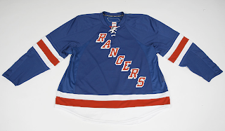
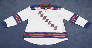
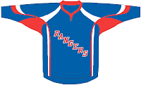
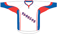
There was no fanfare or big unveiling ceremony, but the New York Rangers now officially have their Rbk EDGE uniforms. They are up for pre-order on the Rangers' official web site along with photos!


As you can see, the jersey designs were not changed, merely adapted to the new cut. So that's that. Hope you Rangers fans like them. Now those among you annoyed with my posting of frivolous matter such as jersey designs in the template of the all-star uniforms can finally rest.

By the way, HUGE thanks to a reader for letting me know about this! You guys are great!

UPDATE (5:20 PM): I've just been informed the Rangers have since taken these photos off of their official web site. Like the Flyers they now only have a page up where you can pre-order the jerseys — without being able to see them. Luckily for us, we've already seen them and there were really no changes made. So if you have friends who are Rangers fans who would like to buy a jersey, let them know that if they want to see pictures, we've got them here.

Some Rangers Jersey Design Concepts

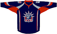
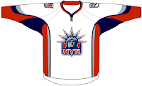
Earlier I posted some Wild designs but along with them I found these for the New York Rangers. Have a look.


I'm not expecting the Rangers new duds to look anything like these designs, but I'm of the opinion they should switch to the Lady Liberty logo full time and save the jerseys with "RANGERS" written across the front for special occasions like a vintage jersey. What do you guys think? Keep with tradition or move forward?

Some Wild Jersey Design Concepts

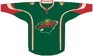
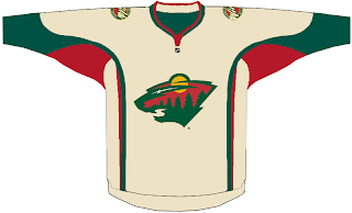
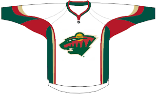
This is going to annoy those among you who are disturbed by the concepts being designed based solely on the look of the all-star game jerseys from this year. But, hey, it's out there and I feel like posting it for anyone who wants to see it. We've got a look here at some concept designs for the Minnesota Wild.


Take it as you will, knowing that in all likelihood, the actual Wild uniforms will not look anything like this. We don't have any official news from the team regarding an unveiling or announcement date, so stay tuned for that.

Possible Islanders Jersey Design?

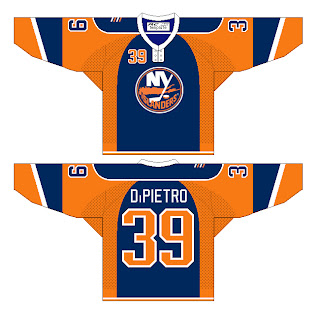
Along the lines of my post earlier today regarding the Flyers comes another image for the New York Islanders. It's not official news as Newsday's Isles correspondent thinks the team won't unveil anything until September. However, remember that terrible cell phone photo from a while back? One fan has created a template layout based on what we saw there.

It's pretty awful, huh? (Not the artist's work, but the design itself.) The layout you see here isn't in the proper cut of the new Rbk EDGE uniforms, but it does give you a better overall idea of what was in that photo. Feel free to post your thoughts below.