Coyotes vs Ducks


vs
COYOTES
DUCKS
4-4
1-11

The Aesthetics
The Coyotes logo isn't the greatest, but the Ducks logo is a wordmark. Lesser of two evils, here. Not sure what else there is to say about it.
Coyotes

The Nickname
If motivated, I'm sure a Coyote would eat a Duck.
Coyotes

The Analysis
Where is the duck? I see the coyote but where is the duck? Oh right, there's not one. Yeah, I'm still not getting over that yet. I understand the webbed duck foot "D" will become the primary this season. I guess they just wanted to establish the change of name. But in doing so, they get swept yet again.
Coyotes


WINNER
3-0


Senators vs Islanders


vs
SENATORS
ISLANDERS
4-5
1-11

The Aesthetics
I've been beating it like a drum for weeks, but I don't think wordmarks belong in logos. At least not crests. The logo should serve as a symbol for the team and be so recognizable as to not require the accompaniment of a written out name. Also the hockey stick and puck don't help very much.
Senators

The Nickname
Senators and Islanders? Hand-to-hand combat, my money's on the Islanders.
Islanders

The Analysis
We'll keep this short. I like the outline of Long Island in the background of the Islanders logo and yearn for some reference to Ottawa in the Senators logo. We can't have everything. Incidentally, if there's something I'm missing in the Sens logo, feel free to comment about it.
Islanders


WINNER
2-1


Wild vs Blue Jackets


vs
WILD
BLUE JACKETS
11-1
7-1

The Aesthetics
These are the league's two youngest teams, part of the most recent expansion. As far as aesthetics, this is one of the most difficult matches to judge. This incarnation of the Blue Jackets is simply the best ever devised. At the same time The Wild logo is pretty awesome. Some may not necessarily agree, but they really have to want it to see it. I don't know who to choose. I'm tempted to flip a coin. But since I can't do that, I'm going with the Blue Jackets for reasons unknown.
Blue Jackets

The Nickname
A Blue Jacket should know his way around the Wild, but if he were to face a bear, I don't know that he could necessarily hold his own.
Wild

The Analysis
A clever forest scene of Minnesota versus an Ohio flag wrapped around a silver star. How do you decide? Somebody really knew what they were doing when they designed these. However, while the Wild logo could befit any forest-laden locale, the Blue Jackets logo is very specific to Ohio. My love for the Wild logo will have to be overtaken. I'm sorry to say.
Blue Jackets


WINNER
2-1


Coming Tomorrow: Tournament Announcement

This post is for anybody who has been following the tournament or voted in the sidebar poll. As you can see, the number of people interested in getting involved with the voting is outstanding! Over 92% of the people who voted want their voices heard as to which logo should win the tournament. And I'm listening because I trust your judgment better than mine when it comes to these things.

So stay tuned! Tomorrow I'm going to make an announcement regarding the future of the NHL Tournament of Logos and what your involvement can be if you're interested. Expect it some time on Saturday. As a reminder, the sidebar poll closes at 3 AM Sunday morning, so if you still want to vote yes, no or maybe, this is your last chance.

New Oilers Jersey Design Concept

Thanks to another reader who came across this image of a dark jersey for the Edmonton Oilers. At first, it seems to be the real deal, but as with all jerseys yet to be publicly unveiled, you have to look at the ones that have been unveiled to compare. Take a look.

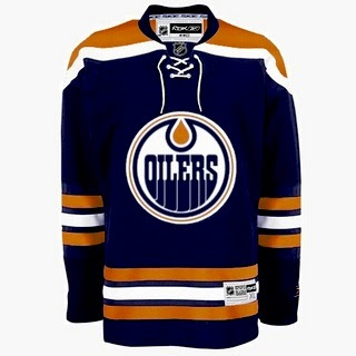
As far as changes, this one is rather different from what the Oilers have been wearing. It dumps the bronze and red altogether for a return to straight-up orange and blue like in the old days. The one thing I did hear prior to this post is that they'd be doing away with the oil man shoulder patch logo and this design does take that into account.

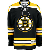
However, now that you've had a minute to look at that design, compare it to the Bruins jersey here to the left — a jersey which has already been unveiled to the public. See any similarities? How about the fact that the entire layout is verbatim, the stripes and everything — the only alterations being the colors and logo. But the designer did one thing cleverly to try and throw us off the path. The strings hanging from the collar have been slightly modified. Compare the strings hanging on the right side.

Anyway, take this image for what it's worth, but it seems clear to me that this is the work of one of our friendly Photoshop artists.

For the record, the Oilers have yet to make an official announcement regarding uniforms. I'll let you know if I hear anything. In the meantime, what do we think of all this?