Thrashers Fan Artwork

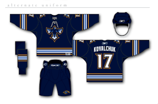
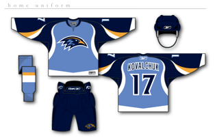
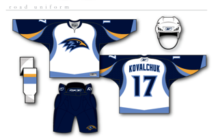
Get excited, Thrashers fans! You asked for it yesterday and some among you responded. I reader linked me to the following designs for a new Atlanta Thrashers jersey. Keep in mind they are only concepts and as far as I know, no change in logo is being contemplated at this time by the team.


How about them apples? It's certainly a unique take on branding for the Thrash. The designer certainly took "Blueland" and ran with it. He dropped the maroon altogether. They're sharp designs but I don't think there's really anything wrong with the current uniforms.

But if that wasn't enough for you, he also came up with an alternate jersey design, as seen below.

I really just think the color combination and jersey design of the current home uniforms work so much better. These are cool, but more like something I'd expect to see on the backs of a minor league club — that's certainly no offense at all. Still, Thrashers fans, we finally have something new for you to look at. What do you think? Go? No go?
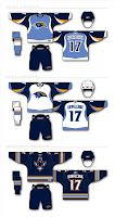
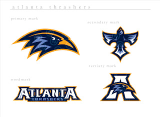
UPDATE (8/6 5:30 PM): Good news for those of you who liked these Thrasher designs. I found better quality images. You can click on the images to enlarge them. These are the same jerseys posted above.

I also found graphics with a better look at the logo designs. If anyone else is seeing the Baltimore Ravens resemblance, I'm with you. It's a great set of logos, though. And any team would be lucky to wear them.

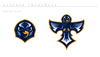
The second graphic features logos the designer created but ultimately did not use for this concept. They're all very sharp though with a very nice and clean color scheme. Thrashers fans, do you like these? Or do you prefer what your team wears right now?

Kings vs Blue Jackets


vs
KINGS
BLUE JACKETS
7-5
10-2

The Aesthetics
Both of these logos have lots of pointy edges. I don't know why that matters. Anyway, I like the color schemes in each logo and despite the fact that neither one has existed for very long, I see the Blue Jackets logo becoming a classic... you know, one day when the team actually makes the playoffs and that sort of thing. The Kings have struggled to find an identity when it comes to logos and I feel like this is just another in a long line.
Blue Jackets

The Nickname
An army is usually at the King's command. But in fact, it was the ancestors of the Blue Jackets who overthrew the King almost a hundred years before. So it's in their blood.
Blue Jackets

The Analysis
I know it isn't vital for a logo to incorporate the home city, but it's always a nice touch. You've got suns on either side of the crown in the Kings logo and the Ohio flag wrapping around a silver star for the Blue Jackets. I'm also a fan of subtlety in logos and the Kings are guilty. Check out those hockey sticks on top of the crown. If they were blatant, I'd be hesitant, but since they aren't, they'll help the Kings logo avoid the sweep. One more match left for each logo in this tournament.
Kings


WINNER
2-1


Panthers vs Canadiens


vs
PANTHERS
CANADIENS
11-1
7-4

The Aesthetics
That panther makes for one fierce logo. Unfortunately for the Panthers, though, simplicity is going to win the day for the Canadiens logo. There's a profound quality to it that's hard to describe which likely stems from the fact that it's only been around since the beginning of time itself. No, I'm not usually one to bend to the irritating whim of tradition, but what can I say? I'm helpless against the force today.
Canadiens

The Nickname
On the other hand, a hungry Panther would totally eat a Canadien for breakfast.
Panthers

The Analysis
The Panthers logo speaks for itself, but not necessarily Florida or Miami. Whatever. The Canadiens logo speaks French to me, although there's been some debate about the meaning of the "H" here among the readers at the NHLToL. And when I say "debate," I of course mean me being a smartass. Now once and for all, may I state my opinion here before ultimately giving this point to the Habs. I understand that back in the day (1917 to be precise, right?), the "H" stood for hockey as the team was called Le Club de Hockey Canadien or something to that effect. However, my (ignorant?) stance is that in today's world where the team is more commonly known as the Habs, why can't the logo evolve to take on new meanings? I'm actually asking if anyone has a good reason why that makes absolutely no sense. Because I'm sure that's the case.
Canadiens


WINNER
2-1


Bruins vs Devils


vs
BRUINS
DEVILS
8-3
12-1

The Aesthetics
I was going to make a comment about how both of these logos have circles for primary elements. But what's wrong with circles, anyway? They've long made for great logos worldwide in every aspect. Anyway, they each also have letters inside their circles. Though, here's where I think I'd be more impressed if the "B" formed some sort of bruin since the "NJ" manages to form a devil. Good stuff.
Devils

The Nickname
Devil, all-powerful, et cetera. Bruin, itty-bitty bear in comparison. Fire, brimstone, hell, move on. Stupid Satan. Go ahead, smite me with your pitchfork! (Okay, that's enough.)
Devils

The Analysis
I don't know what it is that makes the Bruins logo stand out so much. Maybe its the thick black lines over yellow. Not that the Devils logo has nothing to offer. This is a tough one. But I have yet to actual mention this so I'm going to take this opportunity. It's been pointed out to me that the spokes behind the "B" form a wheel, a hub if you will. And why is this significant? In fact, Oliver Wendell Holmes referred to the State House in Boston as the "hub of the solar system." Long story short: It stuck. And here we are. The Hub of Hockey. End of the road for the Devils, by the way. Count 'em up.
Bruins


WINNER
2-1


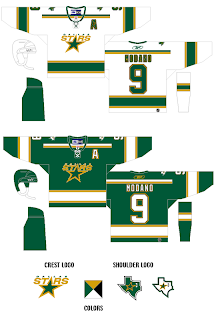
Jersey Ideas For The Big D

Further proof that this Dallas Stars jersey I posted a few days ago was a fake comes by way of another piece of work from the same designer. As a side note, he also created this Lightning concept jersey.

What gives it away here is the "Big D" logo with the star in the bottom corner of it. Have a gander.

So what do you guys think? It's a little reminiscent of the old North Stars with a touch of cool in the logo. Speaking of which, am I the only one who likes that concept for the logo? Anybody else out there? I thought it was a huge improvement over what they've been using.

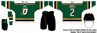
I also came by another fan-designed concept to put out there.

I don't think I really like the lack of black here. Don't put too much stock in either of these designs. Based on what little we've heard, we should expect to see home and road uniforms with two different crests. It may even be that the road jersey says "DALLAS" across the chest like in some of the other fan artwork we've seen.

Anyway, that being the case, what do you guys think about what you're seeing here? I'd also like to hear from some Stars fans as well if any are reading.