Every so often I find myself with just so many images for one team I feel like getting them all posted in one shot. Today that team is the New York Islanders. Remember that Atlanta Thrashers artwork I posted on Friday? Well, I've got more from that same artist (who's apparently been posting his awesome work over at the SportsLogos.net message board.
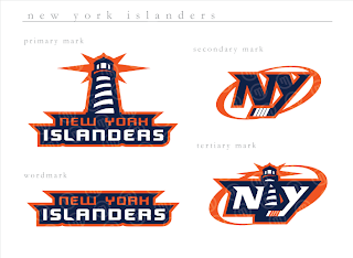
If you ask me, that's a pretty nice set of logos. Isles fans?
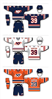 This is the uniform set that goes with those logos and they're just as cool. I really like the lighthouse as a primary element. I don't think you can lose the "NY" altogether because that's just one of those things that's always been there and it really does look good.
The Islanders tried out a lighthouse logo back in the mid-'90s when they switched to the fisherman logo. But nobody liked the fisherman, so they reverted back. I don't know why they didn't keep some version of the lighthouse, though.
In fact, this next design makes use of that lighthouse. Before you look, though, just know that it is a design based off the dreaded all-star jersey template.
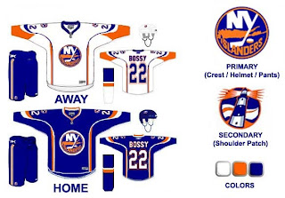
I like that its a Mike Bossy jersey. Good stuff. The only problem is, those logos don't really go well together. The waviness of this lighthouse logo just went better with those mid-'90s jerseys. I'm curious to know what Islanders fans thought of those — and this jersey design. Though I think the designer is trying to subliminally mess with your sense of nostalgia by placing Bossy's name on the back.
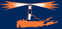 I'm just about done here. This is another example of a lighthouse-based logo. It doesn't necessarily have to be the primary mark, but I think it would make a good secondary logo. Put it on the shoulder patch or something. This one isn't extremely well-balanced for a sports logo, but I had it so I thought I'd post it.
One last thing and then I'll leave you and the Islanders alone for a while.
 Sorry I don't have a larger size, but a reader emailed this logo to me. It's got some neat elements but I'm not sure what it would be for. Perhaps a seal logo for hats and t-shirts and the like.
To sum up, it's a lot of cool fan artwork and absolutely nothing official from the team. Sorry to disappoint, but nobody has been saying anything official these days and I still want to keep posting new stuff on the blog. So the only way is to post fan designs in the interim while we wait. As always, I'll be sure to let you know when something official is announced. Until then, enjoy the fan artwork, and feel free to submit any of your own.


