Thrashers Uniform News

I'm a little behind the curve on this one. The Blueland Blog at the Atlanta Thrashers' official web site posted news on the new uniforms last week. Have a read.

August 7, 2007

New Uniform News

Ben Wright
Blueland Blog

First off- my apologies for the lack of posting lately. Things have been pretty quiet on the Thrashers front, and I was on vacation. I'm back though and hopefully things will pick up soon. On to a bit of uni news.

Plenty of people seem to be wondering what the new Reebok Edge Thrashers uniforms are going to look like and multiple people have asked me when they're going to be unveiled.

Well, I have some answers, but no pictures. Despite rumors to the contrary there are no major changes planned for the uniforms. Naturally they're going to look a bit different to keep them in line with the league-wide look being rolled out by Reebok, but the logo, colors and general design are staying the same. Some of the trim and accents will change but it's not a uniform overhaul.

So when do you get to see the new threads for yourself? During training camp, which begins in mid-September (on the 13th I think, but I'll have to confirm that).

So stay patient and relax. There are no secret plots to do away the blue uniforms.


There you have it, Thrashers fans — semi-official news on your team's new uniforms. Anyone who was worried about big changes may now have their minds put at ease.

Big thanks to Mike for emailing in this information. I'm going to go ahead and place September 13 in the sidebar countdown. If the date changes, I'll update the countdown to match.

Concept Art For Sens, Kings

Thanks to everyone who's placed their vote here on the first day of the Championship Tournament. Exciting stuff.

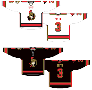
Anyway, I've still got fan artwork to share. We'll start out with the Ottawa Senators amidst all the news of their logo leaking. This concept ignores that logo (or was perhaps created prior to its leak).

It makes the current secondary logo the crest and sends the current primary to the shoulders, but beneath the shoulder elements. I'd be curious to see how something like that actually looks on a player. I think those are pretty sharp, even with the vertical stripes under the arms. Only, if it were me, I'd avoid doing vertical and horizontal stripes together. What do you guys think?

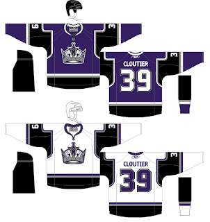
I was also emailed this concept for the Los Angeles Kings. I know they've already unveiled their new jerseys, but these aren't actual possibilites anyway, are they? It's just something fun to stare at while we wait for the hockey season to start again.

I think what the designer's done with the shoulders and sleeves is very interesting. It also seems he isn't a fan of the "LOS ANGELES" text across the bottom of the sweater. Seems a lot of Kings fans don't care much for that. I think it's unique. Is it a cool element or should they dump it?

Poll: Devils vs Maple Leafs


vs
New Jersey
DEVILS
Toronto
MAPLE LEAFS


Voting is finally here! This is the first match of the championship tournament. Place your vote and then feel free to leave a comment about how you came to your decision. Then come back tomorrow and vote on the next match. Also, tell everyone you know to drop in and vote. The more voices heard, the more accurate our results will be!

Poll opening date
Aug 12 @ 7:34 AM
Poll closing date
Aug 19 @ 11:59 PM

07CHTRN | #E1A | NJDvTOR

Canucks New Logo Leaked?

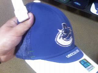
Tonight I found what appears to be a sneaky picture of a hat with the new Vancouver Canucks logo on it. Take a look and tell me if you think it's real.

If it is fake, it's the best job I've ever seen. We've been getting conflicting reports over just how much green there will be in the new logo. At first we were hearing blue and silver then it was blue and silver and green. I just don't know what to believe. Anyway, on this hat, while the logo is blue and silver, it has a small bit of green stitching as you can see.

Incidentally, I added August 29 to the sidebar countdown for the Vancouver Canucks big unveiling event. This comes not from the team directly but rather someone apparently working for a graphics firm hired by the team. Said someone emailed me directly and told me I should post the date. That being said, take it for what its worth. I can't verify that claim any more than you but there it is.

I really hope that is the date for the sake of Canucks fans everywhere. You guys have been getting yanked around so bad this summer. It's not even right.

The "SJ" In The Shark

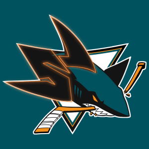
I noticed that a few of you have been hard pressed to find the "SJ" I was referring to in the San Jose Sharks logo in this post from the other day. I thought I'd make things a little easier for those of you who can't find it.

Check it out.

How about that! Because of that little nugget, it's moved way up on my list of favorite NHL logos. It's stuff like that that can make logos so cool.