Rbk EDGE Review: Rangers

Part 21 of 30. All 30 NHL clubs have unveiled new jerseys under the new Rbk EDGE Uniform System for the 2007-08 season. Here at the NHLToL, we're going to review every one of them. Read up and then rate the new sweaters. We'll do a full ranking after completing all of the reviews.

Rbk EDGE Uniform System

New York Rangers


New Uniforms

Old Uniforms

The Unveiling
The Rangers held no unveiling ceremony and images of their new jerseys were the last to be posted at online stores selling NHL gear.

Home vs. Road
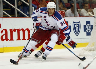
Home: Blue. Road: White. The two sweaters are essentially mirror images of each other aside from the patterns on the shoulders.

The blue home jerseys feature white-red-white stripes around the elbows and waist. Red letters with white trim spelling out "RANGERS" are positioned diagonally across the front of the sweater and the laces at the collar are white.

The blue home jerseys feature slightly spaced blue-red-blue stripes around the elbows and waist. The shoulder yoke is blue with spaced red-blue stripes on the outside. Blue letters with red trim spelling out "RANGERS" are positioned diagonally across the front of the sweater. A blue stripe wraps around the wrist. The collar is red and the laces are white.

In The Details
The Rangers are the only team that does not use its primary logo on either jersey. The same numbering and lettering style has been retained.

New & Old
There are no major differences between the new and old jerseys. Slight modifications have been made though, including the league-wide changed collar. Also, the letters on the front of the sweater have been vertically spaced more and at times may seem a little off center.

Standard FAQ
Numbers on the front? No.
Laces at the collar? Yes.

NHLToL Editorial by Chris
The Rangers' jerseys have always been fine. Nothing special to me. I understand tradition and this and that, but the Rangers were given a golden opportunity this season with the introduction of these new uniforms. If you ask me, they blew it big time. I've never been a fan of the text across the chest. I think hockey sweaters are meant to have logos. I also think the third jersey with the Lady Liberty logo is one of the best ever seen in the NHL. I would've quite possibly rated such a uniform 6/5 in this review. This may be a personal bias speaking, but I think the Rangers are one team in need of a sweeping makeover. But that will never happen. And that's really all I have to say on that. 2/5


Buy your new Rangers jersey!

Redesigning Boston, Buffalo Unis

Good afternoon, everyone. First off, apologies on the late posts today (including the new poll), but you'll understand once I explain. See, my girlfriend and I bought a Nintendo Wii today.

Enough said. That should explain everything.

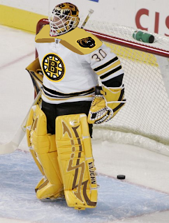
Now onto today's concept art. We'll start with the Boston Bruins, who I believe, already have perfect jerseys. However, I posted some pretty cool concept art a couple of months ago.

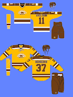
The other day I got an email from a reader who shows us what that idea might look like on a player.

I'm not completely repulsed by it. I like what they have now, but this isn't horrible. I sort of like that bear on the shoulder. Not so much with that spoked "B," however.

This concept is along the same lines. I like the idea of brown and yellow for a potential third jersey, but they'd definitely need to use the new secondary logo with it.

That's just my opinion. But I really do think they need that yellow third jersey hanging around for the future.

I don't know about the brown pants though. It might look good or it might be a big mistake. I'd have to see it on the ice first.

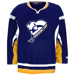
Anyway, here's something I really like for the Buffalo Sabres.

I think it needs a little sprucing up, but it's really sharp! I don't care for the horizontal stripes on this sweater, but that logo could work very well if the organization is insistent upon this particular type of bison.

It's a little too monochromatic the way it is now, but with a little color we just might have a winner.

Do you have an opinion on any of these designs? Well, you know what to do with it.

Poll: Coyotes Franchise Logos


JETS
COYOTES


This new poll series focuses on franchises that have been relocated. To begin, we're comparing the best Jets logo and the best Coyotes logo. Which is better? You decide.

Place your vote and then feel free to leave a comment as to how you came to your decision. Tell all your friends to drop in and vote! The more voices heard, the more accurate the results!

Poll opening date
Sun Oct 14 @ 4:20 PM
Poll closing date
Thu Oct 18 @ 11:59 PM

07BONLH | RFPHX

Rbk EDGE Review: Flames

Part 20 of 30. All 30 NHL clubs have unveiled new jerseys under the new Rbk EDGE Uniform System for the 2007-08 season. Here at the NHLToL, we're going to review every one of them. Read up and then rate the new sweaters. We'll do a full ranking after completing all of the reviews.

Rbk EDGE Uniform System

Calgary Flames


New Uniforms

Old Uniforms

The Unveiling
Tuesday, September 4. The Flames unveiled their jerseys to fans at Flames Central in Calgary.

Home vs. Road
Home: Red. Road: White. The two sweaters are essentially mirror images of each other and feature national and provincial flag patches on the shoulders.

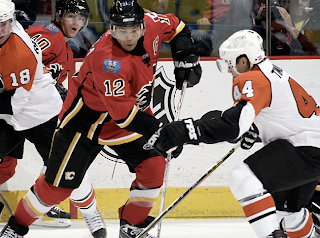
The red home jerseys feature a unique striping pattern. Black piping circles from the sides to the sleeves but stops short before meeting on the outside of the arm. Black-white-yellow-black stripes are featured beneath the piping up the sides and extend down to the bottom of the jersey. White-yellow trim runs across the bottom of the sweater horizontally, stopping at the vertical black striping on the sides. The sleeves feature a black stripe above thinner white and yellow stripes. Beneath that, the cuff is black. The lacing and collar are black and the black version of the primary logo serves as the crest.

The white road jerseys feature a unique striping pattern. Red piping circles from the sides to the sleeves but stops short before meeting on the outside of the arm. Black-white-yellow-red stripes are featured beneath the piping up the sides and extend down to the bottom of the jersey. Red-yellow trim runs across the bottom of the sweater horizontally, stopping at the vertical black striping on the sides. The sleeves feature a black stripe above thinner white and yellow stripes. Beneath that, the cuff is red. The lacing is red, the collar is black and the red version of the primary logo serves as the crest.

In The Details
On both jerseys, the right shoulder features the Canadian flag and the left shoulder features the Albertan flag. The same numbering and lettering style has been retained.

New & Old
The differences between the old and new sweaters is primarily the striping as well as the secondary logo patches. The striping has completely changed and the secondary logo has been eliminated and replaced by national and provincial flags.

Standard FAQ
Numbers on the front? No.
Laces at the collar? Yes.

NHLToL Editorial by Chris
I can't lie. Those stripes bother me on the Flames' sweaters. I think the striping on the sides is unique. But the piping is odd. Also, I feel like the horizontal stripes along the bottom clash with those vertical stripes. The jersey just feels poorly put together in that area. However, to balance that out, I do like the sleeve stripes, the collar style and the flag patches. So I can't reconcile calling it bad. It just averages out overall to me. 3/5


Buy your new Flames jersey!