Blues Third Jersey Coming This Fall

Good news for Blues fans hoping for a third jersey next season. The St. Louis Post-Dispatch's Bernie Miklasz wrote today that team has apparently confirmed it.

Blues Chairman Dave Checketts, honored at the Sold on St. Louis awards luncheon on Wednesday, announced that the Blues will introduce a navy-based third jersey next fall featuring a new logo incorporating the Blue Note and the Gateway Arch on the front.

So as soon as the design is available, which likely won't be until late this summer, I'll post photos.

This news had me thinking. We've heard a number of teams including the Flyers and Oilers reference possible third jerseys for next season. I'd like to keep a running list here on the blog of teams that have announced a new third jersey for 2008-09.

To make things easier on me, I'd like to get you guys involved if you're interested. Email me or write a comment on this post any time you see a reference to a potential new third jersey for next year. Cite a credible source too. I can't accept "my best friend's uncle's mother's cousin works in a pro shop and told me so" as a source.

This list now exists as a sidebar element. Enjoy!

UPDATE (2/17 5:20 AM): Just wanted to add that back in December, I posted concept art for the Blues in the form of a third jersey that incorporated the Blue Note and Gateway Arch on a navy sweater. You can find it at the bottom of this post if you're interested.

Just To Freak You Out XXVII

It's Friday and despite the fact that I'm waist-deep in boxes and half-dead from packing them, I have Freak Out art. And lots of it. So much so that I'm saving some of it for next week. But let's get to the good stuff.

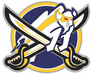
Please don't ask me what that's supposed to be. I think I get the buffalo and the swords. But I'm not sure I understand the raccoon reference found around the eyes there. Perhaps it's just me, though.

But while we're on the topic of indignities...

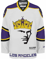
No, the guy wearing the crown isn't Mark Messier. But good guess. And to the right there, the ultimate Vancouver Canucks jersey. How do you improve upon perfection like that?

Couple more oddities.

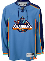
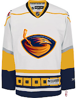
I like those colors on the Islanders jersey. And I know how you guys love the asymmetry on that thing — the original coming from the actual Thrashers jersey, not to be confused with the one on the right which is a recoloring of the Hurricanes sweater. The striping is weird. Yeah.

Sticking to the irony tack, here's an idea no one ever considered for the Anaheim Ducks.

And now you know why no one ever considered it.

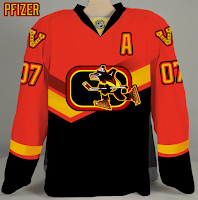
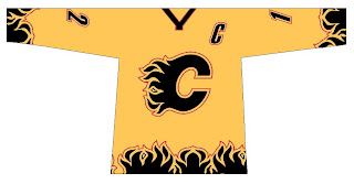
We're developing of list of things the Flames need.

Also on that list: trading Jarome Iginla.

And finally, with the recent introduction of the new Stanley Cup playoffs logo, one reader got to work on new East and West logos — only what if they reverted back to the old conference names?

Despite the creativity, and I have to give a lot of credit for that, they're just messing with my brain so bad. Nice work, but über freaky!

Hope you enjoyed your Freak Out Friday. If I'm unable to update the site tomorrow, just know that's it's because I'm moving to a new apartment this weekend, not that I'm lazy. Not that I'm not lazy. It's just that's not the reason. Did you follow all that?

Logo Adjustments For 'Hawks

Got a quick concept post for tonight. No new polls until Sunday when the fourth round of the Quest for the Worst begins.

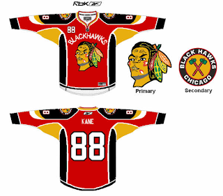
You already know that I'm not a fan of what many would consider to be one of the best logos in all of sports, so I won't get into that. But I do have proof that I'm not the only one who feels that way about the Chicago Blackhawks. A couple of people made some interesting "adjustments" to the logo and uniform.

We'll start with the uniform.

And while I do recognize this particular design might be more worthy of the Freak Out Friday post, I'm putting it here. I personally wouldn't consider it an improvement, but you be the judge.

These next two logos keep mostly in the spirit of the current logo.

I'm more partial to the design on the right. It's always interesting to me to see what you guys come up with.

By the way, I'm moving this weekend so don't be too surprised if there's little to nothing posted over the next several days. I will, however, try to get a Freak Out posted at some point tomorrow.

Poll: Canucks vs Whalers


vs
Vancouver
CANUCKS
Hartford
WHALERS


REMEMBER: You're choosing the WORST logo!

Place your vote and then feel free to leave a comment as to how you came to your decision. Tell all your friends to drop in and vote! The more voices heard, the more accurate the results!

Poll opening date
Wed Feb 13
Poll closing date
Sun Feb 17

Poll: Golden Seals vs Stars


vs
California
GOLDEN SEALS
Dallas
STARS


REMEMBER: You're choosing the WORST logo!

Place your vote and then feel free to leave a comment as to how you came to your decision. Tell all your friends to drop in and vote! The more voices heard, the more accurate the results!

Poll opening date
Tue Feb 12
Poll closing date
Sat Feb 16