New Look Coming for Crunch

Say goodbye to this logo. The AHL's Syracuse Crunch will unveil a completely new look on Monday, July 2, according to the Syracuse Post-Standard.

The rebranding efforts apparently come as part of the Crunch's new affiliation agreement with the Tampa Bay Lightning. So presumably, the Crunch will start wearing blue next season and my tongue-in-cheek recolor from the weekend is looking less ridiculous.

Specifically, the article says, "The Lightning deal allows Syracuse to rebrand its look, starting with a new logo and colors it will unveil on July 2." Meaning along with the new colors, we will see a new primary mark. That's probably the best news of all.

But then it may not be all that new. I'm told the Crunch could be looking at something from their history. The franchise began life as the Hamilton Canucks in 1992, moving to Syracuse, New York in 1994. At that point, they introduced the comic book-style logo seen here in purple, gold and green.

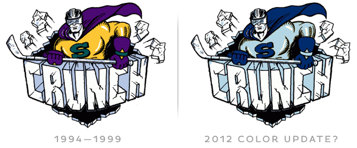
Obviously, my crudely recolored version of that logo won't be what we get. But it will probably be the basis. I imagine the new look will be a modern update that looks less like it came off the pen of a cartoonist. But I'm just guessing. I've also been told the new colors are blue, white and silver.

Now the history lesson. I've already mentioned Hamilton and the 1994 relocation to New York. Five years after that, on Sept. 30, 1999, the Crunch entered into an affiliation agreement with the Columbus Blue Jackets and changed their logo and colors to match their new parent club — a full season before the Jackets would ever hit the ice, by the way. That was also the introduction of the abominable snowman ice gorilla.

In 2010, the Crunch hooked up with the Anaheim Ducks and changed their colors again. So this rebranding shouldn't surprise us. The Crunch have a track record of taking on the look of their NHL affiliate. 

Elsewhere in the AHL, the Hershey Bears are apparently getting new uniforms with a redesigned logo. Can't tell you much about the source of this info, so take it for what it's worth. Also expecting a new third jersey for the Wilkes-Barre/Scranton Penguins (no surprise there), so we should certainly keep an eye on these teams throughout the summer for any news.

Draft Day 2012 Disappoints

Over the last few years, jersey geeks like us have counted on the NHL Entry Draft to see the league's newest members sporting its newest looks. But after years of upheavel and change in team branding, I'm sorry to report that we're in for a bit of a lull in 2012.

That, of course, means the 2012 draft, held over the weekend in Pittsburgh, was kind of a disappointment in that regard. There really aren't any new sweaters coming this year apart from Winter Classic threads for Detroit and Toronto as well as rumors of a new alternate in Tampa.

Still, even if there weren't any teams debuting new sweaters, at least there were a couple new sweater patches that will be in use for the coming 2012-13 season.

On Friday, the jerseys handed to Lightning draftees featured the new 20th anniversary patch. It's a simplified version of the 20th anniversary logo that was officially unveiled at the team's draft party that night.

In addition to that, the 2013 NHL All-Star Game logo could be seen on the sweaters being donned by Columbus Blue Jackets picks. They're both nice looking patches. I don't think any other teams are planning special event patches for their uniforms this season.

It is odd that while the Lightning and Ottawa Senators both joined the league 1992, they chose to celebrate their 20th anniversaries a year apart. The Sens were marking the years while the Bolts are just counting the seasons played (we all know 2004-05 was canceled due to the international shock of Tampa Bay winning the Stanley Cup).

Depending on how the Florida Panthers and Anaheim Ducks interpret anniversaries, they could both be marking 20 years either this season or next, having both been founded in 1993. Kind of straying from the topic now. Back to the draft...

Really, the only other thing worth a mention (and that's only because there's nothing else to talk about) would be these three jerseys. The Ducks and Minnesota Wild both opted for third jerseys at this year's draft. It's nothing new for the Wild, but it was a first for Anaheim.

Also, it's the first time the new Winnipeg Jets jersey has appeared on the draft stage. Famously, you'll recall that Mark Scheifele was given a generic NHL jersey last year, only moments after team owner Mark Chipman announced the team's name. Jerseys had yet to be designed.

In past years, I've outlined which jerseys were handed out to draftees by the teams. This year, there's not much to say. All but four teams gave out their home jersey, keeping the draft nice and colorful. As reported above, Anaheim and Minnesota used third jerseys. That leaves Nashville and Colorado doling out the white road sweaters — also known as the uglier ones.

By the way, the next two draft hosts were announced as well. New Jersey will handle things in 2013 while Philadelphia gets it in 2014. Logos to come at a later date.

Hope this draft recap was as fun for you as it was for me.

Lightning, Ducks Swap AHL Affiliates

Earlier this week, the Tampa Bay Lightning announced a new AHL affiliation agreement with the Syracuse Crunch. That will lead the Anaheim Ducks to align with the Bolts' former affiliate and 2012 Calder Cup champion Norfolk Admirals in the fall.

I've since gotten a lot of questions about whether either of the Crunch or Admirals will redesign their jerseys to match their new NHL affiliates. The short answer is: I don't know. The funny answer is this...

Obviously, I just made this graphic for fun. I have no reason to believe either team will change their colors. If they were to do any sort of redesign, I don't see it happening this season. But I'll keep an eye on it, of course.

Meantime, what do you think about the new color treatments I gave the Crunch and Ads?

Lightning Unveil 20th Anniversary Logo

The Tampa Bay Lightning officially unveiled their 20th anniversary logo today. It's very much in line with the club's new branding. And the style reminds me a little of the Calgary Flames' 30th anniversary logo from a few years ago.

You can read more about the Bolts' 20th-year plans on their website.

What's your instant read on it? Good, bad or ugly?

Branding the 2012 Draft Parties

The 2012 NHL Entry Draft opens in Pittsburgh tomorrow. With that, a number of teams will be celebrating with their fans. I've never understood why teams feel the need to brand their draft day parties with special logos, but every year we always get a few.

Here are the ones I've tracked down for this weekend.

The Chicago Blackhawks, Columbus Blue Jackets, Montreal Canadiens and New York Islanders are all promoting their draft day events with specially-designed logos. I don't really have anything more to say about them, but the blog was getting a bit stale.