 We're not expecting any logo changes in the NHL this year, so I thought it might be the perfect time to take a look back at when all of our current logos were born.
The timeline stretches from last summer all the way back to 1948. But creating a simple chronological list isn't quite as simple as it seems. Do we say a logo was born when the basic concept was formed? Is it "reborn" each time it gets an update?
These are questions I'll try to tackle here. Enjoy the read.
2011


January 31: Right in the middle of the season, the Tampa Bay Lightning become the first team of 2011 to introduce a new primary logo. They drop black and silver from their color scheme and go with a simplified, single-color design.
June 22: The Nashville Predators update their primary logo — a shape and basic design that was first created when the team joined the NHL in 1998. Extraneous details and colors are removed in the updated version.
July 22: After the logo is leaked online, the Winnipeg Jets scramble to hold a cyber-unveiling just a month after the team's name is announced at the 2011 NHL Entry Draft. Only two months earlier, the team had been known as the Atlanta Thrashers prior to the relocation and renaming.
2008

September 20: The Buffalo Sabres offer up a modernized throwback third jersey to quell rising fan opposition against the team's rebranding efforts two years earlier. The Sabres revive their original 1970 logo, adding silver outlining and a darker blue.
November 22: The Los Angeles Kings unveil a third jersey, featuring a brand new crest. Three years later, that crest would become the team's primary mark.
2007


As Reebok takes over production of all NHL uniforms, several teams take the opportunity to implement new designs which include revamped logos.
June 21: The Boston Bruins modernize their logo with new lines and serifs on the B. However, the spoked-B concept is first introduced in 1948. The Bruins have used it ever since, making slight modifications throughout their history.
June 22: After 12 years of wearing bronze and blue, the Washington Capitals return to their roots with a classic patriotic color palette. The team also brings back the wordmark concept first used upon the team's entry into the league in 1974.
July 24: The San Jose Sharks introduce an updated version of their primary logo. Just like the team's original mark from 1991, it features a shark biting through a hockey stick and is created by the same designer. The new version includes fewer straight lines and a heavier emphasis on Pacific teal, the club's primary color.
August 22: The Ottawa Senators unveil new uniforms featuring a revised version of their faux-3D centurion character. The original concept of this mark is first seen on a third jersey in 1997. The new version uses a simplified color palette and stronger lines.
August 29: The Vancouver Canucks reveal a new palette and a recolored primary mark. The orca design first debuts in 1997 in dark blue, light blue, maroon and silver. The new version does away with maroon but retains the dark blue and silver which are not part of the team's new color palette of green and blue.
2006

June 22: A year after the sale from Disney, the Mighty Ducks franchise is renamed the Anaheim Ducks at the urging of fans and introduces a brand new logo and color scheme. During the 2006-07 season, the webbed-D logo was rarely seen on its own as the club made a big push to market the newly shortened name by using the full wordmark.
2005
July 22: Following the lockout that canceled the 2004-05 season, the National Hockey League unveils its new shield logo as part of a process of rebuilding its image. The orange is replaced with Stanley Cup silver and the letters are rearranged to read in an upward direction rather than downward.
2003


September 3: Under the direction of NHL great Wayne Gretzky, the Phoenix Coyotes unveil a completely redesigned logo that retains some of the original colors launched in 1996 when the team moved from Winnipeg. The brick and sand colors are carryovers while the forest green and purple are dropped.
October 13: The Columbus Blue Jackets hit the ice in a new alternate jersey with a crest that focuses more on the symbolism of its name and home state and less on electric green. Four years later, the Civil War-inspired star wrapped in the Ohio flag becomes the club's primary logo.
The Calgary Flames introduce a red home sweater in 2003 that features their classic flaming C in black. However, the flaming C dates back to 1980 when the club is relocated from Atlanta. A red version is used on the white jersey and vice versa. The logo is revised to include a black outline in 1995. For these reasons, this logo is the trickiest when trying to determine a true origin date.
2000

October 28: The Pittsburgh Penguins debut a new third jersey which reintroduces the skating penguin logo which was created at the team's formation in 1967 and modified a year later. The 21st-century edition, however, features Vegas gold in the color palette. In 2002, it becomes the team's primary logo.
1999

November 18: The Minnesota Wild officially unveil the new logo that will represent the team when it takes the ice for the first time the following year.
1998

The St. Louis Blues refresh their famous Blue Note logo with an extra shade of blue. The revised logo with its more angular corners dates back to the 1997-98 season when it debuted on a new white third jersey in a lighter shade of blue. The darker blue is used on the version of the logo used on the blue sweater which launched in the fall. The Blue Note concept itself originates with the team's inception in 1967.
1997

June 16: Following their move from Hartford, the newly minted Carolina Hurricanes officially reveal their logo to fans at a public event at the team's arena.
1995


January: The Dallas Stars begin play in the lockout-shortened 1995 season with an updated logo that now emphasizes the club's new home. The original concept for the logo debuted with the Minnesota North Stars in 1991, prior to their 1993 relocation to Texas.
August 10: After relocating from Quebec earlier in the summer, the newly renamed Colorado Avalanche unveil their new logo.
1993

June 14: One of two expansion teams, the Florida Panthers hold a fan event to display their new logo and uniforms.
1992

February: The New Jersey Devils announce the green in their color palette will be replaced with black to start the 1992-93 season. Other than the color swap, however, the logo remains unchanged from its 1982 design which came after a relocation from Colorado.
1979

The Edmonton Oilers transfer to the NHL from the WHA, where this logo debuted in 1972. The team continues to use it unchanged until 1996 when its colors become dark blue, red and copper. The classic color palette is brought back in 2008 for a third jersey, and finally, returns to primary status in 2010.
1978

The New York Rangers and Toronto Maple Leafs make some modern updates to their primary logos, as had become standard practice over their decades in existence. The basic look of the Rangers shield dates back to their 1926 entry into the NHL. Toronto's use of a complex leaf design goes back to their renaming in 1927, but a simplified shape isn't first seen until 1967. The 11-point leaf debuts in 1970 and is revised eight years later.
1972
The New York Islanders join the NHL with this logo in 1972. It sees tweaks and updates over the years to design elements as well as the colors. It is replaced for a brief period between 1995 and 1997 until fan backlash forces it back onto the team's sweaters. From 1997 to 2010, a navy blue is used. The original mark with the original royal blue returns on a third jersey in 2008 along with one modification. It now features four stripes around the hockey stick, instead of three, to commemorate the team's four Stanley Cup championships. It becomes the Isles' primary logo in 2010.
1967

The Philadelphia Flyers introduce the winged P upon entering the NHL in the first wave of expansion in 1967. They are the only team from that group still using their original logo, unchanged.
1965

Prior to the first NHL expansion, the Chicago Blackhawks made some modifications to modernize their classic Indian head primary mark, a basic idea in use since the team joins the league in 1926. It begins as a black and white logo, with color being added in 1935. The mark would endure a number of cosmetic upgrades over the years, but the mark in use today is first found on a Hawks uniform in 1965.
1952

Like many of its Original Six cohorts, the Montreal Canadiens logo is largely unchanged from the franchise's early days. The CH is seen on Habs jerseys from the founding of the NHL in 1917, though in a much rougher design. The version with the enclosed C debuts in 1952 and has remained unaltered since.
1948

The use of a winged wheel logo by the Detroit Red Wings dates back to the team's renaming from the Falcons in 1932. But the actual shape would go through a few changes early on. The wing is extended and the wheel design is perfected in 1948, making it the oldest logo currently in use in the National Hockey League.
Discuss your take on this history in the comments.

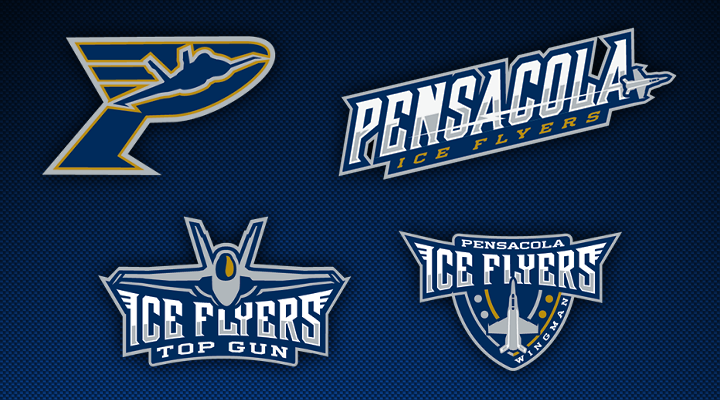
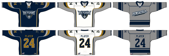
 The Pensacola Ice Flyers unveiled a brand new identity that's millions of miles beyond the monstrosity they entered into the world upon joining the Southern Professional Hockey League in 2009.