Top 10 NHL Logos of All Time

So. A handful of ancient cultures tell us the world ends on Friday. Guess there's no better time than now to quantify the history of hockey logos — since obviously there won't be anymore to come. Ever.

Before we start, understand this is just me picking my favorites. Yours may differ wildly. And if we all survive December 21, you'll get your chance to vote in a new sort of logo tournament after the new year. Now let's go. Clock's ticking.

1. Hartford Whalers

Its perfection lies in its subtlety. The use of negative space has a lot to do with the brilliance of the Whalers' logo. Often the H in the middle is what catches people off guard. They say, "how could I have missed that?" When a designer is able to incorporate every inch of their design into important symbolism, they've struck gold. Peter Good is responsible for this logo and even though it was retired in 1997 with the relocation of the Whalers, hockey is better off for having had it.

2. Minnesota Wild

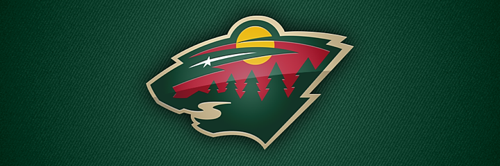
It was hard not to place this logo at No. 1. I think the Whalers logo only got it because of longevity. It happened to come first. But if the world weren't ending, I'd say this logo will be around for a long time as well. Imagine being told to design a logo for a team called the Minnesota Wild. What does that mean? And yet this mark so perfectly captures the wilderness the team is named for. You can see something new every time you look at it. The trees and setting sun are perhaps most obvious. Then there's the shooting star, flowing river and distant hills. It all comes together in the shape of a wild animal's head. Some people see a wolf. I see a bear. It's a remarkable symbol that I hope survives the apocalypse.

3. Montreal Canadiens

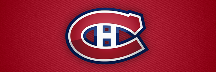
No list of this sort would be complete without this juggernaut toward the top. Montreal's classic CH has survivedin some form for more than a century. It's lived through wars, depressions and even lockouts. So what's a little armageddon? Long live the CH. And just so it's being said here, the H does not stand for Habs, but rather simply, "hockey" as the organization's official name is le Club de hockey Canadien.

4. Colorado Avalanche

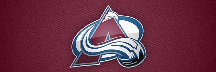
It may seem blasphemous to put so many logos created in the last two decades so high on this list, but I wouldn't do it if they weren't awesome. The Avalanche logo is another that approaches perfection. Created by Adrenalin in 1995 after the sudden relocation of the Quebec Nordiques, this logo is striking. It conveys motion splendidly with a color palette found nowhere else in sports. A logo this good. There's no way it could wait to hoist the Stanley Cup.

5. St. Louis Blues

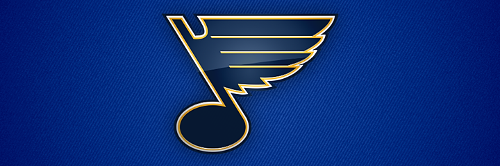
The Blue Note originated in 1967 when the NHL expanded beyond the Original Six. Over the years it's been upgraded and revised. The mark we see today is beautifully balanced and it almost makes you hear music in your head when you look at it. There's no better symbol for a team named the Blues. They got it right the first time. They were smart to stick with it.

6. New Jersey Devils

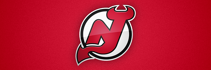
Clearly this isn't a list of my favorite teams. And for as much as I may dislike the Devils, they have a superb logo. It's no wonder they don't have any secondary or alternate logos. Just this one. The only difference you'll find in the history books is that green replaced black at the beginning when the team arrived in New Jersey in 1982. (By the way, Wikipedia would have us believe that the logo was designed by the wife of the owner at the time of the team's move. But I can't find any corroborating evidence for that.)

7. Boston Bruins

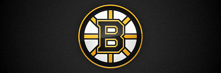
The spoked-B has always been in league with Montreal's CH in my book. I don't mean that literally. Of course they are both members of the NHL and have been since the early days. But the idea of logos so simple, I think, is beyond what would be considered good sports logos these days. When was the last time a new team sprang up with nothing but a letter as its primary symbol? Over the years, the Bruins' logo has been upgraded and refined, each time for the better. It's one of those great, recognizable marks.

8. Chicago Blackhawks

No doubt many of you will complain this logo wasn't higher on the list. But you've heard my position before. I don't think it's a bad logo. I just don't think it's the best the way so many other people do. I've never understood that. Still, it certainly has a place on my Top 10. Only the Blackhawks could pull off such great use of color. (There are 8!) It's another one that's been around for a long time and seen a lot of refinements. But it's old and it shows. For a logo, there's no better compliment.

9. Colorado Rockies

Yep, the Rocky Mountain State shows up twice on my list with two different teams. In 1976, the Kansas City Scouts moved to Denver and became the Colorado Rockies (the original ones!). Their logo struck the ideal balance between a team's nickname and its location. It was only a shame they left town in 1982. I always hoped the Avalanche would get a chance to wear this mark in a Winter Classic or something. But with the Four Horsemen supposedly on their way, I guess that's out of the question.

10. Philadelphia Flyers

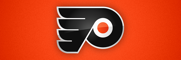
How does anyone finish a Top 10 list? It's so difficult. And so final. Here I've decided to go back to the first expansion again. Some logos are just so instantly identifiable, that you'd only need to see them for a fraction of a second. The Flyers logo is one of them. Like the Devils, I can't stand the team. It's ingrained in me. But when I look at their mark, I can't deny a fantastic design.

I'm sure a number of you will find fault with my ranking, but that's what the comments are for. How did I do? Any serious oversights? Any big blunders? I'd love to see your Top 10s.

Check back on Thursday for my Top 10 worst NHL logos. Tuesday and Wednesday will be dedicated to the minor leagues — AHL and ECHL.

IceHL Artist Makes Mark in ACHA

Neat story to share today. It's about one of the artists who contributed his work to the IceHL Project and what he's been up to these days.

Back in 2008, Nick Matarese created just one entry for the IceHL logo design contest. It was for the North Carolina Nighthawks. And it won. Nick's black and neon green bird struck apparently a chord with Icethetics voters. Even today, it remains one of the league's best logos.

But that was then. What's he been doing since? Well if you've ever heard of the Fightin' Blue Hens, you might recognize elements of the logo above. Currently, Nick is the goalie coach for the men's ice hockey team at the University of Delaware — where he actually tended goal for four years. The team is a Division 1 member of the ACHA (American Collegiate Hockey Association).

This season, Nick tells me the organization is celebrating its 40th anniversary. So he pitched in with a logo and jersey design to help mark the occasion. You've seen the logo, so how about the uniforms?

Photo by Tisa Della-Volpe

Nick says the original design he pitched was a little more intricate and not so much of a Montreal Canadiens knock-off, but the cost of such a custom jersey would've been a bit high for a college team.

"I am kind of over the old school look throughout hockey design," Nick tells me, "but it is a big anniversary year and we are playing in an outdoor game in a month so I am ok with it."

Photo by Tisa Della-Volpe

The crest is actually a retired logo no longer in use by the University of Delaware. Nick said he "had to jump through a million hoops" to be able to use it. But it definitely adds to the retro theme of the sweater. Certainly better than just running text across the front as well.

When Nick's not coaching the Fightin' Blue Hens' goalies or designing their anniversary sweaters, he's running his own design firm, Matarese Designs. Right now, he caters to mostly corporate clients, but is hoping to make a run at some minor league hockey or baseball teams in need of a rebrand over the coming year.

It's great hearing from Nick and getting to see what he's up to. With any luck, maybe he'll join us in the first round of IceHL rebranding that will be starting soon.

Portland Pirates Celebrate 20 Years

Over the weekend, I wrote up a post outlining the variety of theme jerseys the AHL will see this season. During my research, I discovered the that Portland Pirates have already worn their share of creative sweaters for this season.

Pirates mark 20th anniversary with special logo and jersey

The Pirates were actually founded in Pennsylvania in 1975 as the Erie Blades. In 1982, they moved to Maryland and became the Baltimore Skipjacks. Then in 1993, the club arrived in Portland, Maine. That's the anniversary the Pirates are celebrating this season.

So they needed a logo. But the final version you see above didn't just happen. As with any logo, a lot of options were created and considered. In fact, a member of the team that designed the mark has given us a peek inside the process. Scott Lyle posted these photos on his blog.

Photos by Scott Lyle

Lyle also lists these other members of the design team: Adriana Warner, Alyssa Harvey, Christopher Moore, Kelsey Raymond, Lucy Henson, Paige Wojcukiewicz, Rachel Carter, and Sheyenne Rivers.

That project also included designing this colorless 20th anniversary sweater.

Rendering from Portland Pirates (official Facebook)

I'm not sure why they decided to drop the red — a key part of the Pirates' color palette for all of its 20 years. Might've made this jersey stand out a little bit more.

Throwback and Pink in the Rink theme night jerseys

Earlier this season, the Pirates held a couple of theme nights that saw them wearing special uniforms.

On Sat., Oct. 27, it was Pink in the Rink, their sixth annual Breast Cancer Awareness Night. Naturally, the players had their pink-infused jerseys on. What's funny is it also happened to be Boy Scout Night.

Photo credits: AHL official Facebook page (left); Pirates official Facebook page (right)

Then a week later, on Fri., Nov. 2, it was Throwback Jersey Night. The Pirates brought back the 20-year-old sweaters from their inaugural season in Portland. I kind of miss the simplicity of old logos like that.

Happy Holidays from the Pirates

That about wraps up today's coverage of the Pirates. Now I'd just like to leave you with this.

Bears Unveil Outdoor Classic Jersey

Hershey Bears revealed design online Monday

The AHL's Hershey Bears are hosting hockey's only outdoor game of the 2012-13 season. The Outdoor Classic at Hersheypark Stadium will take place on Sun., Jan. 20, 2013. And just two days ago, the Bears unveiled the special uniform they'll be wearing for that game — complete with white pants and oodles of chocolate stripes!

From the press release:

When the Chocolate and White lace up their skates for the 2013 Outdoor Classic game on Sunday, January 20 they will be wearing commemorative jerseys. The jerseys will be brown and white stripe, and have the Outdoor and 75th Anniversary logos on respective sleeves. These game-worn jerseys will be signed and auctioned off following the game, with proceeds donated to charity.

Rendering from Hershey Bears (official website)

The Bears will be facing off against the Wilkes-Barre/Scranton Penguins for this game. But I've yet to find the jersey the Pens will be sporting — and you know they'll have one! This is a team that will wear a special sweater just because it's Wednesday. Heck, you need only look back to this past weekend to see them in their Christmas sweaters.

So what's your take on Hershey's Outdoor Classic jersey?

NHL Draft Logos for 2013 and 2014

Apparent 2013 NHL Draft logo turned up online in September

First up is this gem. It appears to be the logo for the 2013 NHL Entry Draft, which will be hosted by the New Jersey Devils this summer. I say "appears to be" because I haven't yet been able to track down and a solid source for where the logo came from.

(UPDATE: Turns out this was a concept designed by a fan that got picked up by more than a few sites since the NHL took its time releasing the real one.)

From what I've been able to find, it looks like the logo first showed up online in early September in a blog post on PuckCentralHQ. It was a post discussing preseason draft rankings. But there's no reference to where they got the logo which appears at the top of the page (and as a repeated background image).

It has also popped up on a number of other minor websites and blogs (which you can find via a quick Google search). But no official NHL sources or media outlets have posted this logo. That said, it certainly looks like it should be the real thing.

It has the same design theme we've seen on past draft logos. However, what's interesting is the typeface that identifies the city and year. It's not the NHL's standard font. This could indicate a change moving forward, or it could be that this logo isn't the real thing. You can draw your own conclusions.

Abbreviated draft logos for 2013 and 2014 seen on NHL websites

During the 2012 draft, held in Pittsburgh, the NHL announced the next two draft hosts as New Jersey and Philadelphia. Photos showing the 2013 and 2014 draft logos showed up in photo galleries on the host teams' websites shortly thereafter.

The photo on the left was posted on the Devils' website. The photo on the right can be found on the Flyers' website. The two logos seen in background of these images are the simplified versions. The current NHL draft logo standard was introduced in 2010 when Los Angeles hosted.

For each, the abbreviated versions are the same shape and design but with the host's name and color (except for Los Angeles, which was blue). The full shield versions have all been unique shapes. You can see all three previous logos below. The 2013 logo at the top of this post fits in nicely.

By the way, it's disappointing to think that if this NHL labor dispute doesn't get resolved soon, the draft may just be next NHL event that takes place.