Stars CEO Previews New Look

Dallas announces official unveiling date of June 4

On Tuesday, the Dallas Stars publicly announced the date for their new uniform and logo unveiling. It's June 4. And as I said two weeks ago, I will be there. (And thank you to everyone who has donated a few bucks here and there to help me with the cost of the trip.)

In the press release, the Stars' CEO spilled a few details about the new look. All right, well not really.

The Dallas Stars announced today that the team will unveil its new uniform and logo on Tuesday, June 4th at the AT&T Performing Arts Center in Dallas at 6:00 p.m. Owner and Governor Tom Gaglardi, President and CEO Jim Lites, General Manager Jim Nill, Executive Advisor and Alternate Governor Mike Modano and Stars forward Jamie Benn will all be a part of the special event.

"Since Tom Gaglardi took over as owner, we have been working diligently on a rebrand that is classic, simple and true-to-hockey," said Lites. "This event will showcase the results of that process to our loyal fans and will also provide us with an opportunity to announce several new developments about the future of our franchise."

Aside from unveiling the new logo and uniform, the team will also address the current state of the franchise and will make a significant announcement regarding the 2013-14 season.

Classic, simple and true to hockey. Let's hope they live up to those words.

I'm excited about the trip. But more than that, I'm thrilled to bring some original reporting to Icethetics for a change. By the way, if you were thinking of making a donation, it's not too late to chip in. You have until June 2 — unless 100% of the costs are covered before then.

And once again I have to thank you guys for the incredible generosity!

Rivermen, Raiders Unveil New Logos

Peoria's new SPHL team reveals logo, uniforms

On Saturday, the latest incarnation of the Peoria Rivermen franchise — now a member of the Southern Professional Hockey League — officially unveiled its logo and uniforms.

Peoria Rivermen new uniform designs (via Facebook)

I briefly went over the history of the Rivermen in Friday's post. The new look came just a day later via the club's new Facebook page, where they also posted the progression of Rivermen logos over the years.

Rivermen logo progression, 1984—present (via Facebook)

The branding efforts are an attempt to capture history and tradition of the Rivermen franchise which has existed in some form for nearly 30 years. That's quite a run. For a deeper look, I recommend this article from Dave Eminian of the Peoria Journal Star. The write-up mentions that the logo and uniforms were designed by Carie Hanawalt.

The old Rivermen franchise of the AHL was recently purchased by the Vancouver Canucks and will no longer play in Peoria. So there will be a new name and a new location for the team at some point but nothing has been announced yet.

WHL's Prince Albert Raiders start "green movement"

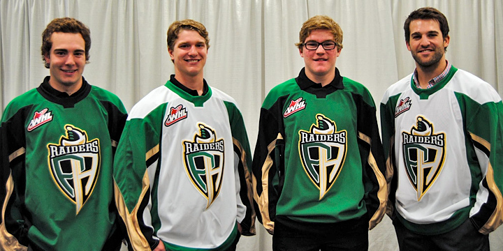
The other big logo unveiling last week happened in the Western Hockey League. The Prince Albert Raiders decided to highlight their green and introduce all new logos and uniforms.

New jerseys modeled at Raiders unveiling (via Facebook)

Take a good look at those jerseys. They're Reebok Edge, but a brand new template we've ever seen. Factor in the colors, and what are the odds we're looking at the next Dallas Stars uniform with a different logo on the front? It was an IceHL GM, Mike Kelly, who first mentioned this via Twitter. And I have to agree.

Then again, it would be surprising for a couple of reasons. First, if Reebok is going to go out of its way to generate an entirely new sweater template, why would they do it for a junior league team. It's more likely that it'd be for an NHL club — like Dallas. But then if all that is true, why allow the junior team to hold its unveiling first — three weeks before the NHL club?

It could be a simple solution, like maybe Reebok works up new templates every year — some of which may or may not end up in use in the NHL. It could just be a way of expanding their own product line. In any case, it's something worth talking about.

What's your take? Both on the Raiders' new look as well as the possibility that they're a preview of the Stars' redesign. And how about the new Rivermen?

May Minor League Report

All this work on the IceHL's 13 Weeks of R&R project has kept from doing my real job on Icethetics — updating the blog with actual news. In other words, there's a lot to catch up on.

Hartford Wolf Pack officially return to AHL

Well that didn't take long. After playing parts of three seasons as the Connecticut Whale, the Hartford Wolf Pack identity has made a glorious comeback — thanks to their NHL parent club, the New York Rangers.

The Wolf Pack were established in 1997 when the Binghamton Rangers moved to Hartford. Then in 2010, Howard Baldwin happened. His effort to recapture Hartford Whalers failed miserably with the rebranding of the franchise as the Connecticut Whale.

Connecticut Whale, 2010—2013

We applauded the judicious use of green but not the name or the terrible logo. Within two years, Baldwin was gone — which probably says more about his management style than his taste in sports branding. But we're all grateful nonetheless that the Pack is back.

And not for nothing, but the New York Rangers' AHL affiliate is now operated by the parent company of the Philadelphia Flyers, is it not? Global Spectrum is running things these days and it would seem they have two masters. Interesting.

The Rivermen are dead, long live the Rivermen

Speaking of the AHL, some craziness took place on Monday. The Vancouver Canucks who recently acquired the Peoria Rivermen franchise from the St. Louis Blues, announced the team would not operate out of Illinois next season. They don't know where exactly yet. Just not Peoria.

So it seemed the end of a brand that has existed for nearly 30 years. But the Rivermen are plucky. They won't go quietly. After 12 years in the IHL between 1984 and 1996, the franchise transferred to the ECHL for about a decade. Then in 2005, they got the upgrade to the AHL. In 2013, they move down — way down — to the SPHL, that's the Southern Professional Hockey League. (It exists!)

The SPHL is home to teams like the equally plucky Columbus Cottonmouths and the Pensacola Ice Flyers. And now it's also home to...

Bloomington Blaze switch from CHL to SPHL

The Bloomington Blaze are jumping the sinking ship that is the Central Hockey League for the equally crummy SPHL. A lateral move at best. But one they apparently feel is necessary.

The Blaze were founded just two years ago after the folding of the IHL's Bloomington PrairieThunder. (All these minor leagues you've probably never heard of.) They begin play in their new league this fall.

Now that we're on the CHL, we might as well talk about their newest expansion team.

Brampton gets Beast to replace lost OHL team

Earlier this year when we learned the OHL's Brampton Battalion were moving to North Bay, Ontario, it seemed like the good people of Brampton would be without a team. But that's when the Central Hockey League jumped in, expanding into Canada for the first time.

On April 27, the Brampton Beast were revealed to the world. Along with a very vanilla CHL-like logo. I won't pass judgment too hard since somebody was obviously trying. (I just don't know what they were trying for.) In any case, the Beast begin play in the fall. Like Peoria, hockey fans of Brampton won't miss a beat.

For the record, the North Bay Battlion also begin play in the OHL this fall. They will keep the same logo they had in Brampton.

2013 Stanley Cup Playoff Logos

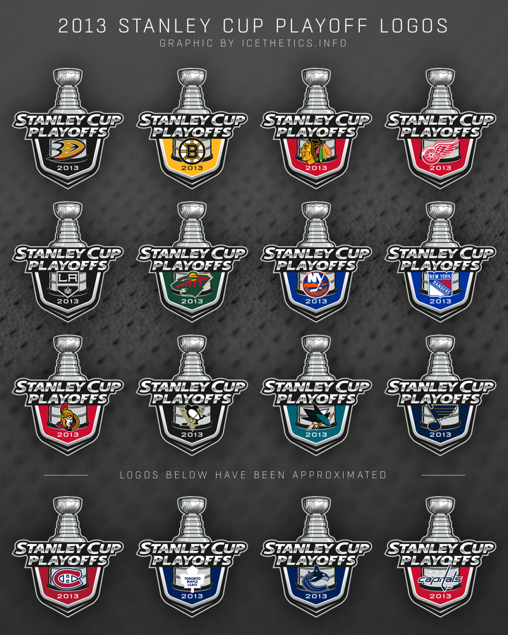
Here's something fun to look at. Last month when the AHL's Calder Cup Playoffs began, we saw each individual team's version of the 2013 Calder Cup logo. Little did we know the NHL would be doing the same thing for the 2013 Stanley Cup Playoffs.

These are the 16 individual team logos in use this postseason*.

*As you can see, for the bottom four I had to guess at the design as I couldn't find them anywhere on the web. If you've seen them, let me know so I can update this graphic. Unfortunately, all four teams have been eliminated so it's unlikely they'll turn up if they haven't already.

Meantime, I hope you're enjoying the playoffs as the Conference Semifinals get underway!

Third Jerseys in the 2013 Playoffs

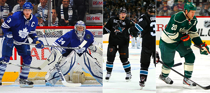
There's been a lot of chatter on Twitter this week regarding the trio of teams that have opted to wear their third jerseys during the 2013 Stanley Cup Playoffs. For those of you not on Twitter, I present this brief blog post.

The Toronto Maple Leafs, San Jose Sharks and Minnesota Wild are all sporting their alternate uniforms when they play at home this postseason. It's certainly nothing as many teams have done it in recent years — the Sharks included. And the BlackArmor has served them well this year as they swept the Canucks.

For the Wild it was their first time in the playoffs since 2008. I say "was" because they were eliminated by the Blackhawks last night. And by the way, 2008 the only season since 1996 where no NHL team has had a third jersey. That was the inaugural season of Reebok Edge.

The Maple Leafs, I believe, have made a habit of sporting their thirds for the playoffs in recent years. Well, not "recent" as the last time they qualified was 2004. But between 1999 and 2004, their old white alternate got an extra workout in the postseason.

Should we read anything into these decisions? The Kings wore their black thirds in the 2010 and 2011 playoffs before making them their home uniform in 2011-12. But I wouldn't call that typical. The Sharks are supposedly making some changes in the fall but I doubt they'd drop the teal. And Minnesota is only looking at a new road sweater for now.

That said, I'm fairly sure the NHL only permits teams to use two jerseys during the playoffs. So if the Sharks were to win the Cup, they'd only be able to do so wearing black or white.

What's your take? Do you like seeing third jerseys in the playoffs? Or should they be reserved for the regular season only?