JerseyWatch Mini-Update

A full NHL JerseyWatch update should be posted within the next two weeks. But there are several items I wanted to touch on briefly right away so we're all on the same page.

Sabres' new third jersey coming Friday, could be gold

A short headline with a lot of new information to digest. But it's true. Yesterday, the daughter of Buffalo Sabres Terry Pegula briefly took over the team's Twitter account for a Q&A session. Among other things, Kelly was asked for details on the forthcoming third jersey.

To which she replied:

I don't know what "sneak glimpse" means exactly, but it sounds like we're getting a look at the jersey on Friday. Will it be prospects modeling it for us? We'll see.

Following that tweet, I heard from a source I trust that Buffalo's new sweater will actually be gold, rather than the blue we've come to expect. Hence the eye-grabbing background color in the graphic above. Is it true? Guess we'll find out in a couple days.

This jersey will replace the royal blue alternate the Sabres wore for two seasons to mark their 40th anniversary. In their four decades, the team has worn blue, navy blue, white, black and red jerseys. But never yellow. That seems to be Nashville territory. Can the Sabres do it without looking like a copycat?

Wild to reveal new road jersey at Minnesota State Fair

Last week, Minneapolis Star-Tribune beat writer Michael Russo let us know that the Minnesota Wild will unveil their new white road sweater at the Minnesota State Fair. He tweeted:

If you're curious, the Minnesota State Fair takes place Thurs., Aug. 22 through Labor Day, Sept. 2. So that's a 12-day span. But obviously late August is a good bet. I'll keep you posted as I learn more.

2014 Heritage Classic announced for Vancouver

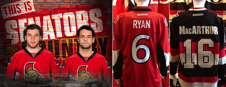
The NHL officially announced today something we've all known for a while now. The 2014 Heritage Classic will be held at B.C. Place on March 2 as the Vancouver Canucks host the Ottawa Senators.

I haven't seen the full logo anywhere yet, but the text treatment above has been making the rounds online. It at least gives us a bit of an insight into the type style. That's something, right? Hopefully we won't have to wait long for the full version.

Islanders not changing for Brooklyn. Really!

Chris Botta feels the need to keep reminding us that Charles Wang has no intention of changing the New York Islanders' logo or uniform when the team moves to the Barclays Center in Brooklyn in the next couple years. That's probably because of all the conflicting reports.

Last month, Isles CEO Brett Yormark was seen on the Internet talking about realigning the club's brand with its new location. He never said anything specific but it's easy to read "changes are in store." But every time he says something like that, Wang, the owner, fires back about how the existing identity isn't going anywhere.

But reading between all the lines — and there are a lot of them — everything seems to be leaning toward a third jersey change. The current black one is widely disliked (at least on the Internet) and could easilly be replaced with something more "Brooklyn-ized" by 2014 or 2015.

The Sharks could've been the Oakland Blades

Yesterday, the Silicon Valley Business Journal had an interesting piece on the genesis of the San Jose Sharks' identity from the early '90s. The writer spoke with sports consultant Matt Levine, who was brought on in 1989 to help develop the club's branding.

Levine talks about why the colors are teal and black, how S.J. Sharkie was born, and the significance of the triangle from which the shark protrudes in the logo. But more importantly, he explains that the franchise was almost based in Oakland and a name-the-team contest yielded Blades at the preferred moniker.

I highly recommend reading the story.

That's all. Looking forward to the unveiling of the Sabres' third jersey on Friday. 'Til then!

NHL Sweater Switch 2013

Sweater Switch was an annual tradition on Icethetics going back to 2009 — until I accidentally skipped it last year. No one asked for it and I quite simply forgot about it. Not this year.

Now that we're several days into NHL free agency, teams are starting to hold press conferences to introduce their newest members. So I'm gathering up photos to give us all a first glimpse at a handful of big names who will be sporting new sweaters in the fall. Enjoy.

Photos from Philadelphia Flyers (via Instagram)

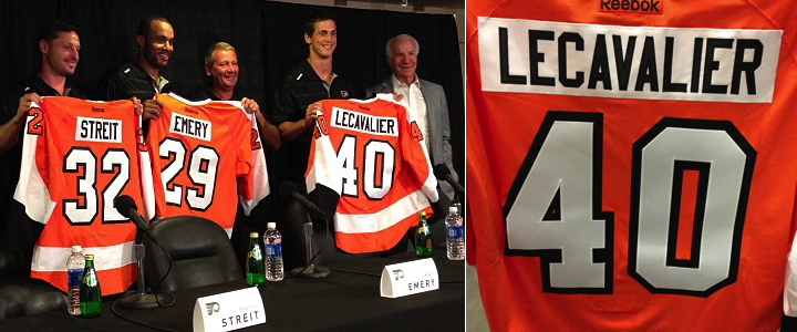
Flyers add Lecavalier, Streit and Emery

This has got to be the most bizarre one of them all. And I'm not just speaking as a Lightning fan here. Vincent Lecavalier wearing anything but the bolt is just not right. Even if he is on the downswing of his career. Trading blue for orange. Four for forty. And temperate Tampa for chilly Philly. Just bizarre.

Lecavalier was forced to dump the No. 4 jersey he wore for many years in Tampa since it was retired by the Philadelphia Flyers in 1975 for Barry Ashbee. But here's a fun fact: Lecavalier wasn't always No. 4. After being drafted by Tampa Bay in 1998, he actually wore No. 8 since his Jean Beliveau-inspired jersey was taken by previous Lightning draftee Cory Cross. However, the following season, Cross was traded for Fredrik Modin, freeing up the number we all associate with Vinny. I'm hoping he's the last Bolt to wear it.

Mark Streit also had retired-number problems. His standard No. 2 was raised to the rafters in Philly just last year for Mark Howe. For Ray Emery, on the other hand, Tuesday's media event was all very deja vu. He held up that same No. 29 Flyers jersey for pictures when he was signed four years ago.

By the way, the Courier-Post has a neat shot of the trio wearing their new threads.

Photo from Dallas Stars (via Facebook)

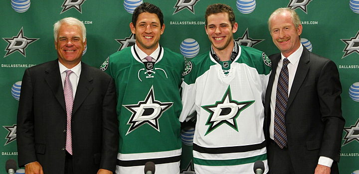
Stars welcome Seguin and Horcoff

Also on Tuesday, two new Dallas Stars players got to model two new Dallas Stars jerseys. Shawn Horcoff, in green, will wear No. 10 next season as he has for nearly all his years in Edmonton. (I believe he had No. 36 briefly as a rookie.)

Meanwhile, Tyler Seguin, donning white for the media, was forced to swap digits as his No. 19 was retired by the North Stars for Bill Masterton in 1987. They still honor Minnesota's retired numbers in Dallas. He'll now wear No. 91 in Dallas.

By the way, don't forget that this franchise will be retiring another number next season. On March 8, 2014, No. 9 goes up for Mike Modano, a fact made public last month when the Stars unveiled these new uniforms.

Photos from Columbus Blue Jackets

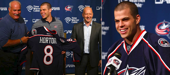
Nathan Horton joins Blue Jackets

The Columbus Blue Jackets wasted no time getting their biggest free agent signee in front of the media. Nathan Horton met the cameras on July 5, the first day of free agency and the day he signed his new deal. As you can see, he'll take on No. 8 with R.J. Umberger occupying No. 18.

But this is the last time we'll see Horton in a Blue Jackets jersey for a while. He's about to undergo shoulder surgery, which will put him out of commission for four to six months. Meaning we probably won't get to see him in action until November or December.

By the way, speaking of Horton and Seguin, I was amused by this photo from 2010, depicting the pair showing off their new Bruins jerseys. Just goes to show how futile these things can be sometimes.

Anyway, I'll leave it here for now. There will be more of these press conferences as the summer goes on, so I'll just keep adding updates to this post.

By the way, I know the the Minnesota Wild already introduced Keith Ballard, but I understand they're doing Matt Cooke on Wednesday, so I'll post their pictures together once that happens.

Deal Approved for Arizona Coyotes

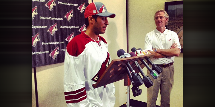
Late last night, the Glendale City Council approved a deal that will keep the Phoenix Coyotes in town for the foreseeable future — but with a new name. The team will take the ice at Jobing.com Arena this fall as the Arizona Coyotes.

That was part of the agreement with the new buyer, Renaissance Sports and Entertainment. And it's been in the works a while. You can read more about it all here.

As far as logos and jerseys go, I wouldn't expect any major changes before October. Obviously, we'll see a new wordmark — which could be a simple as swapping out Phoenix for Arizona in the existing wordmark. Though there's plenty of time to come up with something entirely new if they wanted.

More interesting is the "PHX" patch on the left shoulder of the home and road jerseys. It's in the shape of Arizona and the design is inspired by the state flag. But will it be changed or removed for next season? My bet is it will. It's pretty late in the calendar for Reebok, but there may still be enough time to get it changed rather than to drop it entirely. One thing's for sure, though. That PHX patch just became a collectible.

I'll keep you apprised of anything I hear as the summer goes on.

And for the record, as a Seattleite, I'm only the slightest bit disappointed by the deal because it means our town will be without the NHL for at least another year. And that's not right. On the other hand, I'm happy for Coyotes fans, who can finally put this mess behind them.

NHL Draft Yields Anniversary Logos

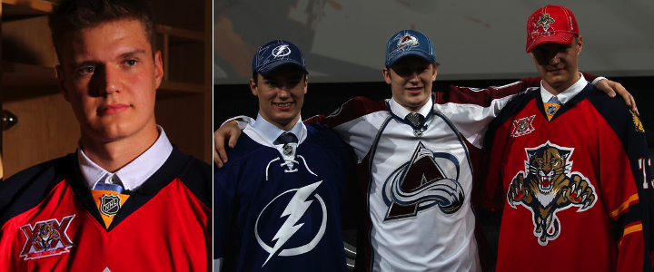
The 2013 NHL Draft was held this afternoon in Newark, N.J. and it treated us to a few new uniform decorations for the 2013-14 season. By that I mean it was positively lousy with special anniversary patches. I'll review those and some other items, team-by-team, in the order it all happened.

Photos from Florida Panthers

With the second overall selection, the Florida Panthers took Aleksander Barkov. They handed him a red jersey featuring the new 20th anniversary patch on the chest. This wasn't our first time seeing the logo, but it was the first time in patch form on a sweater.

Photos from Carolina Hurricanes

The Carolina Hurricanes picked fifth, nabbing Elias Lindholm, giving us another opportunity to see the new threads. I'm still not a fan. Where's the originality of days gone by? Not to mention, the poor kid looks pregnant wearing that.

Photos from Yahoo! Sports

With a pair of first round selections, the Dallas Stars decided to get creative with their new sweaters — handing out one of each. At No. 10, Valeri Nichushkin got the green home jersey while Jason Dickinson got the white one at 29th overall. And the uniforms still look amazing.

Photos from Yahoo! Sports

Skipping ahead to the 18th selection, we find the San Jose Sharks avoiding the jersey redesign question by letting Mirco Mueller have the black alternate. Look at his face. He sees what they did there.

While we're on the third jersey subject, the Minnesota Wild also kept to their tradition of making green the first thing their greenhorns get to wear. Pictured above is Dylan Labbe, taken 107th overall. That brings us to the third and final team to hand out a third jersey today.

At No. 26 were the Anaheim Ducks, who are about to mark two decades in existence. They selected Shea Theodore of the Seattle Thunderbirds. His alternate jersey featured the Ducks' new anniversary logo, which got its official unveiling with today's festivities.

Photos from Anaheim Ducks

I won't lie. I'm disappointed. It's a rehash of the Ottawa Senators' 20th anniversary logo from two years ago. It doesn't tie in to any existing Ducks branding — apart from the D stuck on it like a game of pin the tail on the donkey. It's all set in the stale Bank Gothic font every other sports team has used at some point. And it's packed with lazy gradients. My favorite.

The Ducks unveiled the logo via Twitter this afternoon following Theodore's selection. They also posted this press release to their website, detailing plans for their 20th anniversary season. One interesting note is a "Throwback Night" set to take place "near the start of the 2013-14 regular season, paying homage to the inaugural 1993-94 Mighty Ducks of Anaheim season."

Does this foreshadow an eggplant-and-jade specialty jersey? One can dream. The release says more details will be announced at a later date.

Photo from Boston Bruins (via Instagram)

The Boston Bruins didn't get their first crack at the draft pool until the end of the second round, 60th overall to be precise. But they did have jerseys on hand for the later picks featuring their 90th anniversary patch. It was revealed via their Instagram account during the draft. (Also a couple of photos on Twitter.)

I've yet to see it in any digital art, but it looks all right. It's the standard giant number above a ribbon with the team's logo tacked on the middle. It resembles the club's 80th anniversary logo more than its 75th — which is a good thing. And while it conforms to the dull conventions of an anniversary logo, it's unique enough to be a solid logo as far as I'm concerned.

(And for the record, I think Icethetics concept artist Justin Nahhas is somewhat psychic. Compare this logo to a design he created almost two years ago.)

One final note. I did a tally of all the jerseys handed out to draftees today. Out of 30 teams, 25 used their dark home jersey, three went with a third jersey (read above) and three used white road sweaters, including Colorado, Winnipeg and double-dipping Dallas.

That's it as far as jerseys are concerned. But there's one more item. We learned at last year's draft that Philadelphia will take on hosting duties in 2014. But we didn't get the full version of the logo until today.

I love the bell shape of the shield for this one. Just outstanding execution of what can be a tired concept. The Liberty Bell is in Philly, we get it. But this is a neat logo!

What do you think of all the new stuff we got to see today? Hit or miss on the anniversary logos?

Predators Unveil 15th Anniversary Logo

Nashville celebrates decade-and-a-half with special mark

All right. First, who else is reeling from the revelation that the Nashville Predators have been around for 15 years? Now I think I understand all the folks who couldn't believe last year was the Lightning's 20th. How old am I?

With that out of the way, there's not much to this story. The Preds unveiled the logo on Monday along with plans for marking the anniversary starting in the fall. That link is useful if you want to know more.

Before you ask, I don't anticipate any special jerseys for next season. Certainly no third at least. And 15 years doesn't really feel long enough to break out the "classic sweaters." (That's not to say I wouldn't enjoy seeing Nashville in those old mustard thirds again.)

In their release, the Predators did tease a special 15th anniversary website with stories from the origins of the club. If nothing else, maybe we'll get to relive the stories about how the name and logo came about. And if we're really lucky, maybe they'll share some of the original concept logos they looked at before landing on the final version.

In other anniversary-related news, let's remember the Anaheim Ducks should be marking 20 years this season, having been founded in 1993. (The Stars also moved to Dallas in 1993 yet did their 20th anniversary thing this past season.)

And in case you missed it amid all the Dallas/Carolina excitement, the Florida Panthers unveiled their 20th anniversary logo last month. I don't believe there are any other anniversaries that end in 0 or 5 this year. At least not in the NHL.