Series of "glimpses" offered up by Buffalo today
We knew we were getting a little something out of the Buffalo Sabres today with regard to their new third jersey. But I'm not sure I expected as much as we got.
Sabres goalie Jhonas Enroth appeared to be the impetus for some of today's jersey action. Though I'm not sure if it was staged as a social media marketing effort or if Enroth was legitimately curious about the new uniform. I don't know anything about him and his Twitter presence.
It began this morning when Enroth tweeted, "when is the sneak peek for the new 3rd jerseys?" To which the Sabres' official Twitter account replied, "our jersey teaser video will be played in the arena during the scrimmage today."
Then in a follow-up tweet, he tried to cajole a picture out of the team. And would you believe it, he got one! That's why I wondered if it was staged.
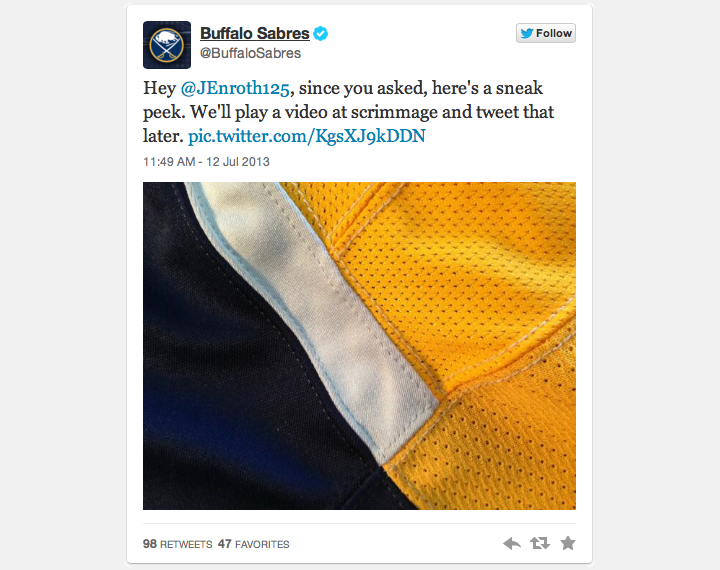
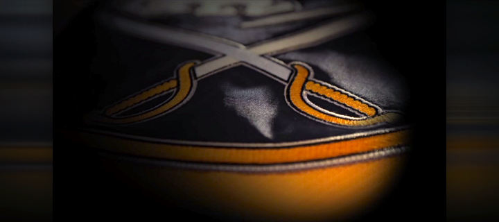
So that was it. At 11:49 AM PT, we got our first official "sneak glimpse" of the Sabres' new gold third jersey. And there was much more to come, of course. But first, there was some debate on Twitter as to what part of the jersey this is.
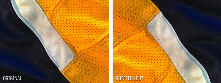 Photo from Buffalo Sabres (via Twitter)
Is it the bottom of the jersey? Sure looks like it could be. But if we flip the photo around, now it looks like it could be a shoulder with a yoke design inspired by an old Boston Bruins sweater. Very clever, Sabres marketing people. Very clever.
So really all the photo tells us is that the jersey is mostly gold with some navy and white in there. Standard Sabres colors. Good to know. (At least it's not black, right?)
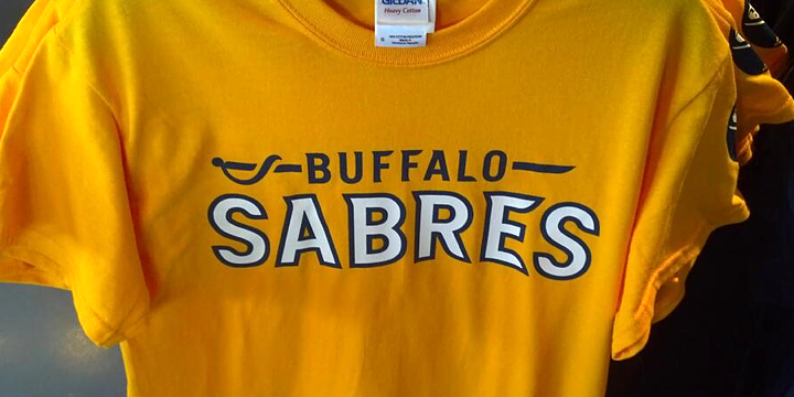 Photo by Eric Schmitz (@3rdManIn via Twitter)
Fans tweet gold t-shirts with new wordmark
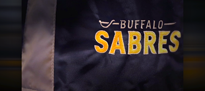
The other thing we got today was our first look at the Sabres' new wordmark. (They've been using the Slug-era mark for the past few years despite not using the Slug anymore.) Eric Schmitz tweeted the photo above. Garret Wolowski was actually the first person I saw to tweet a picture of this shirt but Eric's shot had better lighting. (Sorry, Garret.)
This is a solid, modern logo — something Buffalo hasn't faired to well with over the years. It's striking in its simplicity. Basic letter shapes that form sharp, blade-like serifs. And even the sword from the crest has been incorporated, though straightened out to fit with the style.
So where else might we see this new logo? Glad you asked. As promised, the Sabres posted that teaser video on their website this afternoon and it gave us a few more insights into the new look.
Frame-by-frame: The Sabres' teaser video
First, a lot of tweeters bemoaned the lack of anything of substance in the video. But of course they're missing the point. This "I want it now" culture of ours is sad. Whatever happened to building anticipation? Plus, it'll give us more to talk about here on Icethetics for several more weeks.
That said, I'm afraid I won't be satisfied to just give you the video link and be on my way. Yeah, I'm going to have to break it all down frame for frame. I can't help myself. I write an entire blog about hockey uniforms. You understand.
 All video stills from Buffalo Sabres
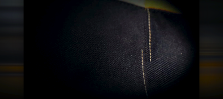
We begin on a tight shot of blue jersey material as the stitching animates on. This is odd because everything prior to this has indicated the jersey will be gold. But this is a big swatch of blue. Of course we can see a sliver of gold and white at the top of the frame, but deciphering what part of the jersey this is exactly is near impossible.
For what it's worth, I am intrigued by the white stitching on the blue areas of this jersey. That will make for an interesting look. On most jerseys, isn't the stitching the same color as the fabric itself?
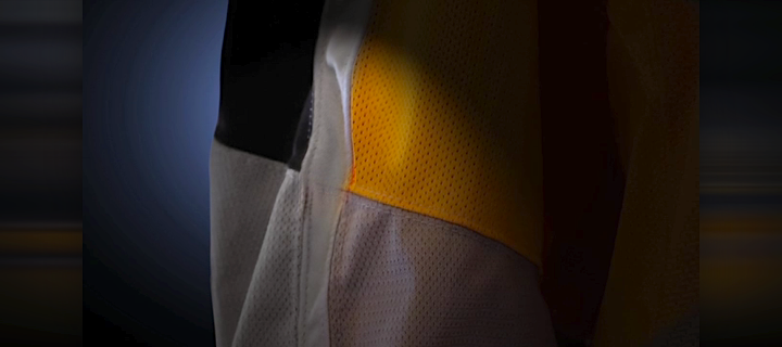
Next we cut to what appears to be the right sleeve. But even as I say that I'm unsure. This patchwork mess doesn't really resemble any Reebok Edge material I'm familiar with. And it looks like the top half of the sleeve is colored and the bottom half is white, giving it that T-shirt effect the Predators used to have.
Plus, it looks like the front of the sleeve is gold while the back is blue with a heavy white stripe running between them down the length fo the sleeve. Is that right? Or is this another part of the uniform altogether?
Hey, it's that new wordmark we saw earlier! And there's no question about what this is. We're looking at the pant shell, the right leg to be specific. Good a place as any for a wordmark. Better than the chest at least. And this is a great-looking logo. Modern and retro all at the same time.
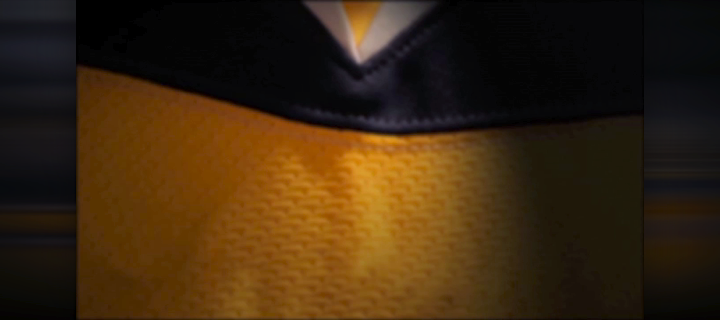
Cut to what is clearly the collar. We've come to know that triangle very well thanks to our friends at Reebok. And look, a shoulder yoke that extends below the triangle. This is new. But this still frame doesn't tell the whole story. All throughout this video various elements have been animating on, just like the stitching at the beginning.
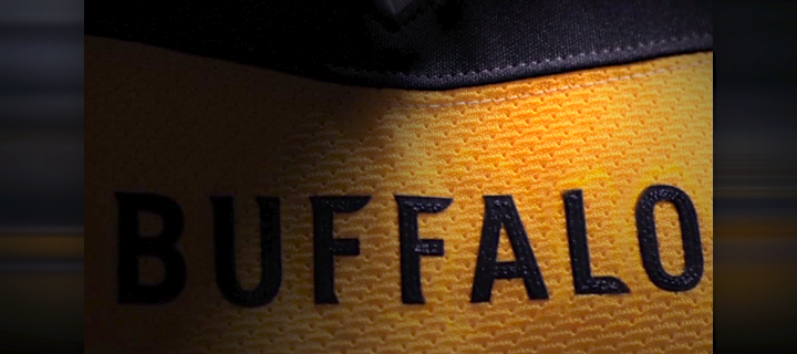
Here, the word BUFFALO animates on just below the collar. It's the same style of text as the wordmark. This is NFL territory, folks. But for better or worse, it seems the NHL is dipping a toe in. It could be kind of cool. Remember that the last Sabres third jersey also had the word BUFFALO plastered across the front. But this one seems to be more toned down. Of course we haven't seen the crest yet.
Now we're on the collar itself. First, it's dual-toned in a way we haven't seen before on an Edge jersey. It's white until just above the triangle where it abruptly goes blue. But more noticeable than that is Reebok's "hanger effect," which really doesn't seem to be going anywhere.
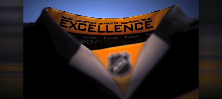
Inside the back of the collar is crammed a bunch of words: belief, commitment, character, discipline, trust and excellence. I'm assuming it's some sort of locker room mantra for the Sabres. Seems like a bit much for a jersey, but to each his own.
By the way, this shoulder yoke is starting to remind me of those hoodies sold in the NHL's online store. It looks huge and given what we saw in earlier frames of this video, it may extend down to the elbow.
At last, with the video winding down we get a look at the crest. Thank goodness! It's the classic Sabres primary logo from the home and road jerseys — albeit the one from 2008 with silver trim. But I'd rather that than another new logo from this organization. Normally I'm in favor of alternate crests on alternate jerseys, but every time the Sabres try something new, they manage to miss the mark. By a lot.
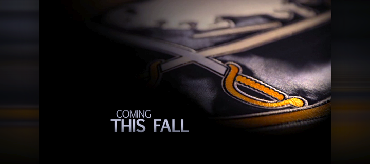
The video ends on a graphic reading, "coming this fall." It's not clear whether they're talking about the full reveal or the on-ice debut — which would have to wait for the fall since the season doesn't start until then.
After posting the video, the Sabres made it clear in a tweet that seeing the whole uniform is still far off at this point. They promised more photos "in the coming weeks." So we should keep an eye on their Twitter account for a while.
Another thing worth keeping in mind is that the Sabres typically hold off on jersey unveilings until training camp, when more eyes are on them. So the full reveal could be up to two months away in mid-September. But now is a perfectly good time to get some buzz started. It just better live up to the hype now.
All right, I'm done. Time to share your take on all this. Maybe you saw something the rest of us didn't. Maybe you're looking at these photos and video stills in a way others aren't. Comment away!
Update on 2013-07-13 21:52 by Chris
Another player got into the act this afternoon. Steve Ott tweeted this:
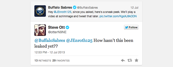
A fan replied asking if Ott had seen the new sweater yet. Ott said, "nope." Looks like Sabres are hoping to keep things under wraps for a while.