The Mighty Ducks Still Shine
/ Photo from Anaheim Ducks
Anaheim looked fantastic on Throwback Night
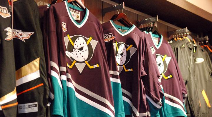
I still puzzle over this one. Why did the NHL have to lose one of its coolest brands? And make no mistake, the Mighty Ducks of Anaheim were definitely among the best. And don't give me a lame business or marketing excuse. This uniform should still be making regular appearances every night.
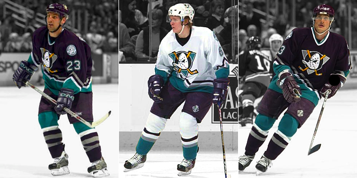
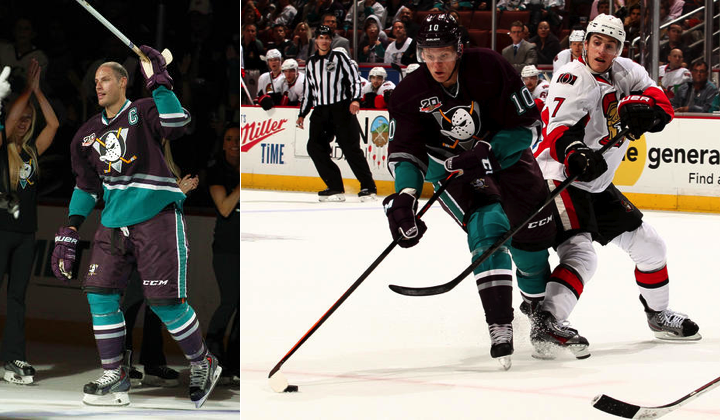
Sunday night was a special one in Ducks history. Not only did they pay homage to their inaugural team with the most crowded ceremonial puck drop ever, but they did it in style by breaking out the old eggplant and jade jerseys no one can forget.
 Photos from Anaheim Ducks
Twenty years on, those uniforms still look great. Is the crest a little cartoony? Maybe, but it's a classic. Are the colors a little unusual? Of course, but that's what gave this team its identity! Anyone who doesn't love these jerseys doesn't love hockey uniforms for the right reasons.
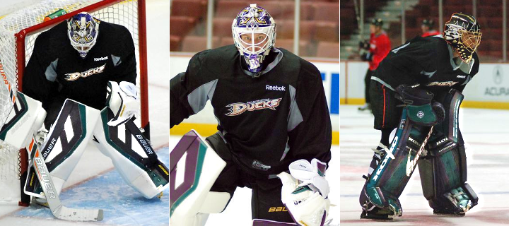
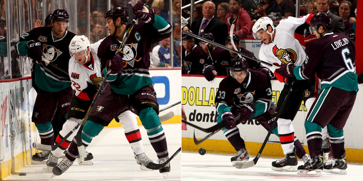 Photos from Anaheim Ducks
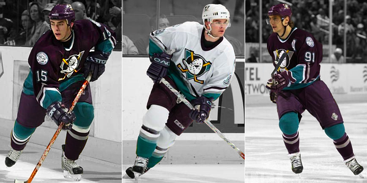
One of my favorite rules of good sweater design is whether the team is still recognizable without the crest. This one absolutely is! The current Ducks jerseys are as well, for the most part, but for the wrong reasons. All three California teams wear black and, for one of the sunnier states in the union, that's sad.
Look at this. Is there any question this is a California team? Can't say that about the black and gold.
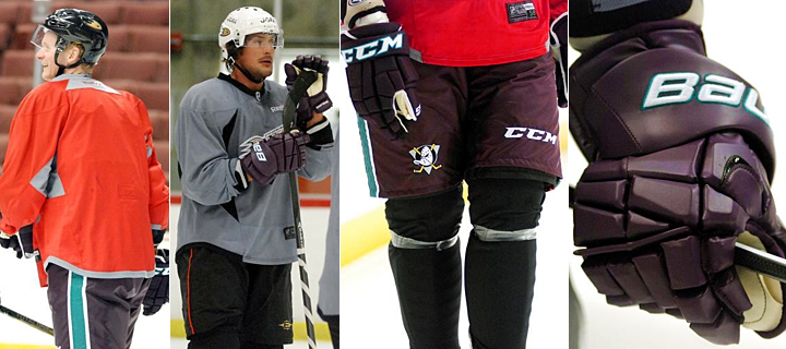
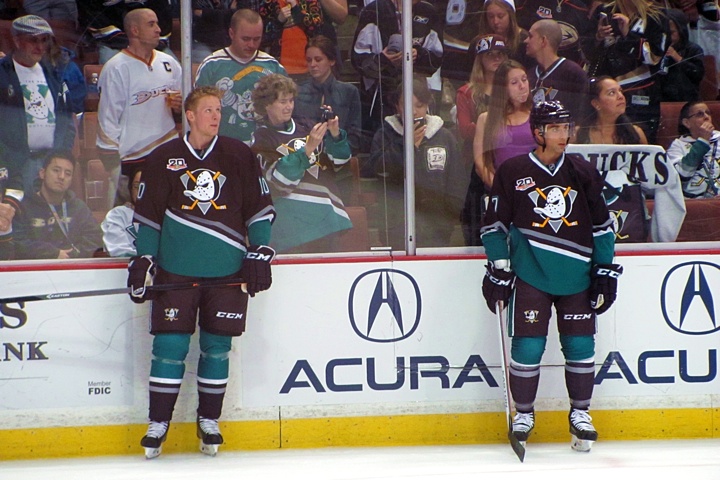 Photo provided by Paul Gheduzzi
Icethetics reader Paul Gheduzzi was at the game Sunday night and snapped a few pictures during warm-ups. I particularly like seeing the original Mighty Ducks third jersey from 1996 in the crowd above. Still have one of those hanging in my closet.
 Photo provided by Paul Gheduzzi
One of my favorite aspects of Ducks' Throwback Night was how even the TV side got involved! Throughout the game, Prime Ticket used classic-colored graphics and the Mighty Ducks logo and even mixed in a few old-style Chyron overlays.
 Stills from Prime Ticket (via NHL GameCenter Live)
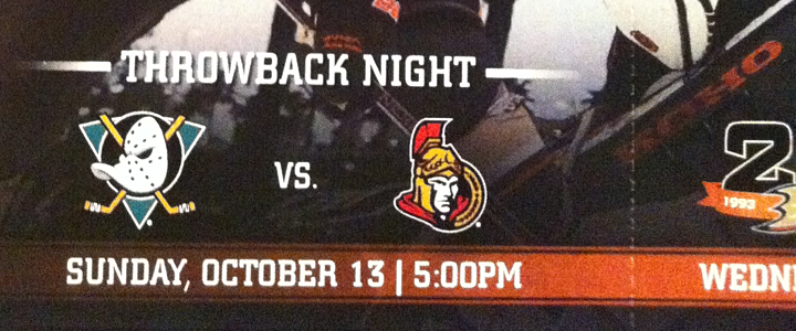
I enjoyed the use of the original Ottawa Senators logo too. Some Icethetics readers wondered if the Sens had planned to surprise us with an early '90s throwback of their own. But this was Anaheim's night, so it wouldn't have made much sense.
It was a pretty spectacular night all around for jersey geeks and Mighty Ducks fans. So the next question we have to ask... will they do it again?
The Ducks haven't announced plans for any other throwback nights this season, but given how popular this one was (on Twitter at least; I wasn't at the Honda Center), I could see them scheduling one more later in the year.

Could Ducks go Mighty again for outdoor game?
Let's not forget that the Ducks will play an outdoor game on Jan. 25, 2014. They will meet the Los Angeles Kings at Dodger Stadium as part of the NHL's new Stadium Series. (All five teams involved are expected to have special sweaters for the games.)
But before you point out that teams wear white on the road (and the Ducks would be considered the road team for this game), understand that none of the standard rules really apply when we talk about these outdoor "event" games.
The Sabres wore white when they hosted the first ever Winter Classic in 2008. In this season's Winter Classic, neither team will wear white. Plus, if the Ducks and Kings wear throwbacks, they'd be "throwing back" to a time before 2003 when teams did wear white at home.
I point this out not because I don't want to see a white version of the Mighty Ducks jersey again, but because it would make more economic sense for Reebok to produce just one throwback jersey for the Ducks in a single season rather than two. This is an outdoor game, but it's one of four so it won't be as big a deal as the actual Winter Classic. (In other words, I'm tempering expectations.)
So that's my take. What's yours? And what did you think of seeing the Mighty Ducks on the ice again after seven years? Would you want to see more or less of them in the future?