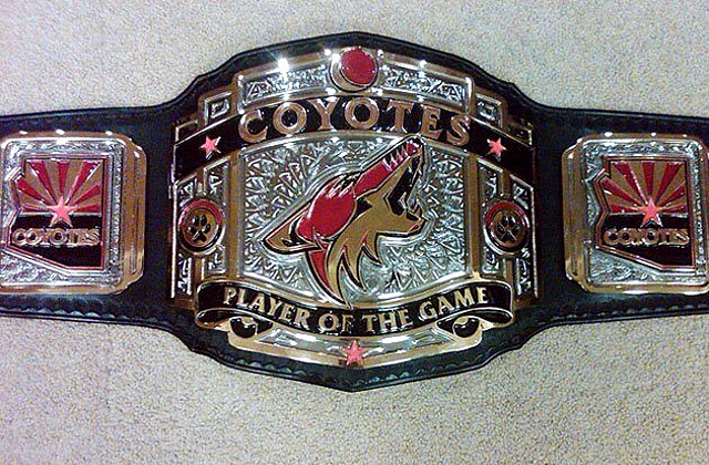
Coyotes planning 1996 throwback jersey

New name to be matched with old sweater in 2014-15 season

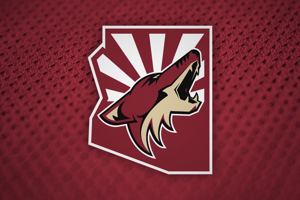
Craig Morgan of FOX Sports Arizona elaborated on the Arizona Coyotes renaming with a report that they plan to bring back their original uniforms for a game next season.

You can see Morgan's series of tweets on the side. Hopefully this is more than just wishful thinking.

That's not all.

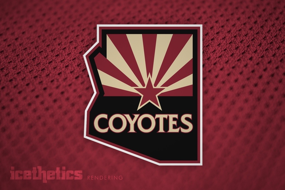
Coyotes owner may be mulling a future rebrand

Down the road, could the team also be considering a completely new look? Based on an article Morgan wrote Wednesday, it sure seems that way.

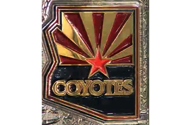
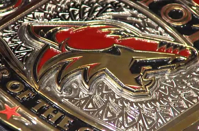
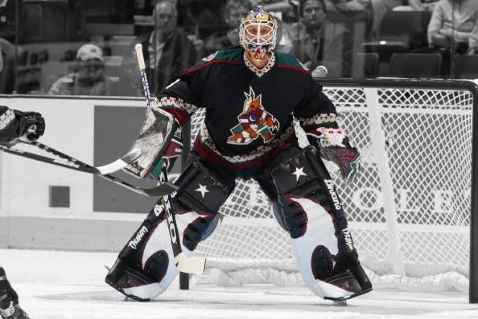
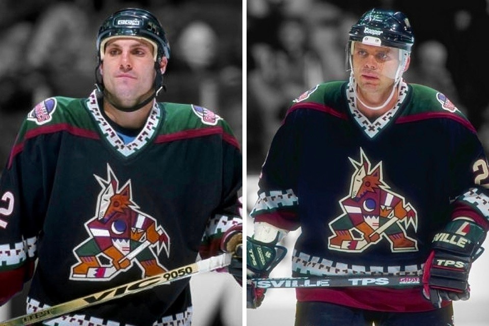
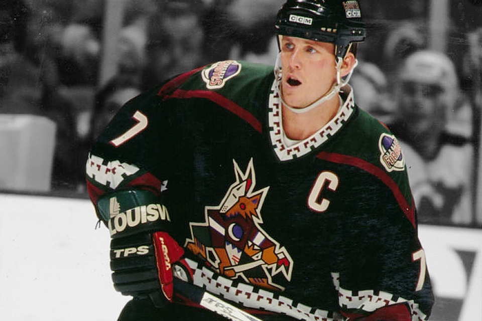
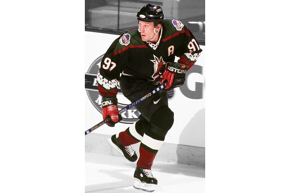
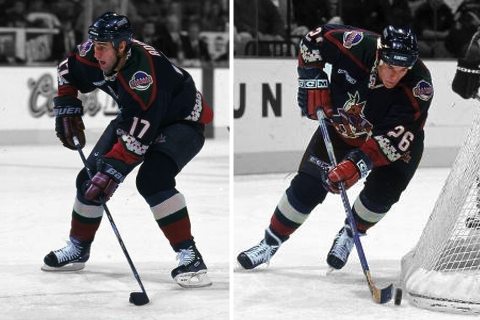
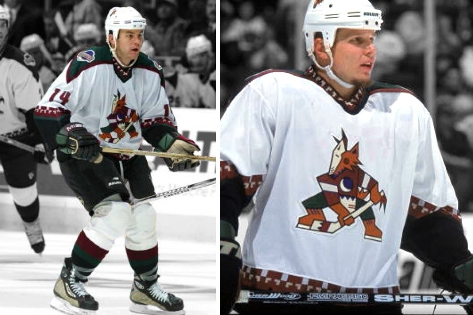
Once the Coyotes make the name change they might also consider rebranding. The team changed its logo once already from the old Aztec style Coyote — known locally as the Cubist Coyote — to the current logo when the team moved from America West Arena in Phoenix to Jobing.com Arena in Glendale in 2003.

But the uniforms will remain the same in the short term. 

"Changing uniforms is a considerably longer term process that requires significant lead time with our merchandise partners," [Coyotes president and CEO Anthony] LeBlanc said.

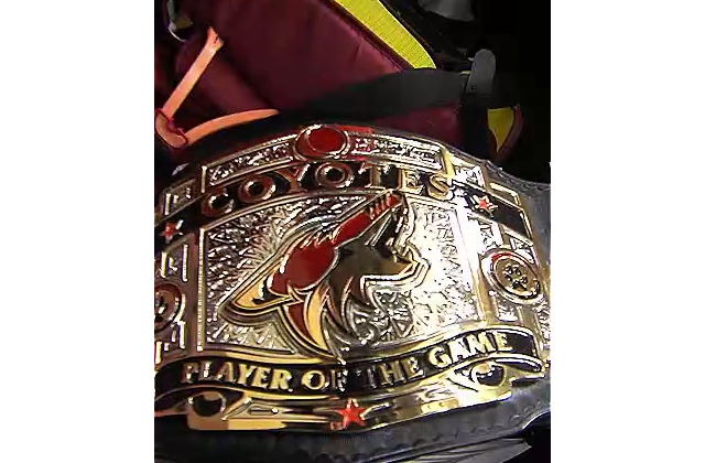
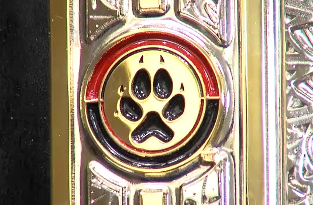
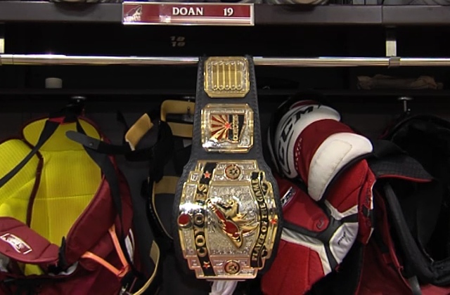
There are two visible changes to the uniform that Coyotes fans can look for next season. The team will introduce a shoulder patch for their home and road jerseys. The patch will be unveiled for the first preseason game next season. 

Will this bring another new logo? The third in less than two decades in the desert?

Even if LeBlanc is happy with the logo and just wants to update the uniforms, that would be big news. The Coyotes escaped the Reebok transition mostly unscathed — except for the disappearance of the waist stripes from their jerseys.

Personally, I've been hoping for an upgrade for the Coyotes for a long time. And not just the name change — though I do prefer Arizona Coyotes.

Anyway, if you're a Coyotes fan and not following Craig Morgan, get to it already!

Focus groups saw unused Coyotes logos in 2003

Since we're talking about the possibility of the Coyotes changing their 11-year-old logo, I thought this might be a good time to look back at its genesis.

Roll back the clock to Feb. 23, 2004 when the SportsBusiness Journal published an article talking about how the Coyotes successfully launched a new hockey brand... in the desert... in the summer.

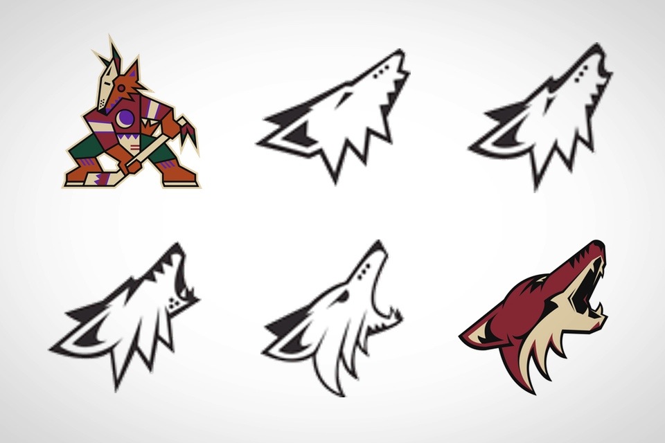
The piece itself is an interesting read, but most notable were the various logo concepts shown to focus groups. You can actually see the evolution of the original logo into what it became.

The new "howling Coyote" logo, produced by the Adrenalin Design Group, was the most extreme of the four finalists presented to focus groups. It also was the most popular, fitting in with the fans' wishes to get far away from the previous multicolored "masked coyote" logo, yet remaining true to the Southwest identity.

The result was a mark that features a desert sand and red palate [sic] and connotes aggression and speed.

It's always exciting to see some of the drawings and logo designs that didn't make it through to the end of a team rebrand.

Flames ditch third jersey on Western night

Calgary is 0-8 this season in the new threads

Athletes are a superstitious bunch. Everyone knows that. But it seems to have shown up in a tangible way Saturday night as the Calgary Flames made a last-minute decision not to wear their new third jerseys.

After all they are 0-8 this season while wearing them. But this was Western Night — a theme night perhaps tailor made for a jersey with obvious western influences. The "C of Red" became a sea of white cowboy hats while the Flames wore their standard red home sweaters.

As it happens, Calgary won in overtime on a Mikael Backlund goal and extended a home winning streak to five games. Was it because of their jersey choice? We'll never know.

What we do know is the Flames announced the new sweater would be worn for 12 home games during the 2013-14 season. Either that number now drops to 11 or another date will be added.

I have a hunch it's the latter. What about you?

Update

Superstition was definitely to blame Saturday night. During his post game press conference, Flames coach Bob Hartley straight up admitted it.

Reporter: Did you have any say in what uniforms your team wore tonight?

Hartley: Yesterday I talked to Brian [Burke]. I said we're playing so well right now. I said, "Can we just keep going?"

Brian said, "Let me check." He got back with me and said, "Yeah I can help you that way."

Sometimes little superstitions... sometimes they work, sometimes they don't.

Thanks to Caleb for the video link!

Monarchs celebrate Kings' original third jersey

Fan vote determined throwback sweater for Los Angeles Kings Night

The AHL's Manchester Monarchs wore a jersey last Saturday, Jan. 25, that hasn't been seen on the ice in 18 years.

Last August, the Monarchs decided to let fans choose which jersey the team would wear in honor of their NHL affiliate for Los Angeles Kings Night.

The vote featured these three throwback jerseys from Kings history.

Option A was the Kings' original gold sweater, worn for their first 13 years of existence. It's the reverse of the purple Legends Night jersey currently in use by the Kings.

Option B, unmistakably, was the first ever third jersey worn by the Kings for a few games in 1996. And Option C was the Kings' alternate jersey from 2002 to 2007.

The result of the vote was an  overwhelming win for that memorable '96 sweater.

A few months later, the first photos of the Monarchs' version of the sweater emerged.

For more photos, check out the Monarchs' Instagram posts on the side. And in case you need a reminder, below are some shots of how the Kings wore it back in '96.

Coyotes confirm Arizona name change for 2014-15

Team will introduce new shoulder patch, keep same uniforms

The Phoenix Coyotes are dropping the "Phoenix" from their name. The club will take to the ice as the Arizona Coyotes to start the 2014-15 season, according to an official statement made today.

The team confirmed its uniforms will remain the same apart from the shoulder patch, emblazoned with PHX and the Arizona state flag inside a mark shaped like the state. The new patch will be officially unveiled in September prior to the first pre-season game of 2014.

Not addressed in the release was the fact that the wordmark and a shoulder patch from the third jersey will also need updates. Flip through the above slideshow to see some potential solutions to the problem.

Anthony LeBlanc — co-owner, president and CEO of the Coyotes — explained the name change:

“Becoming the Arizona Coyotes makes sense for us since we play our games in Glendale and the city is such a great partner of ours. We also want to be recognized as not just the hockey team for Glendale or Phoenix, but the team for the entire state of Arizona and the Southwest.

We hope that the name ‘Arizona’ will encourage more fans from all over the state, not just the valley, to embrace and support our team.”

This change is not at all unexpected. It was part of the agreement with the city of Glendale to keep the Coyotes in town for at least a few more years.

What to expect

So what will the new logo look like? Will the team create something entirely new to represent the state? It seems unlikely given how much Arizona symbolism is already baked into the existing logo.

It would therefore make sense that some minor tweaks could settle things. And there may already be a logo in existence that could do the job.

Many NHL teams have a post-game locker room tradition by which an outstanding player is recognized for his on-ice heroics. For the Coyotes, a custom-designed MVP belt is passed from player to player during the season. It was featured in an online video last spring. Flip through some stills here.

I haven't seen this particular logo in use anywhere else before. However, it could be something the club's marketing department devised as this belt was evidently designed around the time of the arena agreement that required the team's name to be changed. Probably not a coincidence.

What are you expecting for the new shoulder patch design? Big changes or minor tweaks?