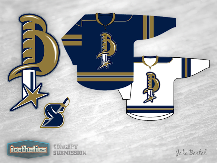
The Hilt

With today's concept, Jake Bartal is upending Buffalo Sabres design convention — literally. He's turned the sword upside down and formed a "B" with the hilt. It's well executed, but it gets a Freak Out Friday placement simply because I'm not sure fans would love a bladeless sabre representing their team.

0179: A Bruin That Shows Its Teeth

Boston Bruins logos have always been more influenced by their city that their team nickname. Here, Jake Bartal has put together a design with a few more teeth — literally.

And if black and gold doesn't work for you, how about brown as another color option?

0102: Sabres with Swords

One of the gripes I hear a lot is about how the Buffalo Sabres logos tend to feature the animal for which the city is named as opposed to the weapon for which the club is. Jake Bartal's concept deals with that issue pretty well. But then I've never minded the Buffalo sports franchises allowing the symbol of their city to represent them. What's your take?