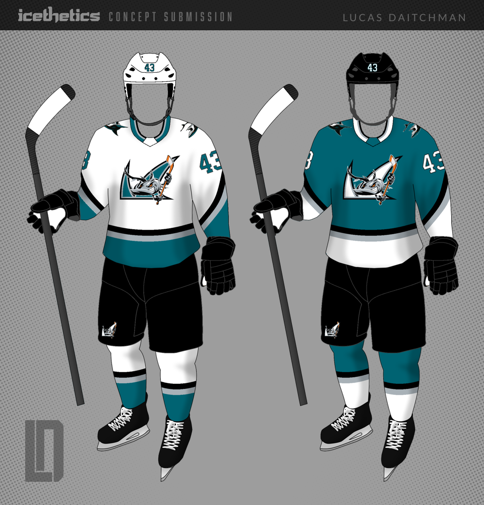
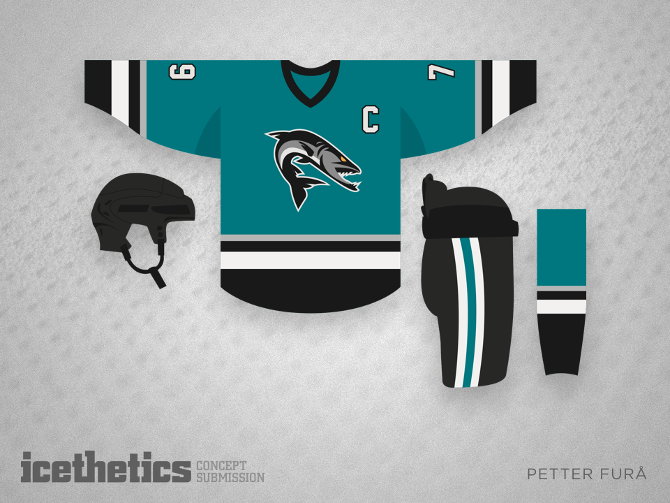
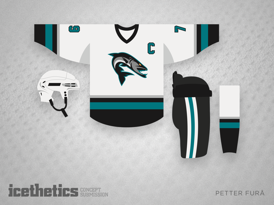
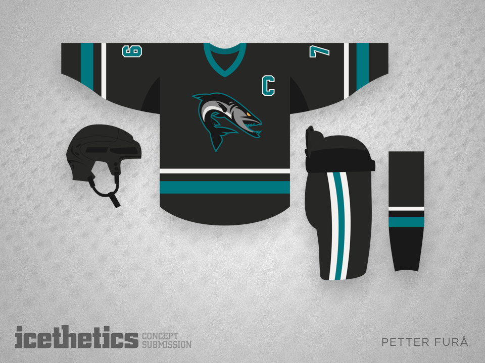
B Is For Barracuda

The incredibly prolific Lucas Daitchman is back for a second time this week to help us out with this Minor League Sunday entry. He's got a simple but sharp redo for the AHL's San Jose Barracuda. (Nevermind the shoulder Sharks swimming upside down.)

Big Teeth

The Barracuda have been one of the more popular rookie teams to get attention from Icethetics concept artists this season. In this one Alan John Herbert moves the Barracuda Networks logo around to make it a little less obvious. What do you think?

Barracuda Style

The San Jose Barracuda have jerseys that mimic their parent club, the Sharks, but Alan Su decided to give them their own style — though I think the dual Barracuda Networks logos may be overkill. 

Better Barracuda

The San Jose Barracuda are about to embark on their inaugural season in the same arena as their NHL parent club. But what if they took their branding in its own direction? Petter Furå has a stunning take on what they could look like.