0355: Sabres or Swords?

This one is sort of a mix of old and new. Matt Marczel says he "was inspired by the old Cinncinati Swords of the AHL during the '70s" for this concept. Their classic look would still work today. But then so would Buffalo's original jerseys from the 1970s. If only they could lose all the extraneous silver piping and fix the blue.

For reference, here's a look at the old Swords jersey.

0354: White and Black Hawks

Nick Burton brings us a couple of Chicago Blackhawks concepts today based on the black-and-white color scheme the club wore during its first eight years of existence. They are pretty sharp and, if you ask me, pull off the colorless palette much better than the Kings do.

0353: Minnesota's Wilderness

Patrik Gustafsson takes a stab at the Minnesota Wild today. It's an interesting look that borrows elements from the primary logo to create the striping pattern for the bottom of the jersey.

0352: More of the Stars in Green

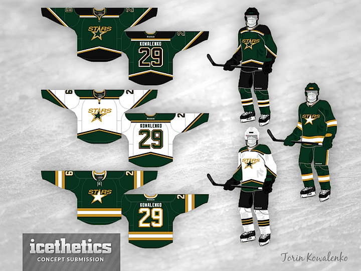
As I've said before, we'll be seeing a lot of Dallas Stars concepts until the team finally unveils its new logos and uniforms later this year. Meantime, here's one from Torin Kowalenko. I like that the set has not one but two green sweaters.

0351: Super Bowl Sunday

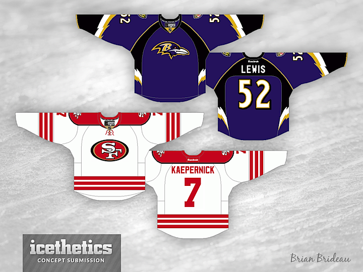
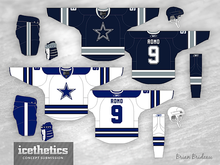
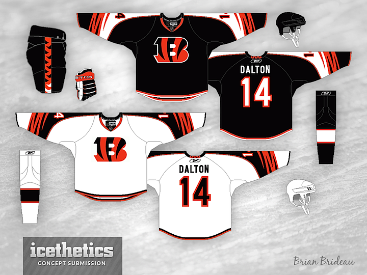
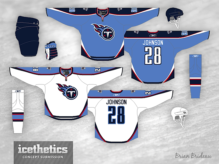
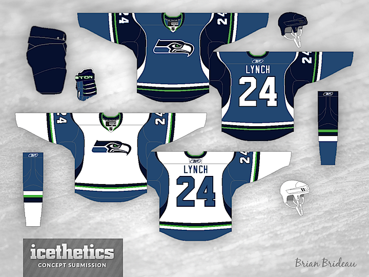
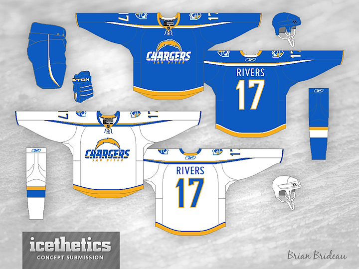
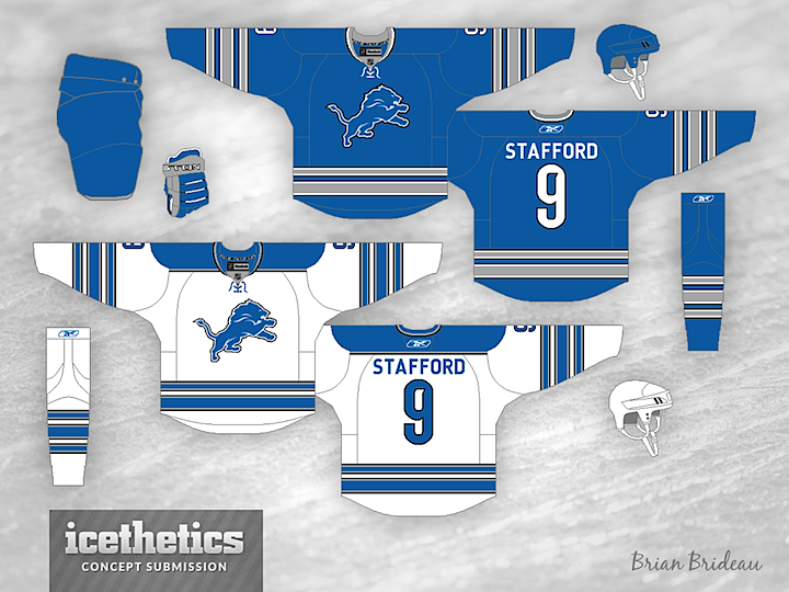
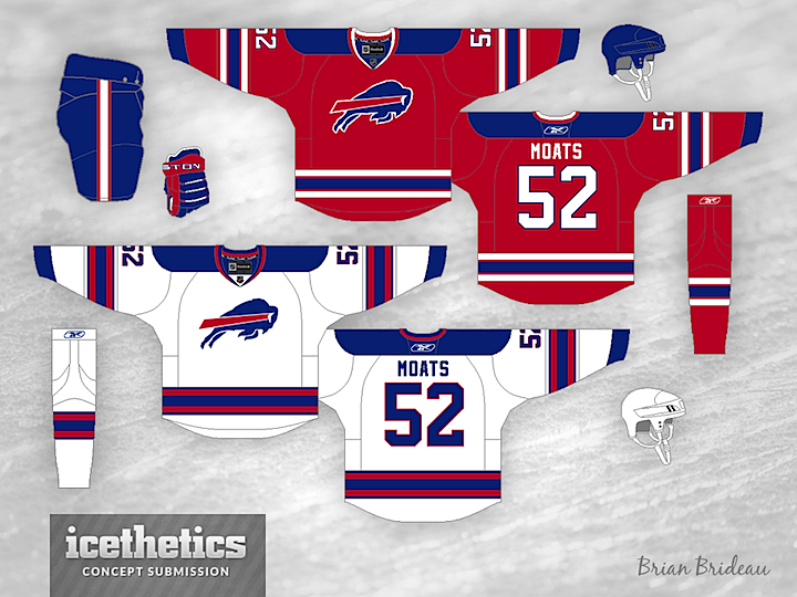
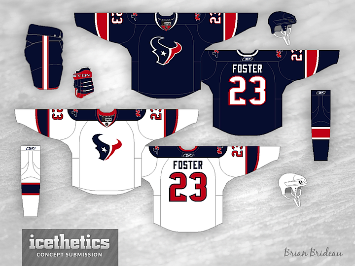
Got a special post today. In honor of Super Bowl XLVII, we have a handful of NFL hockey sweater concepts from frequent contributor Brian Brideau. We start, of course, with the Ravens and 49ers. And as a bonus, Brian has designed jerseys for 8 other teams. Check them out.

Our brand new Sunday concept series kicks off one week from today.