Bring Back Bronze and Blue

In today's concept, Nick Burton mixes together a handful of branding elements from the Washington Capitals' colorful history. And it looks amazing!

There's no question the NHL team based in and named for the United States capital should be red, white and blue. But there are so many other teams using those colors and it's hard not to like that bronze and blue color palette the Caps used between 1995 and 2007.

San Jose Made in Grey

The San Jose Sharks are looking pretty plain these days without those waist stripes. Avi Stein takes it a step further with a mostly colorless jersey.

The Kings wore a grey Stadium Series jersey last season. They have a new one for this season coming on Dec. 16. We're also likely to see the Sharks' Stadium Series jersey in the next couple weeks as well. But it'll probably be teal.

Reading the "T" Leaf

Here's a unique take on the Toronto Maple Leafs' crest from newcomer Adam Del Monte. Way to sneak the "T" in there.

Big Third in Big D

Over the weekend we got a look at some of the concepts considered by the Dallas Stars during last year's rebrand. But I often have a hard time seeing the line between the professionals and amateur designers like Brian Brideau. When the Stars eventually add a black third jersey to their arsenal, it should probably look something like this, right?

Classic Fisherman

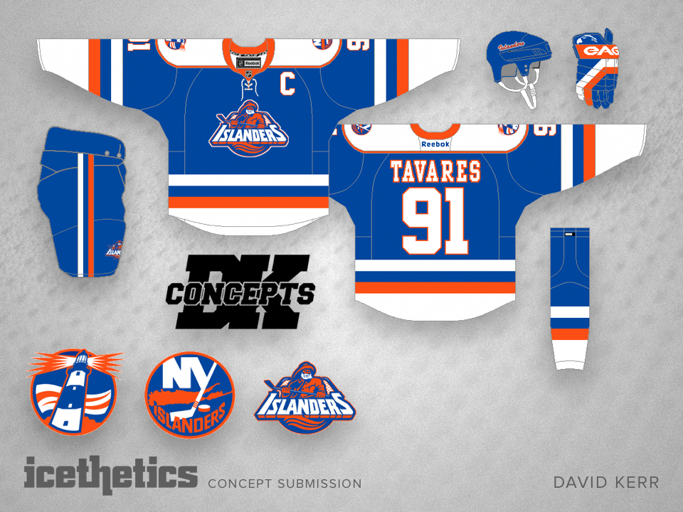
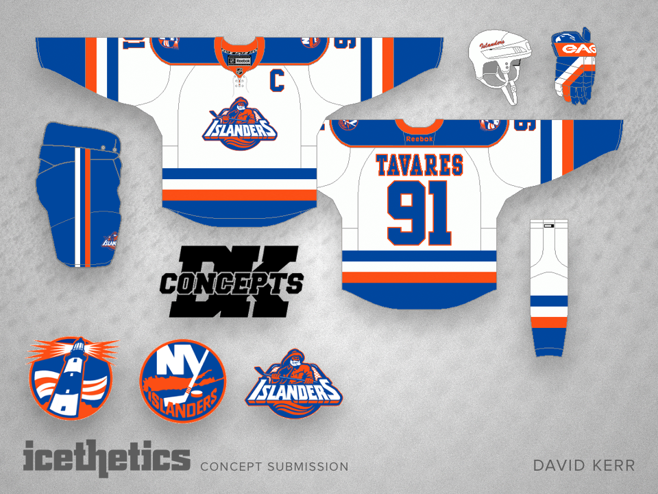
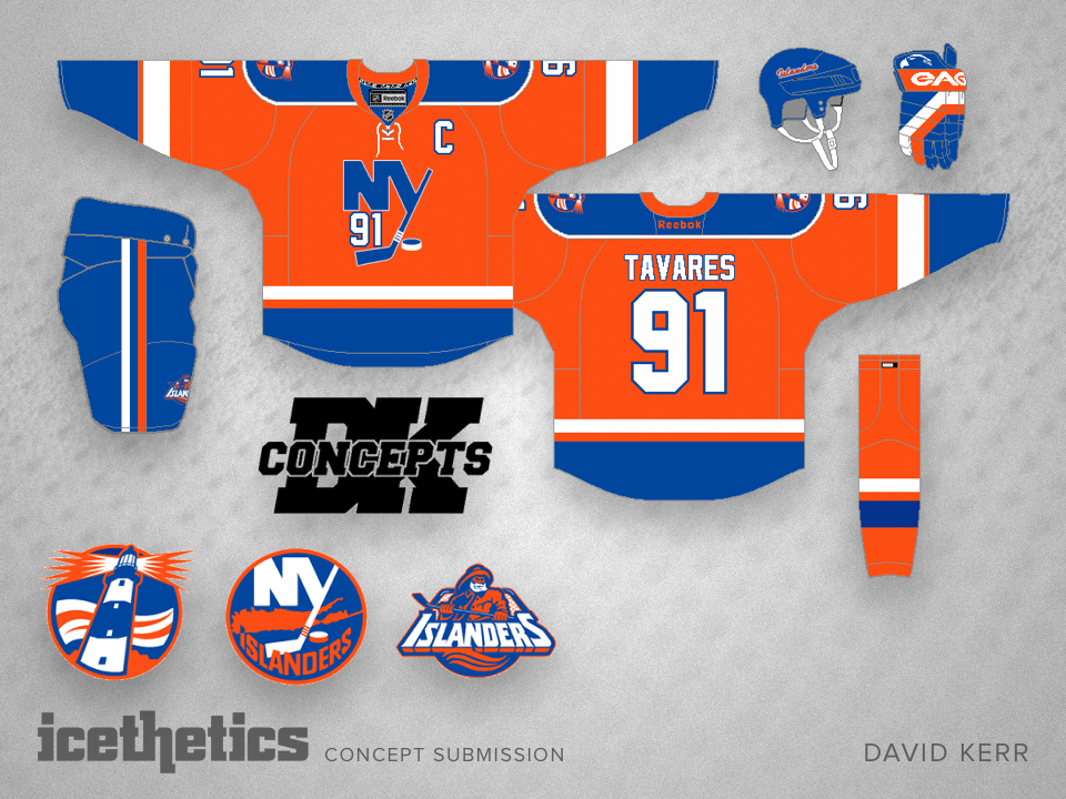
We're wrapping up November with another great Islanders concept featuring a logo that was disposed of almost as quickly as it was introduced. David Kerr wants to bring the fisherman back — sans teal — with a very traditional style of jersey.

It seems to be proof this logo could've actually worked if the team knew what it was doing back in 1995. The third jersey even gives me up for that Stadium Series crest. Nice work here.