
For Canada's Capital
/To thank Matt McElroy for his help over the weekend, I wanted to share one of his concepts today. What do you think of his stripped-down look for the Senators?
To thank Matt McElroy for his help over the weekend, I wanted to share one of his concepts today. What do you think of his stripped-down look for the Senators?
The ECHL's Quad City Mallards hosted a special jersey design contest in October. A handful of artists wanted to share there work with the Icethetics community. What do you think?
Ross Taylor has a sharp, classic look.
Eric Andrews went with something simple.
And finally, Christian Legault decided on a faux retro sweater. Hard to pick a favorite here.

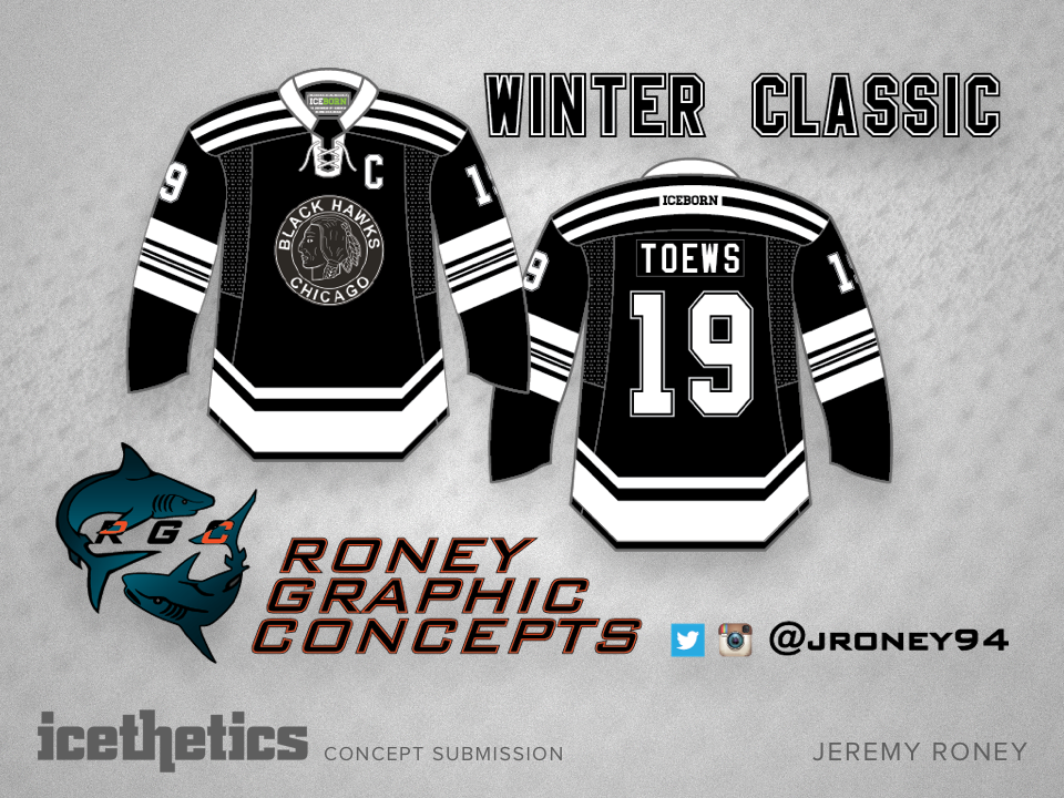
I was really hoping to see the Chicago Blackhawks go with a Winter Classic jersey that looked a little more like this. Obviously Jeremy Roney agrees. Would that have been too much to ask?
The St. Louis Blues have such a great, classic look that seeing something this is just wrong. Remember when the Blues used red trim? Now imagine them wearing a red jersey. Consider yourself sufficiently freaked out for this week.
In today's concept, Nick Burton mixes together a handful of branding elements from the Washington Capitals' colorful history. And it looks amazing!
There's no question the NHL team based in and named for the United States capital should be red, white and blue. But there are so many other teams using those colors and it's hard not to like that bronze and blue color palette the Caps used between 1995 and 2007.