
Designing the ’90s NHL, Part 4: To The Extreme
/I thought this series would conclude with Part 3, but new stories of NHL logo design of 1990s seem to be coming out of the woodwork. Here in Part 4, a story of myth becomes real.
In Part 3, I lauded the Colorado Avalanche for having such an excellent logo. But things very nearly went in the opposite direction for this franchise.
The tale has long been told that in 1995 the Avs were originally supposed to be named the Rocky Mountain Extreme. I call it myth because it was a story that lacked any visual evidence.
Until now.
Rocky Mountain Extreme logos by Michael Beindorff via Mixbook
These stories work best when told from the beginning.
PLANNING FOR THE FUTURE
1995. That was a rough year for NHL fans. We lost half the season to a lockout. The Capitals and Islanders killed their 20-year-old identities with controversial new logos. And the famed Nordiques were mercilessly ripped away from the people of Quebec.

But let's back up for a second. Before the Nordiques were ripped away, they had no intention of leaving. In fact, management was planning for the future by rebranding the franchise with a new logo, uniforms, and new colors (with our '90s favorite, teal!).
Check out this article printed in The Hockey News in April 1995 for details:
Nordiques will have new look in 1996-97
Compiled by the THN Staff
The Quebec Nordiques don't have a new arena yet, but a new logo and colors are on the way.
When the Journal de Quebec published the Nordiques' new colors March 30, the team had no choice but to confirm the makeover.
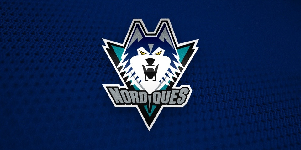
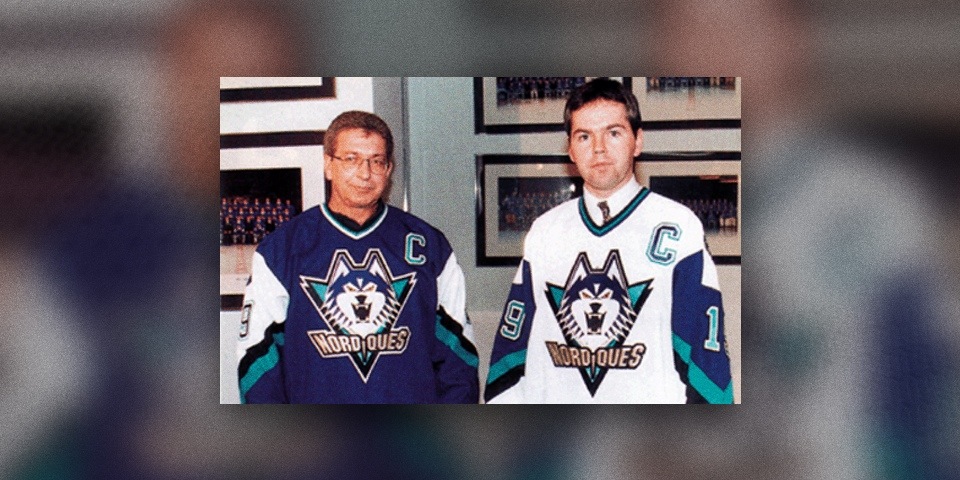
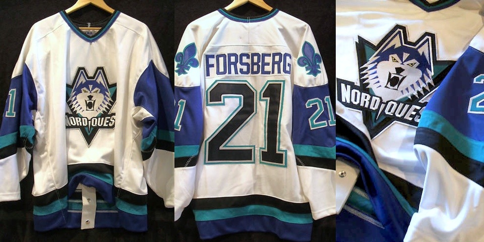
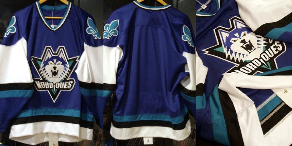
The team's road jersey will be dark blue with a few lines of a teal-like green color, black, white, and silver. The crest has a large head of a husky dog with its teeth bared. They will sport their new colors in 1996-97 and not next season (1995-96) because they failed to meet the NHL's deadline for a logo change.
Strike one.
A ROCKY START
When the Nordiques owner was unable to keep the team in Quebec, it was sold to Denver-based COMSAT Entertainment Group. Apparently their instinct was to name it the Rocky Mountain Extreme. It even got as far as the logo design process.
Most fans have never seen these designs, despite the fact that they've been hiding on the Internet for more than three years. Graphic designer Michael Beindorff published the sketches in an ebook featuring samples of his work.
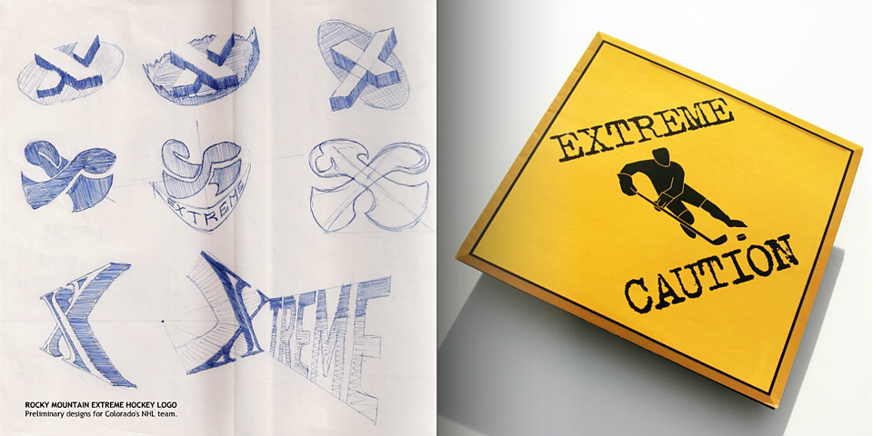
The "Extreme" name was leaked by Adrian Dater of the Denver Post, at which point Colorado hockey fans loudly objected. As any reasonable person would expect.
Strike two.
IN SEARCH OF AN IDENTITY
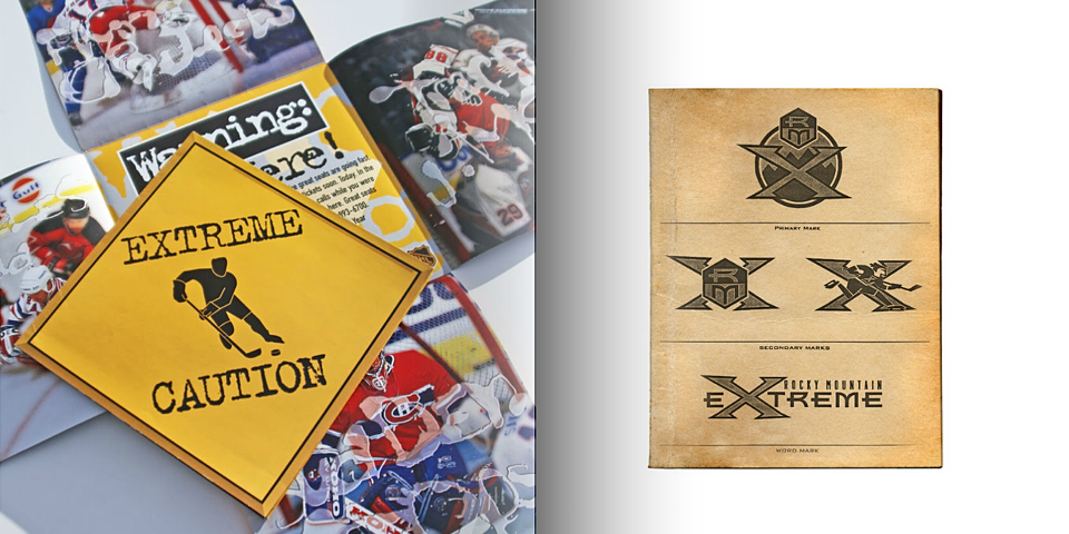
The new owners decided to do what they probably should've done in the first place. They invited fan input on the name. Among the options presented were Black Bears, Cougars, Outlaws, Rapids, Renegades, Storm, Wranglers, and of course, Avalanche.
Photo from Adam Jones via Photobucket
The photo above was uploaded without its source identified, but it could be an early Avalanche game program. I'd love any help from Avs fans.
Surprisingly, fan voting didn't yield the name we know today. Coloradans weren't initially interested in Avalanche. They wanted the Cougars, according to a book called History and Heroes: The Story of the Colorado Avalanche by Bill McAuliffe.
When the Quebec Nordiques were purchased by COMSAT Entertainment Group in 1995, it was clear that the team would need a new name. Nordiques means "Northerners," and that certainly didn't describe Denver.
At first, the new owners wanted to call the team the Rocky Mountain Extreme, but the Colorado public didn't like that. ... The owners set up a "feedback forum" in which fans could identify their preference for a new name. "Cougars" won out in the fan voting, but the owners had the final say and decided on "Avalanche."
The name was unique in all of professional sports, describing the dangerous snow slides that can occur in mountainous areas such as Colorado.
With the name settled, Beindorff — the team's in-house graphic designer — was called to action once again, under the guidance of creative director Dan Price — who now heads an agency called Adrenalin (responsible for the current Coyotes logo).
Again, Beindorff's ebook provides insight into the design process.
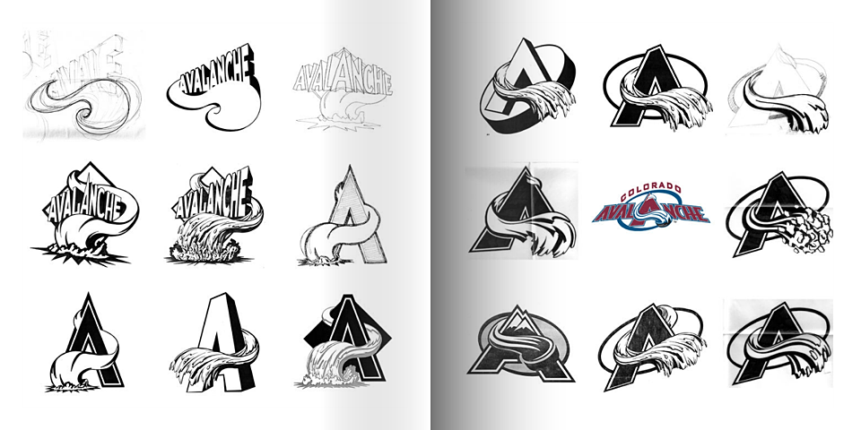
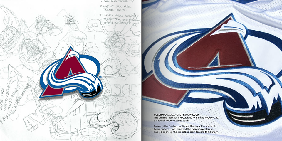
I'm always captivated by seeing a series of sketches that ultimately led to a great logo. Without these, we would not have the great icon we see today.
For more, we turn back to the publication that showed us the original team name options.
Photo from Adam Jones via Photobucket
If it helps in identifying the book, this photo is visibly credited to Cyrus McCrimmon, who currently works for the Denver Post.
Finally, on Aug. 10, 1995, the Colorado Avalanche were introduced to the world.
From the SportsBusiness Daily report:
Colorado's new NHL team will be called the Colorado Avalanche and its logo will feature a color scheme of burgundy, silver, blue and black. ... The logo and colors were designed in partnership between the NHL's David Haney and COMSAT's Creative Dir. Dan Price, Sr. Art Dir. Michael Beindorff and Art Dir. Rick Pillmon.
Home run. After averting two branding disasters, it's clear the third time was the charm for this franchise — named the Avalanche. The irony.
So what do you think of all that?
CONTINUE READING: Part 5: A History of Blue