
How the timeless Hartford Whalers logo came to be
/A lot of you have been enjoying my series of NHL logo origin stories from the 1990s. Many of those designs were short-lived. Those that weren't are anything but uncontroversial today.
But roll back the clock and we find one of the most universally admired logos of all time.
In 1979, the WHA folded and the New England Whalers were one of only four teams absorbed into the NHL. The franchise was renamed and in need of a new logo. Peter Good was the designer hired to create a new identity for the Hartford Whalers.
On June 29, WFSB-TV in Hartford, Conn. aired an interview between Face the State host Dennis House and Good — from the Connecticut design firm Cummings & Good. During the 9-minute conversation, the two talked about the genesis of the logo and all things Whalers.

If you can't watch the video above, I've transcribed the good stuff below.
Things kicked off with an image of the old New England Whalers logo.
Peter Good: This was given to me as the starting point really. They wanted a new, fresh identity. They just moved to Hartford. There was a lot of excitement in the community.
Like any project, I meet with them. In this case Howard Baldwin, Bill Barnes and I think Jack Kelly was the manager at that time.
Dennis House: And so you started sketching?

Still frame from WFSB-TV
PG: This is where all design projects start. Those are the original designs that I presented not as a design solution but as a way of thinking about the identity.
Curiously, when I did these, Howard Baldwin actually said, "I like the lower right one." Shown here. With the trident. The trident was a reference to the harpoons.
I said, "Why do you like that one?" He said, "The 'H' is there." So I said, "Wait a minute, that was a not a requirement. It was just an idea that I had. But now that I know that it limits the field. So let me have another three or four days to play with it, to go back and rethink this given the idea it should have the 'H' integrated.
DH: And you came up with this?
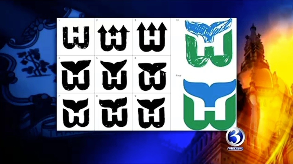
Still frame from WFSB-TV
PG: This is how it started. I was bothered by the idea of harpoons anyway because their mascot is a whale. So why would you have a symbol that suggests killing your mascot? That seems contradictory.
So I said, what do we have to work with? I have the letterforms 'W' and 'H' and I have a whale. And whales are kind of amorphous creatures. They're not like a tiger where you could characterize it very simply. But the whale's tail is very, very formally interesting. It's symmetrical. So you have three symmetrical elements to play with. This was a gift.

PG: I call it a marriage of convenience between a whale's tail, a letterform 'W' and the offspring is essentially the negative 'H'.
DH: What was the public's reaction when it was first unveiled and first showed up on uniforms?
PG: They liked it. My wife Jan and I designed the first uniforms. There was overwhelming support. I think a lot of it had to do with the idea of Hartford having a professional team.
From there, the two discussed the process of designing a logo in today's climate. The video on WFSB's website becomes choppy at this point, cutting out parts of the conversation. It's impossible to know what they were saying but it seemed insightful. There's mention of focus groups and other things that tend to water down great designs.

Peter Good, Cummings & Good // Still frame from WFSB-TV
Then came the question a lot of fans are curious about.
DH: Who owns the rights to the logo?
PG: Aha, well. This has been controversial since a long time ago. The NHL is licensing it and it's really been a cash cow for them. They are making a profit. We have started doing some things of our own in that we never did sign the rights over. We were asked but we never signed the document. It was never work-for-hire. I still have the check for a dollar that I never cashed to make it legal.
DH: So where do we go from here? Can you sell items?
PG: We're doing some shirts. The products that we're doing are quite different from what I've seen in the marketplace. When we first started this, Jan and I designed a lot of items. It was called the Designer Series and we sold them through the Whalers shop and it was umbrellas and tote bags and shirts and aprons. But they were very sophisticated. Beautiful embroidery. Very subtle. And to tell you the truth, it wasn't successful because sports fans like it big and brassy.
In wrapping up the conversation, House and Good mused on the possibility of the NHL returning to Hartford and whether the name and logo could be resurrected.
DH: How would you feel if the team came back and they hired someone else to change the logo completely?
PG: Believe me, that's happened before. Logos are things that every designer likes to think are timeless and enduring but some that I thought would last for many, many years tend to change.
There's so many factors. The team starts losing games, everything's on the table. Change the uniforms, change the logo and so forth.
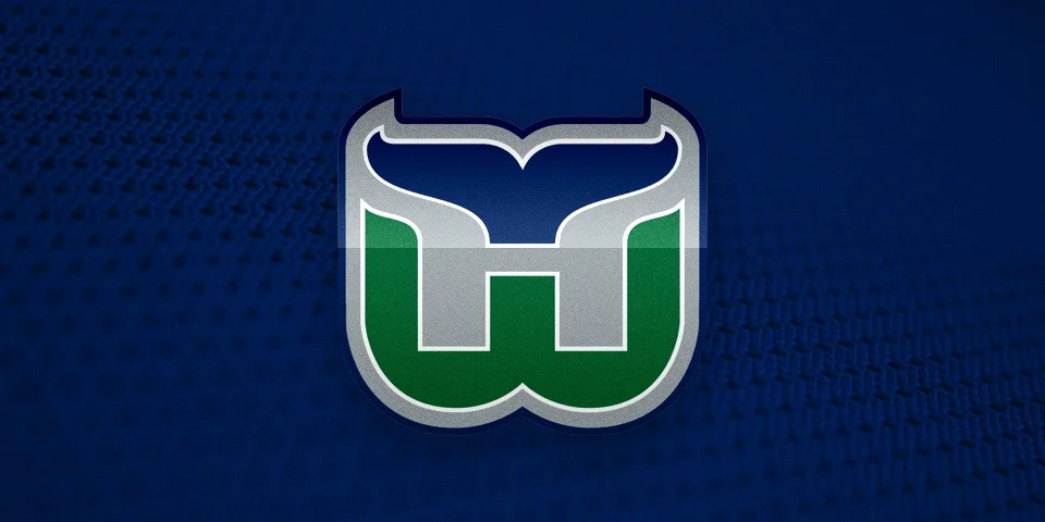
Good may be referencing the fact that for their final five years in Hartford, the Whalers used an altered version of his logo with grey added to the color scheme. That came about in 1992.
Seriously, what is it about the '90s?
FURTHER READING: A Tail of a Whale · Aug 21, 2010