
Texas Stars complete rebrand with new jerseys
/
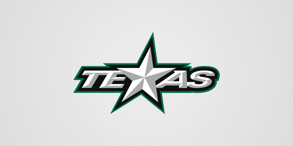
More than three months ago the AHL's Texas Stars unveiled their new logos, inspired by those of their owner and NHL affiliate, the Dallas Stars.
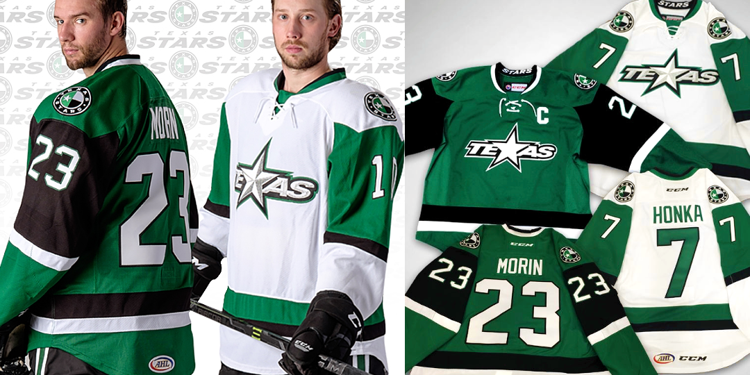
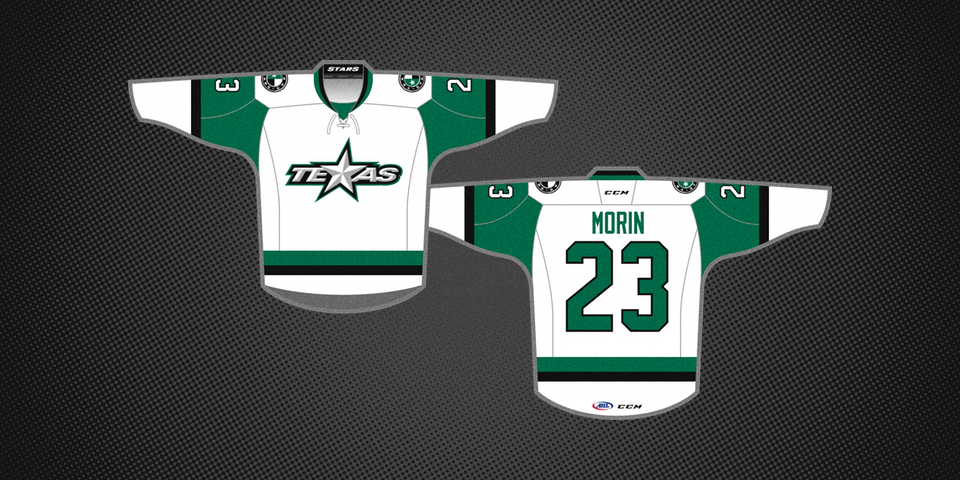
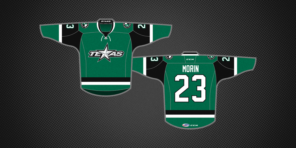
Tonight, we finally got a look at the uniforms that complete this summer's rebrand. They were unveiled tonight at a fan event and are heavy on the Victory Green — which is a welcome sight!
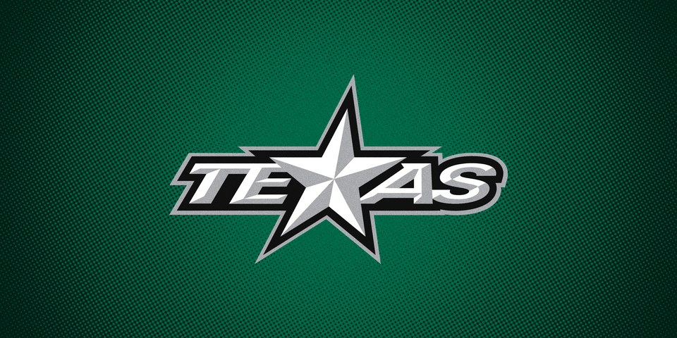
Front and center on both sweaters is the new "TEXAS" primary mark. Previously, the T-Stars did not have matching crests on their uniforms.
From the press release:
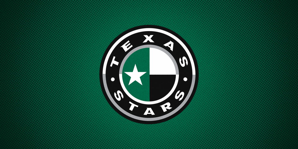
Narrowed down from more than 30 design options, the new sweaters feature striping around the arms and bottom, the circular secondary logo on the shoulders, and black pants.
The jerseys are actually a twist on Dallas' template, which debuted in 2013 and had not been used by any other team until now. The top of the sleeves are a different color, framing the numbers.
I don't want to speak too soon, but I think the Texas Stars may well be the best-dressed team in the American Hockey League this year. I'm not even joking. These are gorgeous jerseys.
We have a design with clear ties back to the NHL parent club while still retaining its own unique identity. Honestly, what's not to like?
Do you agree? Or is it missing something?