
Florida Panthers unveil 25th anniversary logo
/
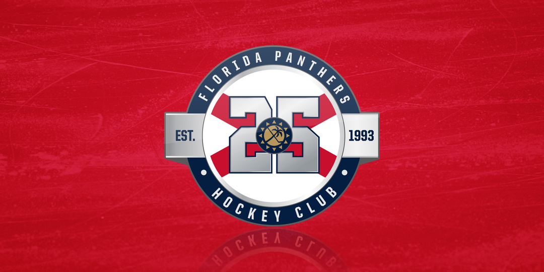
The Florida Panthers unveiled their 25th anniversary logo this morning at Esplanade Park in Fort Lauderdale, Fla. It's a design covered in symbolism spanning the quarter-century of the NHL's south Florida franchise.
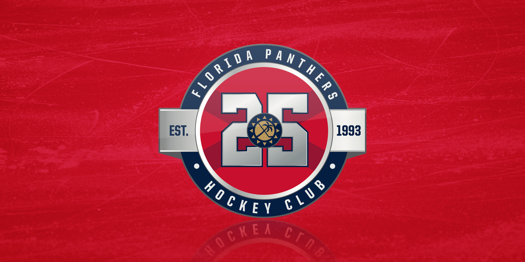
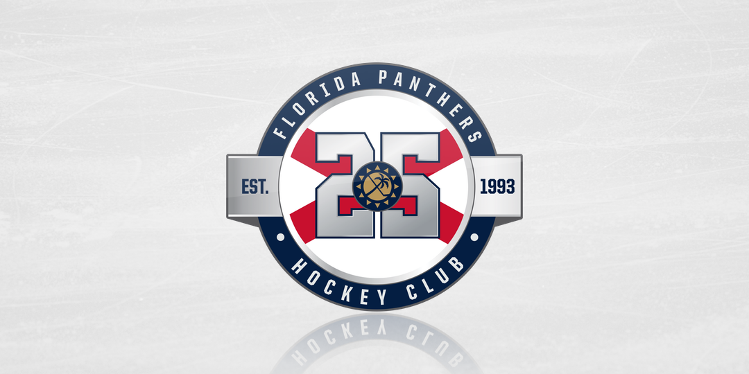
The new mark will be worn as a patch on the front of the Cats' uniforms but each sweater gets its own design. The inner circle is red on the red home jersey and white on the road jersey.
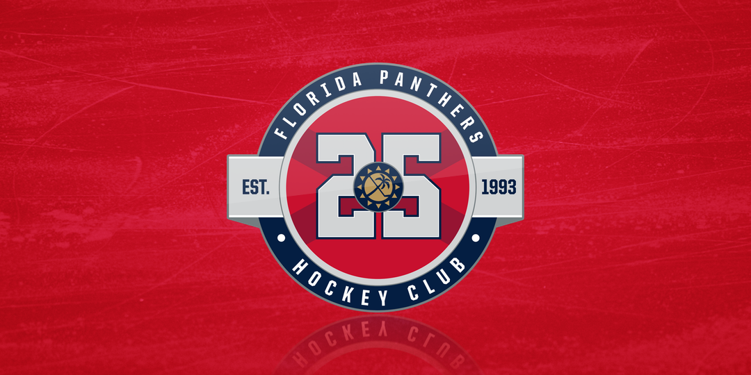
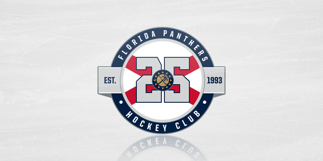
I'm normally not a fan of heavy use of gradients, but as you can see the patches are metallic and that's tough to recreate on a computer screen. But the team did also release flat color versions of the logos that work well too.
The other day I wrote a pretty in-depth breakdown of the Carolina Hurricanes' third jersey teaser. There's not much need to do that for this logo, since the Panthers have already done it for us. Check out this graphic from the team's website.
25th anniversary logo explainer / Florida Panthers
The best example that the Panthers are paying attention to fans when it comes to branding decisions is front and center. That sun symbol with the crossed hockey stick and palm tree is a nod to the club's original shoulder patch design.
I spoke to the Panthers' John Viola by phone this morning about the new mark and he called out that element specifically. He said the old secondary mark was very popular with fans and he heard a lot about that after the 2016 rebrand when it disappeared. The team felt it was important to include that emblem in this mark.
To me, it's fascinating to see just how many elements of the team's branding history has been incorporated into a single design. The original roundel logo, the 2009 third jersey crest, and the red cross from the Florida state flag all come together very well.
The fact that it works so cohesively is a testament to the designers. Viola said the club's internal design team worked on the logo. So kudos to them. I'm told that talented group is made up of Molly Marshall, Alexandra Lytle, and Danielle Maciver.
Now, as much as I like this logo, I do have one minor quibble. Was there really a need to have a red inner circle on the home jersey version of the patch? That part of the mark is meant to represent the state flag of Florida, which is white. The white version looks great over red.
The white version of the logo over red
For what it's worth, there's also a sort of 3D chrome version from the Panthers' release video.

Video still / Florida Panthers
The last thing I'll say doesn't come lightly. As an unabashed Tampa Bay Lightning fan, the Florida Panthers have been the enemy for 25 years. So when I tell you I like their 25th anniversary logo far better than the Bolts', that's no small thing. But it's true.
Say what you will about how much the Panthers tried to cram into this logo — they did a lot, but they did it well — and at least they put some thought into the design. The Lightning went with a pretty plain look that — let's be honest — has been done plenty of times before in sports.
So that's all I'll say on that.
For what it's worth, I also asked Viola whether the Panthers had a throwback jersey in the pipeline for their 25th anniversary season, but he couldn't say much on the subject. So we'll just have to wait and see.
The other team that will join Florida in marking 25 years is the Anaheim Ducks. If you haven't seen it, take a look. It was revealed last December.

It's not a bad design, but it doesn't show any love to the franchise's history — particularly the Mighty Ducks era which lasted for more than half of those 25 years. It was just an excuse to shoehorn the current primary mark into a "5".
You've heard my take, so what do you think of these logos? Which do you prefer?