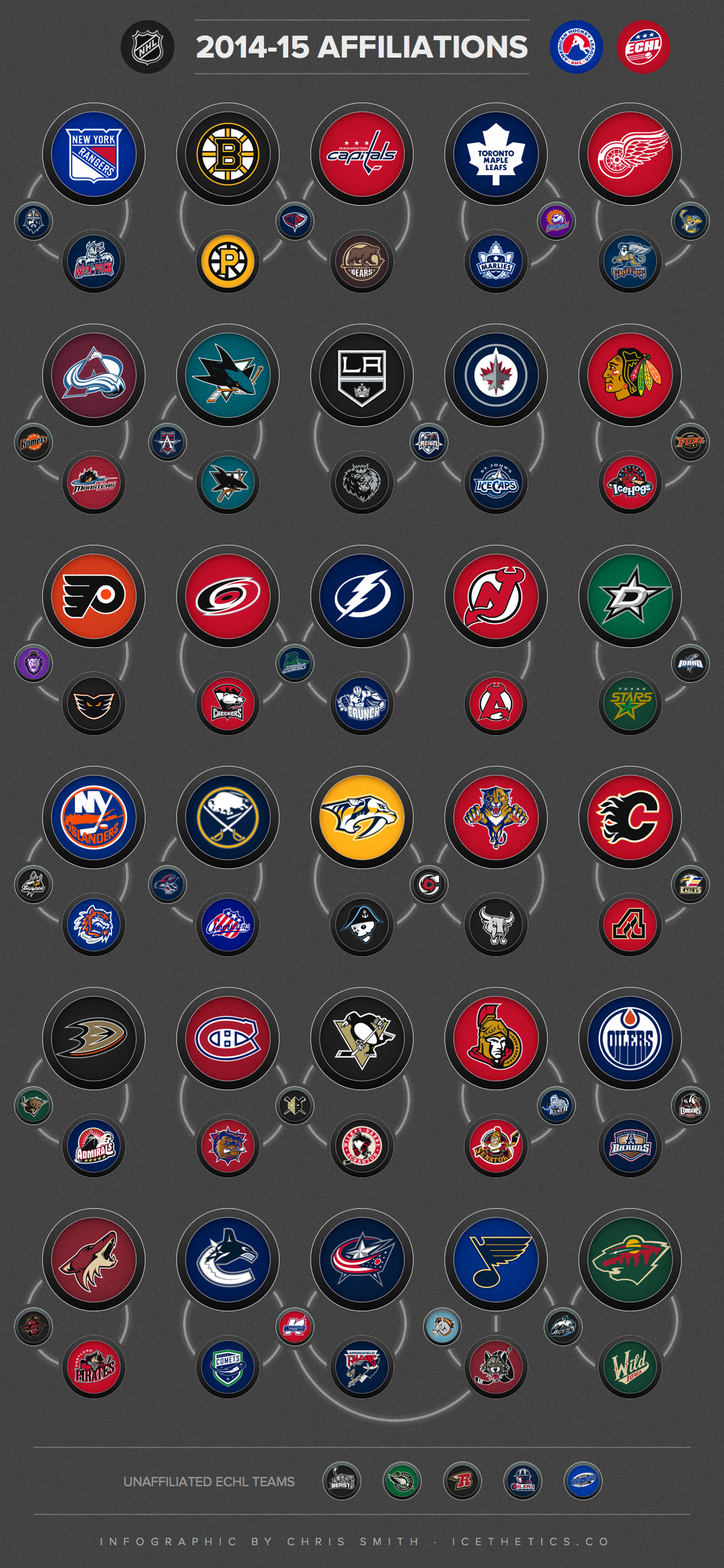
Infographic: 2014-15 NHL Affiliations
/Curious about how teams in the NHL are connected to those in the AHL and ECHL? Enjoy this infographic showing the various affiliations across North American pro hockey.
Curious about how teams in the NHL are connected to those in the AHL and ECHL? Enjoy this infographic showing the various affiliations across North American pro hockey.
A lot of you have been enjoying my series of NHL logo origin stories from the 1990s. Many of those designs were short-lived. Those that weren't are anything but uncontroversial today.
But roll back the clock and we find one of the most universally admired logos of all time.
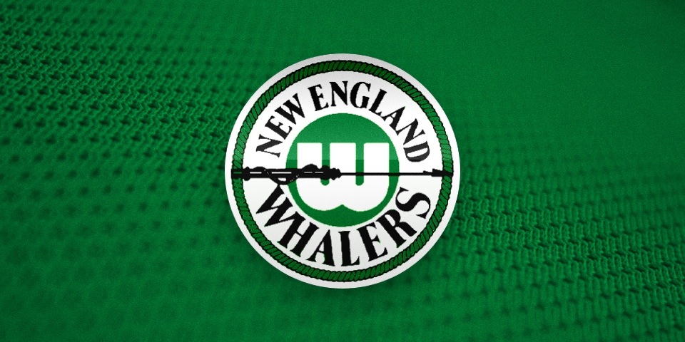
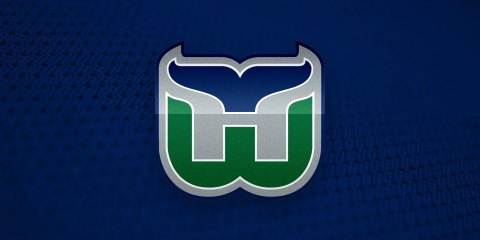
In 1979, the WHA folded and the New England Whalers were one of only four teams absorbed into the NHL. The franchise was renamed and in need of a new logo. Peter Good was the designer hired to create a new identity for the Hartford Whalers.
On June 29, WFSB-TV in Hartford, Conn. aired an interview between Face the State host Dennis House and Good — from the Connecticut design firm Cummings & Good. During the 9-minute conversation, the two talked about the genesis of the logo and all things Whalers.
What's the deal with resurgence of Hartford Whalers logo? Today on WFSB. Preview here: http://t.co/8GlE0fYIih pic.twitter.com/wP3YioOg5A
— Dennis House (@DennisHouseWFSB) June 29, 2014
If you can't watch the video above, I've transcribed the good stuff below.
Things kicked off with an image of the old New England Whalers logo.
Peter Good: This was given to me as the starting point really. They wanted a new, fresh identity. They just moved to Hartford. There was a lot of excitement in the community.
Like any project, I meet with them. In this case Howard Baldwin, Bill Barnes and I think Jack Kelly was the manager at that time.
Dennis House: And so you started sketching?

Still frame from WFSB-TV
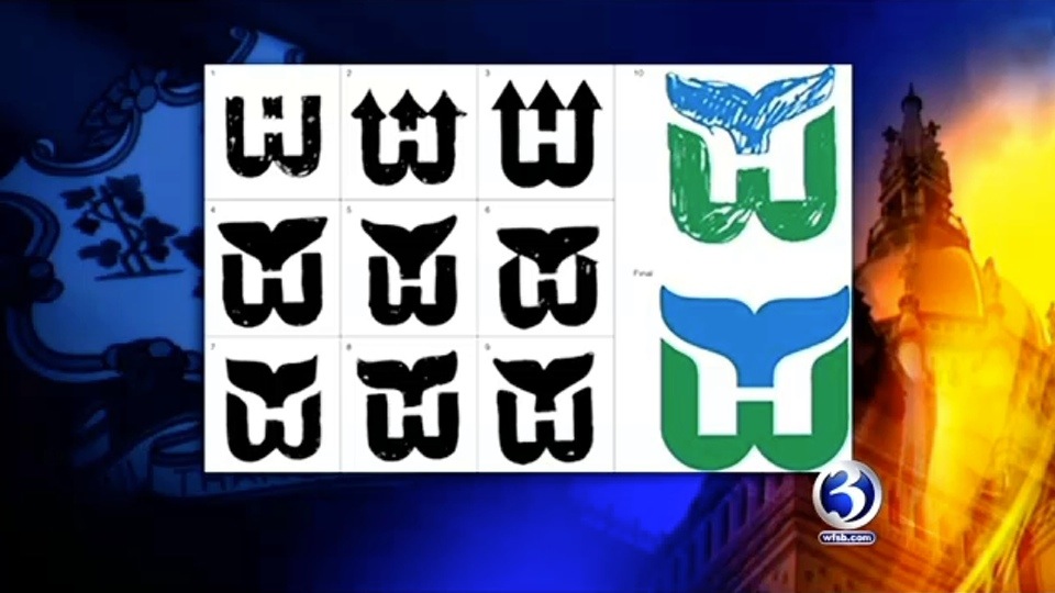
PG: This is where all design projects start. Those are the original designs that I presented not as a design solution but as a way of thinking about the identity.
Curiously, when I did these, Howard Baldwin actually said, "I like the lower right one." Shown here. With the trident. The trident was a reference to the harpoons.
I said, "Why do you like that one?" He said, "The 'H' is there." So I said, "Wait a minute, that was a not a requirement. It was just an idea that I had. But now that I know that it limits the field. So let me have another three or four days to play with it, to go back and rethink this given the idea it should have the 'H' integrated.
DH: And you came up with this?
Still frame from WFSB-TV
PG: This is how it started. I was bothered by the idea of harpoons anyway because their mascot is a whale. So why would you have a symbol that suggests killing your mascot? That seems contradictory.
So I said, what do we have to work with? I have the letterforms 'W' and 'H' and I have a whale. And whales are kind of amorphous creatures. They're not like a tiger where you could characterize it very simply. But the whale's tail is very, very formally interesting. It's symmetrical. So you have three symmetrical elements to play with. This was a gift.

PG: I call it a marriage of convenience between a whale's tail, a letterform 'W' and the offspring is essentially the negative 'H'.
DH: What was the public's reaction when it was first unveiled and first showed up on uniforms?
PG: They liked it. My wife Jan and I designed the first uniforms. There was overwhelming support. I think a lot of it had to do with the idea of Hartford having a professional team.
From there, the two discussed the process of designing a logo in today's climate. The video on WFSB's website becomes choppy at this point, cutting out parts of the conversation. It's impossible to know what they were saying but it seemed insightful. There's mention of focus groups and other things that tend to water down great designs.

Peter Good, Cummings & Good // Still frame from WFSB-TV
Then came the question a lot of fans are curious about.
DH: Who owns the rights to the logo?
PG: Aha, well. This has been controversial since a long time ago. The NHL is licensing it and it's really been a cash cow for them. They are making a profit. We have started doing some things of our own in that we never did sign the rights over. We were asked but we never signed the document. It was never work-for-hire. I still have the check for a dollar that I never cashed to make it legal.
DH: So where do we go from here? Can you sell items?
PG: We're doing some shirts. The products that we're doing are quite different from what I've seen in the marketplace. When we first started this, Jan and I designed a lot of items. It was called the Designer Series and we sold them through the Whalers shop and it was umbrellas and tote bags and shirts and aprons. But they were very sophisticated. Beautiful embroidery. Very subtle. And to tell you the truth, it wasn't successful because sports fans like it big and brassy.
In wrapping up the conversation, House and Good mused on the possibility of the NHL returning to Hartford and whether the name and logo could be resurrected.
DH: How would you feel if the team came back and they hired someone else to change the logo completely?
PG: Believe me, that's happened before. Logos are things that every designer likes to think are timeless and enduring but some that I thought would last for many, many years tend to change.
There's so many factors. The team starts losing games, everything's on the table. Change the uniforms, change the logo and so forth.
Good may be referencing the fact that for their final five years in Hartford, the Whalers used an altered version of his logo with grey added to the color scheme. That came about in 1992.
Seriously, what is it about the '90s?
FURTHER READING: A Tail of a Whale · Aug 21, 2010
I thought this series would conclude with Part 3, but new stories of NHL logo design of 1990s seem to be coming out of the woodwork. Here in Part 4, a story of myth becomes real.
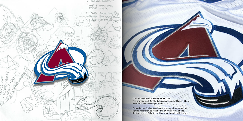
In Part 3, I lauded the Colorado Avalanche for having such an excellent logo. But things very nearly went in the opposite direction for this franchise.
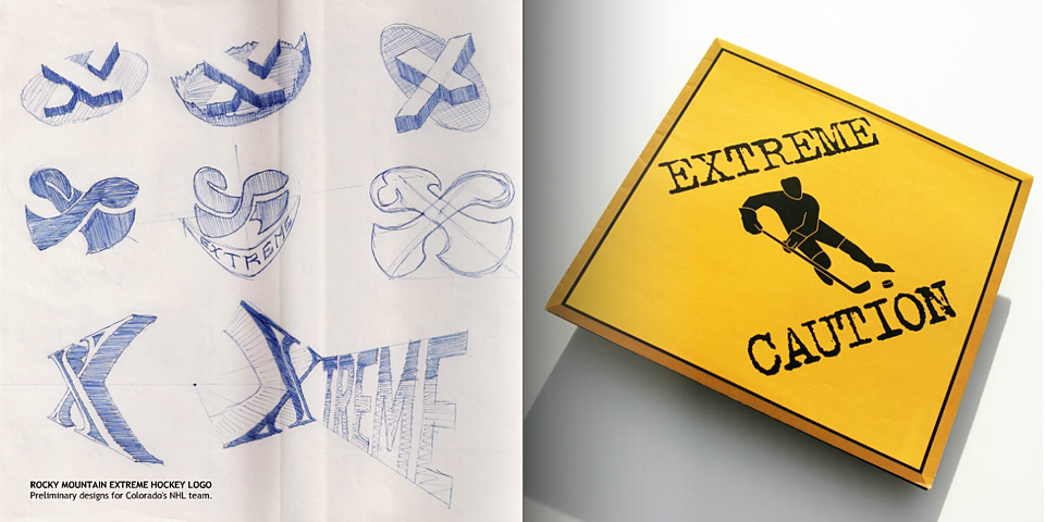
The tale has long been told that in 1995 the Avs were originally supposed to be named the Rocky Mountain Extreme. I call it myth because it was a story that lacked any visual evidence.
Until now.
Rocky Mountain Extreme logos by Michael Beindorff via Mixbook
These stories work best when told from the beginning.
1995. That was a rough year for NHL fans. We lost half the season to a lockout. The Capitals and Islanders killed their 20-year-old identities with controversial new logos. And the famed Nordiques were mercilessly ripped away from the people of Quebec.

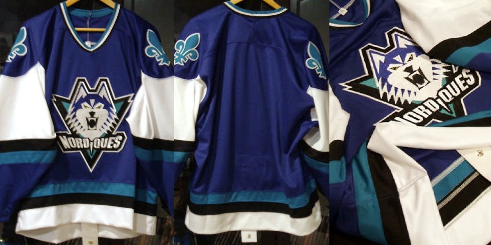
But let's back up for a second. Before the Nordiques were ripped away, they had no intention of leaving. In fact, management was planning for the future by rebranding the franchise with a new logo, uniforms, and new colors (with our '90s favorite, teal!).
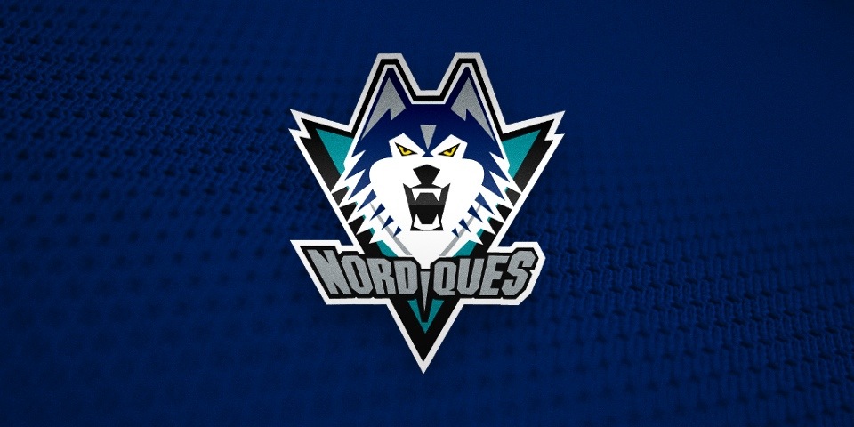
Quebec Nordiques, proposed logo for 1996-97 season
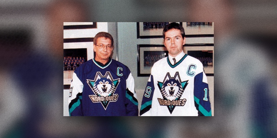
Publicity photo, source unknown
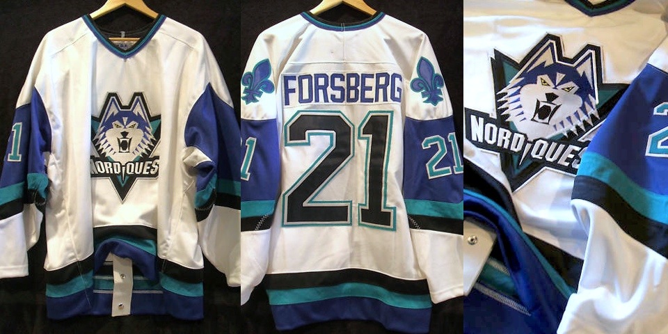
Photos from ebay posting (2010), authenticity unknown
Photos from ebay posting (2011), authenticity unknown
Check out this article printed in The Hockey News in April 1995 for details:
Nordiques will have new look in 1996-97
Compiled by the THN Staff
The Quebec Nordiques don't have a new arena yet, but a new logo and colors are on the way.
When the Journal de Quebec published the Nordiques' new colors March 30, the team had no choice but to confirm the makeover.
The team's road jersey will be dark blue with a few lines of a teal-like green color, black, white, and silver. The crest has a large head of a husky dog with its teeth bared. They will sport their new colors in 1996-97 and not next season (1995-96) because they failed to meet the NHL's deadline for a logo change.
Strike one.
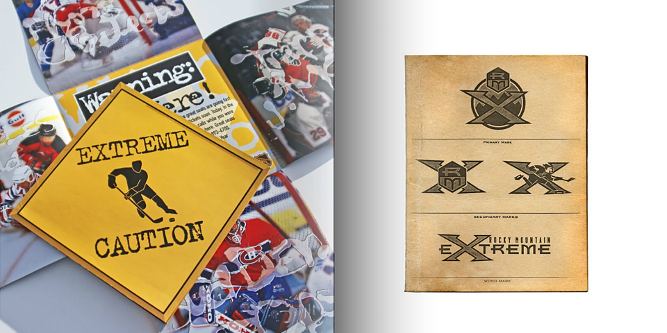
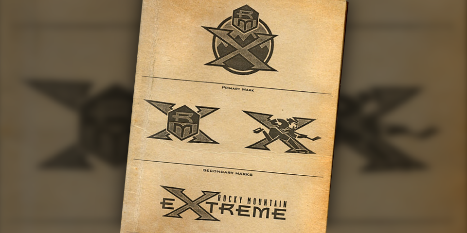
When the Nordiques owner was unable to keep the team in Quebec, it was sold to Denver-based COMSAT Entertainment Group. Apparently their instinct was to name it the Rocky Mountain Extreme. It even got as far as the logo design process.
Most fans have never seen these designs, despite the fact that they've been hiding on the Internet for more than three years. Graphic designer Michael Beindorff published the sketches in an ebook featuring samples of his work.
The "Extreme" name was leaked by Adrian Dater of the Denver Post, at which point Colorado hockey fans loudly objected. As any reasonable person would expect.
Strike two.
The new owners decided to do what they probably should've done in the first place. They invited fan input on the name. Among the options presented were Black Bears, Cougars, Outlaws, Rapids, Renegades, Storm, Wranglers, and of course, Avalanche.
Photo from Adam Jones via Photobucket
The photo above was uploaded without its source identified, but it could be an early Avalanche game program. I'd love any help from Avs fans.
Surprisingly, fan voting didn't yield the name we know today. Coloradans weren't initially interested in Avalanche. They wanted the Cougars, according to a book called History and Heroes: The Story of the Colorado Avalanche by Bill McAuliffe.
When the Quebec Nordiques were purchased by COMSAT Entertainment Group in 1995, it was clear that the team would need a new name. Nordiques means "Northerners," and that certainly didn't describe Denver.
At first, the new owners wanted to call the team the Rocky Mountain Extreme, but the Colorado public didn't like that. ... The owners set up a "feedback forum" in which fans could identify their preference for a new name. "Cougars" won out in the fan voting, but the owners had the final say and decided on "Avalanche."
The name was unique in all of professional sports, describing the dangerous snow slides that can occur in mountainous areas such as Colorado.
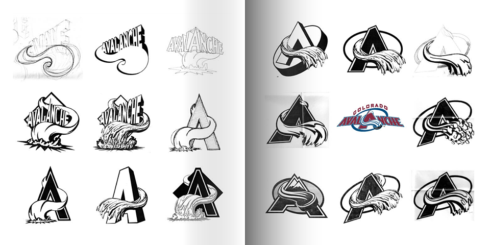
With the name settled, Beindorff — the team's in-house graphic designer — was called to action once again, under the guidance of creative director Dan Price — who now heads an agency called Adrenalin (responsible for the current Coyotes logo).
Again, Beindorff's ebook provides insight into the design process.
I'm always captivated by seeing a series of sketches that ultimately led to a great logo. Without these, we would not have the great icon we see today.
For more, we turn back to the publication that showed us the original team name options.
Photo from Adam Jones via Photobucket
If it helps in identifying the book, this photo is visibly credited to Cyrus McCrimmon, who currently works for the Denver Post.
Finally, on Aug. 10, 1995, the Colorado Avalanche were introduced to the world.
From the SportsBusiness Daily report:
Colorado's new NHL team will be called the Colorado Avalanche and its logo will feature a color scheme of burgundy, silver, blue and black. ... The logo and colors were designed in partnership between the NHL's David Haney and COMSAT's Creative Dir. Dan Price, Sr. Art Dir. Michael Beindorff and Art Dir. Rick Pillmon.
Home run. After averting two branding disasters, it's clear the third time was the charm for this franchise — named the Avalanche. The irony.
So what do you think of all that?
CONTINUE READING: Part 5: A History of Blue
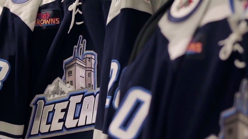
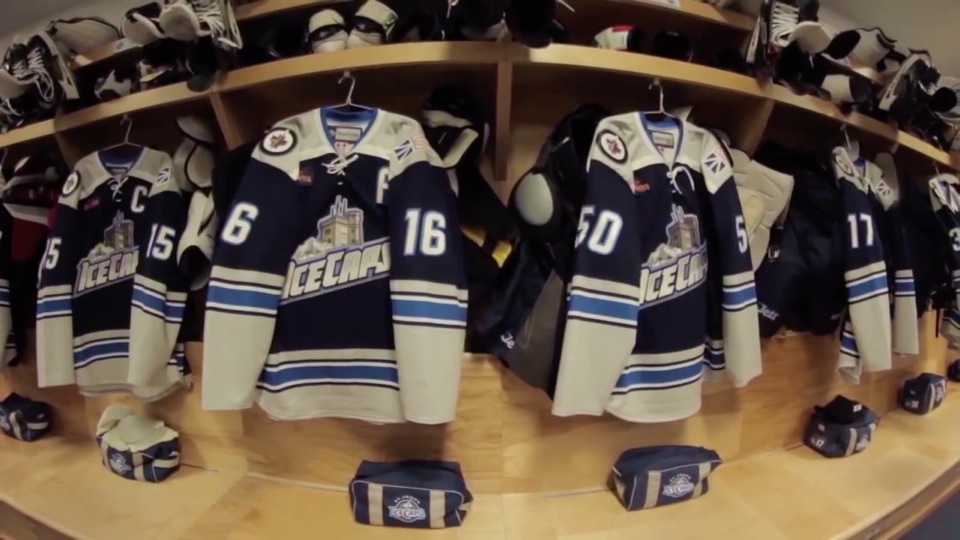
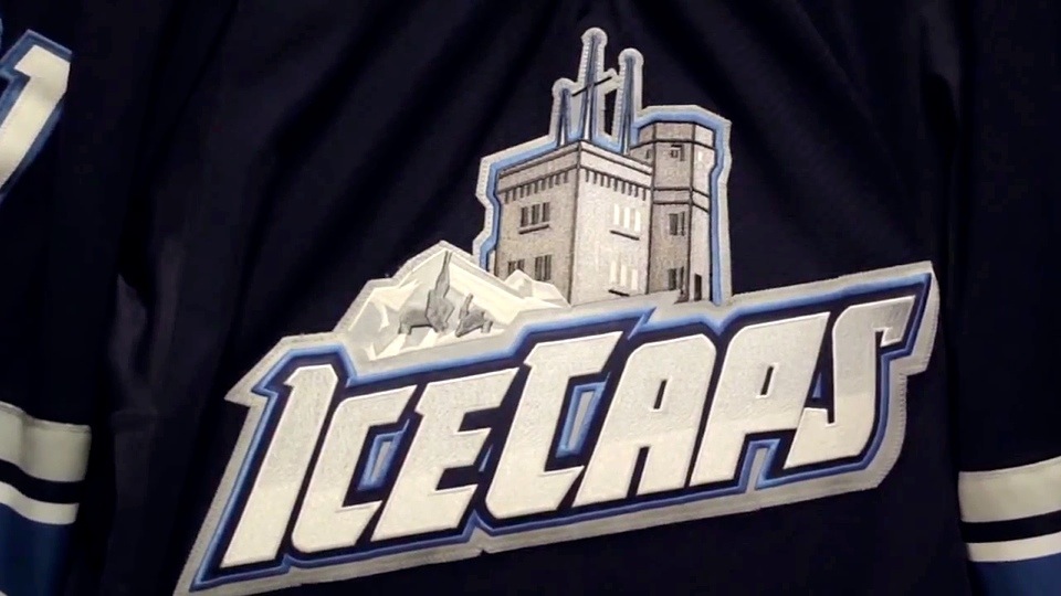
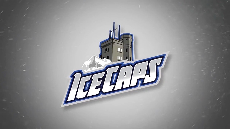
A look at how the IceCaps third jersey came to be.
The AHL's St. John's IceCaps unveiled their third jersey last November, but last week they wanted to remind us how it came about by tweeting a past YouTube video.
We've been doing a lot of peeking behind the curtain around here lately so I thought it appropriate to mention this video.
The fact that the design was created by a fan who approached the team — and not the other way around — should give hope to our many talented concept artists.
Hopefully it sticks around beyond 2016 when the franchise is set to relocate to Thunder Bay.
In case you can't play the video above, here are some stills I grabbed. Because who doesn't love watching a graphic artist create a hockey sweater?
WATCH: Go behind the scenes and see how our 3rd jersey, unveiled in November, came to be. https://t.co/jWkWMsjVV3
— St. John's IceCaps (@IceCapsAHL) July 11, 2014


Before you dig in, first catch up on Part 1 and Part 2.
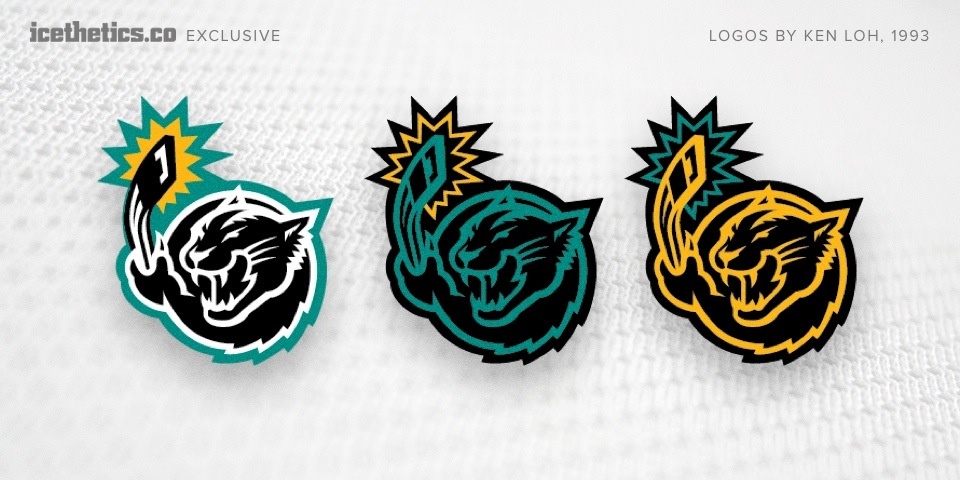
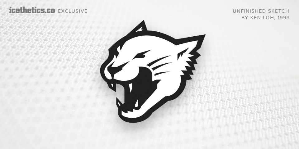
What began as a feature on an unused Flyers third jersey design took me in unexpected directions. Exchanging emails with Ken Loh over the weekend got me thinking a lot about the jerseys and logos the NHL introduced in the 1990s.
The decade welcomed nine expansion teams, including a pair in 1993 — one of which was the Florida Panthers. To my surprise Ken and The Mednick Group also worked on proposals for them. These logos have never been seen outside that circle before today.
These designs reminded me of a Miami Herald article from 2010 by George Richards.
Bill Torrey said he had to fight with then-owner Marti Huizenga regarding the team's colors and uniforms back in 1993. Said she preferred the Marlins black-and-teal color scheme, which then, was all the rage.
That quote is finally validated visually with this work which demonstrates exactly how black and teal might have been used. But Ken admits he was not particularly proud of it.
I’m actually really glad that never saw the light of day since I felt it was too cartoony. I much preferred the simpler, more emblematic approach which, [in my honest opinion], had better potential for a longer lifespan.
However, I was a lowly designer, pretty fresh out of school at the time and, despite my credentials of having come to the agency with the New England Patriots work under my belt, I didn’t really have much pull back then.
Ken opposed incorporating a hockey stick into the design. Above you can see an unfinished sketch he shared — a version of the panther without the stick.
Other concepts from the Panthers' logo design process can be found on display these days in the team's arena in Sunrise, Fla. On the wall are framed drawings of early sketches.
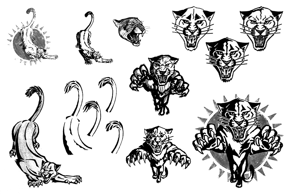
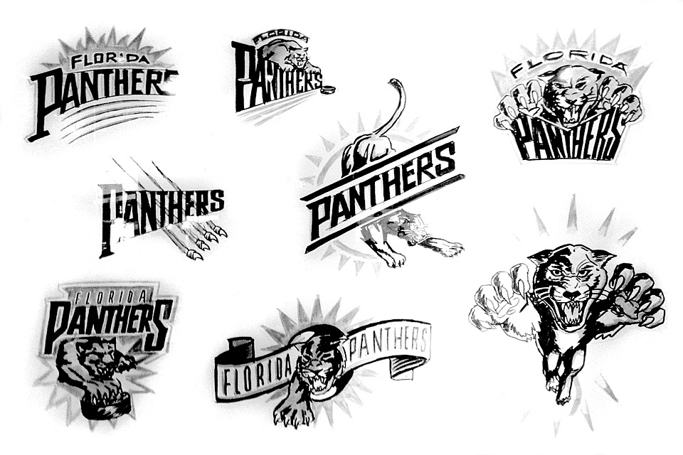
My thanks go to Drew Goldfarb and David Silverstone for providing the original photos.
The Panthers aside, I starting thinking about how many new logos were introduced during that most design-challenged of decades. How many are still around? The period was notorious for trendy designs that lacked staying power. Is that a fair judgment?
So I went back. Back to black. When many of us think back hockey design trends of the '90s, we conjure a simple but derisive acronym: BFBS — black for black's sake. In 1989, four NHL teams wore black jerseys. A decade later that number had tripled — 12 out of 28 teams had a black sweater in their arsenal. Let's begin there.
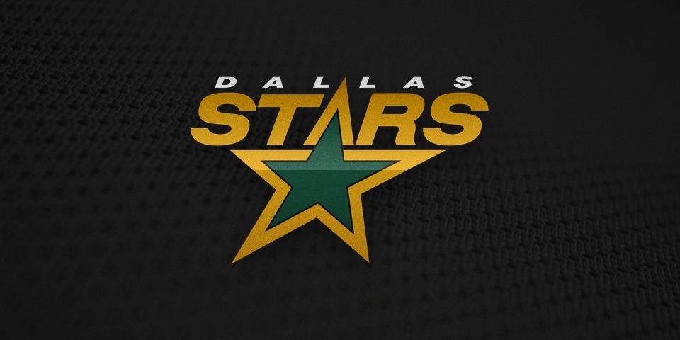
After decades of gorgeous green uniforms, the Minnesota North Stars abruptly switched to black in 1991 — taking it with them to Dallas in the 1993 move. The logo and colors were replaced in 2013.
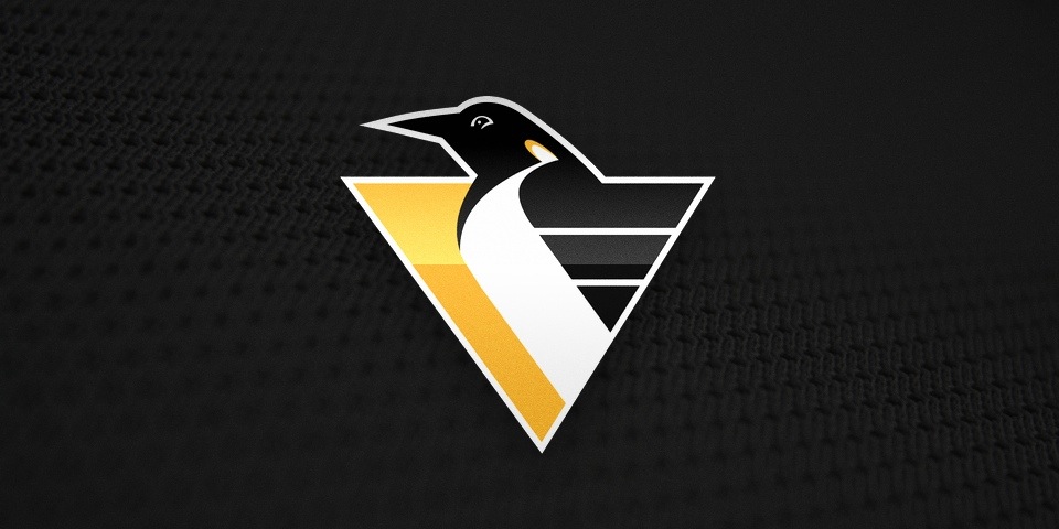
The Penguins began wearing black in 1980 but when the "RoboPenguin" logo was implemented in 1992, it was widely despised. It was replaced in 2002 and fully eradicated in 2007.
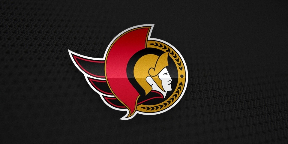
The NHL added two new expansion teams in 1992 and two new black jerseys. And despite the legendary name, the Senators' logo lasted only 15 years, being retired in 2007.
Phil Esposito drew this logo on a cocktail napkin in 1991. It seems no graphic designers bothered to follow up before it appeared on a jersey in 1992. It was finally scrapped in 2007.
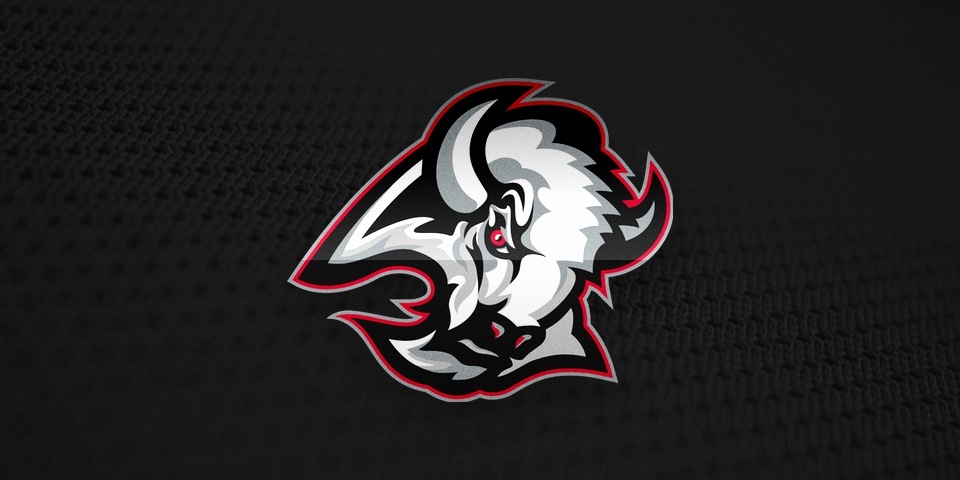
Shockingly, the Sabres ditched 26 years of blue and gold for the "Goathead" in 1996. In 2006, it was replaced by a logo that was inexplicably worse. By 2010, Buffalo fans had their original logo back.
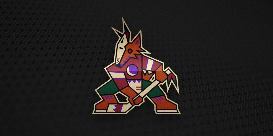
The Coyotes' original logo from 1996 is one of the more unique designs in NHL history. But its strangeness left it open to ridicule and it disappeared in 2003. (Though it returns on a retro jersey in 2014.)
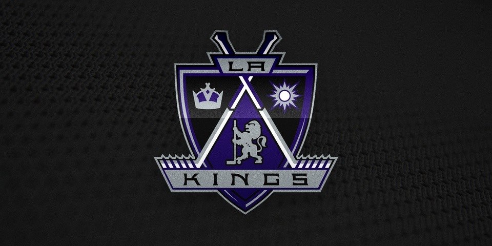
Before the decade was out, the Kings added another future failure to the NHL logo pool in 1998. In 2002, they switched to their secondary logo. In 2011, that entire era was erased.
Be sure to click through the logos and read the captions as they offer insight into the designs as well as the years they were introduced and subsequently jettisoned.
Teams like Coyotes, Kings and Sabres suffered through some unfortunate designs at that time. Others like the Lightning and Stars were just plain boring and lacking in any sense of style — good or bad. But don't start thinking the non-black jerseys were immune.
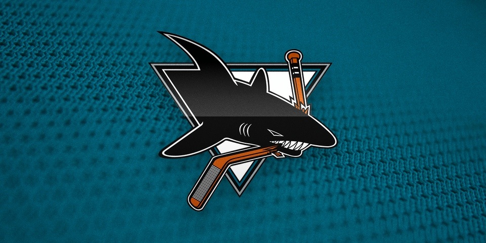
The Sharks joined the NHL in 1991 with this logo. Many fans still consider it a classic, but so many highly detailed lines are just overkill. A modernized design replaced it in 2007.
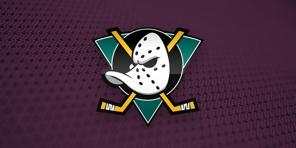
When the Mighty Ducks introduced this logo in 1993, many fans thought it was too childish. But that's what the NHL was going for. Two decades later, some of those kids are nostalgic adults campaigning for it to come back.
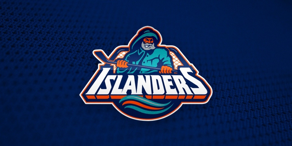
The madness peaked in 1995 as the Islanders did the unthinkable, trashing a beloved logo that was the backdrop for four Stanley Cups in favor of a kid-friendly cartoon character. And is that teal? It didn't even last two full seasons before fans forced them back to the old logo.
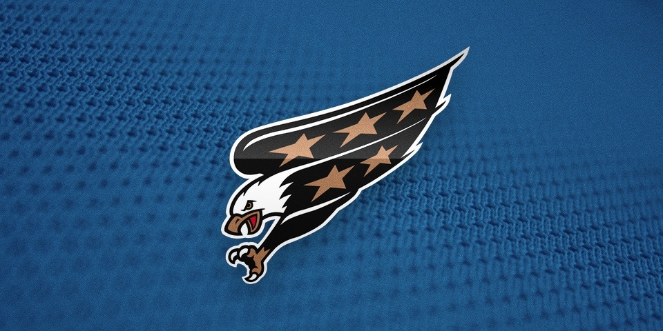
Unlike the Isles, the Capitals improved upon their previous logo in 1995, but bafflingly lost the red, white and blue color scheme that defines the American capital city. In 2007, the colors were corrected and the logo redesigned with a nod to that 1974 crest.
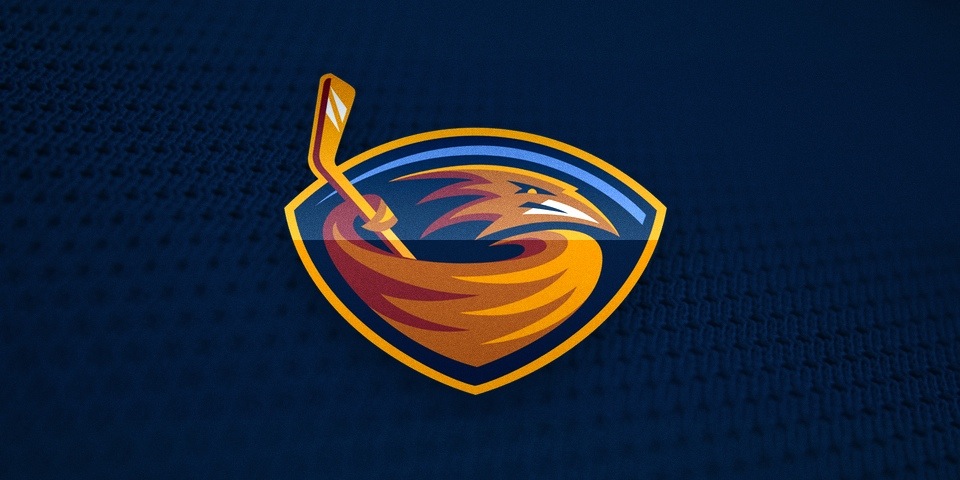
The Atlanta Thrashers were established in 1999. Their logo, often described as a bird stirring itself into a bowl of soup, might still be around had the franchise not moved to Winnipeg in 2011.
In fact, these were some of the worst offenders of the '90s. Look at them all. What do they have in common? Ken Loh said it. The hockey sticks. Only someone who isn't a hockey fan would do that to a team logo.
And while the Caps logo above may not have a stick — though the secondary mark sure did (a lousy puck, too) — I'd bet money those open claws once held a stick at some point during the design process. Kudos to whoever forced that eagle to release it.
I'm certainly making the '90s out to be like the Dark Ages of hockey logo design. But truthfully, it wasn't all bad. Some logos are still around — after a bit of nip and tuck.
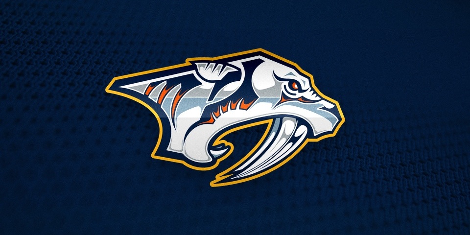
In 1998, the Predators entered the world with this on their chest. It had too many colors and too many intricate details. In 2011, both failures were rectified.
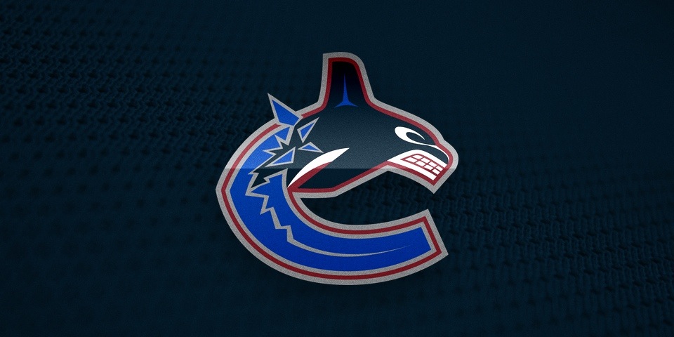
Ending almost 20 years of the "spaghetti skate," the Canucks moved in a new direction with a logo inspired by the Pacific Northwest. As for the colors? That's anyone's guess. They were changed in 2007.
Perhaps more fascinating were two of the last logos to come out of this decade. The Minnesota Wild and Columbus Blue Jackets didn't play their first games until 2000, but their logos were absolutely products of the '90s — though they couldn't have been more different.
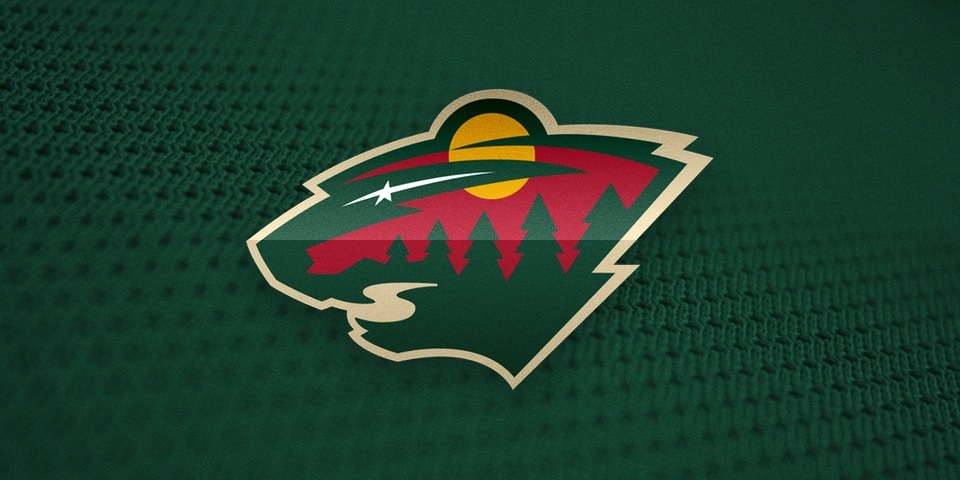
The Wild are considered by many to have one of the most brilliant and clever logos in all of sports. We look upon the abundant symbolism in awe to this day.
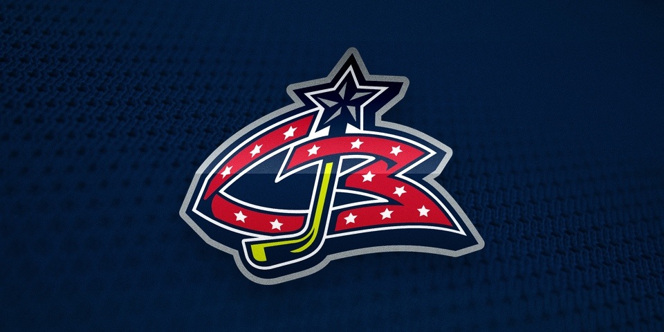
In Part 2, we saw how this logo came about. But in utter contrast to the Wild, the design the client demanded could not endure. It was replaced in 2007 by a third jersey logo designed in 2003.
Have I warmed you enough yet to the idea that not everything produced in the 1990s was bad? Because it wasn't. There are a handful of '90s NHL logos I haven't mentioned here. You know what they are. I held them to the end for the catharsis.
Let's bring it full circle. Back to the Sunshine State.
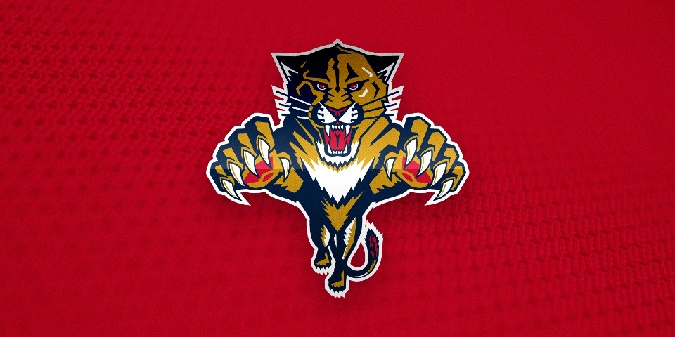
Florida Panthers, 1993—

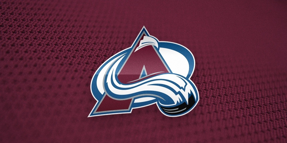
Colorado Avalanche, 1995—
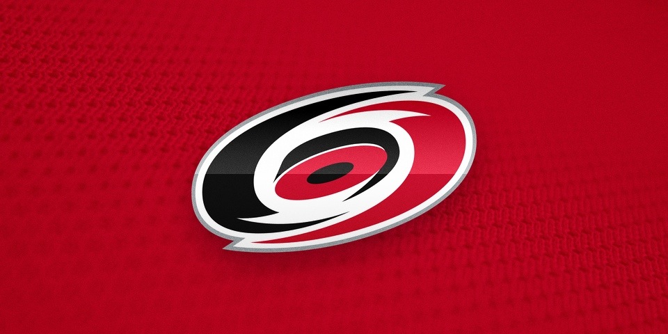
Carolina Hurricanes, 1997—
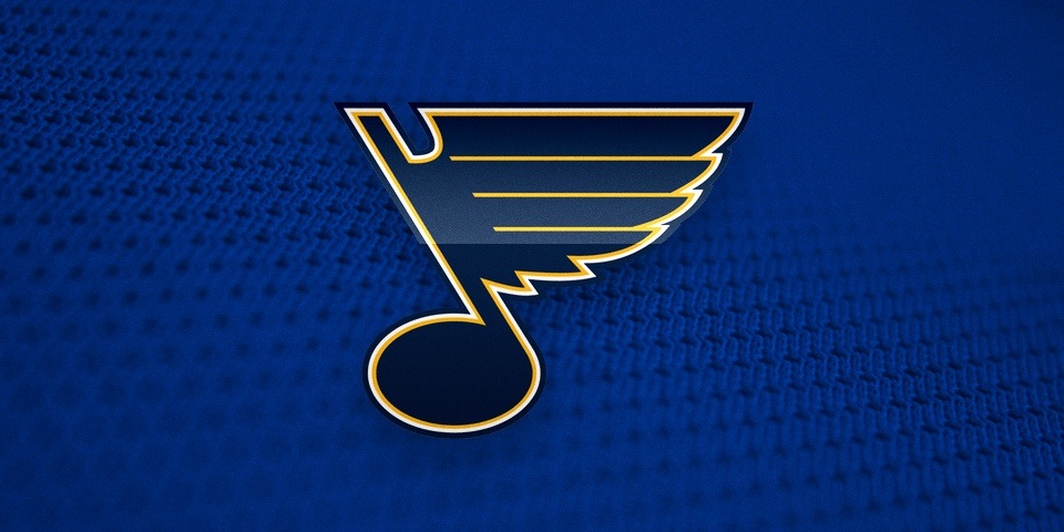
St. Louis Blues, 1998—
See? There were some gems. Granted, the majority were flops. Of the 20 logos that debuted in the 1990s, 15 did not live to see drinking age (21, I mean). But the ones that did deserved to. Survival of the fittest, you might say.
But didn't I just berate the Sharks and Predators for being too intricate? Why do I suddenly love the Panthers logo? Look closely. The difference is in the details. For Florida, it adds to the animal ferocity. It adds to the design — rather than detracting from it.
The Hurricanes logo was designed by a copy writer and hides a hockey puck at its core. Cardinal sins? Maybe, but you try to do better. No one else has yet. And there's been ample opportunity. So I'm happy to see it entering its 18th year. Stick tap to Peter.
As for the Avs and Blues, well there's simply no way to improve upon perfection. Period.
I grew up in the '90s and it's sometimes hard for me to fathom that it was two decades ago. I still feel like a kid most days. Time flies. But here's the thing. I was the target audience for those trendy designs back then. And now I do this. So was it successful marketing after all?
You be the judge.